Design Philosophy: Massimo Vignelli — Design Is One
The Principle
“It is with this set of values that we approach Design everyday, regardless of what it may be: two or three dimensional, large or small, rich or poor. Design is One!” – Massimo Vignelli, The Vignelli Canon1
Vignelli designed dinnerware, corporate identities, a subway map, furniture, books, and the design program of a Manhattan church. He never treated these as different jobs. The discipline was the constant; the medium was the variable. Search for the meaning of the thing, structure it with rigor, refuse anything fashionable, and the same method that produces a melamine cup produces a transit system. That is what “Design is One” means – not that one designer should do everything, but that there is only one discipline underneath everything.
The claim sounds arrogant until you look at the work. The 1972 subway diagram, the National Park Service brochure system, and a stack of plastic dishes share the same DNA: a small set of rules, applied without exception, chosen so that the rules themselves do most of the design work. Vignelli did not decorate problems. He built systems that made individual decisions unnecessary – the same instinct behind taste as infrastructure, where quality lives in the structure rather than the surface.
Context
Vignelli was born in Milan on January 10, 1931. At sixteen he was working as a draftsman for the Castiglioni brothers’ design firm, and he went on to study architecture at the Politecnico di Milano and the Università Iuav di Venezia.2 Milan in those years treated design as a single profession that ran from the smallest object to the city itself – architects designed lamps, chairs, and logotypes without changing hats. Vignelli absorbed that assumption so completely that he spent the rest of his career exporting it.
With Lella Vignelli – his wife and design partner for the rest of his life, credited beside him on much of the best work – he opened the Vignelli Office of Design and Architecture in Milan in 1960. In 1965 Massimo co-founded Unimark International and moved to New York to run its office there.3 Unimark applied European modernism to American corporations at industrial scale: the American Airlines identity of 1967 – the AA logotype set in Helvetica, half red, half blue – survived for 46 years, until the airline retired it in 2013.4 The famous eagle was not his idea; the airline insisted on it, and the drawing came from Henry Dreyfuss’s office. When the 2013 rebrand finally killed the mark, Vignelli’s verdict was characteristically dry: “I’m not sorry to see the eagle go.”5
By April 1971 Unimark had drifted toward marketing, and Vignelli left. He and Lella founded Vignelli Associates the same year, working for Knoll, Bloomingdale’s, and dozens of institutions.23 In 2010 the couple donated their complete archive to the Rochester Institute of Technology, where the Vignelli Center for Design Studies now holds it. Massimo died in New York on May 27, 2014, at 83. His own summary of the goal, given in an interview RIT preserved: “If you design it right, it will last forever.”3
The Work
Max 1 Stacking Dinnerware (1964): One Shape Family, Twenty-Five Pieces
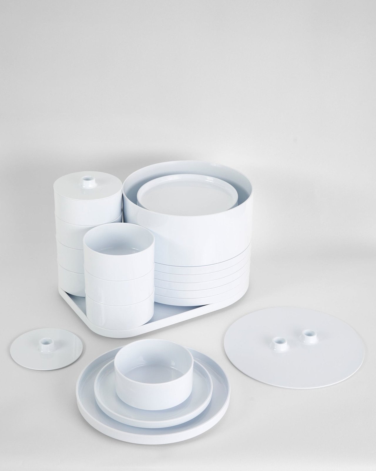
Designed with Lella in Milan in 1964, Max 1 is a 25-piece dinnerware service in molded melamine in which every piece nests into every other piece.67 Storage was not an afterthought; it was the design brief. The plates, bowls, and cups resolve into one compact cylinder, which means the geometry of each piece is constrained by the geometry of all the others. Nothing in the set exists alone. It is a system that happens to be dishes.
The original Italian manufacturer went out of business. Alan Heller saw the stacked set in a museum in the late 1960s, tracked down the Vignellis, and relaunched it in 1971 as the first product of his new company – which is why Americans know it as Hellerware.6 The design entered MoMA’s permanent collection and won the Compasso d’Oro, Italy’s highest design honor.67
Sixty years on, Heller still produces it. A dinner plate is about the hardest brief there is for the “timeless” claim – it sits on a table and gets judged daily against every trend that has passed through the housewares aisle since. Max 1 survives because there is nothing in it to date: primary shapes, no ornament, and a single organizing idea strong enough to carry the whole family.
New York City Subway Diagram (1972): Only the Spaghetti
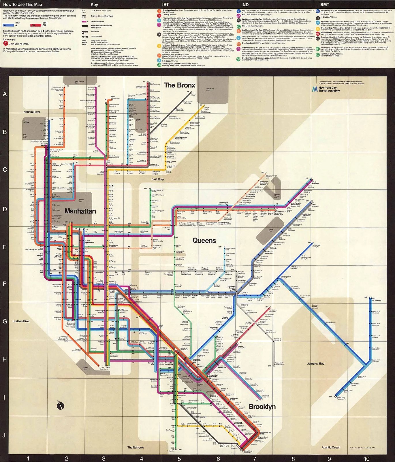
The subway work began as signage, not cartography. In 1967, on the recommendation of MoMA curator Mildred Constantine, the New York City Transit Authority brought in Unimark to impose order on the visual chaos of its stations.8 Vignelli and Bob Noorda produced the 1970 Graphics Standards Manual, the modular signage system whose descendants still organize the stations today. The typeface legend needs correcting: the manual specified Standard Medium, not Helvetica. Helvetica did not officially take over the subway until 1989, a story Paul Shaw untangled in an entire book.9
The diagram came next. Debuting in August 1972 and drawn with Unimark designer Joan Charysyn, it reduced the world’s most complicated subway to lines running vertically, horizontally, and at 45 degrees, with one dot per station.10 Geography was sacrificed on purpose: the water was beige, Central Park became a gray rectangle wider than it is tall, and station spacing reflected the diagram’s needs rather than the street grid’s.11 Vignelli’s defense was blunt: “You want to go from Point A to Point B, period. The only thing you are interested in is the spaghetti.”10
Riders disagreed. New Yorkers navigate by geography, and a map that put stations in the wrong place relative to the streets above felt like a lie, however internally consistent. The MTA replaced the diagram in 1979 with Michael Hertz Associates’ geographic map.10 Then the verdict slowly reversed: MoMA acquired the diagram, the standards manual, and a set of porcelain-enamel station signs in 2004,8 and in September 2011 the MTA itself brought the diagram back – updated by Vignelli with Beatriz Cifuentes and Yoshiki Waterhouse – as The Weekender, its digital service map.12 The 1972 map failed as geography and succeeded as a diagram. It just took the arrival of screens, where you toggle between abstraction and neighborhood detail, for both things to be true at once.
Unigrid for the National Park Service (1977): A System, Not a Brochure
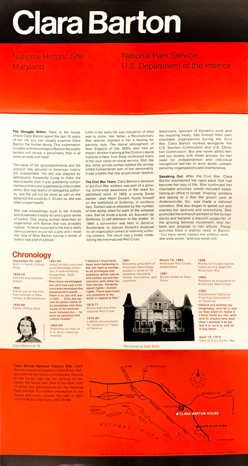
In 1977, NPS publications chief Vincent Gleason hired Vignelli to fix a practical mess: hundreds of park brochures in incompatible sizes and styles, each designed from scratch. The answer was the Unigrid – a modular system built on 4 by 8¼ inch panels defined by fold lines, in formats up to a full 25 by 38 inch press sheet, with Helvetica and Times Roman as the original typefaces and a black title band running across the top of every brochure.13 The first Unigrid brochure, for Clara Barton National Historic Site, appeared in 1978.
The numbers are what make the case. The Park Service prints roughly 20 million brochures a year across more than 400 parks, all on one system, for nearly fifty years.13 When the program won a Presidential Design Award in 1985, the evaluators put their finger on exactly why it works: the Unigrid “reduces routine decisions so that effort can be concentrated on quality.”13
That sentence is the whole philosophy in miniature. Vignelli did not design brochures for the Park Service. He designed the decisions – panel sizes, type choices, the black band – so that hundreds of staff designers across five decades could spend their attention on the content of each park instead of relitigating the format. Anyone who has built a component library or a design system will recognize the move exactly.
The Method
Vignelli wrote the method down. The Vignelli Canon, published by Lars Müller in 2010 and released free as a PDF through RIT, opens with the three questions he asked of every project: “There are three aspects in Design that are important to me: Semantic, Syntactic and Pragmatic.” Semantics first – “the search of the meaning of whatever we have to design” – then the syntax that structures it, then the pragmatic test of whether the person on the receiving end understands it.1
Underneath the triad sits discipline, and he was unsentimental about it: “There is no room for sloppiness, for carelessness, for procrastination.” And: “Design without discipline is anarchy, an exercise of irresponsibility.”1 The rules were self-imposed, which for Vignelli was the point – discipline as a bag of tools that guarantees continuity of intent from the first sketch to the printed sheet.
The most famous constraint was typographic. Appalled by desktop publishing – “a cultural pollution of incomparable dimension,” and, “if all people doing desktop publishing were doctors we would all be dead!” – he mounted an exhibition of decades of work done in only four typefaces: Garamond, Bodoni, Century Expanded, and Helvetica. The lesson, in his words: “is not the type but what you do with it that counts.”1 The constraint was never asceticism. It was the same bet as the Unigrid: remove the routine decision and the attention goes where it matters.
He fought in public and enjoyed it. “The life of a designer is a life of fight: fight against the ugliness,” he says in Gary Hustwit’s Helvetica – “just like a doctor fights against disease.”14 And the Canon’s chapter on timelessness reads like a manifesto against the entire churn economy: “We despise the culture of obsolescence, the culture of waste, the cult of the ephemeral.”1
Influence Chain
Who Shaped Him
The Milanese architecture tradition gave him the founding assumption. Apprenticing with the Castiglioni brothers at sixteen and training as an architect in Milan and Venice, Vignelli inherited the Italian ideal of the designer whose competence runs from the spoon to the city – one profession, every scale.2 “Design is One” is that tradition compressed into three words.
Jan Tschichold set the typographic precedent. Die Neue Typographie (1928) argued for objective, structural typography in service of communication – the argument the Swiss school systematized into grids and sans-serifs, and the one Vignelli carried to American corporate scale. He acknowledged the debt in the Canon’s introduction: “To have learned about disciplined design from my Swiss fellows, to have learned about the white space from my American fellows, to have learned about the forceful impact of type from my German fellows.”1 (Lineage through the Swiss school)
Who He Shaped
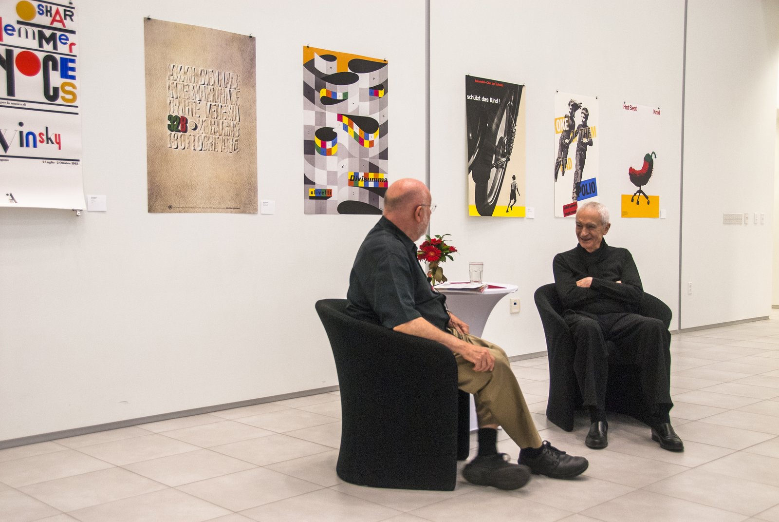
Michael Bierut arrived at Vignelli Associates planning to stay eighteen months and stayed ten years before becoming a Pentagram partner. His tribute after Vignelli’s death – “my teacher, my mentor, my boss, my hero, my friend” – records the deeper lesson: that doing good work is what brings more good work, and that design is the structure of an experience, not the styling of a surface.15
Every design system since. The 1970 subway standards manual and the 1977 Unigrid are ancestors of the component libraries and brand systems that now run every serious product organization: a constrained set of parts, documented rules, and the explicit goal of making routine decisions disappear. The vocabulary changed from press sheets to tokens; the idea did not.
The Throughline
Dieter Rams and Vignelli are the two great systematizers of postwar modernism, working the same principle along different axes. Rams worked vertically – what can be removed from this object? Vignelli worked horizontally – what stays constant across all objects? Both bets pay out in longevity: the 606 shelving system has been in production for sixty-six years, the Unigrid in service for nearly fifty – still legible, still working. And like Susan Kare’s 32x32 pixel grid, Vignelli’s four typefaces prove the recurring series lesson that a constraint chosen deliberately is not a limit but a lever. The design guide maps these connections across the series. (Series bridge)
What I Take From This
My web stack is four typefaces deep: FastAPI, HTMX, Alpine.js, plain CSS. Chosen once, argued for never, mastered continuously. Vignelli’s line covers it – it is not the type but what you do with it that counts.
FAQ
What is Massimo Vignelli’s design philosophy?
Vignelli’s philosophy rests on “Design is One” – the conviction that a single discipline underlies design at every scale, from dinnerware to transit systems. In The Vignelli Canon he names three aspects of any project: semantics (the search for meaning), syntactics (the structure), and pragmatics (whether the result is understood), all governed by discipline, appropriateness, and timelessness.1
What did Massimo Vignelli design?
With Lella Vignelli he designed the Max 1 stacking dinnerware (1964, later Hellerware), the American Airlines identity (1967, with the logotype in Helvetica), the New York City subway signage standards with Bob Noorda (1970) and the 1972 subway diagram, the National Park Service Unigrid brochure system (1977), the Bloomingdale’s shopping bag, graphics for Knoll, and design work for St. Peter’s Church in New York (1977).23
Why was Vignelli’s 1972 subway map replaced?
Riders found the diagram’s distortions disorienting – beige water, a rectangular Central Park, stations placed by diagrammatic logic rather than street geography – and the MTA replaced it in 1979 with Michael Hertz Associates’ geographic map. The design was later vindicated: MoMA acquired it in 2004, and the MTA revived an updated Vignelli diagram as its digital Weekender map in 2011.81012
What can designers learn from Massimo Vignelli?
Constrain your toolkit and master what remains: Vignelli demonstrated that four typefaces could carry decades of work. Design the system that makes decisions, not the individual artifact – the Unigrid succeeded because it “reduces routine decisions so that effort can be concentrated on quality.” And design for the long term; anything aimed at a trend dies with the trend.113
Sources
Images: portrait via Wikimedia Commons (CC BY-SA 3.0); 1972 subway diagram scan via NYC Urbanism (map © MTA); Max 1 photography courtesy Heller; Unigrid brochure via NPS Harpers Ferry Center (public domain).
-
Massimo Vignelli, The Vignelli Canon (Lars Müller Publishers, 2010). Free PDF via RIT Vignelli Center. Source for: “Design is One!”, semantics/syntactics/pragmatics, discipline quotes, four-typefaces exhibition, desktop-publishing “cultural pollution,” timelessness chapter, “Swiss fellows” passage. ↩↩↩↩↩↩↩↩
-
Wikipedia, “Massimo Vignelli.” Birth date, Castiglioni apprenticeship, education, Unimark departure, client list, Compasso d’Oro (1964, 1998) and AIGA Gold Medal (1983). ↩↩↩↩
-
RIT News, “Massimo Vignelli, icon of design, dead at 83” (May 2014). Career timeline, Vignelli Office of Design and Architecture (1960), Unimark co-founding (1965), Vignelli Associates (1971), Vignelli Center (2010), “If you design it right, it will last forever.” ↩↩↩↩
-
Archivio Grafica Italiana, “American Airlines.” 1967 identity with Heinz Waibl at Unimark, Helvetica logotype in red and blue, eagle attribution to Henry Dreyfuss’s office, retirement in 2013. ↩
-
Dallas Observer, “The Designer of the Old American Airlines Logo Really Doesn’t Like the New Design” (2013). Vignelli’s reaction quotes, eagle added at the airline’s request. ↩
-
Heller, “Max 1 Dinnerware by Massimo Vignelli.” Design year 1964, relaunch as the company’s first product in 1971, MoMA collection, Compasso d’Oro. Alan Heller’s museum discovery and the original manufacturer’s closure per Hive Modern’s Hellerware history. ↩↩↩
-
MoMA, “Massimo Vignelli, Lella Vignelli. Stacking Dinnerware. 1964.” Joint attribution and dating in the permanent collection. ↩↩
-
MoMA Inside/Out, “The Subway and the City: Massimo Vignelli, 1931–2014” (June 2014). Unimark invited in 1967 on Mildred Constantine’s recommendation; MoMA’s 2004 acquisition of the diagram, standards manual, and station signs. See also the collection record: New York City Subway Guide, 1970–72. ↩↩↩
-
Paul Shaw, Helvetica and the New York City Subway System: The True (Maybe) Story (MIT Press, 2011). Publisher page. Standard Medium in the original manual; Helvetica not standard until 1989. ↩
-
New York Transit Museum, “Vignelli” digital exhibit. August 1972 debut, Joan Charysyn credit, “the only thing you are interested in is the spaghetti,” 1979 replacement by Michael Hertz Associates, path from the 2008 diagram refresh to The Weekender. ↩↩↩↩
-
NYC Urbanism, “1972 Vignelli Subway Map.” Beige water, Central Park proportions, one dot per station, 45-degree geometry. ↩
-
Wikipedia, “New York City Subway map” and Second Ave. Sagas, “The return of Vignelli with a weekend twist” (September 16, 2011). Weekender launch using the Vignelli–Cifuentes–Waterhouse diagram. ↩↩
-
National Park Service, Harpers Ferry Center, “A Brief History of the Unigrid.” Vincent Gleason, 1977 commission, panel system and typefaces, 1978 Clara Barton brochure, 20 million copies across 400+ parks, 1985 Presidential Design Award and “reduces routine decisions” quote. ↩↩↩↩
-
Gary Hustwit, Helvetica (documentary, 2007). “The life of a designer is a life of fight: fight against the ugliness.” hustwit.com ↩
-
Michael Bierut, “Massimo Vignelli, 1931–2014,” Design Observer (May 2014). Ten years at Vignelli Associates, “my teacher, my mentor, my boss, my hero, my friend.” ↩