Jan Tschichold's Design Philosophy: Repudiating His Own Manifesto
The Principle
“Perfect typography is more a science than an art.” – Jan Tschichold1
Tschichold believed typography was governed by laws, not taste. In 1928, he codified those laws in Die Neue Typographie – the manifesto that defined modernist typography for the century. Asymmetric layouts. Sans-serif faces. White space as structural element. No ornament. No centered text. No serifs. The rules were absolute, and the reasoning was that absolute rules produce consistent communication.
Then he changed his mind. Not partially, not gradually – he reversed course completely. By the 1940s, Tschichold called his own manifesto’s inflexibility “fascist.” He spent the second half of his career designing books in the classical tradition he had earlier rejected: centered titles, serif typefaces, symmetrical pages, ornamental borders. He did not abandon rigor. He redirected it. The reversal is not a contradiction. It is the most intellectually honest act in design history: a man who cared more about being correct than being consistent. The taste infrastructure territory explores why this kind of principled self-correction is a structural feature of durable design systems, not a weakness.
Context
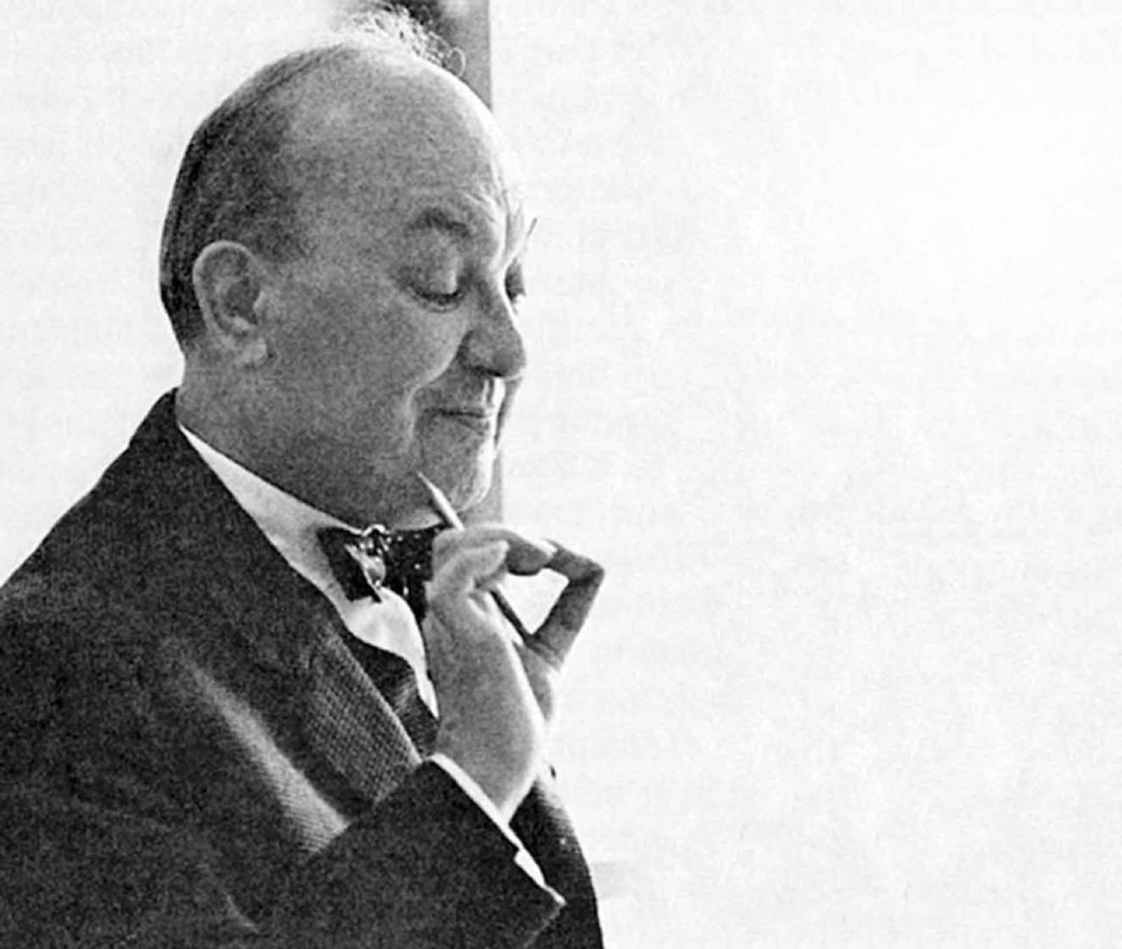
Jan Tschichold was born in Leipzig on April 2, 1902. His father was a sign painter – a working-class craftsman who understood letterforms as physical labor, not aesthetic theory. Tschichold studied calligraphy at the Leipzig Academy of Graphic Arts and Book Production from 1919 to 1921, learning to construct letters by hand before he ever set type in a composing room.2
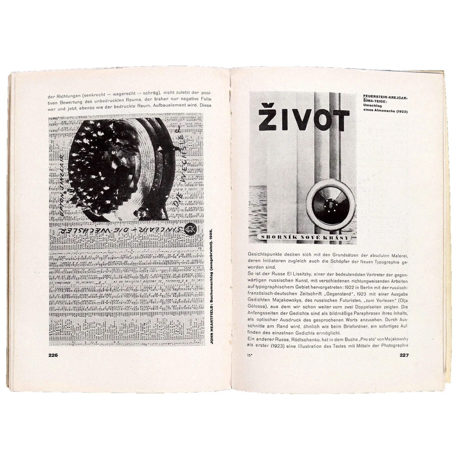
In August 1923, Tschichold visited the first Bauhaus exhibition in Weimar. The encounter was catalytic. He saw the work of El Lissitzky, Moholy-Nagy, Herbert Bayer, and Kurt Schwitters – typographers and artists who treated the page as a spatial composition rather than a container for text. Tschichold returned to Leipzig transformed. Within two years, he published “Elementare Typographie” in the journal Typographische Mitteilungen (October 1925) – a special issue that introduced the principles of the New Typography to the German printing trade. He was 23 years old.3
Die Neue Typographie, published in 1928, expanded the journal article into a 240-page manifesto. The book’s argument was total: modern life is asymmetric, dynamic, and industrial. Typography that serves modern life must be asymmetric, dynamic, and industrial. Centered text belongs to the aristocratic past. Serif typefaces belong to the hand-press era. Sans-serif type, flush-left composition, photomontage, and geometric layouts are the forms that communicate with clarity in the modern world.1
The manifesto was prescriptive. Tschichold did not suggest alternatives. He demanded them. This absolutism attracted the attention of the National Socialists, who associated modernist design with cultural bolshevism. In March 1933, Tschichold was arrested by the Nazis and detained for six weeks. He fled to Basel, Switzerland, with his wife Edith and their son Peter. He would never return to Germany permanently.2
The Work
Die Neue Typographie (1928): The Rules That Changed Everything
The book’s rules were specific and enforceable. Use sans-serif type. Set text flush left, ragged right. Use asymmetric page layouts. Employ photographic illustration instead of drawn ornament. Treat white space as a compositional element, not an absence. Standardize paper sizes. Use typographic hierarchy (size, weight, position) rather than decorative borders to organize information.1
These rules were not theoretical preferences. They were practical instructions for the thousands of compositors, printers, and commercial artists who set type in Germany’s printing industry. Die Neue Typographie was written for working professionals, not art school students. Tschichold understood that typography changes not through gallery exhibitions but through the daily decisions of the people who produce business cards, invoice forms, letterheads, and advertisements.
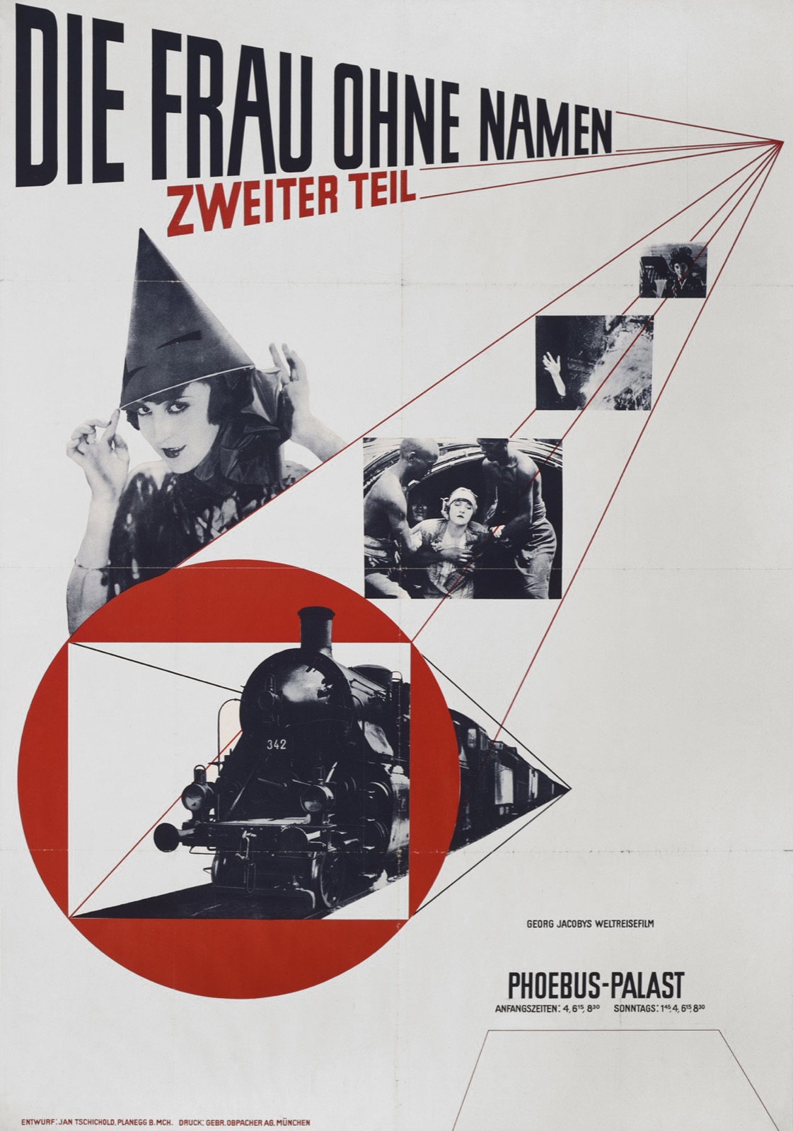
The book’s influence was immediate and structural. Within a decade, the principles of the New Typography had been absorbed into mainstream European commercial printing. Sans-serif faces moved from avant-garde experiment to standard practice. Asymmetric layouts became the default for advertising, corporate communications, and book jackets.
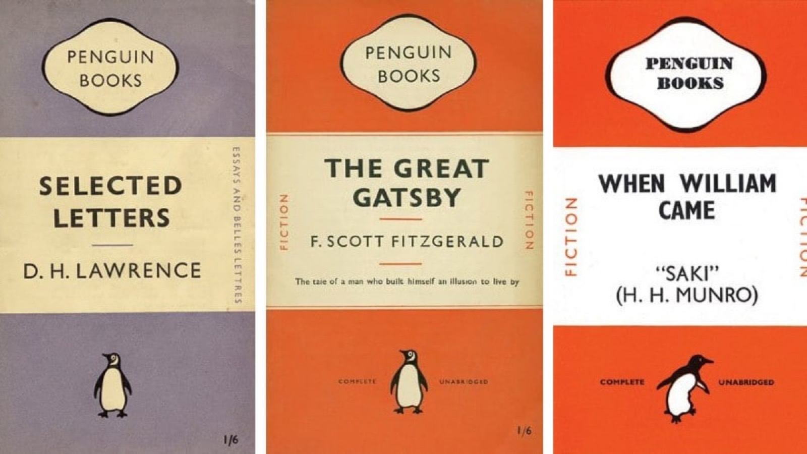
The Penguin Redesign (1947-1949): 300 Books, 4 Pages of Rules
In 1947, Allen Lane hired Tschichold to redesign Penguin Books. Tschichold spent two and a half years in England, during which he redesigned more than 300 Penguin titles and wrote the Penguin Composition Rules – a four-page document that standardized how every Penguin book should be typeset.4
The Composition Rules specified everything: margins, leading, text alignment, punctuation spacing, the treatment of footnotes, the position of page numbers, the use of small capitals. They were not aesthetic guidelines. They were manufacturing specifications – instructions precise enough that any compositor in any print shop in England could produce a typographically correct Penguin book without consulting a designer.
This is the most influential piece of design documentation in publishing history. Tschichold did not redesign 300 books by hand. He wrote a system that redesigned them automatically. The rules were the design. Everything that followed was execution.
Compliance was another matter. “I had a rubber stamp made,” Tschichold later recounted. “‘Equalize letter-spaces according to their visual value.’ It was totally ignored.”4 The gap between documentation and practice – the reality that rules only work when the people who follow them understand why – became a persistent concern.
The irony is that the Penguin Composition Rules specified serif typefaces, centered title pages, and symmetrical layouts – precisely the conventions that Die Neue Typographie had declared obsolete twenty years earlier.
The Reversal: Why He Rejected His Own Work
Tschichold’s reversal was not a drift toward convention. It was a philosophical reckoning. In 1946, Max Bill publicly accused him of betraying modernism. Tschichold responded with “Glaube und Wirklichkeit” (Belief and Reality) – an essay that framed the debate not as aesthetic preference but as political ethics. By 1959, in his TDC essay “Quousque Tandem…,” Tschichold was explicit: “The ruthless restriction of typefaces, a parallel to Goebbels’ infamous Gleichschaltung, and the more or less militaristic arrangement of lines.” He called the dogmatic modernism of his youth structurally identical to the totalitarianism he had fled.5
“I am the most severe critic of the young Tschichold of 1925-28,” he wrote. The reversal was not confession. It was correction.5
The reversal did not mean abandoning standards. Tschichold’s classical work was as rigorous as his modernist work – the Penguin Composition Rules are more demanding than Die Neue Typographie in their specificity. He had not relaxed. He had expanded: he now believed that typographic quality could be achieved through multiple formal systems, not just one.
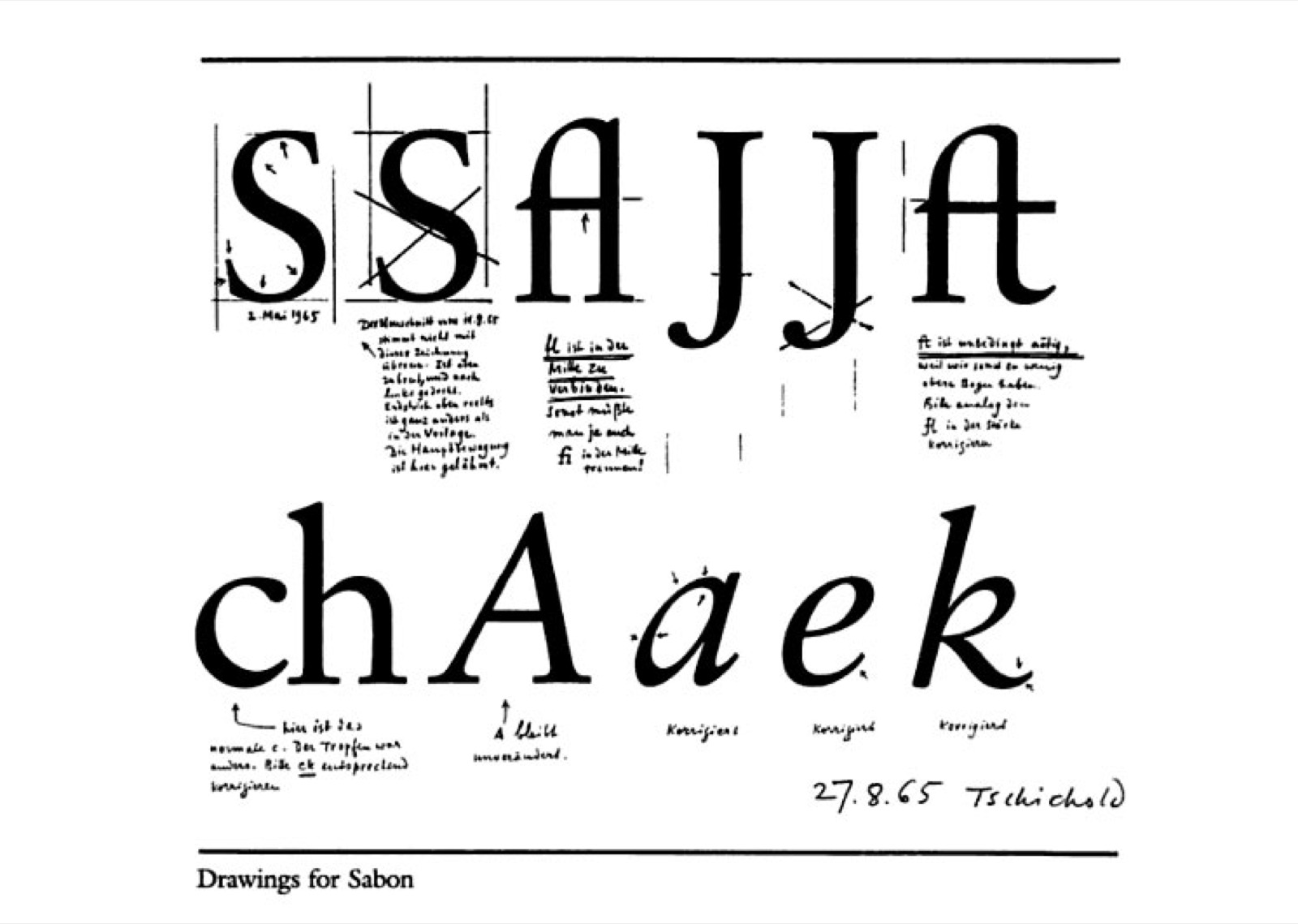
Sabon Typeface (1967): The Final Synthesis
Late in his career, Tschichold designed Sabon – a typeface commissioned to work identically across three different typesetting technologies (hand composition, Linotype, and Monotype). Matthew Carter would later face the same cross-platform constraint when designing Verdana and Georgia for screen rendering, extending Tschichold’s principle into the digital era. The constraint was severe: the same design had to produce the same results regardless of the machine that set it. Sabon is a classical design – a Garamond revival with refined proportions – but its existence depended on solving a modern manufacturing problem. The typeface reconciled the tension between Tschichold’s classical aesthetics and his modernist insistence on systematic, reproducible quality.6
The Method
Tschichold’s method was documentation. He did not design by inspiration. He designed by writing rules, testing them against thousands of printed pages, and refining until the rules produced consistent quality without requiring constant supervision. The Penguin Composition Rules are the purest expression of this method: four pages that controlled the typographic quality of millions of books.
His calligraphic training was foundational. Before he theorized about typography, he practiced the physical construction of letterforms. He understood letters as things made by hands before he understood them as elements in a communication system. This sequence – craft first, theory second – distinguishes Tschichold from designers who begin with manifestos and never touch a composing stick. The design engineering guide explores how this craft-first sequence recurs across disciplines.
Influence Chain
Who Shaped Him
El Lissitzky, Moholy-Nagy, and the Bauhaus gave Tschichold the formal vocabulary of modernist typography at the 1923 Weimar exhibition. The encounter was a conversion experience: before Weimar, Tschichold was a calligrapher and lettering artist. After Weimar, he was a revolutionary. (Direct influence)3
His father, the sign painter, gave him the manual foundation. Letterforms were labor before they were theory. This grounding in craft meant that Tschichold’s rules were always tested against the physical reality of printing – he never proposed a rule that a compositor could not execute. (Formative influence)
Who He Shaped
Dieter Rams absorbed Tschichold’s reduction principles through the Ulm School lineage. Tschichold’s argument that typography should serve communication, not decoration, is precisely the argument Rams made about products. The connection is documented in the Rams post: “The Ulm School taught this principle through Tschichold’s lineage.” (Indirect influence)
Paul Rand adopted Tschichold’s modernist typography for American commercial practice. Rand’s books, logos, and advertising used the asymmetric layouts, sans-serif faces, and spatial compositions that Die Neue Typographie had codified. The irony: Rand maintained the modernist position for his entire career, while Tschichold – the man who invented the position – abandoned it. (Direct influence)
Robert Bringhurst and the modern editorial design tradition trace directly to Tschichold’s Penguin work. The Elements of Typographic Style is a direct descendant of the Penguin Composition Rules – a systematic approach to typography that treats quality as reproducible through documented standards, not dependent on individual talent.
The Throughline
Tschichold is the only figure in this series who repudiated his most famous work. Every other subject refined their position over time. Tschichold reversed his. The reversal is not weakness. It is the most rigorous application of the principle that all these designers share: if the evidence says you were wrong, change. Dieter Rams asked “Is my design good design?” and developed the Ten Principles as a self-correction framework. Tschichold asked the same question about his entire body of early work and answered: no. The dogmatism was wrong, even though the aesthetic outcomes were beautiful. Correctness matters more than consistency. (Series bridge)
What I Take From This
Tschichold proved that your best work can be your worst idea. Die Neue Typographie was aesthetically right and philosophically wrong. The courage to say that – about your own manifesto – is the hardest design decision anyone in this series made. For more on how typography operates as a system rather than a style, the throughline from Tschichold to digital type is instructive.
FAQ
What is Jan Tschichold’s design philosophy?
Tschichold’s philosophy evolved dramatically. In Die Neue Typographie (1928), he argued that modernist typography – sans-serif, asymmetric, unornamented – was the only valid approach. By the 1940s, he reversed this position, calling his earlier absolutism “fascist” in spirit. His mature philosophy held that typographic quality is achievable through multiple formal systems, and that rigorous standards (like the Penguin Composition Rules) matter more than adherence to a single aesthetic doctrine.15
What did Jan Tschichold design?
Tschichold wrote Die Neue Typographie (1928), the definitive modernist typography manifesto. He redesigned over 300 Penguin Books titles (1947-1949) and wrote the Penguin Composition Rules. He designed the Sabon typeface (1967). Earlier, he produced influential film posters and the “Elementare Typographie” special issue of Typographische Mitteilungen (1925).146
How did Jan Tschichold influence modern design?
Tschichold codified modernist typography into rules that working printers could follow, bringing the principles of the Bauhaus into mainstream commercial printing. His Penguin Composition Rules established the model for systematic design documentation in publishing. His influence on Dieter Rams (through the Ulm School) and Paul Rand (directly) connected typographic modernism to industrial and graphic design.3
What can designers learn from Jan Tschichold?
Your best insight might be wrong. The courage to reverse a publicly held position – especially one you are famous for – is a mark of intellectual seriousness, not weakness. Document your standards as rules, not guidelines: the Penguin Composition Rules worked because they were specific enough to be followed without interpretation. And remember that dogmatism is a design flaw, not a design principle.
Sources
-
Jan Tschichold, Die Neue Typographie (Verlag des Bildungsverbandes der Deutschen Buchdrucker, 1928). English translation: The New Typography (University of California Press, 1995, trans. Ruari McLean). Also: Design History Research. ↩↩↩↩↩
-
Britannica, “Jan Tschichold.” Leipzig birth, sign painter father, Nazi arrest, Basel exile. ↩↩
-
Bard Graduate Center, “Jan Tschichold and the New Typography: Graphic Design Between the World Wars.” Exhibition February-July 2019. 1923 Bauhaus encounter, Typographische Mitteilungen special issue. ↩↩↩
-
Penguin Composition Rules, Wikipedia. Also: Mark Owens, “Some Tschichold Penguins.” 300+ titles redesigned, four-page rules document. ↩↩↩
-
McSweeney’s, “Tschichold, Nazis and Allen Lane: The Modernist Politics of Type.” The reversal, “fascist” characterization of his own earlier work, political context. ↩↩↩
-
Sabon typeface history. Commissioned for cross-platform compatibility (hand, Linotype, Monotype). Garamond revival with manufacturing constraints. ↩↩