Design Philosophy: Steve Jobs — The Back of the Fence
The Principle
“When you’re a carpenter making a beautiful chest of drawers, you’re not going to use a piece of plywood on the back, even though it faces the wall and nobody will ever see it. You’ll know it’s there, so you’re going to use a beautiful piece of wood on the back. For you to sleep well at night, the aesthetic, the quality, has to be carried all the way through.” – Steve Jobs, Playboy interview, 19851
Jobs was not a designer. He could not draw, code, or engineer at the level of the people who worked for him. What he could do was evaluate. He had an absolute binary: something was either “insanely great” or “shit.” There was no middle register. This was not temperament. It was a design method – the most ruthless editing process in the history of consumer technology, applied by a person who controlled every decision from the circuit board to the box the product arrived in.
The back of the cabinet is the principle. If the care is not total – if it stops at the parts the customer sees – then the care is performance, not conviction. Jony Ive would later express the same idea as “finishing the back of a drawer.” The lineage is direct. The principle is identical.
Context
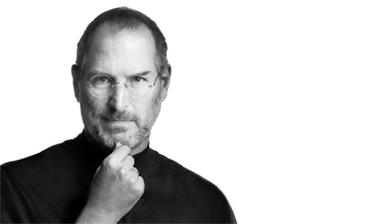
Steven Paul Jobs was born in 1955 in San Francisco and adopted by Paul and Clara Jobs. Paul Jobs was a machinist and car mechanic who taught his son the craft ethic that would define Apple: the parts you cannot see matter as much as the parts you can. The lesson came from building fences together. Paul Jobs insisted on using good wood for the back of the fence – the side facing the yard that nobody but the family would see.2
Jobs dropped out of Reed College in Portland after one semester but stayed on campus for another eighteen months, sitting in on classes that interested him. The most consequential was a calligraphy course taught by Robert Palladino. “I learned about serif and sans-serif typefaces, about varying the amount of space between different letter combinations, about what makes great typography great,” Jobs said in his 2005 Stanford commencement address. “It was beautiful, historical, artistically subtle in a way that science can’t capture, and I found it fascinating.”3
Ten years later, when Jobs and his team were building the original Macintosh, the calligraphy class became a design decision. The Mac was the first personal computer with proportionally spaced fonts and multiple typefaces. Susan Kare designed Chicago, Geneva, New York, and the other original Mac fonts. Paul Rand designed the NeXT logo after Jobs sought him out specifically. The calligraphy class did not teach Jobs to design. It taught him that typography matters – and that conviction, applied through hiring decisions, became the Macintosh.
“None of this had even a hope of any practical application in my life,” Jobs said at Stanford. “But ten years later, when we were designing the first Macintosh computer, it all came back to me.”3
The Work
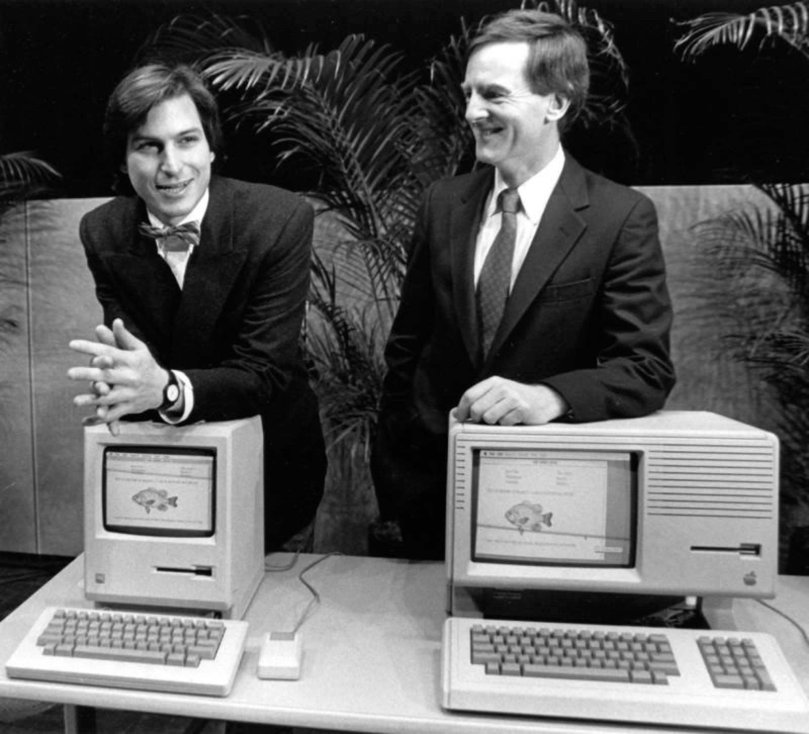
The Macintosh (1984): Calligraphy Becomes a Computer
Jobs did not design the Macintosh. He hired the people who did, defined the standard they had to meet, and rejected everything that fell below it. The machine’s signature – its graphical interface with proportionally spaced fonts, icons designed by Kare, and a bitmap display that treated every pixel as a design decision – traces back to Jobs’s conviction that computers should be beautiful, not just functional.
The original Macintosh case was signed on the inside by every member of the team. Jobs insisted on this: the makers’ signatures belonged inside the machine because the machine was a work of craft, not just a product. The signatures faced inward – visible only to someone who opened the case. The back of the fence.2
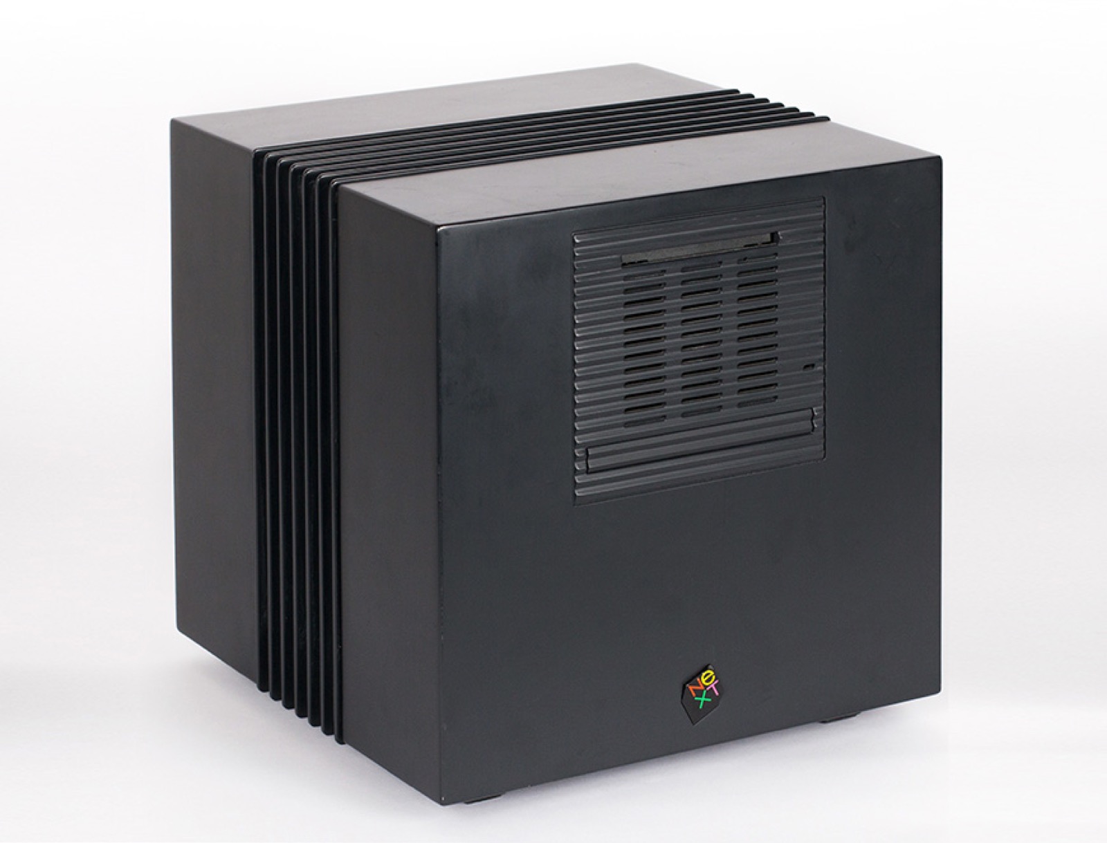
The NeXT Cube (1986): One Option, Beautiful
When Jobs was forced out of Apple, he started NeXT. He hired Paul Rand for $100,000 to design the identity. Rand delivered one option – a black cube at 28 degrees with “NeXT” in Garamond. Jobs accepted it. The NeXT computer itself was a perfect black magnesium cube. The cube form was not optimal for airflow, expansion, or manufacturing. It was optimal for conviction: the object should be as uncompromising as the software inside it.4
The NeXT Cube failed commercially. But the software became macOS. The design principle – total control from silicon to packaging – became the iPhone. The commercial failure was irrelevant to the method. The method survived.
The Apple Store (2001): Retail as Architecture
Jobs treated retail the same way he treated hardware: as design. The Apple Store was not a shop. It was a spatial experience designed to communicate the values of the products inside it. The Genius Bar was not a service desk. It was a designed encounter – an architectural element that communicated accessibility through its name, its position in the store, and its material (wood and glass, not plastic and metal).
Ron Johnson, who led the Apple Store project, described Jobs insisting on full-scale mockups of every store layout in a warehouse before committing to construction – the same method Florence Knoll used at Connecticut General in the 1950s.2 The mockup was not a luxury. It was the only way to evaluate whether the space felt right.
The Unboxing (2001-2011): Packaging as First Impression
Jobs controlled the packaging. The white box, the precise fit, the way the lid lifts with gentle air resistance, the placement of the product inside – all designed. Isaacson documented that Apple had a dedicated packaging design room where engineers spent months adjusting the experience of opening a box. Ive described the unboxing as a “ritual” that should build anticipation.2
This is the back of the fence applied to logistics. The box is thrown away. The packaging serves no ongoing function. But it is the customer’s first physical contact with the product, and Jobs understood that the first contact sets the emotional frame for everything that follows. Don Norman’s three levels of design – visceral, behavioral, reflective – are all engaged in the ten seconds of opening a box.
The Cost of Conviction
Jobs’s method had a human cost that the design press often omits. Isaacson documents instances of Jobs publicly berating engineers whose work did not meet his standard, taking credit for ideas that originated with his team, and cancelling projects years into development because the result was “not good enough.”2 The designers who thrived under Jobs – Ive, Kare, Johnson – were people who could withstand the binary and use it as fuel. Many others could not. The method produced extraordinary objects. It also produced extraordinary casualties. The question the series must ask is whether the objects justify the method, and the honest answer is: it depends on who you ask.
The Method
“Design is not just what it looks like and feels like. Design is how it works.” The statement appeared in Rob Walker’s 2003 New York Times profile “The Guts of a New Machine” and has become Jobs’s most cited line on design – though Walker may have been paraphrasing rather than quoting directly.5 Regardless of the exact sourcing, the principle is documented across dozens of Jobs’s decisions: design was not a veneer applied after engineering. Design was the engineering decision. The two were inseparable.
His method was not creation but curation. He did not draw, prototype, or code. He evaluated. He said yes or no. He had the taste to recognize quality and the authority to reject everything else. “People think focus means saying yes to the thing you’ve got to focus on. But that’s not what it means at all. It means saying no to the hundred other good ideas that there are.”3
The relationship with Jony Ive was the method in its purest form. Jobs gave Ive the authority, the budget, and the protection from committees that a designer needs to produce uncompromising work. In return, Ive produced objects that met Jobs’s standard: so right that alternatives seemed irrational. The partnership was not collaboration in the conventional sense. It was a principal-agent relationship where the principal’s taste was the only brief.
Influence Chain
Who Shaped Him
Paul Rand demonstrated to Jobs what conviction looks like in a designer. Rand’s refusal to present multiple options – “I will solve your problem for you and you will pay me” – was the model Jobs applied to Apple’s entire design process. One option. No focus groups. (Direct influence)4
Dieter Rams gave Apple its visual language through Ive. Jobs recognized Rams’s principles as the standard Apple should meet. The Braun lineage – white surfaces, visible materials, removal of ornament – runs through every Apple product from the iPod to the iPhone to Apple Park. (Indirect influence, mediated through Ive)
Robert Palladino and the Reed College calligraphy class taught Jobs that typography is a design discipline, not a technical utility. The decision to put multiple typefaces on the Macintosh – the decision that hired Kare, that made Rand’s logo possible, that created the visual language of personal computing – originated in a calligraphy classroom in Portland, Oregon.3
Who He Shaped
Jony Ive became the most influential industrial designer of the 21st century because Jobs gave him the authority to be. Ive’s talent was already at Apple when Jobs returned in 1997. Jobs’s contribution was recognizing it, protecting it, and demanding that it be applied without compromise.
Susan Kare designed the Macintosh icons because Jobs demanded that the computer have a visual personality. Kare’s work exists because Jobs created the conditions for it.
Consumer technology as a design discipline. Before Apple under Jobs, consumer electronics were designed by engineering committees and styled by industrial design departments. After Apple, the expectation is that the CEO cares about the radius of a corner, the weight of a click, the texture of an unboxing.
The Throughline
Jobs completes the strongest spine in this series: Rams established the principles. Rand demonstrated conviction. Kare created the visual language. Ive designed the objects. Jobs was the force that connected them – the client who demanded that every element, from the typeface on the screen to the wood on the back of the fence, meet the same standard. He was not a designer. He was the condition under which designers could do their best work. (Series bridge)
What I Take From This
“Saying no to the hundred other good ideas.” That is scope control. The hardest part of building software is not solving problems. It is refusing to solve the wrong ones.
FAQ
What is Steve Jobs’ design philosophy?
Jobs believed design is inseparable from engineering – “Design is not just what it looks like and feels like. Design is how it works.” His principle was total quality: the parts nobody sees (the back of the cabinet, the inside of the case, the packaging) must meet the same standard as the visible product. He practiced design through curation rather than creation – hiring the best designers, setting uncompromising standards, and saying no to everything that fell below them.15
What did Steve Jobs design?
Jobs did not design products himself. He led the teams that created the Macintosh (1984), NeXT (1988), iMac (1998), iPod (2001), iPhone (2007), and iPad (2010). He commissioned Paul Rand’s NeXT logo, hired Susan Kare for the Macintosh icons, and gave Jony Ive the authority to define Apple’s industrial design. He co-founded Apple in 1976 and led it until his death in 2011.24
How did Steve Jobs influence design?
Jobs raised design from a department inside technology companies to a core executive function. He demonstrated that a CEO’s taste – the ability to evaluate and reject – is as important to a product’s design quality as the designers’ skill. His insistence on controlling every touchpoint (hardware, software, packaging, retail) became the model for how technology companies approach design.5
What can designers learn from Steve Jobs?
Quality is total or it is performance. The back of the cabinet, the inside of the case, the bottom of the box – every surface matters because the maker knows it’s there. Focus means saying no, not saying yes. And the most important design skill may not be creation but evaluation: knowing the difference between “insanely great” and everything else.
Sources
-
Steve Jobs, Playboy interview, February 1985. “Playboy Interview: Steven Jobs.” “Beautiful chest of drawers” / back of the cabinet quote. Design philosophy in Jobs’s own words. ↩↩
-
Walter Isaacson, Steve Jobs (Simon & Schuster, 2011). Authorized biography. Paul Jobs fence-building lesson, Macintosh team signatures, Apple founding, design conviction. ↩↩↩↩↩↩
-
Steve Jobs, “Stay Hungry, Stay Foolish.” Stanford University Commencement Address, June 12, 2005. Calligraphy class, “none of this had a hope of practical application,” “saying no to the hundred other good ideas.” ↩↩↩↩
-
NPR, “New Biography Quotes Jobs On God, Gates, Great Design.” NeXT/Rand commission, design evaluation method. ↩↩↩
-
Rob Walker, “The Guts of a New Machine,” New York Times, 2003. “Design is not just what it looks like and feels like. Design is how it works.” ↩↩↩