Design Philosophy: Rejane Dal Bello — Citizen First
The Principle
“We are not the heroes of the project. Design is in-between things. Design is a medium between the thing and the thing that needs to be communicated at. We can be everywhere in society, from a hospital to a play to client surveys – anywhere there is communication.” – Rejane Dal Bello1
Dal Bello practices reduction without sterility. Her work is a foundational layer of the taste infrastructure that governs how identity systems communicate human experience through formal structure. Her identity systems are minimal (clear, systematic, repeatable) but they carry human warmth because the reduction serves a human subject. An alphabet that degrades letter by letter is minimal. It is also a portrait of Alzheimer’s disease. The formal and the emotional are the same gesture.
This is the distinction her work makes: reduction is not coldness. Reduction is the removal of everything that does not serve the communication. If the communication is about loss, the reduction is warm. If the communication is about transformation, the reduction transforms. The system carries the meaning inside its structure, not on top of it.
Context
Rejane Dal Bello was born in 1978 in Rio de Janeiro. At fifteen, she was an exchange student in Lynchburg, Virginia, where a painting she made in art class won “best in show,” the moment she committed to a creative career. She studied at art college in Brazil while simultaneously working, and then studied under Milton Glaser at the School of Visual Arts in New York.2
“I studied under him for six months,” Dal Bello said. “What stayed with me were the discussions we had about the responsibility of designers, and our responsibilities within the industry and society.”1 Glaser’s influence was not formal but ethical. The conviction that designers have civic obligations, not just aesthetic ones, runs through everything she has done since.
After working at Ana Couto Branding and Design in Rio de Janeiro (“the biggest branding company in Brazil”), Dal Bello earned a Master’s in Social Design at Post St. Joost Art School in the Netherlands. She then spent eight years at Studio Dumbar as a senior designer (the Dutch studio known for playful, systematic, colorful identity work) before brief stints at Wolff Olins in London and R/GA. In 2014, she founded Studio Rejane Dal Bello (SRDB) in London.2
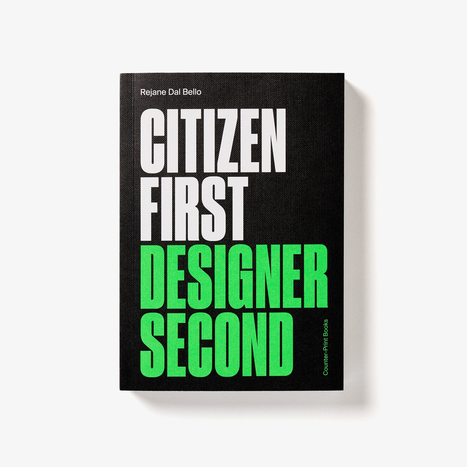
Her book, Citizen First, Designer Second (Counter-Print Books, 2020), was named in Designboom’s “50 Essential Books Every Designer Should Read.” It argues that design is a social act first and an aesthetic act second.3 Kashiwa Sato shares her commitment to distilling complexity into a single communicable idea, though Sato’s reduction serves commercial instant comprehension while Dal Bello’s serves human experience.
The Work
Alzheimer Foundation Nederland: The Alphabet That Forgets
At Studio Dumbar, Dal Bello created the visual identity for the Alzheimer Foundation Nederland. The centerpiece is a bespoke typeface where letters progressively degrade, losing strokes, clarity, and legibility as the disease progresses. In the early stages, the text is readable. In the late stages, it dissolves into texture: pattern without meaning, the visual equivalent of what the disease does to language.4
“I created this alphabet that sometimes you can read well but sometimes you can’t, because that’s how the disease progresses until you have no meaning in front of you anymore, just texture,” Dal Bello explained.
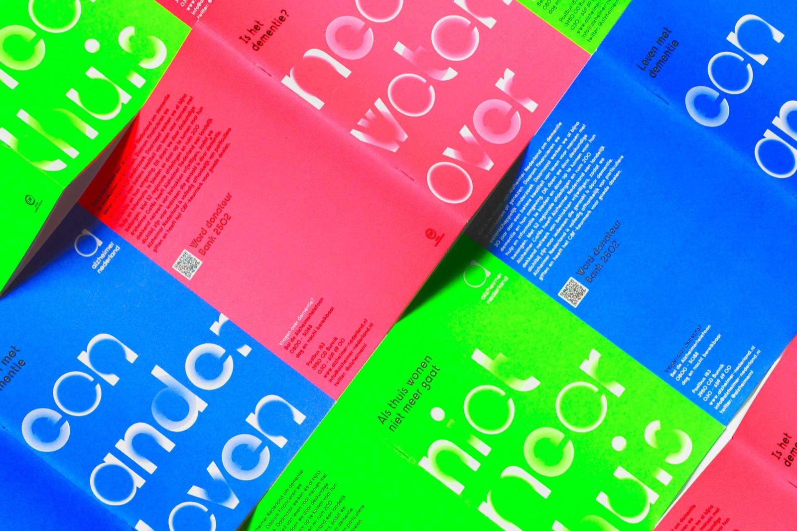
“I think that’s where designers can come in, to look at a difficult topic and to see that bridge between it and the world.”4
The identity does not illustrate Alzheimer’s. It embodies it. The formal system, a typeface that loses its own legibility, is the message. The system and the meaning are one thing. Reduction without sterility looks exactly like this: the simplest possible visual idea (letters losing strokes) communicates the most complex possible human experience (losing yourself).
Sesc Av Paulista: Typography That Transforms
For Sesc Av Paulista, a major Brazilian non-profit cultural center serving over 120,000 people weekly, Dal Bello designed an identity with a dual typeface system where the typography itself reflects transformation. “The typography reflects a transformation,” she explained. “When you go to a course you transform yourself, so the typography itself has changed shape to be quite different.”4
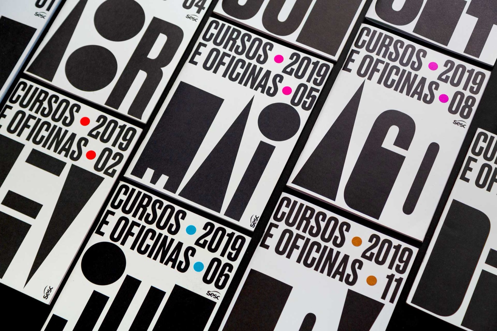
The identity serves a complex institution: educational programs, cultural events, social services, community gathering. The dual typeface system creates consistency without uniformity: the same identity looks different for a children’s workshop and a concert series, because the institution’s purpose shifts with its audience.
Paz Holandesa Hospital: Fourteen Years, No Fee
Dal Bello has worked pro bono for Paz Holandesa, a free children’s hospital in Peru, for over fourteen years. The project demonstrates the “citizen first” principle in practice: design as ongoing commitment to a cause, not a deliverable with an end date.2
Dr. Giraffe: Self-Initiated Design for Children
Dr. Giraffe is a self-initiated children’s book series that helps kids cope with illness. Dal Bello created the project because the need existed and no client was going to commission it. The project bridges her social design training (Post St. Joost) with her identity design practice (Studio Dumbar): systematic visual communication applied to a problem she identified herself.4
The Method
“I specialise in distilling complex ideas into a unique simple idea which can be translated to any market,” Dal Bello says. “If the design is clear and recognisable it comes back to your mind faster. It’s identifiable as a shape and a shape that recalls what that company means. The simpler the way you can communicate that, the core of that idea, is the most effective you can be as a graphic designer and branding specialist.”1
The method starts with the brief but does not stay there. “Brave work is not crazy work. Brave work is when you see the possibilities of doing something that pushes expectations but is still within the client’s best interests.”1 The bravery is in taking the client’s problem further than the client expected, not in a direction the client didn’t ask for, but deeper into the direction they did.
She insists on hands-on execution. “I’m a graphic designer at heart. In a big studio I would have to be an administrator rather than do the design, but I love the doing, the conceptualising, and translating what the client wants into a shape, a vision, an entity.”1 She left Wolff Olins because the role required directing people rather than designing. Dal Bello wants to be the person who draws the letter that forgets itself.
“Every time we start a new project we go back to ground zero,” she says. “We are creating from scratch and don’t know if it’s going to be successful. That’s what I love about the profession.”1
Influence Chain
Who Shaped Her
Milton Glaser gave her the ethical framework: the idea that designers have social responsibilities, not just aesthetic ones. Paula Scher shares this conviction that graphic design operates as a social act, not merely an aesthetic one. The SVA months were short but foundational. (Direct influence)1
Studio Dumbar / Gert Dumbar gave her the formal vocabulary: eight years of Dutch systematic identity design, playful, colorful, rigorous. The Dumbar tradition is not Swiss cold reduction but Dutch warm reduction, with systems that have personality. (Direct influence, professional formation)2
Who She Shaped
Identity design for difficult subjects. The Alzheimer Foundation typeface demonstrated that identity systems can communicate sensitive, complex human experiences without illustrating them, and that the formal structure itself can carry the emotional weight. The technique (typography that embodies its subject rather than depicting it) is now widely referenced in healthcare and social sector design.
“Citizen first, designer second” as framework. Her book articulated what many designers feel but do not formalize: that the civic responsibility precedes the professional identity, and that design’s most important work happens when the designer treats themselves as a citizen of the community they’re designing for, not an outsider hired to apply aesthetics.
The Throughline
Dal Bello closes the graphic identity branch of this series from a position none of the other identity designers occupy: social purpose as the primary design constraint. Paul Rand reduced corporate identity to single marks. Paula Scher expanded identity to architectural scale. Kashiwa Sato compressed identity to iconic flags. Dal Bello embeds identity in human experience. A typeface that degrades is not a logo. It is a diagnosis rendered as visual language. The reduction is the same. The subject it serves is different. (Series bridge)
What I Take From This
“Every time we start a new project we go back to ground zero.” That is the correct posture for any new system. Past success does not transfer. The method transfers. The answers do not.
FAQ
What is Rejane Dal Bello’s design philosophy?
Dal Bello distills complex ideas into unique simple ideas that carry human meaning inside their formal structure. Her approach, “citizen first, designer second,” treats design as a social act with civic responsibilities. She specializes in identity systems for organizations with social missions, embedding the subject’s emotional reality into the visual system itself rather than illustrating it.13
What did Rejane Dal Bello design?
Dal Bello founded Studio Rejane Dal Bello (2014, London) after eight years at Studio Dumbar. Her signature work is the Alzheimer Foundation Nederland identity (a typeface that degrades like the disease), Sesc Av Paulista identity (dual typeface system for Brazil’s largest cultural non-profit), and the self-initiated Dr. Giraffe children’s book series. She authored Citizen First, Designer Second (Counter-Print, 2020). Her work is in the V&A permanent collection.24
How does Dal Bello’s work differ from traditional branding?
Traditional branding creates consistent, stable identity marks. Dal Bello creates identity systems that carry the subject’s experience inside their formal structure: a typeface that loses legibility to represent Alzheimer’s, a typography that transforms to represent education. The system is the message, not a container for the message.4
What can designers learn from Rejane Dal Bello?
The design guide connects Dal Bello’s “citizen first” approach to other identity designers in this series. Virgil Abloh shares her conviction that design operates in the space between culture and audience, though his medium is fashion rather than institutional identity.
Reduction does not require coldness. The simplest possible visual idea can communicate the most complex human experience if the reduction is guided by the subject rather than by the designer’s aesthetic preferences. Go deeper into the client’s problem, not further from it. And the civic responsibility precedes the professional identity.
Sources
-
Rejane Dal Bello, Design Leaders Conference interview (2024). “Not the heroes,” distilling complexity, brave vs crazy work, hands-on imperative, Glaser influence, “ground zero.” ↩↩↩↩↩↩↩↩
-
Rejane Dal Bello, Design by Women interview (2021). Career trajectory: SVA/Glaser, Ana Couto, Post St. Joost, Studio Dumbar, Wolff Olins, SRDB founding, Paz Holandesa. ↩↩↩↩↩
-
Counter-Print Books, Citizen First, Designer Second. Book description, 2nd edition. Also: AGI profile. ↩↩
-
Rejane Dal Bello, It’s Nice That interview (2019). Alzheimer typeface quote, Sesc typography, Dr. Giraffe, “design as bridge.” ↩↩↩↩↩↩