Design Philosophy: Kashiwa Sato — A Strong Identity Is an Icon
The Principle
“The purpose of branding is to create a strong identity. A strong identity is an icon.” – Kashiwa Sato1
Sato’s work is a foundational layer of the taste infrastructure that defines how identity operates at the speed of instant comprehension. He reduces brands to flags. Not metaphorical flags – objects with the properties of flags: instantly recognizable at any distance, infinitely reproducible at any scale, meaningful across linguistic and cultural barriers, and simple enough that a single glance communicates the entire message.
“You can’t expect dramatic results unless you can communicate value in an instant,” he has said.2 The instant is the design constraint. Everything that requires a second look is too complex. Everything that requires explanation has failed. The icon – one symbol, one color, one message – is the unit of communication that survives the speed at which people actually move through the world.
Context
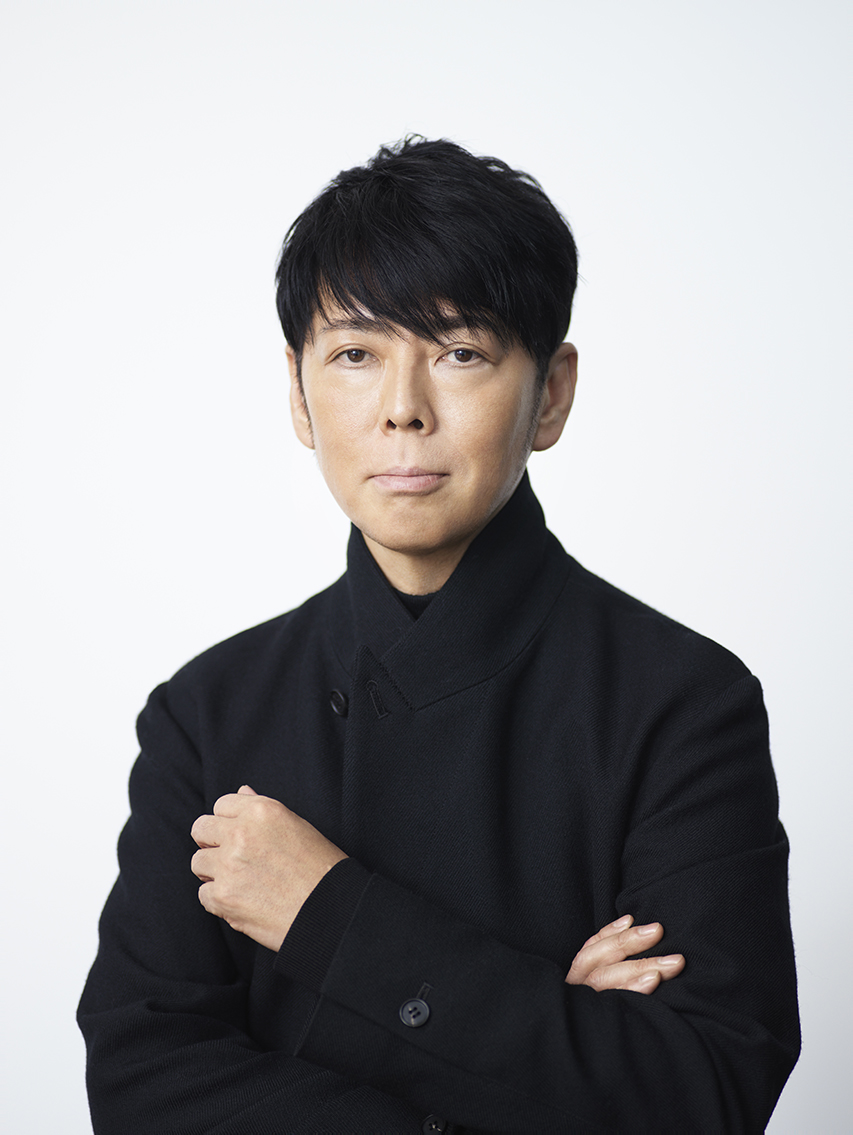
Kashiwa Sato was born in Tokyo in 1965. He graduated from the Department of Graphic Design at Tama Art University and spent eleven years at Hakuhodo, one of Japan’s largest advertising agencies, managing over fifty clients as an art director. “After graduating in graphic design from the Tama Art University I went on to work at Hakuhodo for eleven years,” Sato told Designboom. The agency years taught him how brands work at scale – and where they fail.3
In 2000, he left to found SAMURAI Inc., a creative direction studio. The name is deliberate: the samurai operates with discipline, precision, and an obligation to the mission rather than to personal expression. Sato describes himself as a “Total Producer” – not just a logo designer but a creative director who works from conception through interior design, spatial planning, communication strategy, and architectural direction. “I wear many hats: art director, creative director, brand architect, and communication director.”3
In 2016, the Agency for Cultural Affairs appointed Sato as Japan Cultural Envoy – the first creative director ever named to the post. In 2021, the National Art Center in Tokyo mounted his largest solo exhibition, spanning thirty years of work across seven sections.4
The Work
Uniqlo Global Rebrand (2006): The Flag That Went Everywhere
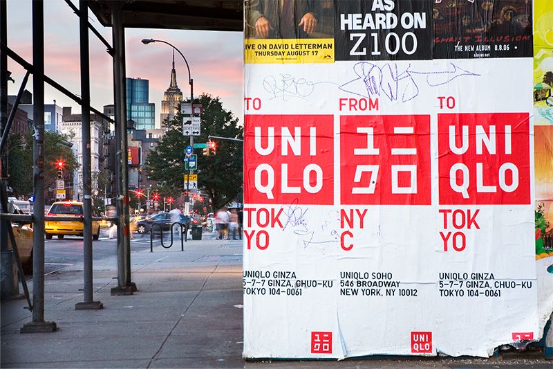
When Sato was tapped as creative director for Uniqlo’s global expansion – beginning with the Manhattan flagship store in November 2006 – the brand was a Japanese discount clothing retailer with no international identity. Sato’s solution was a red square with the brand name in katakana characters.5
The choice of katakana was not arbitrary. “Uniqlo needed a core image that expressed its rational, practical approach to clothing as ‘components of dress’ and also its ‘direct from Japan’ fashion aesthetic,” Sato explained. “I felt intuitively that katakana characters would work best as the key visual. Katakana embodies the inorganic quality of Japanese pop culture right now, as opposed to the soft, organic feeling of traditional culture. I was after a kind of ‘exquisite incongruity’ that would elicit a double take from Japanese and foreign consumers alike.”2
The red and white were chosen to be “reminiscent of the country’s flag” – instantly identifying Uniqlo as Japanese regardless of the viewer’s language. The brightness and saturation were increased from the previous wine-red logo to match the actual Japanese flag.
“It proved that you could control a brand’s image very precisely through visual signals like font and color,” Sato said. “For me, that experience was a powerful demonstration of the power of icons.”2
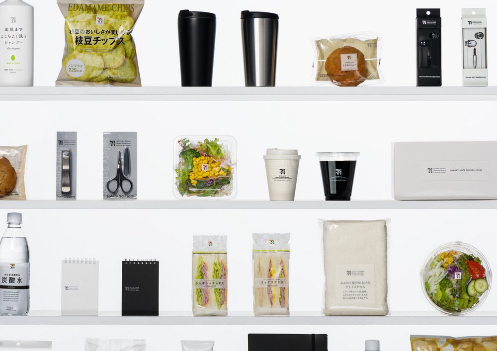
7-Eleven Japan Rebrand (2010): 1,700 Products, One System
Sato redesigned over 1,700 products for 7-Eleven Japan, the country’s largest convenience store chain. The project rolled out in phases: private brands in the second year, the Seven Cafe coffee stand in the third. The initiative produced record sales, and Seven Cafe became 7-Eleven Japan’s top-selling coffee within one year of launch.6
The scale is the point. Most designers touch one logo, one product, one campaign. Sato redesigned an entire retail ecosystem – seventeen hundred objects that must work together on the same shelves, in the same stores, under the same fluorescent lights, purchased by the same customers in the same sixty-second transactions. The iconic branding method – strip each product to its essential visual signal – is what makes that scale achievable without becoming incoherent.
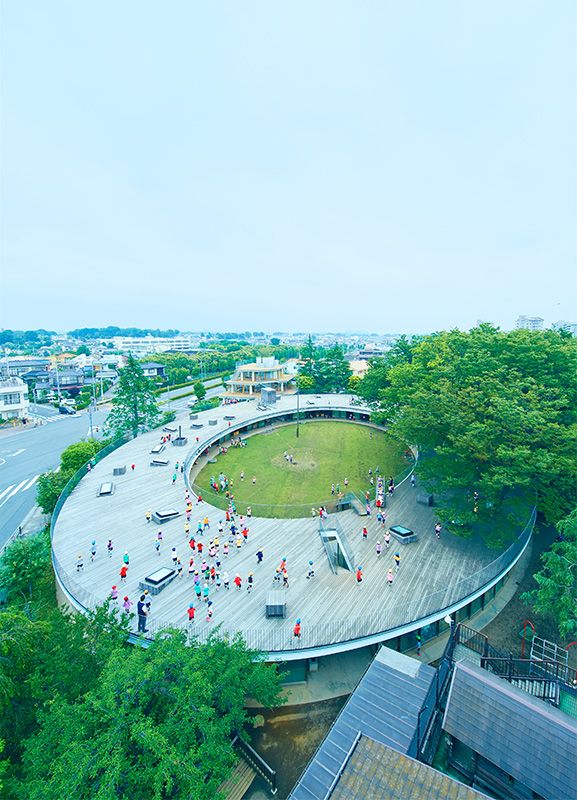
Fuji Kindergarten (2007): Architecture as Icon
Sato served as creative director for Fuji Kindergarten in Tachikawa, Tokyo – a donut-shaped building designed by Tezuka Architects. His role was not architectural but conceptual: defining the school’s identity and ensuring the building, the communications, and the educational philosophy expressed the same message.2
“My work as creative director is about devising solutions to problems. I always start by zeroing in on the essential nature of the problem,” he said. “I think the clarity and simplicity of the concept account for its global appeal. It convinced me that iconic branding could apply to architectural space as well.”2
The OECD selected Fuji Kindergarten in 2010 as the most outstanding of 166 “exemplary educational facilities” from 33 countries. The building is an icon in Sato’s precise sense: a single, instantly communicable idea (children run in circles on the roof) that requires no explanation.
The Method
“I always start by zeroing in on the essential nature of the problem,” Sato says. His opening question for every client is the same: “What’s important to you?”7
The answer rarely comes from the client’s marketing department. Sato looks for the essence that insiders have lost sight of. “Sometimes an outsider can see that essence more clearly than people on the inside,” he told Nippon.com.2 The method mirrors the Imabari towel project, where Sato rebranded a regional Japanese towel industry by identifying a quality – absorbency so pure the towels sink in water – that the manufacturers considered unremarkable but consumers found extraordinary.
His 2007 book Kashiwa Sato’s Ultimate Method for Reaching the Essentials proposes an “organizing flow” that starts with physical organization and moves to abstract organization. The premise: clarity of physical space produces clarity of thought, which produces clarity of design. The book became a bestseller in Japan.3
“In design, there is always the question of how much to preserve and how much to change,” Sato has observed. “In every artifact, there is a basic function, an archaic form that must always stay the same.” The design problem is identifying which elements are essential and which are residue. The icon is what remains after the residue is removed.7
“A concept must not stray too far from the known path, otherwise, people feel overwhelmed and it is immediately rejected,” he warns. “It’s enough to provide that small stimulus. Like a muscle, without any stimulus, it cannot grow either.”7
The “Total Producer” approach means Sato does not hand off after the logo. For the 7-Eleven rebrand, he directed the redesign of 1,700 product packages, the Seven Cafe interior, the staff uniforms, and the in-store signage – every touchpoint in a single system. This is the same discipline Florence Knoll practiced with her Planning Unit: design is not an artifact but a complete environment. The difference is that Knoll designed for fifty corporate clients over two decades. Sato redesigned 1,700 SKUs for one client in three years. The method scales because the icon constrains every decision: if it doesn’t reinforce the core signal, it doesn’t ship.
“Do not be too egotistic and do not be too mindless – don’t follow every request from the client,” Sato advises.3 The balance is precise: the designer’s job is to find the client’s essence, not to impose the designer’s taste. But finding essence requires saying no to the client’s assumptions about what their brand is. The outsider’s clarity is the tool. The insider’s attachment to complexity is the obstacle.
Influence Chain
Who Shaped Him
Japanese aesthetic tradition – but a different branch than Kenya Hara’s. Where Hara draws on wabi-sabi, ma, and the organic softness of traditional culture, Sato draws on the “inorganic quality of Japanese pop culture” – katakana, geometric precision, high-contrast color. Both practice reduction rooted in Japanese sensibility, but Sato’s reduction serves instant communication while Hara’s serves contemplative emptiness. (Cultural foundation)
Hakuhodo and the Japanese advertising tradition gave Sato eleven years of working with fifty-plus clients at commercial scale. The agency taught him that design without business understanding is decoration, and that the designer’s job is to solve the client’s problem, not to express the designer’s personality. (Professional formation)3
Who He Shaped
Japanese commercial branding at global scale. Sato proved that Japanese design sensibility – reduction, precision, the icon as communication unit – could drive global brand expansion. Uniqlo’s international identity demonstrated that “direct from Japan” was not a limitation but a competitive advantage.
The “Total Producer” model. Sato’s practice – spanning logo design, interior architecture, product packaging, communication strategy, and spatial planning under a single creative direction – established a model for how one sensibility can scale across an entire brand ecosystem without fragmenting. Paul Rand practiced this at the level of individual corporate identities; Sato practices it at the level of entire retail ecosystems.
The Throughline
Sato and Kenya Hara are the two endpoints of contemporary Japanese design reduction. Hara designs MUJI as a “vessel” – no brand personality, pure emptiness, the product invites the user to fill the space. Sato designs Uniqlo as a “flag” – maximum brand personality, compressed into a single icon, the product declares what it is at a glance. Both strip to essence. But Hara’s essence is silence. Sato’s essence is signal.
Sato himself recognizes the connection: “Even though the output is very different, I think there’s a lot of resonance in terms of our basic aesthetic sensibility.”2 The resonance is the method. The divergence is the purpose. (Series bridge)
What I Take From This
Sato’s flag test is how I evaluate API endpoints. Each endpoint should communicate its purpose as instantly as a Uniqlo logo communicates “Japanese basics.” If the endpoint needs a paragraph of documentation to explain what it does, it’s not an endpoint – it’s two endpoints wearing a trenchcoat. The icon is the interface: one URL, one verb, one response shape.
FAQ
What is Kashiwa Sato’s design philosophy?
Sato’s philosophy centers on “iconic branding” – reducing a brand to a single, instantly recognizable symbol that communicates across linguistic and cultural barriers. “A strong identity is an icon.” His method starts by identifying the essential nature of the problem, stripping away everything non-essential, and compressing the result into one symbol, one color, one message that works at any scale.12
What did Kashiwa Sato design?
Sato founded SAMURAI Inc. (2000) and has served as creative director for Uniqlo’s global rebrand (2006), 7-Eleven Japan’s product redesign (1,700+ items), Fuji Kindergarten, Rakuten, Honda N-series, the National Art Center Tokyo logo, Nissin (Cup Noodles Museum), and dozens of other Japanese and international brands. He was named Japan Cultural Envoy in 2016.24
How does Kashiwa Sato compare to Kenya Hara?
Both are contemporary Japanese designers practicing radical reduction, but toward different ends. Hara designs MUJI as an “empty vessel” – products that impose no identity and invite the user to fill the space. Sato designs Uniqlo as a “flag” – maximum brand identity compressed into a single icon. Hara’s reduction serves contemplation. Sato’s serves instant communication. Sato himself says: “Even though the output is very different, I think there’s a lot of resonance in terms of our basic aesthetic sensibility.”2
What can designers learn from Kashiwa Sato?
The design guide connects Sato’s iconic branding to other reductive practitioners in this series. Dieter Rams applies the same “nothing unnecessary” principle to industrial objects. Paul Rand established the corporate identity canon that Sato extends to retail ecosystems.
Start by asking “What’s important to you?” – not “What do you want it to look like?” Zero in on the essential nature of the problem before proposing solutions. Design for instant comprehension: if it requires explanation, it’s too complex. And remember that outsiders often see the essence more clearly than insiders.
Sources
-
DesignSingapore Council, “A Strong Identity Is an Icon.” Sato on iconic branding, core philosophy. ↩↩
-
Nippon.com, “An Eye for the Iconic” (2017). Long-form interview. Uniqlo katakana decision, Fuji Kindergarten, Imabari towels, Hara comparison, “communicate value in an instant.” ↩↩↩↩↩↩↩↩↩↩
-
Designboom, “Kashiwa Sato Interview” (2014). Hakuhodo years, SAMURAI founding, “Total Producer” model, books. ↩↩↩↩↩
-
National Art Center Tokyo, “KASHIWA SATO” exhibition (2021). Largest solo show, 30-year retrospective. ↩↩
-
People’s Graphic Design Archive, “Uniqlo Logo Design.” Also: kashiwasato.com project page. ↩
-
Spoon & Tamago, “Kashiwa Sato’s Rebranding for 7-Eleven Japan.” 1,700 products, record sales, Seven Cafe. ↩
-
Tokyo Weekender, “Kashiwa Sato: Revered Brand Designer.” “What’s important to you?” opening question, preservation vs change, “small stimulus” philosophy. ↩↩↩