Tobias Frere-Jones' Design Philosophy: Type Solves Problems

The Principle
“Type exists to solve problems, and beauty is always part of the solution.” – Frere-Jones Type1
Frere-Jones designs typefaces the way civil engineers design bridges: they must carry weight, they must work under stress, and they must serve the public without calling attention to themselves. A typeface that draws the reader’s eye to the letterform and away from the message has failed – no matter how beautiful it is. The beauty must be structural, not decorative. It must be the kind of beauty that disappears into use.
His typefaces are infrastructure. Interstate lives on highway signs. Gotham lives on campaign posters, building facades, and institutional communications. Retina lives in the stock listings of the Wall Street Journal at 5.5 points. Each one solved a specific problem before it became ubiquitous. The ubiquity is a consequence of the solution, not a goal pursued independently.
Context
Tobias Frere-Jones was born in New York City in 1970. He studied at the Rhode Island School of Design, graduating in 1992. At RISD, he came to the attention of Matthew Carter, who recommended him to David Berlow at the Font Bureau in Boston. Frere-Jones spent seven years at Font Bureau (1992-1999), where Berlow became his first professional mentor and where he designed Interstate and dozens of other typefaces for clients including The Wall Street Journal.2
In 1999, he joined Jonathan Hoefler’s studio in New York. The partnership produced some of the most commercially successful typefaces of the 2000s, including Gotham. The partnership ended in 2014 in a public dispute over credit and ownership. Frere-Jones founded Frere-Jones Type in 2014. His first retail release under his own name, Mallory, arrived in 2015.2
He has taught at Yale since 1996 – alongside Carter, connecting two generations of type designers in the same classroom. He received the AIGA Medal and the Cooper Hewitt National Design Award (2019). When the Cooper Hewitt asked him to describe his design practice in three adjectives, he answered: “Decisive. Self-aware. Informed.”3
The self-awareness is precise. Frere-Jones has said he wants an identifiable style of thinking, not an identifiable visual style. “I would rather hear that people see a style of thinking in my work than a style of drawing,” he told Doug Wilson.4 The distinction matters: a visual style can be copied. A method of investigation cannot.
The Work
Interstate (1993-1999): The Highway as Specimen
Interstate began as Frere-Jones’s RISD thesis project, based on the letterforms of the FHWA (Federal Highway Administration) sign alphabet – the typeface you read at 65 miles per hour on every US highway. The original signage alphabet was designed for legibility at distance and speed, not for setting text on a page. Frere-Jones took those constraints and rebuilt them into a family that works on paper and screen while retaining the mechanical clarity of the highway original.2
The project established his method: find letterforms that already exist in the built environment, study the constraints that shaped them, and use those constraints as the foundation for a typeface that works in new contexts. Interstate is not a copy of highway signage. It is a typeface that carries the DNA of highway signage into editorial and institutional settings.

Gotham (2000): The Typeface That Looks Like America
GQ magazine commissioned Gotham for a redesign. The brief was a sans-serif with a distinctly American character – confident, contemporary, but not slick. Frere-Jones walked Manhattan block by block, photographing over 4,000 examples of non-typographic lettering: painted signs, stamped metal plaques, engraved stone, cast concrete. He was looking for “the kind of letter an engineer would make” – letters designed by people who were not typographers but who needed to communicate clearly.5

The touchstone was the lettering on the Port Authority Bus Terminal. Simple, geometric, built from straight lines and circular arcs, with none of the personality that a professional type designer would instinctively add. Gotham inherited that directness: every letter looks inevitable rather than designed.
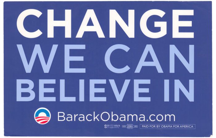
The typeface became famous when the Obama 2008 campaign adopted it. “CHANGE WE CAN BELIEVE IN” set in Gotham became one of the most recognizable political identities of the century. Frere-Jones did not design Gotham for politics. He designed it to look like the built environment of American cities. The Obama campaign chose it because that association – directness, infrastructure, the public square – was exactly what they wanted to communicate.5
Retina (2000): 5.5 Points, Every Day
The Wall Street Journal needed a typeface for its stock listings – columns of numbers and abbreviations set at 5.5 points and printed on newsprint at high speed. The problem is identical to the one Matthew Carter solved with Bell Centennial for AT&T’s phone books: legibility at a size where individual pixels of ink determine whether a letter is readable or not.6
Frere-Jones designed Retina with open apertures, generous counters, and ink traps at the joints – the same engineering approach Carter had pioneered twenty years earlier. “It is certainly the work I am proudest of,” Frere-Jones has said, precisely because the constraint was so severe that the design could not hide behind style. At 5.5 points, there is no room for personality. There is only room for legibility.6
Mallory (2015): The Autobiography in Type
Mallory was Frere-Jones’s first release under his own name after the partnership split. The typeface is a hybrid: British in its vertical proportions and serif references, American in its width and informality. Frere-Jones, whose family has roots in both countries, described it as an autobiography in type – the merging of two traditions he carries in his own background.1
The hybrid is also a technical argument: typographic traditions that evolved separately can be combined into something that serves both. Mallory works for British editorial and American institutional communications because it was designed to bridge the conventions rather than choose between them.
The Method
Frere-Jones’s method is fieldwork. He walks cities, photographs letterforms, and builds a physical specimen library that spans centuries. The photographs are not reference images for copying. They are evidence of how letters behave in the wild – how they weather, how they scale, how they communicate at distances and speeds that no type designer’s studio can simulate.4
“The refinements remain unseen by the user,” he wrote in Communication Arts, “which is as it should be.”7 The concealment is deliberate. Infrastructure works best when nobody notices it. A bridge that calls attention to its engineering has failed as a bridge. A typeface that calls attention to its letterforms has failed as communication.
His preservation instinct is also a design method. Frere-Jones photographs signs before gentrification erases them – documenting the hand-lettered, the stamped, the painted, the carved. The documentation is not nostalgia. It is a specimen library for future typefaces. Every letterform in the built environment is evidence of a constraint someone solved with the tools they had. Frere-Jones collects those solutions the way a biologist collects specimens: as data, not decoration.4
Influence Chain
Who Shaped Him
Matthew Carter recommended Frere-Jones to Font Bureau and has taught alongside him at Yale since 1996. Carter’s approach – designing typefaces for specific technical constraints – is the direct ancestor of Frere-Jones’s method. Bell Centennial’s ink traps at 6 points foreshadow Retina’s ink traps at 5.5 points. The lineage is not stylistic but methodological: both start with the physics of the output medium and let the constraint generate the form. (Direct influence)2
David Berlow at Font Bureau gave Frere-Jones his first professional training. Seven years of client-driven typeface design – where the brief comes from the publisher, not the designer – established the discipline of solving someone else’s problem rather than pursuing personal expression. (Direct influence)2
Who He Shaped
Contemporary American type design. Gotham redefined what an American sans-serif looks like – not Swiss-influenced like Helvetica, not geometric like Futura (the typeface), but derived from the actual built environment of American cities. The approach – fieldwork, not theory – influenced a generation of type designers who study letterforms in context rather than in isolation.
Political and institutional communication. The Obama campaign’s adoption of Gotham demonstrated that typeface selection is a strategic communication decision, not a cosmetic one. The typeface set the tone before a single word was read.
The Throughline
Frere-Jones extends the functional typography lineage from Jan Tschichold through Matthew Carter into the present. Tschichold codified rules. Carter designed typefaces for specific production constraints. Frere-Jones designs typefaces from the evidence of the built environment – walking the streets, photographing the signs, and building letterforms from what he finds. The progression is from theory (Tschichold) to constraint (Carter) to fieldwork (Frere-Jones). Each generation gets closer to the actual conditions under which type is read. Paula Scher operates in the same lineage but at architectural scale – her environmental typography is the destination that Frere-Jones’s letterforms travel to. (Series bridge)
What I Take From This
Frere-Jones’s 4,000 photographs of Manhattan signage are user research conducted on letterforms. He didn’t sit in a studio and draw what he thought American type should look like. He went out and documented what American type already looked like, then formalized it. The method applies to any design problem: study the existing behavior before proposing the new system.
FAQ
What is Tobias Frere-Jones’s design philosophy?
Frere-Jones believes type exists to solve problems, and beauty is always part of the solution – not separate from function but embedded in it. He designs typefaces from fieldwork: walking cities, photographing existing letterforms, and building new typefaces from the evidence of how letters actually work in the built environment. His goal is a recognizable style of thinking, not a recognizable visual style.14
What did Tobias Frere-Jones design?
Frere-Jones designed Interstate (1993-1999, based on US highway signage), Gotham (2000, commissioned by GQ, used by the Obama 2008 campaign), Retina (2000, for WSJ stock listings at 5.5pt), Mallory (2015), and dozens of other typefaces. He worked at Font Bureau (1992-1999) and with Jonathan Hoefler (1999-2014) before founding Frere-Jones Type in 2014. He has taught at Yale since 1996.12
How did Gotham become America’s typeface?
GQ commissioned Frere-Jones to design an American sans-serif. He walked Manhattan, photographed over 4,000 examples of non-typographic lettering, and built Gotham from the geometric directness he found in signs, plaques, and building inscriptions. The Obama 2008 campaign adopted it because the typeface already carried the associations of American public infrastructure. Gotham didn’t become American through marketing. It was American from birth.5
What can designers learn from Tobias Frere-Jones?
Study the built environment before designing in a studio. The best solutions often already exist in fragments – in signs, in engineering, in the accumulated decisions of non-designers solving problems with the tools at hand. Collect those fragments systematically, and the design emerges from the evidence rather than from personal preference.
Sources
-
Frere-Jones Type, About. Studio credo: “type exists to solve problems.” Mallory as autobiographical typeface. ↩↩↩↩
-
Frere-Jones Type, Biography. RISD, Font Bureau under Berlow (Carter recommendation), Yale teaching, career timeline. Also: Adobe Fonts. ↩↩↩↩↩↩
-
Cooper Hewitt, Smithsonian Design Museum, “National Design Award: Communication Design, 2019.” “Decisive. Self-aware. Informed.” Three adjectives from the NDA interview. ↩
-
Doug Wilson, interview with Tobias Frere-Jones, cited in Frere-Jones Type studio materials and Eye Magazine No. 11 (1993) for the broader type design lineage. “Style of thinking, not style of drawing.” Fieldwork method, specimen library. ↩↩↩↩
-
Tobias Frere-Jones, Gotham design documentation. Port Authority Bus Terminal as touchstone, 4,000+ Manhattan signage photographs, “the kind of letter an engineer would make.” Obama 2008 campaign adoption documented across multiple sources including Fonts In Use: Obama 2008 and Typography.com. ↩↩↩
-
Tobias Frere-Jones, Retina design for The Wall Street Journal. 5.5pt stock listings, ink trap engineering. “The work I am proudest of” from studio interviews. Frere-Jones Type: Retina. ↩↩
-
Tobias Frere-Jones, Communication Arts interview. “The refinements remain unseen by the user, which is as it should be.” Also referenced in Adobe Fonts designer profile. ↩