Design Philosophy: Paula Scher — Serious, Not Solemn
The Principle
“Great design is serious, not solemn.” – Paula Scher, TED Talk, 20081
Scher’s work is a foundational layer of the taste infrastructure that defines how visual identity operates at architectural scale. She draws a line between two kinds of rigor. Solemn design follows the rules reverently – correct typefaces, approved color palettes, researched-backed decisions validated by focus groups. It is responsible. It is boring. Serious design understands the rules well enough to break them at exactly the right moment. It takes the same risk as solemn design avoids, but the risk is informed by decades of practice, not by ignorance.
The distinction is not between discipline and recklessness. It is between discipline that produces safety and discipline that produces surprise. Scher’s career is built on the second kind.
Context
Paula Scher was born in 1948 in Washington, D.C. Her father was a photogrammetric engineer for the US Geological Survey who invented a device for correcting lens distortion from the Earth’s curvature – foundational technology for satellite mapping. Growing up around maps and precision shaped her instinct for how information fills space. “As a kid, I felt that distortion was a form of lying,” she said.2
She studied illustration at the Tyler School of Art in Philadelphia, where her teacher Stanislaw Zagorski gave her the directive that defined her career: “Illustrate with type!” She graduated in 1970, moved to New York with a portfolio and $60, and landed in the art department at CBS Records. Eight years of designing album covers – up to 150 a year – taught her to work at speed, with conviction, and without committees.2
In 1991, Scher became a partner at Pentagram – the first woman to hold a principal position at the firm. She has remained there for over three decades, making her one of the longest-tenured partners in Pentagram’s history. Her practice spans brand identity, environmental graphics, packaging, editorial design, and large-scale typographic paintings.3
Her TED talk, “Great design is serious, not solemn,” is one of the most-viewed design talks ever delivered. In it, she traces her career through two phases: the solemn period (technically excellent, creatively safe work that paid the bills) and the serious period (the moment she started taking risks again, which coincided with the Public Theater commission in 1994).1
The Work
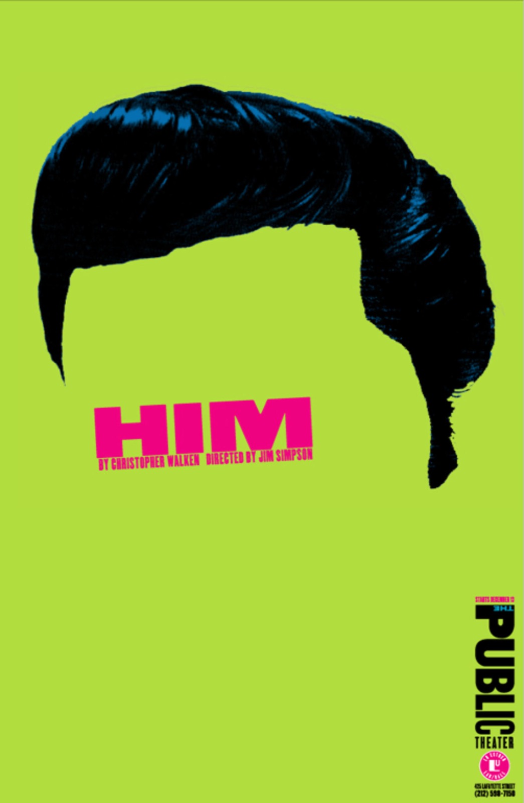
The Public Theater Identity (1994-present): Typography as Voice
In 1994, the Public Theater approached Scher for a new visual identity. George C. Wolfe, the theater’s artistic director, wanted an identity that felt as urgent and accessible as the theater’s mission: new work by living playwrights, performed for New York audiences of every background.4
Scher designed a typographic system using multiple weights and sizes of wood-type-inspired letterforms – bold, compressed, stacked, overlapping. The identity has no logo in the traditional sense. It is a language: any combination of the typefaces, arranged with the right density and energy, reads as “The Public.” The system has been in continuous use for over thirty years, evolving through successive campaigns for Shakespeare in the Park, new productions, and institutional materials without ever requiring a redesign.4
The Public Theater identity proved that a visual system could have the scale and energy of street art while serving a cultural institution. The posters are designed to compete with the noise of New York City – not by being louder, but by being more typographically confident than anything around them.
Citibank Logo (1998): 34 Years in Seconds
When Citigroup was formed from the merger of Citicorp and Travelers Group, Scher was hired to create the identity for the new entity. She sketched the logo on a napkin during the first meeting. The arc over the “t” in “Citi” – a gesture that suggests an umbrella (from Travelers) while giving the wordmark its distinctive silhouette – took seconds to draw.5
“It took me a few seconds to draw it,” Scher said in her TED talk, “but it took me 34 years to learn how to draw it in a few seconds.”1
The statement is not about speed as a virtue. It is about the relationship between practice and intuition. The napkin sketch was not a lucky accident. It was the output of 34 years of pattern recognition – seeing the problem (merge two identities), identifying the constraint (the word must read as both “Citicorp” and “Travelers”), and resolving both in a single gesture. The speed is the evidence of mastery, not the absence of effort.
![]()
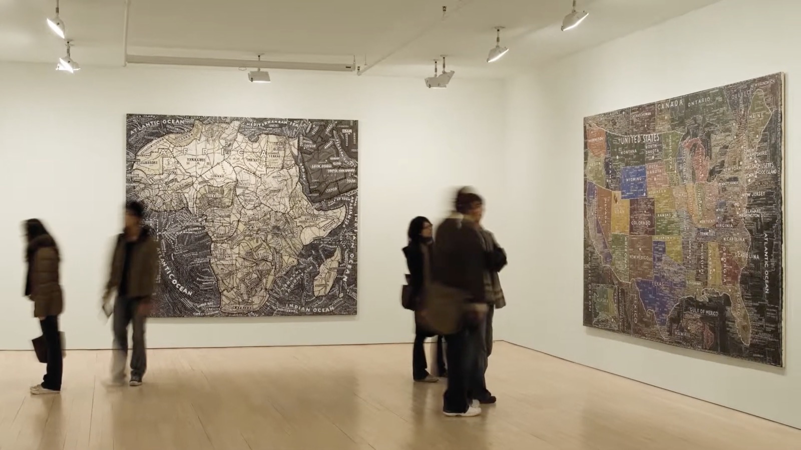
Typographic Maps (2000s-present): Painting as Design Research
Scher’s large-scale typographic paintings render cities, countries, and continents as fields of hand-painted text. The map of New York City replaces geographic features with neighborhood names, street names, and cultural landmarks – all painted in varying sizes and densities that correspond to the energy of the places they name.2
The maps are not commissions. They are Scher’s personal practice – design research conducted through painting. The scale (some are over eight feet wide), the physicality (hand-painted, not digitally composed), and the obsessive density of information serve as a laboratory for the environmental typography she applies to commercial projects. The paintings inform the work. The work does not inform the paintings.
Environmental Graphics: Bloomberg, Jazz at Lincoln Center
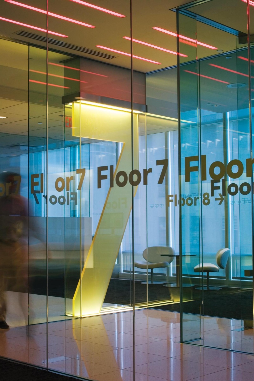
Scher’s environmental graphic work applies typography at architectural scale. The Bloomberg headquarters in New York uses floor-to-ceiling letterforms as wayfinding – numbers and letters that are simultaneously navigational tools and spatial experiences. You do not read the typography from a comfortable distance. You walk through it.3
The approach treats words as architecture. A letter six feet tall occupies space the way a column does. It has mass, presence, and a relationship to the human body that a letter on a page does not. Scher’s environmental work makes graphic design physical – which is the same argument Tinker Hatfield makes when he transfers architectural thinking to shoes: the discipline scales because the principles are spatial, not medium-specific.
The Method
Scher’s method is speed followed by refinement. The initial idea comes fast – the napkin sketch, the first layout, the instinctive typographic choice. The refinement comes slowly – months of production, color calibration, spacing adjustment, and client negotiation. The ratio is deliberate: if the idea doesn’t arrive quickly, it is usually wrong. If the execution isn’t painstaking, the idea is wasted.1
She has spoken openly about her disdain for focus-group-driven design. “You can’t test a new thing against an existing thing,” she has argued. The new thing will always lose, because the test measures recognition, not quality. The Citibank logo could not have survived a focus group. It survived because Scher had the conviction – backed by 34 years of practice – to present it as the answer, not an option.
Her painting practice functions as design R&D. The typographic maps require hours of hand-painting – work that is deliberately slow, physical, and inefficient. The inefficiency is the point: it forces Scher to make compositional decisions that digital tools would allow her to defer. When the letter must be painted rather than repositioned, the decision is permanent and therefore more considered.
Influence Chain
Who Shaped Her
Seymour Chwast and Herb Lubalin gave Scher the American typographic tradition she inherited – expressive, illustrative, commercially confident. Her album cover work at CBS and Atlantic descends directly from the generation of New York designers who treated type as image. (Direct influence)
Russian Constructivism gave her the formal vocabulary of dynamic composition – angled text, overlapping planes, typographic density as energy. The Public Theater identity is Constructivism applied to American cultural marketing. (Direct influence)
Paul Rand is the generational predecessor. Rand brought European modernism to American corporate identity. Scher brought American typographic energy to institutional and environmental design. Both operated at the intersection of play and rigor, but where Rand’s play was intellectual (the IBM rebus), Scher’s play is physical (six-foot letters you walk through). (Generational influence)
Who She Shaped
Environmental typography as a design discipline. Before Scher, large-scale typographic installations were signage. After Scher, they are spatial experiences. Her Bloomberg and Lincoln Center work established the category.
The next generation of Pentagram partners. Scher’s three-decade tenure made Pentagram’s New York office a school for designers who went on to lead practices across the industry.
The Throughline
Scher’s “serious, not solemn” distinction maps to the tension across this series. Dieter Rams is solemn: rules followed with austere discipline, no humor, no surprise. Charles and Ray Eames are serious: rigorous method, playful output, toys on the desk. Scher names the difference that the Eameses practiced but never articulated – that play and rigor are not opposed, and that the most dangerous design is the kind that follows every rule and surprises no one. (Series bridge)
What I Take From This
“It took me 34 years to learn how to draw it in a few seconds.” That is the argument for practice over tools. The napkin sketch is not reproducible by someone who hasn’t done the 34 years. Speed is the output of mastery, not a shortcut around it.
FAQ
What is Paula Scher’s design philosophy?
Scher distinguishes between “serious” design (informed risk-taking backed by decades of practice) and “solemn” design (rule-following that produces safe, boring work). Her philosophy centers on typographic confidence, speed of intuition refined through long practice, and the conviction that graphic design should operate at architectural scale with the energy of street art.1
What did Paula Scher design?
Scher is a partner at Pentagram (since 1991, the first woman principal). She designed the Public Theater’s visual identity (1994-present), the Citibank/Citi logo (1998), environmental graphics for Bloomberg and Jazz at Lincoln Center, the Windows 8 logo, and large-scale typographic map paintings exhibited internationally. She has also designed hundreds of album covers, book jackets, and brand identities.345
How did Paula Scher change graphic design?
She transformed environmental typography from signage to spatial experience, proving that graphic design could operate at architectural scale. Her Public Theater identity demonstrated that a typographic system could serve a major institution for decades without a logo in the traditional sense. Her Citibank logo and TED talk made the case that design intuition – honed through decades of practice – is more valuable than process-driven consensus.14
What can designers learn from Paula Scher?
The design guide traces how Scher’s “serious, not solemn” ethos connects to other practitioners in this series. Jan Tschichold codified the typographic rules Scher learned well enough to break. Kashiwa Sato shares her commitment to reducing identity to its most compressed signal, though Sato compresses to icons where Scher expands to walls.
Practice produces intuition. The speed of a great solution is not carelessness – it is the accumulated output of decades of pattern recognition. Don’t test new ideas against existing ones; the new idea always loses in a focus group. And treat type as architecture: a letter has mass, presence, and a relationship to the human body that changes when it scales from a page to a wall.
Sources
-
Paula Scher, “Great design is serious, not solemn.” TED Talk, Serious Play conference, 2008. “Serious vs. solemn” framework, Citibank napkin story, career arc. ↩↩↩↩↩↩
-
Wikipedia, “Paula Scher.” Tyler School of Art, CBS/Atlantic Records, career timeline, typographic maps. ↩↩↩
-
Pentagram, “Paula Scher.” Partner biography, project archive, practice overview. ↩↩↩
-
Pentagram, “The Public Theater.” Identity system, George C. Wolfe commission, 30+ years of continuous use. ↩↩↩↩
-
Pentagram, “Citibank.” Brand identity for the merger of Citicorp and Travelers Group. ↩↩