设计哲学:Susan Kare——有意义、易记忆、够清晰
核心原则
“有意义、易记忆、够清晰。”——Susan Kare,谈定义优秀设计的三个形容词1
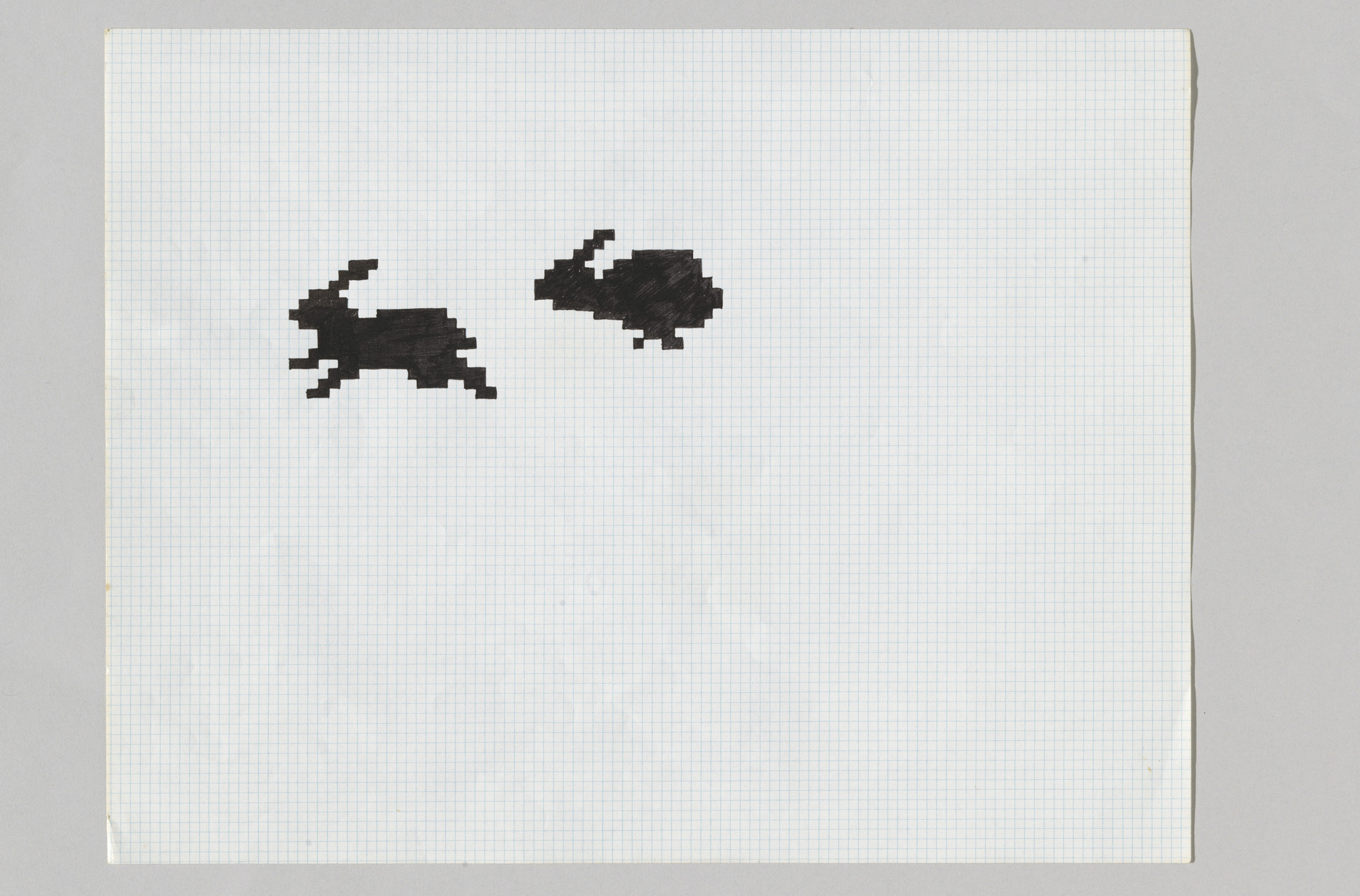
Kare用一本2.50美元的方格纸素描本,在32×32像素网格中设计了初代Macintosh图标——笑脸Mac、炸弹、垃圾桶、画笔、Command键。每个图标都必须向从未使用过电脑的人传达其功能。约束是绝对的:1,024个黑白方块,要传达一个无需说明即可理解的概念。她没有把约束当作限制,而是当作问题本身,并从最古老的视觉传统中寻找答案:十字绣、马赛克、民间符号和交通标志。
她的图标赋予了Macintosh个性。在Kare之前,电脑通过命令行与人沟通;在Kare之后,电脑通过你可以指向的隐喻来沟通。垃圾桶代表删除,折角文档代表文件,微笑的电脑代表一切正常。这些隐喻已深深嵌入计算机世界,以至于我们不再注意到它们是被设计出来的。这种隐形,恰恰是对作品的最高赞誉。
背景
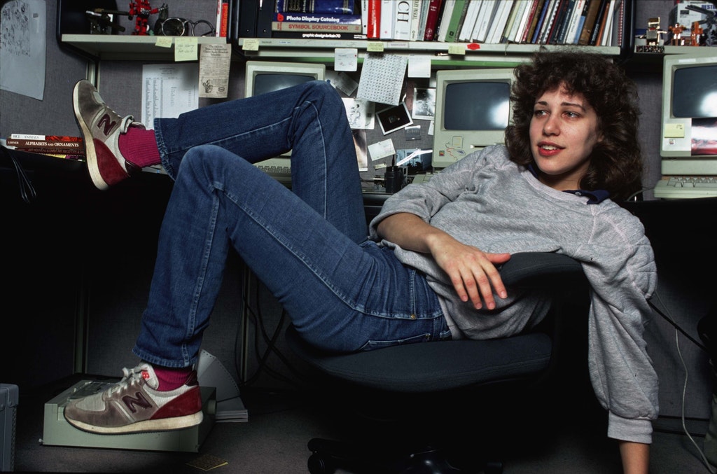
1982年,Susan Kare是一位居住在旧金山湾区的雕塑家。她拥有纽约大学美术博士学位,博士论文研究的是Honore Daumier和Claes Oldenburg雕塑中的讽刺手法。她曾在旧金山美术博物馆担任策展人。当电话响起时,她正在为阿肯色州一家博物馆焊接一座真人大小的野猪雕塑。2
高中好友、Macintosh团队软件工程师Andy Hertzfeld提出用一台Apple II电脑作为报酬,请她手绘”几个图标和字体元素”。Kare没有任何计算机图形经验,也不知道如何设计字体。她去帕洛阿尔托公共图书馆借了排版学的书籍,在University Art商店花2.50美元买了能找到的最小方格纸,然后去参加了一场持续五分钟的面试。”你什么时候能开始?”他们让她成为Macintosh软件组的第2号员工,头衔是”Macintosh艺术家”。2
时机至关重要。Apple正在打造第一台面向大众市场的图形用户界面电脑。Lisa已经确立了这一概念,但Macintosh要做到价格亲民、容易上手。屏幕上的每个元素——图标、字体、光标、对话框——都需要与从未接触过电脑、甚至可能对电脑心生畏惧的人沟通。Kare后来说:”我希望帮助打破人们对电脑冰冷、令人生畏的刻板印象。”3
她没有接受过数字设计的训练,因为这个领域尚不存在。她所拥有的是美术教育背景、雕塑家对约束中形式的理解,以及从民间艺术、十字绣和符号系统中汲取视觉隐喻的直觉。”位图图形就像马赛克、十字绣和其他伪数字艺术形式,这些我在加入Apple之前都做过,”她说。3 对于一个多年来一直在方格纸上填格子、在刺绣中数针脚的人而言,像素网格并不陌生。
作品
Macintosh图标(1983-1984):让机器有人情味


Hertzfeld让Kare买方格纸,画32×32的网格。每个填满的方格就是一个像素。她用铅笔和彩色笔画图标,先在纸上测试隐喻,再将其移至屏幕。当Hertzfeld编写了一个可以用鼠标切换比特的图标编辑器后,素描本成了设计工具,编辑器成了生产工具。她的原始素描本现藏于MoMA永久馆藏,2015年与SFMOMA联合收购。4
笑脸Mac——开机时迎接用户的微笑电脑面孔——旨在消除恐惧。炸弹图标——出现在系统错误时——设计得”俏皮而非令人惊慌”。油漆桶曾测试过油漆滚筒和其他几种方案,最终Kare选择了倾倒的油漆桶,因为它”对人们来说最容易理解”。垃圾桶的概念继承自Lisa,但针对Macintosh不同的像素尺寸重新绘制。2
每个图标都经历了特定的设计流程:Kare会制作多个方案,然后展示给人们并观察他们的反应。”我会尝试做出多种选择,征求大家的意见,”而不是直接宣布最终设计。她刻意避免使用文字和双关语:”我尽量不使用文字,也不使用双关语,因为它们无法翻译。”这个决定——只用视觉隐喻,不依赖英语——意味着图标从发布之日起就能跨越所有语言。2
Command键的诞生故事最为具体。Steve Jobs走进软件区宣布:”屏幕上Apple标志太多了!太荒唐了!”团队一直用Apple标志作为键盘修饰符号,Jobs要求更换。键盘硬件已经在定型——他们只有几天时间,而非几周。Kare在一本国际符号词典中找到了一个环形方块符号(Bowen结,在瑞典露营地地图中表示”景点”),创建了一个16×16像素的位图。团队通过了这个方案。自1984年以来,这个符号出现在每一款Mac键盘上。5
Chicago字体(1984):约束即媒介
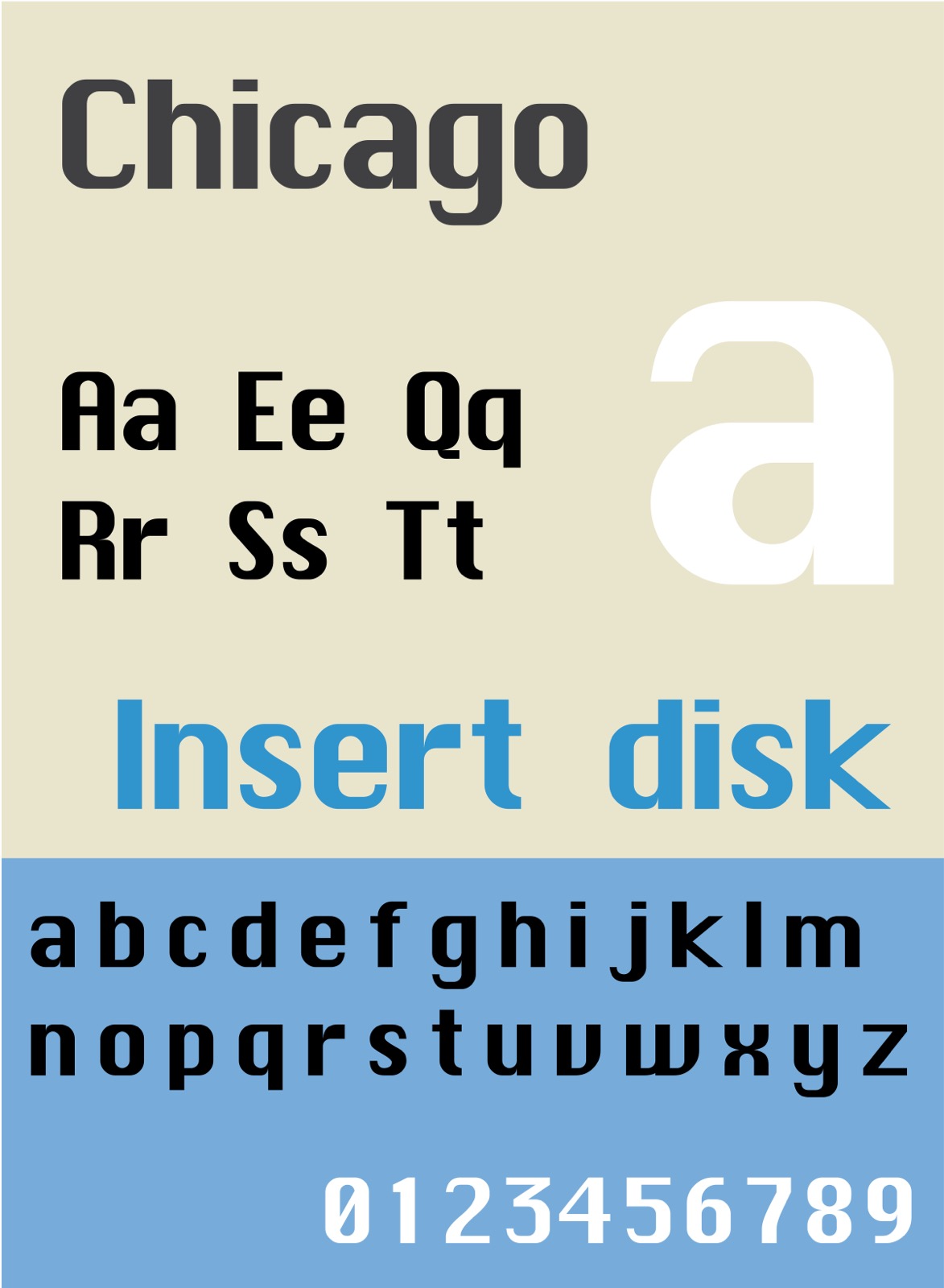
Macintosh需要一款系统字体。Kare在每个字符9×7像素的网格内设计了Chicago,笔画仅限水平、垂直和45度角。没有曲线。这个约束并非出于美学考量——在位图分辨率下,曲线会产生锯齿状边缘(”jaggies”),降低文字可读性。通过限制为直线和45度对角线,Kare让字体在Mac的72 dpi屏幕上清晰可辨。2
这款字体最初用”Elefont”作为占位名称,后来由Jobs更名。最初Macintosh字体以费城主线通勤火车站命名,但Jobs认为应该用”世界级城市”——Chicago、Geneva、London、Toronto、Venice、New York。Chicago从1984年起一直是Apple的系统字体,贯穿整个经典Mac OS时代,后又在iPod界面(2001-2004)中复活,持续使用超过二十年。2
Chicago是大众个人电脑上第一款等比例系统字体——告别了大多数用户所熟悉的等宽打字机字体。每个字母只占据其字形所需的空间。仅凭这一个决定,Macintosh屏幕就从终端的感觉变成了印刷页面的感觉。
Windows 3.0纸牌游戏(1990):跨平台的清晰表达
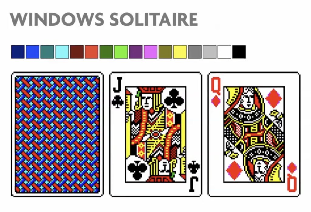
离开Apple和NeXT之后,Kare开设了自己的工作室。Microsoft聘请她为Windows 3.0纸牌游戏设计纸牌图案——这款游戏的存在,正是为了教会用户如何使用鼠标:拖拽、放置、点击。Kare使用Microsoft Paint和16色VGA调色板完成了设计。6
“纸牌正面只需要黑色、红色和黄色,”她说。”我从经典纸牌中汲取灵感,最有趣的部分是尝试将J、Q、K复杂的图案转化到72 dpi的网格中。”同一套纸牌设计被Microsoft从1990年使用到2007年——横跨十七年,覆盖数十亿台Windows设备。这一作品证明了她以约束驱动的方法并非只适用于某一平台。这个方法——理解隐喻、剥离至本质、让真实用户测试——从Mac迁移到Windows,乃至任何拥有像素网格的媒介,都同样适用。6
方法论
Kare的工作流程在四十年间始终如一:理解约束,找到恰当的隐喻,将其精简到能传达概念的最少像素数,然后让非设计师来测试。
她的主要参考书是Henry Dreyfuss的《符号资料集》(Symbol Sourcebook,1972),一部按类别编排的国际符号汇编。她尤其钟爱其中关于流浪者暗号的章节——流浪者在旅途中用来互相传递信息的符号。”我尽量不使用英语,也尽量不用双关语,”她说,”因为它们无法翻译。”2
她将自己的图标设计理念描述为”更像交通标志而非插图——一目了然,不堆砌多余细节”。停车标志不需要每两年重新设计一次,好的图标亦然。”似乎没人觉得需要每两年重新设计一下停车标志,”她在一次播客采访中如此说道。7
32×32像素画布——她认为”对图标来说已经很宽裕了”——要求一种她所称的”独特的极简点彩画法”。她热爱”在16×16和32×32像素网格中工作的解谜般的乐趣,以及工艺与隐喻的结合”。8
当被问到约束是否限制创造力时,她直截了当地回答:”技术约束(例如只能使用黑白两色,或有限的屏幕空间)不一定会妨碍创造力。关键是了解什么是可能的,然后从那里出发。”9
影响链
影响她的人
Paul Rand是她公开声明的”设计英雄”。她践行了他的格言:”不要试图标新立异,只要试图做得出色。”在NeXT时期,她将Steve Jobs引荐给Rand,并聘请Rand设计了NeXT标志——将她职业生涯中两个最重要的人物联系在了一起。(直接影响)1
Henry Dreyfuss塑造了她的方法。他的《符号资料集》(1972)是她图标设计的首要参考。书中对通用符号的分类——交通标志、流浪者暗号、科学符号——赋予她一套不依赖语言即可沟通的词汇。(直接影响)2
民间艺术、十字绣和马赛克赋予了她位图创作的形式语言。她意识到填充像素在结构上等同于在刺绣中数针脚或在马赛克中放置瓷砖:”学过艺术史就会知道太阳底下没有新鲜事——你见过18世纪的十字绣吗?”7
她影响了谁
1984年以来的每一个图形用户界面。 Kare的Macintosh图标确立了后来成为通用语言的视觉隐喻:折角文档、垃圾桶、手形指针、放大镜搜索。这些并非必然的结果。必须有人决定”删除”看起来像垃圾桶、”文件”看起来像折角页面。Kare做出了这些决定,此后的每一个操作系统都沿袭至今。
Emoji设计师。 Kare的Cairo字体(1984)是一种原型emoji——一款包含棕榈树、新月、滑板和其他象形字符的字体。2 它是Shigetaka Kurita 1999年为NTT DoCoMo i-mode平台创建emoji集的概念先驱。Cairo利用字体槽位编码象形含义而非字母字符——比emoji成为全球通信系统早了十五年。
一脉相承的线索
Kare证明了约束不会限制创造力——而是聚焦创造力。一个只有黑白两色的32×32像素网格不是牢笼,而是设计简报。约束迫使每个像素证明自身存在的必要性,这恰恰是Dieter Rams的第十条原则在不同媒介中的体现。(系列桥接)
我从中学到的
“给我16×16像素和一个概念,我就无所畏惧。”这就是那种态度。约束是工具,不是障碍。
常见问题
Susan Kare的设计哲学是什么?
Kare的设计哲学建立在三个词上:有意义、易记忆、够清晰。她将图标设计视为约束条件下的视觉问题解决,从民间艺术、十字绣和国际符号系统中汲取灵感,而非从插图。她的图标”更像交通标志而非插图——一目了然,不堆砌多余细节”。7
Susan Kare设计了什么?
Kare设计了初代Macintosh图标(笑脸Mac、Command键、垃圾桶、炸弹、油漆桶)、Chicago字体、Cairo原型emoji字体,以及1984年Macintosh的系统图形。她后来还设计了Windows 3.0纸牌游戏的纸牌图案(1990-2007年使用)、Facebook的虚拟礼物,并与Pinterest和Niantic Labs合作过。26
Susan Kare如何影响了现代设计?
Kare确立了定义图形计算的视觉隐喻:代表删除的垃圾桶、折角文档图标、手形指针,以及软件应通过可识别符号而非文字命令进行沟通的理念。她的Cairo字体(1984)是一种象形字体,比Shigetaka Kurita的emoji集早了十五年。2
设计师能从Susan Kare身上学到什么?
约束聚焦创造力,而非限制创造力。32×32像素网格迫使每个像素证明自身存在的意义。用真实用户而非其他设计师来测试设计。避免使用文字和双关语,因为它们无法翻译。从现有的符号系统(交通标志、民间艺术、国际象形符号)中汲取灵感,而非从零开始发明新的视觉语言。
参考来源
-
Susan Kare,Cooper Hewitt国家设计奖问答,2019年。“NDA 20 Yrs: Q&A with Susan Kare.” “有意义、易记忆、够清晰”作为她对优秀设计的三个形容词。 ↩↩
-
Susan Kare,Alex Pang采访,斯坦福大学,2000年9月8日。完整文字记录。 方格纸流程、图标设计决策、字体命名、Paul Rand、Andy Hertzfeld招募的第一手资料。 ↩↩↩↩↩↩↩↩↩↩↩
-
史密森尼Lemelson发明与创新研究中心,“Susan Kare: Iconic Designer.” “位图图形就像马赛克和十字绣”引文及传记背景。 ↩↩
-
MoMA,“Apple Macintosh OS Icon Sketchbook, 1982.” 装订素描本,纸上墨水和彩色笔。Susan Kare捐赠。 ↩
-
Andy Hertzfeld,“Swedish Campground,” Folklore.org。Command键起源故事的第一手资料,包括Jobs”Apple标志太多了”的爆发。 ↩
-
Susan Kare,Designboom采访,2014年10月。“Interview with graphic designer Susan Kare.” “给我16×16像素”引文及纸牌游戏设计细节。 ↩↩↩
-
Susan Kare,“Pixels and Personality,” Ledger播客。”似乎没人需要每两年重新设计停车标志”及十字绣类比引文。 ↩↩↩
-
Susan Kare,AIGA奖章致辞/《纽约客》采访,2018年。”解谜般的乐趣”和”独特的极简点彩画法”引文。 ↩
-
Susan Kare,Quartz采访,2019年10月。“Mac icon designer Susan Kare explains the inspiration for her designs.” “技术约束不一定会妨碍创造力”引文。 ↩