App Store Screenshots That Sell the Why

When you have no app preview, Apple shows one to three of your screenshots in search results, and in the only test Apple has published that pits a screenshot against an app preview, the page that dropped its preview video and led with a screenshot won by 3.3 percent across an average of 430,000 impressions per treatment.17 The rest of what the industry says about screenshots is convention, as far as the published record goes. I read the current sets of 37 iPhone apps frame by frame, from Flighty and Copilot to Apple’s own Photomator and Journal, then held them against Apple’s rules and against the handful of tests that report real numbers. The pattern that holds: the first frame states what the app is for, the second frame proves it, and the product carries the rest. Two things the award winners do, Apple’s current guidance says not to do. And the first set we made for our own camera app broke every rule that matters, which is why the rebuild is the worked example at the end.
TL;DR
- Search decides on one to three frames. Apple: “the first one to three images will appear in search results when no app preview is available, so make sure these highlight the essence of your app.”1 One 6.9-inch set at 1320×2868 now covers every iPhone you can upload for today, with the 6.5-inch size required only when the 6.9-inch set is missing; the iPhone Duo row is listed but not yet accepting uploads.2
- Frame one is a point of view in 23 of the 31 captioned sets I read. “Private. Safe. Smart.” (Copilot). “Opal blocks distractions for you.” “Your life, beautifully organized.” (Notion). Feature-first openers are the minority.17
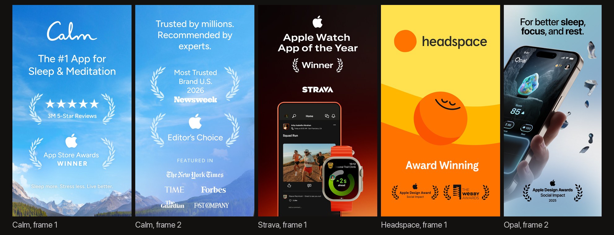
- Proof sits in frames one or two in 16 of 37, and 13 of those show an Apple-designated award. Design Award laurels, press quotes, star counts. Apple’s current asset guidance asks you to “avoid using the entire asset to highlight general accolades” and says “don’t include any Apple-designated recognitions” such as Editor’s Choice or a Design Award.4
- The measured lifts are single digits. Apple’s three published tests: +8 percent (an icon), +3.3 percent (a screenshot over a video), and a redesign that lost by 1.5 percent, each with impressions stated.7 The 20 to 40 percent figures in vendor guides cite no test.14
- No published, isolated caption result. Apple’s Tech Talk says developers test “various callouts on their screenshots”, but no source I could open reports a controlled result for caption presence, length, placement, or size, nor for device frames or background color. Those are conventions. Treat them as such.7
- Our own set went from five identical tiles with feature captions to five compositions that sell the why. Then Apple’s bezel rules sent us back for a third pass.22
What the search result actually shows
A product page has up to 10 screenshots, but the person deciding whether to tap sees far fewer. Apple’s own guidance on the product page: “Depending on the orientation of your screenshots, the first one to three images will appear in search results when no app preview is available, so make sure these highlight the essence of your app. Focus each subsequent screenshot on a main benefit or feature so that you fully convey your app’s value.”1 If you upload an app preview, up to three of 15 to 30 seconds, it plays first, muted, and the screenshots follow it.1192023
The size question got simpler in 2026. App Store Connect lists three accepted portrait sizes for the 6.9-inch display, 1260×2736, 1290×2796, and 1320×2868, and marks the 6.5-inch size as “Required if app runs on iPhone and screenshots for 6.9” display aren’t provided”. Every smaller iPhone size falls back to a scaled copy. Above those rows the page already lists iPhone Duo, 1398×2034 for the outer display and 2007×2853 for the inner, with the note that “Support for uploading assets for this device in App Store Connect will be available later this year”; the iPhone Duo developer post works out what those sizes mean in points.2 One set, ten frames at most, JPEG or PNG without alpha.
App Review’s rule for what goes in them is guideline 2.3.3: “Screenshots should show the app in use, and not merely the title art, login page, or splash screen. They may also include text and image overlays (e.g. to demonstrate input mechanisms, such as an animated touch point or Apple Pencil) and show extended functionality on device, such as Touch Bar.”3 Guideline 2.3.7 adds no prices or terms in the images.3 Apple’s current asset best-practices page gives the closest thing to a caption rule: “If using text, use a short phrase that enhances your visual rather than describes it.” And on sequence: “Lead with your best features. Showcase your strongest features or benefits and sequence them so they tell a cohesive story that’s reflective of how someone would use your app or game.”4
That is the whole of the official instruction. Everything below is what people actually do with it.
Thirty-seven sets, read frame by frame
I pulled the live US sets of 37 iPhone apps on September 22, 2026 through Apple’s search API, downloaded the first six frames of each, and read them on contact sheets.17 The list mixes apps from Apple Design Award-winning developers (Flighty, Fantastical, Darkroom, Not Boring Habits), category leaders (Duolingo, Calm, Headspace, Notion, Strava, WHOOP, Oura), the indie apps designers cite (Halide, Kino, Things, Bear, Craft, Copilot, Structured, Opal, Endel, Gentler Streak, Ivory, Procreate Pocket, Overcast, Lumy), and Apple’s own (Final Cut Camera, Freeform, Journal, Invites, Sports, Keynote, Photomator). Counts below are mine, from the images.
Frame one states a point of view in 23 of the 31 captioned sets. Not a feature: a claim about what the app is for.
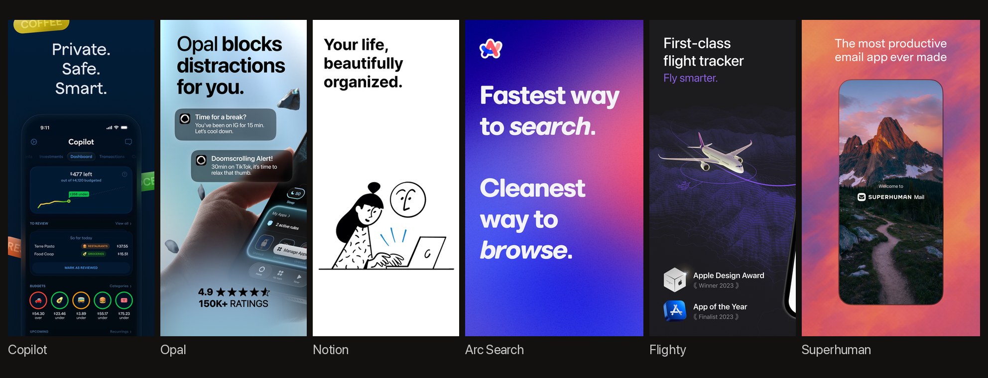
Copilot opens with three one-word sentences. Opal opens with the product as a verb. Notion opens with an illustration and no interface at all. The seven feature-first openers (Darkroom’s “Refine every detail with AI backed Masks”, Photomator’s “Desktop-class color adjustments.”, Focos, Gentler Streak, Bear, Things, Duolingo) are competent, and none of them tells you why the app exists. Keynote’s title card names the category and nothing else.
Proof sits in frames one or two in 16 of 37. Calm spends its first two frames on it before showing a single screen: “The #1 App for Sleep & Meditation”, “3M 5-Star Reviews”, “App Store Awards / WINNER”, then “Trusted by millions. Recommended by experts.” with Newsweek, an Editor’s Choice badge, and five press logos. Strava’s first frame is the Apple Watch App of the Year laurel and the logo, with the devices small beneath them. Opal puts a 4.9-star rating with “150K+ RATINGS” under its first phone and the Design Award in frame two.
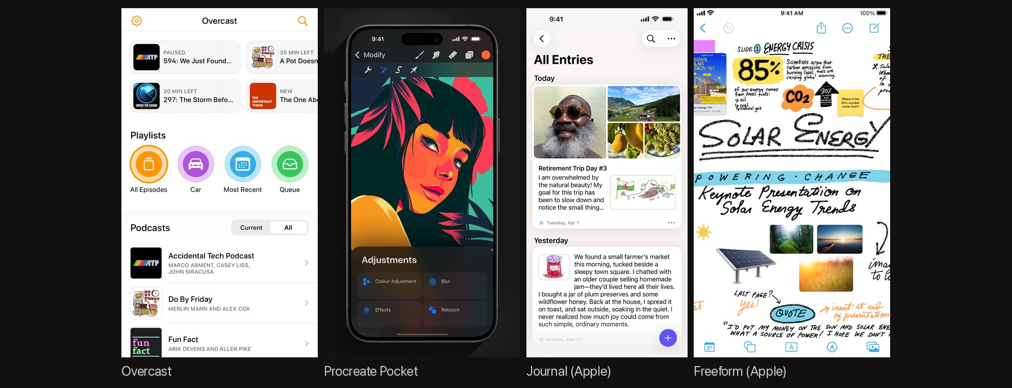
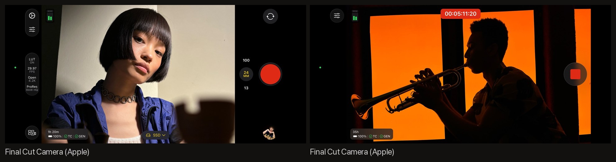
Six sets have no captions at all. Overcast ships one plain screenshot. Procreate Pocket shows the artwork on nine phones and lets it speak. Apple’s Final Cut Camera, Freeform, Journal, and Invites are raw captures, and Keynote captions only its first frame. When the screen is beautiful or obvious, the product is the message.
Headlines are short, second person, and built on a verb. Thirty of the 31 captioned sets keep frame one’s headline to eight words or fewer, most to three to six. The house grammar of the category is imperative verb plus “your”: “Track your workouts” (Strava), “Understand your Sleep”, “Understand your Recovery”, “Understand your Strain” (WHOOP, three frames running), “Organize your life’s work.” (Notion), “Plan your shoots.” (Lumy). Nobody writes “users”.
Captions sit at the top in 28 of 31. Duolingo is the exception the whole industry knows: lowercase benefit pills at the bottom in the brand’s colors, no device frame. Endel’s before-and-after pair puts the words below the phone, and Keynote’s one caption sits under its photograph.
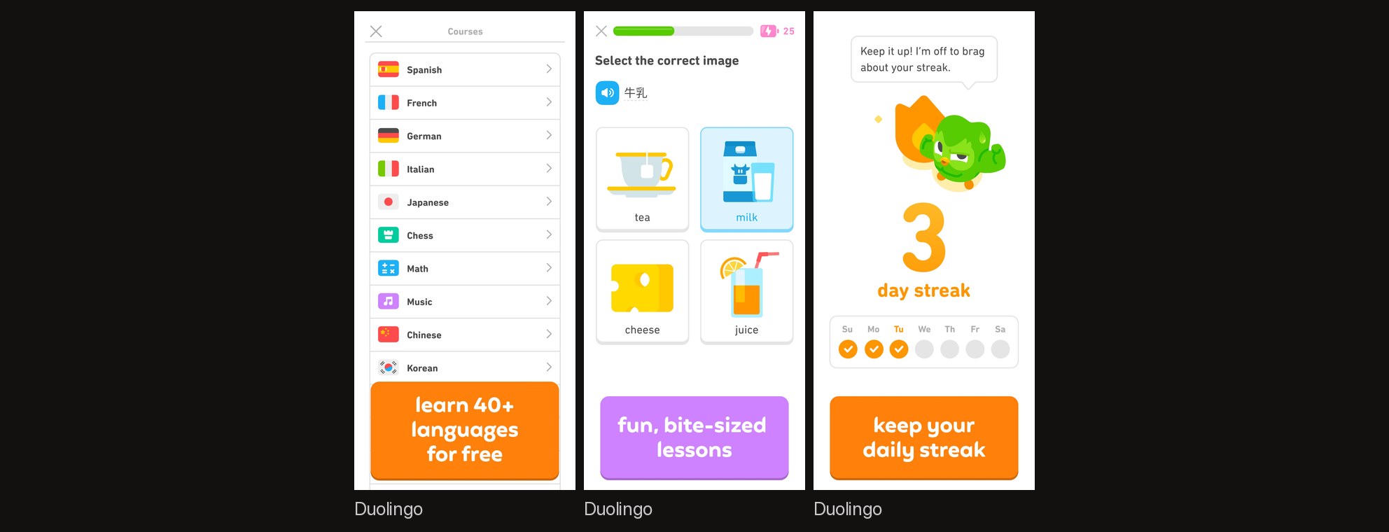
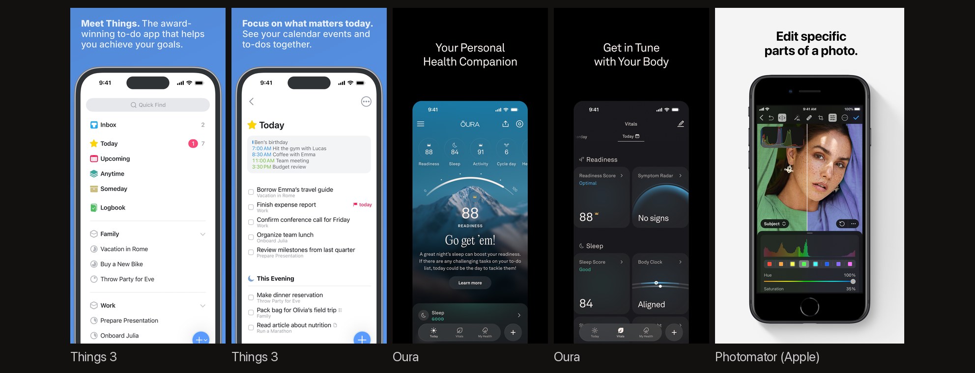
Composition rhythm splits the captioned sets down the middle. Of the 31, 16 change the composition from frame to frame: a tilted phone, a cropped phone, a floating card, a full-bleed photograph, and two devices. The other 15 repeat one template, the same phone in the same place with a new caption. The template works when the interface itself is the argument (Things, Notion) and reads flat when it is not (Oura, whose six frames I read are thin title-case lines over identical phones, the least persuasive set of the 37).
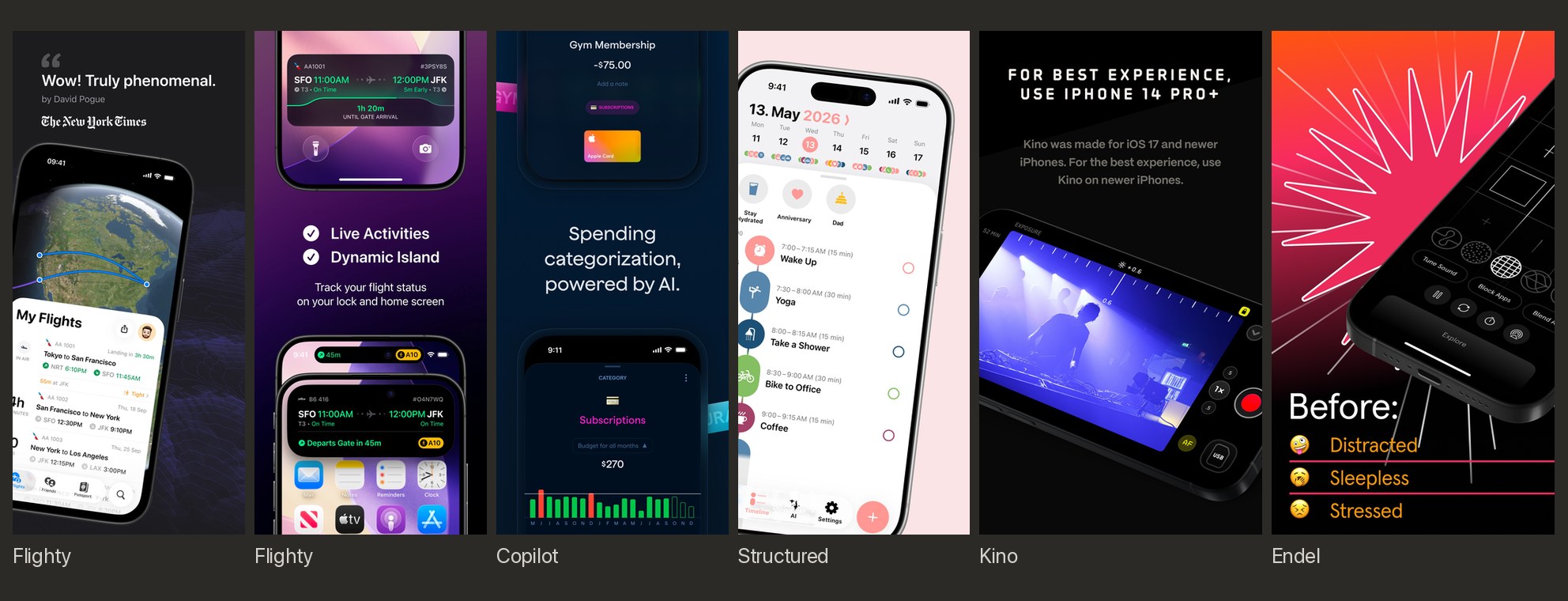
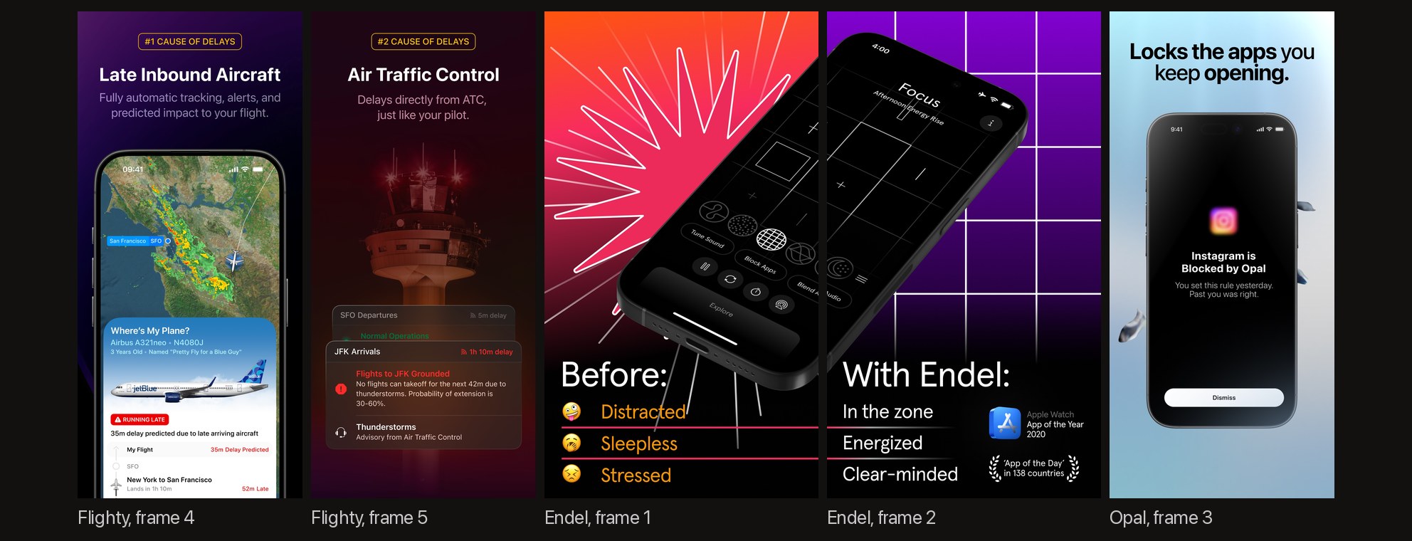
The best frames teach. Flighty’s fourth and fifth frames are “#1 CAUSE OF DELAYS / Late Inbound Aircraft” and “#2 CAUSE OF DELAYS / Air Traffic Control / Delays directly from ATC, just like your pilot.” They sell the app by telling you something true about flying. Endel opens with “Before: Distracted / Sleepless / Stressed” and answers it in frame two with “With Endel: In the zone / Energized / Clear-minded”, three stacked lines under each heading. Opal’s third frame shows its own in-app copy, “Instagram is Blocked by Opal / You set this rule yesterday. Past you was right.”, and sells a voice.
Three smaller counts. Privacy earns a whole frame in four sets (Copilot’s opener, Kino’s “TRULY PRIVATE”, Gentler Streak’s “Your Data Stays Yours … No user accounts. No servers.”, Arc’s incognito frame), rare enough to be a differentiator. People are rare: three sets show a hand holding the phone, and most are product-only. Numbers appear as specific claims: Endel’s “71% of cases”, Opal’s rating count, Copilot’s balances. Not Boring Habits numbers its frames 1, 2, 3, and the numbering earns its place because the frames are a sequence.
Two schools
Read enough sets and they sort into two.
Apple’s school. A quiet ground, one sentence with a full stop, the product and little else. Photomator: “Desktop-class color adjustments.” “Magically remove unwanted objects.” “Edit specific parts of a photo.” Apple Sports, three frames total: “Real-time scores. Fast and simple.” “Your favorite teams and leagues, all in one place.” “Live stats, game updates, and more.”17 Or no words at all, as with Journal, Freeform, Invites, and Final Cut Camera, whose eight landscape frames are simply the app recording six different subjects. Not even Apple’s own sets are pure: Photomator’s frames show an older home-button iPhone with a soft drop shadow, and Apple’s marketing guidelines ask for the latest device and no shadows.5
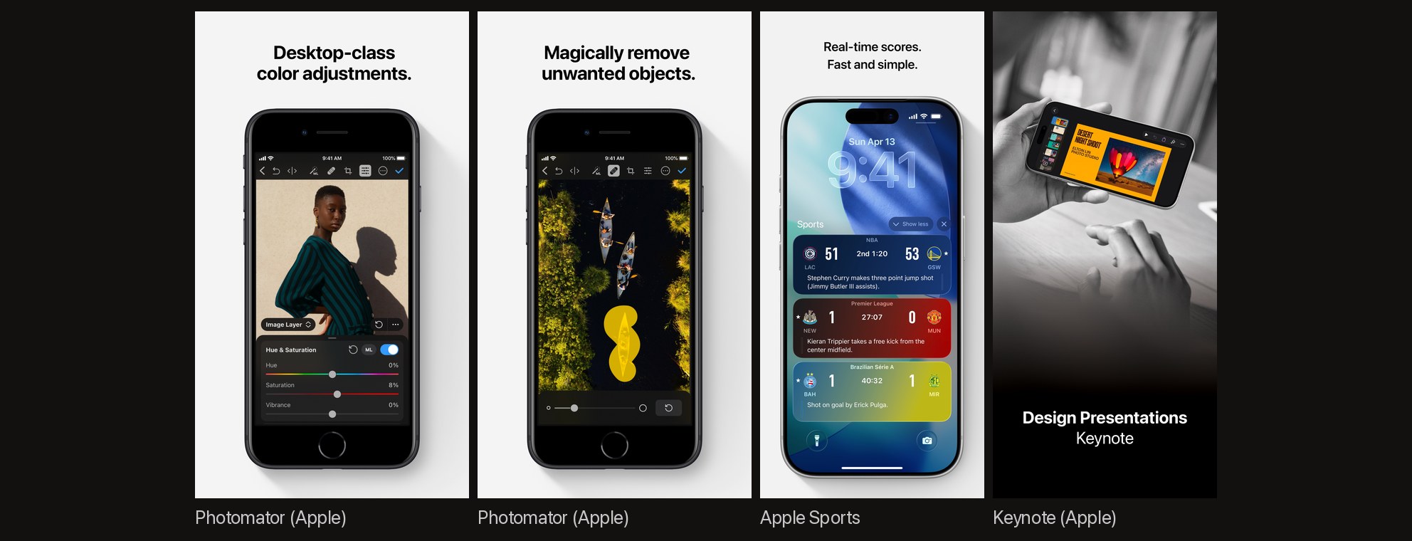
Notion, Copilot, Opal, Arc, and Strava write in the same register, full sentences and full stops, and they are the third-party sets that read most like Apple wrote them.
The award-winner school. A dark or saturated ground, a claim up top, proof early, and a composition that moves from frame to frame. Flighty, Copilot, Structured, Opal, Endel, and Halide. Where Apple’s school trusts the product to carry the frame, the award-winner school treats each frame as a poster with the product in it.
Both hold up, to my eye. What reads worst to me is the middle: a uniform template with feature captions on an app whose interface cannot carry the frame by itself. The template borrows Apple’s restraint without Apple’s product photography, and borrows the award winners’ captions without their claims. It is also the most common set among the 37 I read, and the default output of the screenshot tools I have used.
Where Apple’s rules and the winners disagree
Apple’s current guidance, the 2026 asset best-practices page that also covers the new creative-asset types and the marketing guidelines for its device images, says two things the winning sets ignore.45
On accolades. The page tells you to “Stay focused on the core user experience” and to “avoid using the entire asset to highlight general accolades or call-to-action statements.” Further down: “Please don’t include any Apple-designated recognitions” and it names them: “such as Editor’s Choice, App of the Day, Game of the Day, or Apple Design Award winner, as many of these already appear alongside your app or game in search results, as well as on your product page.”4 Thirteen of the 37 sets I read put exactly those laurels in their first two frames, and the group includes the most-cited sets in the store: Flighty’s Design Award, Calm’s Editor’s Choice, Structured’s App of the Day, Headspace’s Design Award, Strava’s App of the Year.
Apple’s reasoning is sound. The store already shows the award next to the app, so the frame repeats it. And a frame spent on laurels is a frame not spent on the app. But the reasoning is Apple’s, not the winners’, and no test I could find measures the trade.
On bezels. Apple’s Marketing Guidelines govern the device images Apple gives you: “Use Apple product images ‘as is’ and without modification. Modifications include adding reflections, shadows, highlights, or graphic elements that appear to enter or come out of the product screen; cropping, tilting, or obstructing any part of the images; animating, flipping, or spinning the images; or creating buttons or icons with a product image.” And: “Straight-on product shots are preferred. Don’t use extreme angles or alter an Apple product in any way.”5 The bezels themselves come from Apple Design Resources as Photoshop and PNG files for every current device.6
Read that against the award-winner school. Flighty tilts the phone. Copilot crops it top and bottom and floats category tags across it. Opal shows it at an angle in a hand. Structured tilts it. Rendering your own device instead of using Apple’s file does not get you out of the no-alteration rule. The same page’s product-images section opens with “Use Apple-provided product bezels in all your marketing materials to display your app on the Apple devices it supports.” The straight-on line sits in its section on custom photography and video, the imagery you make yourself, and there it is a preference (“preferred”) next to a prohibition (“Don’t use extreme angles or alter an Apple product in any way”).5 Neither document says what App Review does about a cropped bezel: guideline 2.3 is what App Review cites for screenshots, and the marketing guidelines are the terms for using Apple’s device images and trademarks.35 It is still the rule, and I will come back to it, because we broke it too.
One more change is coming. Apple’s WWDC26 App Store guide announced “creative assets”, a third asset type beyond previews and screenshots that “can be used to highlight your brand, promote seasonal offerings, showcase new content, and more.” They appear in product page headers and search results on iOS 27, to be submitted through a new Asset Library and checked in a product page preview tool, both listed as coming this fall.418 Apple’s guidance for those assets is the same page quoted above, and its accolade rule sits in the best practices that cover every asset type, so the Apple-designated laurels have no home there either.4 The brand frame is about to have a proper home that is not your screenshot gallery; the laurel frame is not.
What the tests can and cannot tell you
Apple has published three product-page tests with impression counts, all in one 2023 Tech Talk on Product Page Optimization.7
| Test | Change | Result | Evidence |
|---|---|---|---|
| Peak Brain Training | Three alternate icons | “8% higher conversion rate and over 98% confidence” | 44 days, “an average of 154,000 impressions per treatment” |
| Angry Birds 2 | Seasonal art vs the original | “the original product page with the Evergreen art performed better than the seasonal creative with a 1.5% higher conversion rate, and 100% confidence” | 20 days in December, “an average of 2 million impressions per treatment” |
| Simply Piano | A screenshot in place of the app preview | “The treatment with the screenshot, meaning no app preview, performed better, 3.3% higher conversion rate, and 100% confidence” | 12 days, “an average of 430,000 impressions per treatment” |
Three things follow. The lifts are single digits at six- and seven-figure impression counts. A redesign lost to the page it replaced. And the one video result Apple has published is a case where removing the video won. Apple’s Product Page Optimization page carries the same case as a card: “3%” and “Assets tested: App preview video” at the top, and in its results line, “The original product page without an app preview video outperformed the treatment, contrary to the developer’s hypothesis.”8 Read the headline alone and it looks like a video won. Read the results line and it did not. Apple’s two tellings even disagree about which version was the original, since the transcript calls the no-video page the treatment; they agree on the winner. The transcript is the one with the impressions.
The vendor numbers are larger and softer. SplitMetrics reports a 32 percent lift for ZiMAD’s Bubble Birds 4 after “shorter action-packed captions” replaced feature lists (“Challenging and rewarding gameplay” became “Birds challenge you!”), but the same test also added a character overlay to every frame and swapped plain screenshots for “a healthy mix of art overlays, real screenshots, and gameplay elements.” So the caption rewrite cannot be isolated, and the page states no impressions, platform, or date.12 The same vendor’s Rovio case found “Portrait app screenshots did better in terms of conversion which is, to some extent, against the industry standards” for a landscape game, with a 13 percent lift for a combination of assets.13 Its guide to app previews claims “adding a high-quality preview video can boost conversion rates by 20-40% compared to screenshots alone”, attributes that to “recent data from Apple and leading ASO platforms”, and cites no study; Apple’s only published number points the other way.147 A 2020 SplitMetrics post reports that creatives with people or characters “show a 5-10% improvement” in named categories (photo editors, fitness, finance, hardcore games), with no count of tests and no result for the categories where people did not help.15 The 36 percent lift ZiMAD saw in Japan came from redesigning the screenshots to local conventions, not from translating captions.16
The most-repeated numbers in the field are orphans. “60% of your visitors won’t scroll beyond your First Impression” and “50% of your installers make their decision based on the First Impression only” come from a 2021 Storemaven post that describes itself as “based on more than 500M sessions and 4+ years of analyzing the leading app developers” and gives no sample, period, or method for either statistic; the live page still carries the article, now under a navigation bar selling crypto casinos.11 Cite them as a vendor’s claim from that year or not at all. Apple’s one aggregate number, “a 2.5 percentage point increase on average” for custom product pages, compares targeted traffic on tailored pages with default pages, so it bundles audience with creative and says nothing about screenshots alone.9
And then the gaps. In every source I could open, nobody reports a controlled test of caption presence, caption length, top versus bottom placement, or font size. Nobody reports one for device frames versus frameless crops, dark versus light grounds, or panoramic sets. AppTweak’s current screenshot guide, updated November 2025, is advice; its two numbers are a 50-millisecond attention claim and a client’s lift from A/B testing in general, neither about captions.21 The five-words-or-fewer and 60/40-in-favor-of-top figures that screenshot tools repeat trace to no test I could find. Those are conventions, and the 37-set read above is a description of the convention, not evidence that it converts.
What the platform owners agree on is method. Apple: “Limit the number of variables in the test by testing a single asset at a time.” Run “for at least one week and in seven day increments.” Wait for 90 percent confidence before applying a treatment.78 Google, for Play: “We recommend testing changes to one asset at a time, so you can be as certain as possible of what causes any changes to your store listing performance.”10 The headline vendor lifts are bundles, which is why they cannot be attributed to any one change and why they teach little. Apple adds the other caution: each published result is that developer’s, and the talk says not to apply one as a general rule.7
A worked example: our own set, three times
Founder Camera is a front-camera recorder we are taking to the App Store: it hides your face while you talk, draws a faint outline from the depth sensor so you can stay centered, turns the screen into the lamp, and scrolls a Markdown script just under the lens. The first set we built for it looked like the middle of the field.22
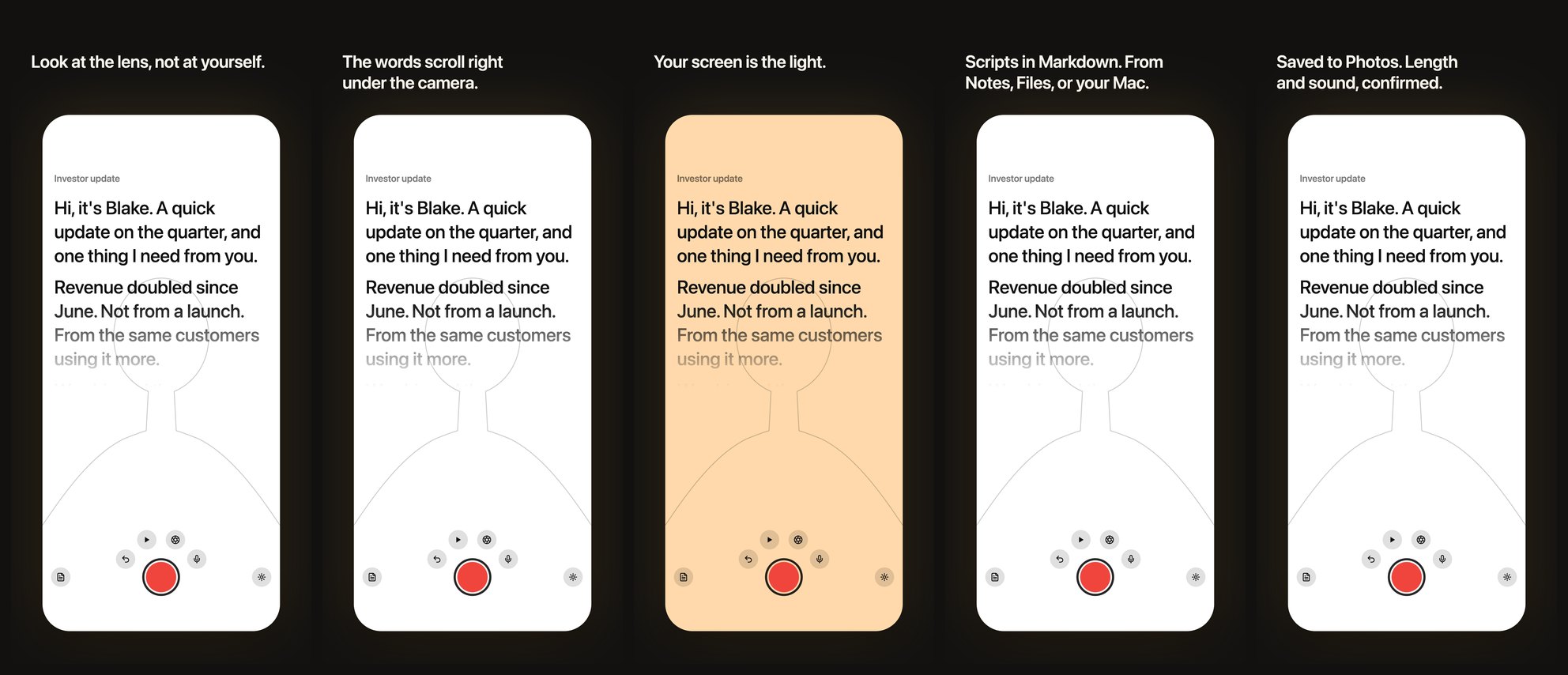
Five tiles, one template, a caption per feature: “Look at the lens, not at yourself.” “The words scroll right under the camera.” “Your screen is the light.” “Scripts in Markdown. From Notes, Files, or your Mac.” “Saved to Photos. Length and sound, confirmed.” Every claim true. Every frame the same. Nothing in it told a founder why the app exists, and the person paying for it said so in one sentence: every screen is the same, it sells features, not the positioning.
The second set rebuilt the sequence around the why, in the order a founder feels it.
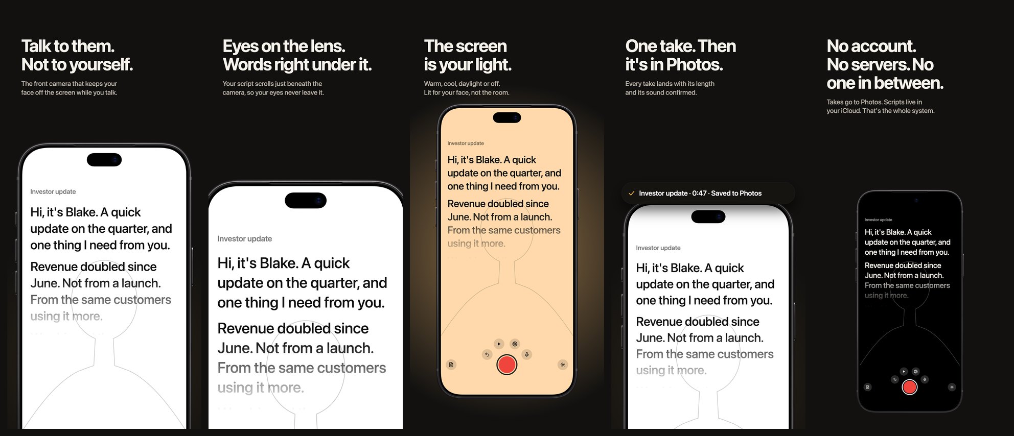
Frame one is the point of view: “Talk to them. Not to yourself.” Frame two is the mechanism, cropped close to the camera so the words under it are the whole picture. Frame three is the light, a warm screen glowing on the dark ground. Frame four is the outcome, the receipt lifted off the screen. Frame five is trust, type first, the phone small and dark. Five compositions, one voice, full stops.
Then the research caught up with it. Frames one, two, and four crop Apple’s iPhone 18 Pro Max bezel. Frame three puts a glow behind it. Frame four floats an element out of the screen. Apple’s marketing guidelines forbid all three for its own device images.5 The third pass keeps every headline and every claim and puts the phone back: whole, straight, unshadowed, with the rhythm coming from scale, ground, and type instead.
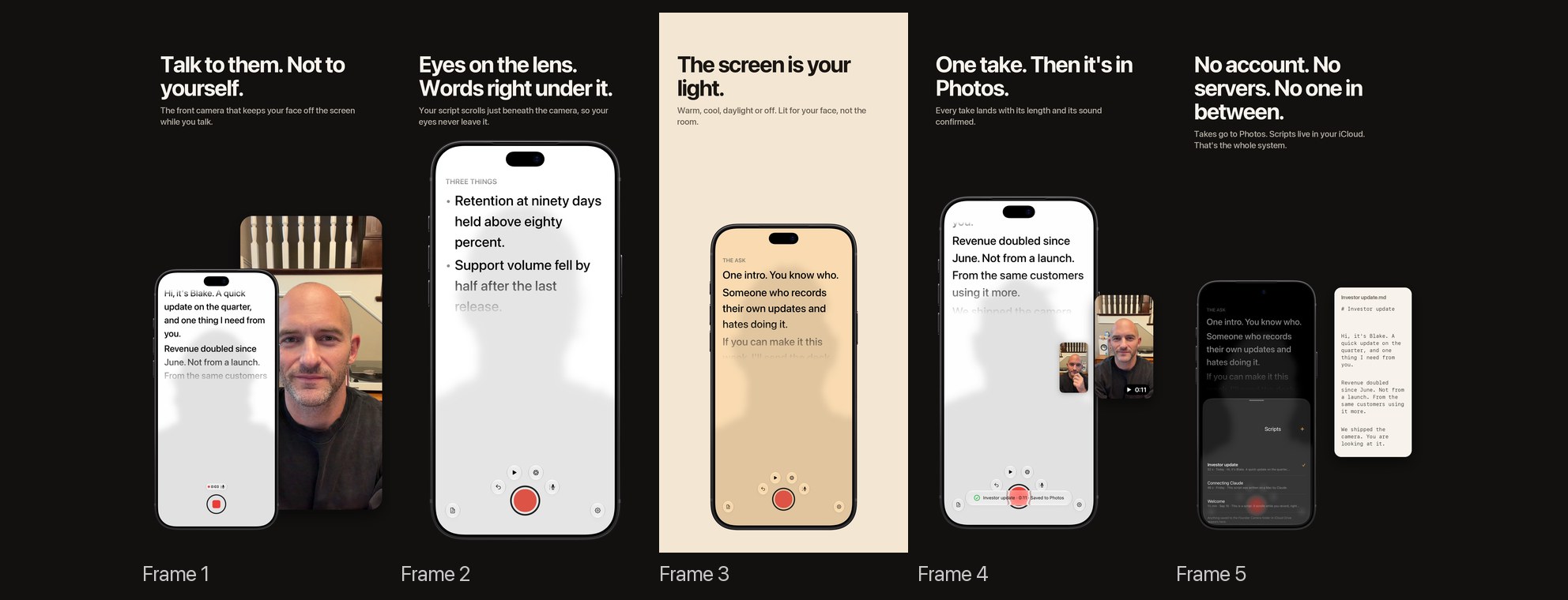
The award winners get their variety from crops and tilts. The version of that which stays inside Apple’s rules is the Apple school’s own answer: scale and negative space. Frame two’s phone is the largest, frame five’s the smallest, and the light frame is the one bright tile in the row. Whether the third set converts is a test, not an opinion, and the second set cannot be the control, since it cannot go up at all under Apple’s terms for its device images. The first run through Product Page Optimization will hold the third set constant and change one thing, frame one’s headline, against a compliant variant.
What the set still lacks is proof, which 16 of 37 sets put up front. Apple’s guidance rules out the Apple-designated kind, and we have no award to be told not to use anyway; a star count or a user’s sentence is still ours. The honest substitute is a sentence from a tester once the TestFlight group has recorded with it, sharing frame two with the app rather than replacing it.
How to build the set
- Write the why before you open a design tool. One sentence a stranger could repeat. If it lists features, it is not the sentence. Ours took three tries.
- Give each frame one claim, in order of how the user feels it. Apple’s own words: “sequence them so they tell a cohesive story that’s reflective of how someone would use your app or game.”4 Problem, mechanism, feeling, outcome, trust is one order that works.
- Keep the caption a phrase that adds to the picture. Apple: “a short phrase that enhances your visual rather than describes it.”4 Second person, a verb, a full stop, eight words or fewer, and nothing the screen already says.
- Decide what proof you may use. Star counts, press quotes, and user quotes are yours to use, inside a frame that still shows the app; Apple asks you not to spend the whole asset on them. Apple-designated recognitions are, per Apple’s current guidance, already on the page and should stay off the frame.4
- Show the app in use, and show it straight. Guideline 2.3.3 for what goes in the frame; the marketing guidelines for the device around it, if you use Apple’s files: whole, unshadowed, untilted, copy beside it rather than on it.35
- Ship one 6.9-inch set at 1320×2868. Everything smaller scales from it, and Apple requires the 6.5-inch size only when the 6.9-inch set is absent.2
- Then test one thing. Product Page Optimization gives you three treatments, up to 90 days, and a confidence number; change one asset per treatment, run in seven-day increments, and apply nothing under 90 percent.78 Expect a result you can attribute, not a headline number.
Key Takeaways
For founders and indie developers:
- Your search result is your first one to three frames. Write the point of view first and make it frame one; the feature list can wait until frame four.1
- In Apple’s three published tests the lifts are single digits, and Apple says each result was that developer’s. A screenshot change that moves conversion 3 percent at 90 percent confidence is a result worth applying, not a failed one.7
- If you are using Apple’s bezel files, read the marketing guidelines before you crop or tilt anything. The award winners’ compositions are not available to you with Apple’s assets.5
For designers:
- Two schools hold up: Apple’s restraint with a product that can carry the frame, or the poster approach with a claim and moving composition. The uniform feature-caption template is the one to avoid, and it is what the screenshot tools I have used produce by default.
- I found no published, controlled result isolating caption presence, length, placement, size, device frames, or backgrounds. Follow the convention (top, short, and second person) as a convention, and spend your testing budget on the claim in frame one.
For marketers running tests:
- One asset per treatment, seven-day increments, 90 percent confidence, then apply. Apple and Google agree on the one-asset rule, and the combined vendor lifts above cannot establish the effect of any individual change.710
- Retire the Storemaven scroll statistics unless Storemaven publishes the method behind them.11
- Watch the creative-asset rollout on iOS 27. Brand frames are getting their own slot, in product page headers and search; Apple-designated laurels stay off every asset type.418
Related on this site: the social-media checkbox and the EU tracking prompt are the other two App Store changes this month to read before you submit, the privacy manifest deep dive covers the declaration Apple reads alongside your assets, the resizable iPhone checklist is the layout work the screenshots have to show, and the 941 Tiles launch post is our other App Store listing, built under a rule Apple said could not be met.
References
-
Apple, “Creating Your Product Page,” App Store, Apple Developer. Fetched September 22, 2026. ↩↩↩↩↩
-
Apple, “Screenshot specifications,” App Store Connect Help. Fetched September 22, 2026. ↩↩↩
-
Apple, “App Review Guidelines,” Apple Developer, sections 2.3.3 and 2.3.7. Page marked “Last Updated: June 8, 2026”. Fetched September 22, 2026. ↩↩↩↩
-
Apple, “Asset best practices,” App Store, Apple Developer. Fetched September 22, 2026. ↩↩↩↩↩↩↩↩↩↩
-
Apple, “Marketing Resources and Identity Guidelines,” App Store, Apple Developer, sections “Apple Product Images,” “Image Use,” and “Custom Photography and Video: Product Use.” Fetched September 22, 2026. ↩↩↩↩↩↩↩↩
-
Apple, “Apple Design Resources: Product Bezels,” Apple Developer. Fetched September 22, 2026. ↩
-
Apple, “Make the most of product page optimization,” Tech Talk 110349, February 28, 2023. Transcript quotes; fetched September 22, 2026. ↩↩↩↩↩↩↩↩↩↩
-
Apple, “Product Page Optimization,” App Store, Apple Developer. Fetched September 22, 2026. ↩↩↩
-
Apple, “Custom Product Pages,” App Store, Apple Developer. Fetched September 22, 2026. ↩
-
Google, “Run A/B tests on your store listing,” Play Console Help. Fetched September 22, 2026. ↩↩
-
Storemaven, “App Store Statistics Revealed: What We Learned from Analyzing 500M Sessions,” published December 27, 2021, archived copy via the Internet Archive; the live URL still carried the article on September 22, 2026, under a site navigation that now advertises crypto casinos. Vendor source; the page states an aggregate of “more than 500M sessions” and no per-statistic methodology. ↩↩
-
SplitMetrics, “ZiMAD: App Screenshots Redesign Results in 32% Conversion Lift,” SplitMetrics case study. Undated; the app dates from the mid-2010s. Vendor source; three changes tested together. ↩
-
SplitMetrics, “App Screenshots A/B Testing Helps Rovio get 2.5M Additional Installs,” SplitMetrics case study. Undated; Angry Birds 2 launched in 2015. Vendor source. ↩
-
SplitMetrics, “An ASO Guide to App Store Preview Videos,” SplitMetrics blog. Living guide; fetched September 22, 2026. The 20 to 40 percent figure is attributed to “recent data from Apple and leading ASO platforms” and to no named study. ↩↩
-
SplitMetrics, “Optimizing App Store Creatives and Screenshots With People & Characters,” SplitMetrics blog, July 31, 2020. Vendor source; number of tests not stated. ↩
-
SplitMetrics, “How ZiMAD Localized App Store Screenshots and Got 36% CR Uplift,” SplitMetrics case study. Undated. Vendor source. ↩
-
Author’s analysis. The current US App Store screenshot sets of 37 iPhone apps, retrieved on September 22, 2026 through Apple’s iTunes Search API and read from the first six frames of each: Flighty, Halide Mark III, Things 3, Bear, Craft, Fantastical, Overcast, CARROT Weather, Duolingo, Headspace, Calm, Notion, Copilot, Structured, Ivory, Kino, Endel, Gentler Streak, Final Cut Camera, Freeform, Journal, Apple Sports, Apple Invites, Keynote, Procreate Pocket, Darkroom, Photomator, Focos, Lumy, (Not Boring) Habits, Opal, Superhuman, Arc Search, Perplexity, Strava, WHOOP, Oura. Screenshots are the property of their developers and appear here for commentary. Counts are the author’s reading of the images. The 16 sets with proof in frames one or two, with the frame: Apple-designated recognitions in Flighty (1), Halide (2), Craft (1), Fantastical (1), Headspace (1), Calm (1 and 2), Structured (1), Endel (2), Darkroom (2), Lumy (1), Not Boring Habits (1), Opal (1, a rating count; 2, the award), and Strava (1), which is the 13; and proof of other kinds in Gentler Streak (1, a BGR quote), Arc Search (2, stars and a user quote), and Things 3 (1, an unspecified award claim, “The award-winning to-do app”). CARROT Weather’s laurels sit in frame three and are not counted. ↩↩↩
-
Apple, “App Store,” WWDC26 guides, sections on creative assets, Asset Library and the product page preview tool. Fetched September 22, 2026. ↩↩
-
Apple, “Show more with app previews,” App Store, Apple Developer. Fetched September 22, 2026. ↩
-
Apple, “Upload app previews and screenshots,” App Store Connect Help. Fetched September 22, 2026. ↩
-
Lina Danilchik, “How to optimize your app store screenshots: best practices,” AppTweak, updated November 21, 2025. Vendor source; advice without a cited test. ↩
-
Author’s analysis. Founder Camera by 941 Apps, in TestFlight at the time of writing; the author made all three screenshot sets and reproduced them from the design files. ↩↩
-
Apple, “App preview specifications,” App Store Connect Help. Fetched September 22, 2026. ↩