Halide: Professional Controls Made Accessible
Why Halide won Apple Design Award 2022: gesture-based camera controls, intelligent activation, and film-inspired UX. With SwiftUI implementation patterns.
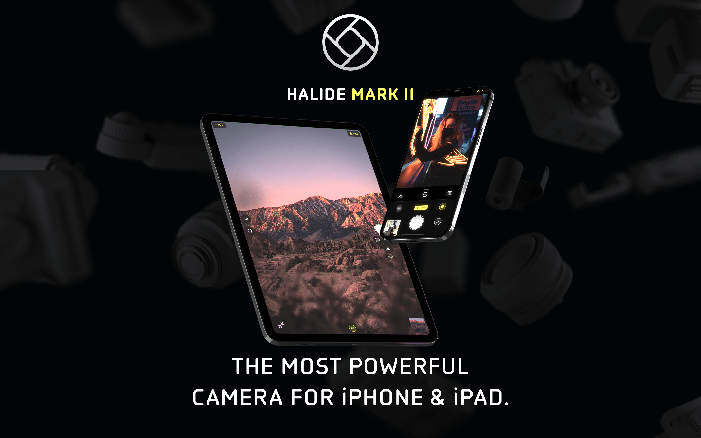
Halide: Professional Controls Made Accessible
“The complexity is there—it’s just not going to overwhelm you. When you’re offered a somewhat accessible way into this world, it can kindle excitement without intimidation.”
Halide proves that professional tools don’t need professional interfaces. Winner of Apple Design Award 2022, it hides DSLR-level controls behind intuitive gestures, revealing power only when you reach for it.
Why Halide Matters
Created by former Apple designer Sebastiaan de With and former Twitter engineer Ben Sandofsky, Halide bridges the gap between Apple’s simple camera and intimidating pro apps.
Key achievements: - Apple Design Award 2022 - Made RAW photography accessible with Instant RAW - Popularized gesture-based camera controls - One-handed operation on all iPhone sizes - 10,000+ 5-star reviews
Key Takeaways
- Hide complexity, don’t remove it - Professional features exist but stay invisible until summoned; the “flight simulator” interface isn’t the only way to expose power
- Intelligent activation beats toggle buttons - Tools that appear on interaction (focus loupe while dragging) are more intuitive than manual show/hide controls
- Gestures should feel physical - Vertical swipe for exposure, horizontal for focus maps directly to real camera dial behavior
- Teach while using - Brief labels on state changes help users learn photography terminology naturally, without a separate tutorial
- One-handed operation is a design constraint - Designing for thumb reach forces good information hierarchy and prioritizes essential controls
Core Design Philosophy
“Stay Out of the Way”
Halide’s guiding principle: tools should appear when needed, disappear when not.
OTHER PRO CAMERA APPS                 HALIDE'S APPROACH
───────────────────────────────────────────────────────────────────
"Flight simulator" UI                 Clean viewfinder
All controls visible always           Controls appear on demand
Learn UI before using                 Learn while using
Fixed layout                          Customizable toolbar
Manual-only workflow                  Auto mode + manual available
Key insight: “Other camera apps looked like flight simulators with lots of dials, which was intimidating, even for someone like me who loves film cameras.”
Film Camera Inspiration
Halide translates the tactile joy of analog cameras to touchscreen gestures.
FILM CAMERA                          HALIDE TRANSLATION
───────────────────────────────────────────────────────────────────
Aperture ring rotation               Vertical swipe for exposure
Focus ring rotation                  Horizontal swipe for focus
Mechanical click stops               Haptic feedback
Physical viewfinder                  Full-screen composition
Light meter needle                   Digital histogram
Manual/Auto switch                   AF button toggle
Design goal: “Give a child a camera and they’ll play with the aperture ring and the dials and the switches. Maybe we can bring a semblance of that delight to an app on a piece of glass.”
Pattern Library
1. Intelligent Activation
Controls appear contextually when needed, then disappear. No manual show/hide required.
Example: Focus Loupe
DEFAULT STATE
┌─────────────────────────────────────────────┐
│                                             │
│              [Viewfinder]                   │
│                                             │
│                                             │
│                                             │
│  [Focus dial at bottom]                     │
└─────────────────────────────────────────────┘

WHEN USER TOUCHES FOCUS DIAL
┌─────────────────────────────────────────────┐
│  ┌──────────┐                               │
│  │ FOCUS    │  ← Focus loupe appears        │
│  │ LOUPE    │    automatically              │
│  │ (zoomed) │                               │
│  └──────────┘                               │
│                                             │
│  [Focus dial active]                        │
└─────────────────────────────────────────────┘

WHEN USER RELEASES
┌─────────────────────────────────────────────┐
│                                             │
│              [Viewfinder]                   │
│                   ↑                         │
│         Loupe fades out                     │
│                                             │
│  [Focus dial at rest]                       │
└─────────────────────────────────────────────┘
SwiftUI implementation concept:
struct IntelligentActivation<Content: View, Tool: View>: View {
    @Binding var isInteracting: Bool
    let content: Content
    let tool: Tool

    var body: some View {
        ZStack {
            content

            tool
                .opacity(isInteracting ? 1 : 0)
                .animation(.easeInOut(duration: 0.2), value: isInteracting)
        }
    }
}

struct FocusControl: View {
    @State private var isDragging = false
    @State private var focusValue: Double = 0.5

    var body: some View {
        ZStack {
            // Viewfinder
            CameraPreview()

            // Focus loupe - appears when dragging
            IntelligentActivation(isInteracting: $isDragging, content: EmptyView()) {
                FocusLoupeView(zoomLevel: 3.0)
                    .frame(width: 120, height: 120)
                    .position(x: 80, y: 80)
            }

            // Focus dial
            VStack {
                Spacer()
                FocusDial(value: $focusValue)
                    .gesture(
                        DragGesture()
                            .onChanged { _ in
                                isDragging = true
                            }
                            .onEnded { _ in
                                isDragging = false
                            }
                    )
            }
        }
    }
}
2. Progressive Disclosure
Simple by default, complex when needed. The UI transforms based on mode.
Mode transformation:
AUTO MODE (Default)
┌─────────────────────────────────────────────┐
│                                             │
│              [Viewfinder]                   │
│                                             │
│                                             │
│ ┌───┐                               ┌───┐   │
│ │ [F] │                               │ AF │   │
│ └───┘                               └───┘   │
│              ┌───────────┐                  │
│              │   (●)     │  ← Shutter       │
│              └───────────┘                  │
└─────────────────────────────────────────────┘
Minimal controls. Just shoot.

MANUAL MODE (After tapping "AF" → "MF")
┌─────────────────────────────────────────────┐
│  [Histogram]                   [Focus Peak] │
│                                             │
│              [Viewfinder]                   │
│                                             │
│ ┌───┐ ┌───┐ ┌───┐              ┌────┐      │
│ │ [F] │ │WB │ │ISO│              │ MF │      │
│ └───┘ └───┘ └───┘              └────┘      │
│              ┌───────────┐                  │
│  [────────────────●───────] ← Focus dial   │
│              │   (●)     │                  │
│              └───────────┘                  │
└─────────────────────────────────────────────┘
Full controls revealed. Pro tools accessible.
Implementation:
enum CameraMode {
    case auto
    case manual

    var visibleControls: [CameraControl] {
        switch self {
        case .auto:
            return [.flash, .shutter, .autoFocus]
        case .manual:
            return [.flash, .whiteBalance, .iso, .shutter,
                    .manualFocus, .histogram, .focusPeaking]
        }
    }
}

struct AdaptiveToolbar: View {
    @Binding var mode: CameraMode

    var body: some View {
        HStack {
            ForEach(mode.visibleControls, id: \.self) { control in
                ControlButton(control: control)
                    .transition(.asymmetric(
                        insertion: .scale.combined(with: .opacity),
                        removal: .scale.combined(with: .opacity)
                    ))
            }
        }
        .animation(.spring(response: 0.3), value: mode)
    }
}
3. Gesture-Based Controls
Exposure and focus controlled through swipes, like physical camera dials.
EXPOSURE CONTROL (Vertical swipe anywhere)
           ↑ Swipe up = brighter
           │
    ───────┼─────── Current exposure
           │
           ↓ Swipe down = darker

FOCUS CONTROL (Horizontal swipe on dial)
    Near ←────────●────────→ Far
                  │
            Current focus

QUICK ACTIONS (Edge swipes)
    ← Left edge: Switch to photo library
    → Right edge: Open manual controls panel
Implementation:
struct GestureCamera: View {
    @State private var exposure: Double = 0
    @State private var focus: Double = 0.5

    var body: some View {
        ZStack {
            CameraPreview()

            // Exposure gesture (anywhere on screen)
            Color.clear
                .contentShape(Rectangle())
                .gesture(
                    DragGesture()
                        .onChanged { value in
                            // Vertical translation maps to exposure
                            let delta = -value.translation.height / 500
                            exposure = max(-2, min(2, exposure + delta))
                            HapticsEngine.impact(.light)
                        }
                )

            // Visual feedback
            VStack {
                Spacer()
                ExposureIndicator(value: exposure)
                    .opacity(exposure != 0 ? 1 : 0)
            }
        }
    }
}

struct ExposureIndicator: View {
    let value: Double

    var body: some View {
        HStack {
            Image(systemName: value > 0 ? "sun.max.fill" : "moon.fill")
            Text(String(format: "%+.1f", value))
                .monospacedDigit()
        }
        .font(.caption)
        .padding(8)
        .background(.ultraThinMaterial)
        .clipShape(Capsule())
    }
}
4. Educational Micro-Copy
When users interact with controls, brief labels teach them the terminology.
USER TAPS "AF" → Switches to "MF"
┌────────────────────────────────┐
│  Manual Focus                  │  ← Appears briefly
│  Swipe to adjust distance      │
└────────────────────────────────┘
   Fades after 2 seconds

USER ENABLES FOCUS PEAKING
┌────────────────────────────────┐
│  Focus Peaking                 │
│  Red highlights = in focus     │
└────────────────────────────────┘
Implementation:
struct EducationalToast: View {
    let title: String
    let description: String
    @Binding var isVisible: Bool

    var body: some View {
        VStack(alignment: .leading, spacing: 4) {
            Text(title)
                .font(.headline)
            Text(description)
                .font(.caption)
                .foregroundStyle(.secondary)
        }
        .padding()
        .background(.ultraThinMaterial)
        .clipShape(RoundedRectangle(cornerRadius: 12))
        .opacity(isVisible ? 1 : 0)
        .onAppear {
            DispatchQueue.main.asyncAfter(deadline: .now() + 2) {
                withAnimation { isVisible = false }
            }
        }
    }
}

// Usage
struct FocusModeToggle: View {
    @State private var showToast = false
    @Binding var isManual: Bool

    var body: some View {
        Button(isManual ? "MF" : "AF") {
            isManual.toggle()
            showToast = true
        }
        .overlay(alignment: .top) {
            EducationalToast(
                title: isManual ? "Manual Focus" : "Auto Focus",
                description: isManual
                    ? "Swipe to adjust distance"
                    : "Tap to focus on subject",
                isVisible: $showToast
            )
            .offset(y: -60)
        }
    }
}
5. Pro Tools (Histogram, Focus Peaking, Zebras)
Professional visualization tools available but not overwhelming.
Histogram options:
PLACEMENT OPTIONS
┌─────────────────────────────────────────────┐
│ [▁▂▃▅▇█▅▃▁]                                 │  ← Top corner (minimal)
│                                             │
│              [Viewfinder]                   │
│                                             │
└─────────────────────────────────────────────┘

┌─────────────────────────────────────────────┐
│              [Viewfinder]                   │
│                                             │
│   ┌─────────────────────────────────────┐   │
│   │ ▁▂▃▅▇██▅▃▂▁ RGB                     │   │  ← Bottom (detailed)
│   └─────────────────────────────────────┘   │
└─────────────────────────────────────────────┘

HISTOGRAM TYPES (cycle by tapping)
1. Luminance (monochrome)
2. RGB (color channels)
3. Waveform (vertical distribution)
Focus peaking overlay:
struct FocusPeakingOverlay: View {
    let enabled: Bool
    let peakingColor: Color = .red

    var body: some View {
        if enabled {
            // Metal shader would be used in production
            // Highlights edges at focus plane
            GeometryReader { _ in
                // Overlay that highlights in-focus areas
                // Based on edge detection at current focus distance
            }
            .blendMode(.plusLighter)
        }
    }
}

struct ZebraOverlay: View {
    let threshold: Double  // 0.0 to 1.0
    let pattern: ZebraPattern = .diagonal

    enum ZebraPattern {
        case diagonal
        case horizontal
    }

    var body: some View {
        // Striped overlay on overexposed areas
        // Helps identify clipping before capture
    }
}
6. Customizable Toolbar
Users can rearrange tools to match their workflow.
DEFAULT TOOLBAR
[Flash] [Grid] [Timer] ─(●)─ [RAW] [AF] [Settings]

LONG-PRESS TO CUSTOMIZE
┌─────────────────────────────────────────────┐
│  Drag to reorder                            │
│                                             │
│  [Flash]   [Grid]   [Timer]                 │
│     ↕         ↕         ↕                   │
│  [RAW]    [Macro]  [Settings]               │
│                                             │
│  Hidden:                                    │
│  [Zebra] [Waveform] [Depth]                 │
│                                             │
│  [Reset to Default]           [Done]        │
└─────────────────────────────────────────────┘
Implementation:
struct CustomizableToolbar: View {
    @State private var tools: [CameraTool] = CameraTool.defaults
    @State private var isEditing = false

    var body: some View {
        HStack {
            ForEach(tools) { tool in
                ToolButton(tool: tool)
                    .draggable(tool) // iOS 16+
            }
        }
        .onLongPressGesture {
            isEditing = true
        }
        .sheet(isPresented: $isEditing) {
            ToolbarEditor(tools: $tools)
        }
    }
}

struct ToolbarEditor: View {
    @Binding var tools: [CameraTool]

    var body: some View {
        NavigationStack {
            List {
                Section("Active Tools") {
                    ForEach($tools) { $tool in
                        ToolRow(tool: tool)
                    }
                    .onMove { from, to in
                        tools.move(fromOffsets: from, toOffset: to)
                    }
                }

                Section("Available Tools") {
                    ForEach(CameraTool.hidden(from: tools)) { tool in
                        ToolRow(tool: tool)
                            .onTapGesture {
                                tools.append(tool)
                            }
                    }
                }
            }
            .navigationTitle("Customize Toolbar")
            .toolbar {
                Button("Done") { /* dismiss */ }
            }
        }
    }
}
Visual Design System
Color Palette
extension Color {
    // Halide uses minimal color for UI chrome
    static let halideBlack = Color(hex: "#000000")
    static let halideWhite = Color(hex: "#FFFFFF")
    static let halideGray = Color(hex: "#8E8E93")

    // Accent for active states
    static let halideYellow = Color(hex: "#FFD60A")  // Active indicators

    // Focus peaking
    static let halideFocusPeak = Color(hex: "#FF3B30")  // Red overlay
    static let halideZebra = Color(hex: "#FFFFFF").opacity(0.5)
}
Typography
struct HalideTypography {
    // UI labels (small, caps)
    static let controlLabel = Font.system(size: 10, weight: .bold, design: .rounded)
        .smallCaps()

    // Values (monospace for numbers)
    static let valueDisplay = Font.system(size: 14, weight: .medium, design: .monospaced)

    // Educational tooltips
    static let tooltipTitle = Font.system(size: 14, weight: .semibold)
    static let tooltipBody = Font.system(size: 12, weight: .regular)
}
Animation & Haptics
Haptic Feedback System
struct HapticsEngine {
    static func impact(_ style: UIImpactFeedbackGenerator.FeedbackStyle) {
        let generator = UIImpactFeedbackGenerator(style: style)
        generator.impactOccurred()
    }

    static func exposureChange() {
        // Light impact on exposure adjustment
        impact(.light)
    }

    static func focusLock() {
        // Medium impact when focus locks
        impact(.medium)
    }

    static func shutterPress() {
        // Heavy impact for shutter
        impact(.heavy)
    }

    static func modeSwitch() {
        // Selection feedback for mode changes
        let generator = UISelectionFeedbackGenerator()
        generator.selectionChanged()
    }
}
Control Animations
// Dial rotation animation
struct FocusDial: View {
    @Binding var value: Double

    var body: some View {
        GeometryReader { geo in
            // Dial visual with tick marks
            Circle()
                .stroke(Color.white.opacity(0.3), lineWidth: 2)
                .overlay {
                    // Tick marks rotate with value
                    ForEach(0..<12) { i in
                        Rectangle()
                            .fill(Color.white)
                            .frame(width: 2, height: 10)
                            .offset(y: -geo.size.height / 2 + 15)
                            .rotationEffect(.degrees(Double(i) * 30))
                    }
                }
                .rotationEffect(.degrees(value * 360))
                .animation(.spring(response: 0.2, dampingFraction: 0.8), value: value)
        }
    }
}
Lessons for Our Work
1. Hide Complexity, Don’t Remove It
Pro features exist but stay out of sight until summoned.
2. Intelligent Activation > Toggle Buttons
Tools appearing on interaction (focus loupe while dragging) beats manual show/hide.
3. Gestures Should Feel Physical
Vertical swipe for exposure, horizontal for focus—maps to real camera dials.
4. Teach While Using
Brief labels on state changes help users learn terminology naturally.
5. One-Handed Operation Is a Design Constraint
Designing for thumb reach forces good information hierarchy.
Frequently Asked Questions
How does Halide differ from other professional camera apps?
Most pro camera apps display all controls at once, creating what Halide’s creators call “flight simulator” interfaces. Halide starts with a clean viewfinder and reveals controls only when needed. Auto mode shows minimal UI; switching to manual mode progressively reveals histogram, focus peaking, ISO, and white balance controls. This approach makes DSLR-level features accessible without overwhelming new users.
What is intelligent activation and why does it matter?
Intelligent activation means tools appear automatically when you interact with related controls, then disappear when you stop. For example, the focus loupe appears when you touch the focus dial and fades when you release. This eliminates the need for toggle buttons to show/hide helper views, reducing visual clutter and cognitive load while ensuring tools are always available when needed.
How do Halide’s gesture controls work?
Halide maps touchscreen gestures to physical camera controls. Vertical swipe anywhere on screen adjusts exposure (like an aperture ring), horizontal swipe on the focus dial adjusts focus distance (like a focus ring). These gestures include haptic feedback that mimics the mechanical click stops of real camera dials. Edge swipes provide quick access to the photo library and manual controls panel.
What professional visualization tools does Halide include?
Halide offers histogram (luminance, RGB, or waveform modes), focus peaking (red highlights on in-focus edges), and zebra stripes (diagonal lines on overexposed areas). These tools appear as overlays on the viewfinder and can be positioned in different locations. Each tool is optional and accessible from a customizable toolbar that users can rearrange to match their workflow.
Why does Halide use film camera metaphors for its interface?
Halide’s designers observed that children instinctively play with aperture rings, dials, and switches on analog cameras. That tactile delight is missing from touchscreen apps. By translating mechanical camera controls to swipe gestures with haptic feedback, Halide recreates some of that physicality. The approach also leverages decades of camera UX evolution, using familiar mental models rather than inventing new paradigms.