Halide:专业控制,易于使用
Halide为何获得Apple Design Award 2022:手势相机控制、智能激活和胶片风UX。附SwiftUI实现模式。
"复杂性依然存在——只是不会让你感到不知所措。当你能以一种相对易于接受的方式进入这个世界时,它可以点燃热情而非带来恐惧。"
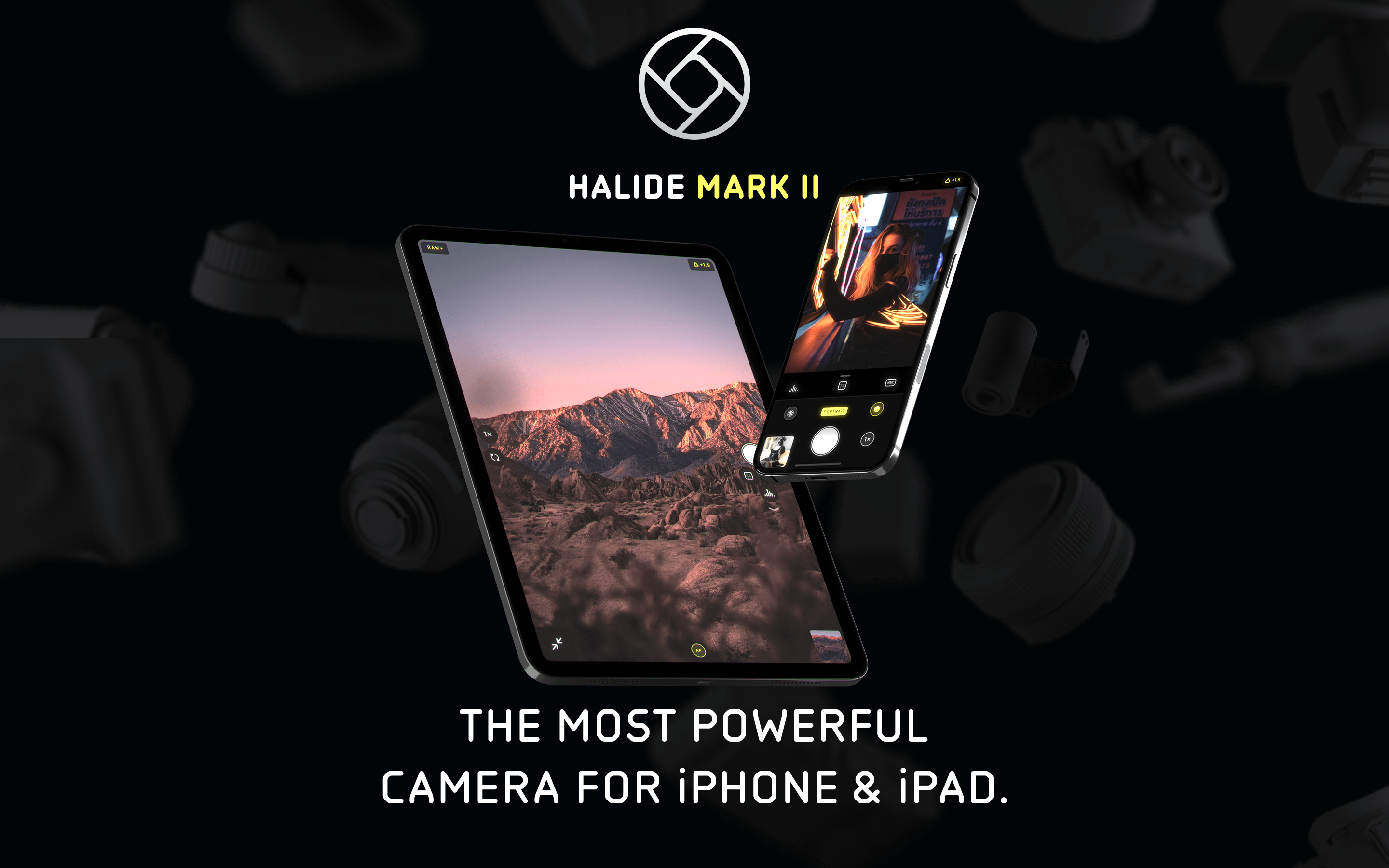
Halide 证明了专业工具不需要专业界面。作为 2022 年 Apple 设计大奖得主,它将单反级别的控制隐藏在直观的手势背后,只有当你需要时才会展现其强大功能。
为何 Halide 如此重要
Halide 由前 Apple 设计师 Sebastiaan de With 和前 Twitter 工程师 Ben Sandofsky 共同创建,它成功地在 Apple 简单的相机应用与令人生畏的专业应用之间架起了一座桥梁。
主要成就: - 2022 年 Apple 设计大奖 - 通过 Instant RAW 让 RAW 摄影变得触手可及 - 开创了基于手势的相机控制方式 - 在所有 iPhone 尺寸上实现单手操作 - 超过 10,000 条五星评价
核心要点
- 隐藏复杂性,而非移除它 - 专业功能存在但保持隐形,直到被召唤;"飞行模拟器"式界面并非展现强大功能的唯一方式
- 智能激活优于开关按钮 - 在交互时出现的工具(如拖动时出现的对焦放大镜)比手动显示/隐藏控件更直观
- 手势应有物理感 - 垂直滑动调整曝光、水平滑动调整对焦,直接映射真实相机转盘的操作行为
- 在使用中学习 - 状态变化时的简短标签帮助用户自然地学习摄影术语,无需单独的教程
- 单手操作是一种设计约束 - 为拇指可达范围而设计,迫使形成良好的信息层级并优先考虑核心控件
核心设计理念
"不要挡道"
Halide 的指导原则:工具应在需要时出现,不需要时消失。
OTHER PRO CAMERA APPS                 HALIDE'S APPROACH
───────────────────────────────────────────────────────────────────
"飞行模拟器"式界面                    简洁的取景器
所有控件始终可见                      控件按需出现
使用前先学界面                        边用边学
固定布局                              可自定义工具栏
仅手动工作流                          自动模式+手动模式兼备
关键洞察:"其他相机应用看起来像飞行模拟器,布满了各种转盘,这让人望而生畏,即使对于像我这样热爱胶片相机的人也是如此。"
胶片相机的启发
Halide 将模拟相机的触觉乐趣转化为触屏手势。
FILM CAMERA                          HALIDE TRANSLATION
───────────────────────────────────────────────────────────────────
转动光圈环                            垂直滑动调整曝光
转动对焦环                            水平滑动调整对焦
机械卡位感                            触觉反馈
物理取景器                            全屏构图
测光表指针                            数字直方图
手动/自动切换                         AF 按钮切换
设计目标:"给孩子一台相机,他们会把玩光圈环、转盘和开关。也许我们可以在这块玻璃上的应用中带来一丝那样的愉悦感。"
模式库
1. 智能激活
控件在需要时根据上下文出现,然后消失。无需手动显示/隐藏。
示例:对焦放大镜
DEFAULT STATE
┌─────────────────────────────────────────────┐
│                                             │
│              [取景器]                        │
│                                             │
│                                             │
│                                             │
│  [底部对焦转盘]                              │
└─────────────────────────────────────────────┘

WHEN USER TOUCHES FOCUS DIAL
┌─────────────────────────────────────────────┐
│  ┌──────────┐                               │
│  │ 对焦      │  ← 对焦放大镜自动出现          │
│  │ 放大镜   │                                │
│  │ (放大)   │                                │
│  └──────────┘                               │
│                                             │
│  [对焦转盘激活]                              │
└─────────────────────────────────────────────┘

WHEN USER RELEASES
┌─────────────────────────────────────────────┐
│                                             │
│              [取景器]                        │
│                   ↑                         │
│           放大镜淡出                         │
│                                             │
│  [对焦转盘静止]                              │
└─────────────────────────────────────────────┘
SwiftUI 实现概念:
struct IntelligentActivation<Content: View, Tool: View>: View {
    @Binding var isInteracting: Bool
    let content: Content
    let tool: Tool

    var body: some View {
        ZStack {
            content

            tool
                .opacity(isInteracting ? 1 : 0)
                .animation(.easeInOut(duration: 0.2), value: isInteracting)
        }
    }
}

struct FocusControl: View {
    @State private var isDragging = false
    @State private var focusValue: Double = 0.5

    var body: some View {
        ZStack {
            // 取景器
            CameraPreview()

            // 对焦放大镜 - 拖动时出现
            IntelligentActivation(isInteracting: $isDragging, content: EmptyView()) {
                FocusLoupeView(zoomLevel: 3.0)
                    .frame(width: 120, height: 120)
                    .position(x: 80, y: 80)
            }

            // 对焦转盘
            VStack {
                Spacer()
                FocusDial(value: $focusValue)
                    .gesture(
                        DragGesture()
                            .onChanged { _ in
                                isDragging = true
                            }
                            .onEnded { _ in
                                isDragging = false
                            }
                    )
            }
        }
    }
}
2. 渐进式展示
默认简洁,需要时复杂。界面根据模式进行变换。
模式转换:
AUTO MODE(默认)
┌─────────────────────────────────────────────┐
│                                             │
│              [取景器]                        │
│                                             │
│                                             │
│ ┌───┐                               ┌───┐   │
│ │ [F] │                               │ AF │   │
│ └───┘                               └───┘   │
│              ┌───────────┐                  │
│              │   (●)     │  ← 快门          │
│              └───────────┘                  │
└─────────────────────────────────────────────┘
极简控件。拍就对了。

MANUAL MODE(点击 "AF" → "MF" 后)
┌─────────────────────────────────────────────┐
│  [直方图]                        [对焦峰值]  │
│                                             │
│              [取景器]                        │
│                                             │
│ ┌───┐ ┌───┐ ┌───┐              ┌────┐      │
│ │ [F] │ │WB │ │ISO│              │ MF │      │
│ └───┘ └───┘ └───┘              └────┘      │
│              ┌───────────┐                  │
│  [────────────────●───────] ← 对焦转盘      │
│              │   (●)     │                  │
│              └───────────┘                  │
└─────────────────────────────────────────────┘
完整控件展现。专业工具触手可及。
实现方式:
enum CameraMode {
    case auto
    case manual

    var visibleControls: [CameraControl] {
        switch self {
        case .auto:
            return [.flash, .shutter, .autoFocus]
        case .manual:
            return [.flash, .whiteBalance, .iso, .shutter,
                    .manualFocus, .histogram, .focusPeaking]
        }
    }
}

struct AdaptiveToolbar: View {
    @Binding var mode: CameraMode

    var body: some View {
        HStack {
            ForEach(mode.visibleControls, id: \.self) { control in
                ControlButton(control: control)
                    .transition(.asymmetric(
                        insertion: .scale.combined(with: .opacity),
                        removal: .scale.combined(with: .opacity)
                    ))
            }
        }
        .animation(.spring(response: 0.3), value: mode)
    }
}
3. 基于手势的控制
曝光和对焦通过滑动操作控制,类似于实体相机的拨盘。
EXPOSURE CONTROL (Vertical swipe anywhere)
           ↑ Swipe up = brighter
           │
    ───────┼─────── Current exposure
           │
           ↓ Swipe down = darker

FOCUS CONTROL (Horizontal swipe on dial)
    Near ←────────●────────→ Far
                  │
            Current focus

QUICK ACTIONS (Edge swipes)
    ← Left edge: Switch to photo library
    → Right edge: Open manual controls panel
实现:
struct GestureCamera: View {
    @State private var exposure: Double = 0
    @State private var focus: Double = 0.5

    var body: some View {
        ZStack {
            CameraPreview()

            // Exposure gesture (anywhere on screen)
            Color.clear
                .contentShape(Rectangle())
                .gesture(
                    DragGesture()
                        .onChanged { value in
                            // Vertical translation maps to exposure
                            let delta = -value.translation.height / 500
                            exposure = max(-2, min(2, exposure + delta))
                            HapticsEngine.impact(.light)
                        }
                )

            // Visual feedback
            VStack {
                Spacer()
                ExposureIndicator(value: exposure)
                    .opacity(exposure != 0 ? 1 : 0)
            }
        }
    }
}

struct ExposureIndicator: View {
    let value: Double

    var body: some View {
        HStack {
            Image(systemName: value > 0 ? "sun.max.fill" : "moon.fill")
            Text(String(format: "%+.1f", value))
                .monospacedDigit()
        }
        .font(.caption)
        .padding(8)
        .background(.ultraThinMaterial)
        .clipShape(Capsule())
    }
}
4. 教育性微文案
当用户与控件交互时,简短的标签会帮助他们学习相关术语。
USER TAPS "AF" → Switches to "MF"
┌────────────────────────────────┐
│  Manual Focus                  │  ← Appears briefly
│  Swipe to adjust distance      │
└────────────────────────────────┘
   Fades after 2 seconds

USER ENABLES FOCUS PEAKING
┌────────────────────────────────┐
│  Focus Peaking                 │
│  Red highlights = in focus     │
└────────────────────────────────┘
实现:
struct EducationalToast: View {
    let title: String
    let description: String
    @Binding var isVisible: Bool

    var body: some View {
        VStack(alignment: .leading, spacing: 4) {
            Text(title)
                .font(.headline)
            Text(description)
                .font(.caption)
                .foregroundStyle(.secondary)
        }
        .padding()
        .background(.ultraThinMaterial)
        .clipShape(RoundedRectangle(cornerRadius: 12))
        .opacity(isVisible ? 1 : 0)
        .onAppear {
            DispatchQueue.main.asyncAfter(deadline: .now() + 2) {
                withAnimation { isVisible = false }
            }
        }
    }
}

// Usage
struct FocusModeToggle: View {
    @State private var showToast = false
    @Binding var isManual: Bool

    var body: some View {
        Button(isManual ? "MF" : "AF") {
            isManual.toggle()
            showToast = true
        }
        .overlay(alignment: .top) {
            EducationalToast(
                title: isManual ? "Manual Focus" : "Auto Focus",
                description: isManual
                    ? "Swipe to adjust distance"
                    : "Tap to focus on subject",
                isVisible: $showToast
            )
            .offset(y: -60)
        }
    }
}
5. 专业工具(直方图、焦点峰值、斑马纹)
提供专业的可视化工具,但不会让界面显得过于复杂。
直方图选项:
放置选项
┌─────────────────────────────────────────────┐
│ [▁▂▃▅▇█▅▃▁]                                 │  ← 顶部角落(简洁模式)
│                                             │
│              [取景器]                        │
│                                             │
└─────────────────────────────────────────────┘

┌─────────────────────────────────────────────┐
│              [取景器]                        │
│                                             │
│   ┌─────────────────────────────────────┐   │
│   │ ▁▂▃▅▇██▅▃▂▁ RGB                     │   │  ← 底部(详细模式)
│   └─────────────────────────────────────┘   │
└─────────────────────────────────────────────┘

直方图类型(点击切换)
1. 亮度(单色)
2. RGB(颜色通道)
3. 波形图(垂直分布)
焦点峰值叠加层:
struct FocusPeakingOverlay: View {
    let enabled: Bool
    let peakingColor: Color = .red

    var body: some View {
        if enabled {
            // 生产环境中会使用 Metal 着色器
            // 高亮显示焦平面处的边缘
            GeometryReader { _ in
                // 高亮显示对焦区域的叠加层
                // 基于当前对焦距离的边缘检测
            }
            .blendMode(.plusLighter)
        }
    }
}

struct ZebraOverlay: View {
    let threshold: Double  // 0.0 到 1.0
    let pattern: ZebraPattern = .diagonal

    enum ZebraPattern {
        case diagonal
        case horizontal
    }

    var body: some View {
        // 在过曝区域显示条纹叠加层
        // 帮助在拍摄前识别高光溢出
    }
}
6. 可自定义工具栏
用户可以根据自己的工作流程重新排列工具。
默认工具栏
[闪光灯] [网格] [定时器] ─(●)─ [RAW] [AF] [设置]

长按自定义
┌─────────────────────────────────────────────┐
│  拖动以重新排序                              │
│                                             │
│  [闪光灯]   [网格]   [定时器]                │
│     ↕         ↕         ↕                   │
│  [RAW]    [微距]  [设置]                     │
│                                             │
│  已隐藏:                                    │
│  [斑马纹] [波形图] [景深]                    │
│                                             │
│  [恢复默认]                       [完成]     │
└─────────────────────────────────────────────┘
实现:
struct CustomizableToolbar: View {
    @State private var tools: [CameraTool] = CameraTool.defaults
    @State private var isEditing = false

    var body: some View {
        HStack {
            ForEach(tools) { tool in
                ToolButton(tool: tool)
                    .draggable(tool) // iOS 16+
            }
        }
        .onLongPressGesture {
            isEditing = true
        }
        .sheet(isPresented: $isEditing) {
            ToolbarEditor(tools: $tools)
        }
    }
}

struct ToolbarEditor: View {
    @Binding var tools: [CameraTool]

    var body: some View {
        NavigationStack {
            List {
                Section("Active Tools") {
                    ForEach($tools) { $tool in
                        ToolRow(tool: tool)
                    }
                    .onMove { from, to in
                        tools.move(fromOffsets: from, toOffset: to)
                    }
                }

                Section("Available Tools") {
                    ForEach(CameraTool.hidden(from: tools)) { tool in
                        ToolRow(tool: tool)
                            .onTapGesture {
                                tools.append(tool)
                            }
                    }
                }
            }
            .navigationTitle("Customize Toolbar")
            .toolbar {
                Button("Done") { /* dismiss */ }
            }
        }
    }
}
视觉设计系统
色彩方案
extension Color {
    // Halide 在 UI 装饰元素中使用极简配色
    static let halideBlack = Color(hex: "#000000")
    static let halideWhite = Color(hex: "#FFFFFF")
    static let halideGray = Color(hex: "#8E8E93")

    // 激活状态的强调色
    static let halideYellow = Color(hex: "#FFD60A")  // 激活指示器

    // 对焦峰值
    static let halideFocusPeak = Color(hex: "#FF3B30")  // 红色叠加层
    static let halideZebra = Color(hex: "#FFFFFF").opacity(0.5)
}
字体排版
struct HalideTypography {
    // UI 标签(小字、大写)
    static let controlLabel = Font.system(size: 10, weight: .bold, design: .rounded)
        .smallCaps()

    // 数值显示(数字使用等宽字体)
    static let valueDisplay = Font.system(size: 14, weight: .medium, design: .monospaced)

    // 教学提示文字
    static let tooltipTitle = Font.system(size: 14, weight: .semibold)
    static let tooltipBody = Font.system(size: 12, weight: .regular)
}
动画与触觉反馈
触觉反馈系统
struct HapticsEngine {
    static func impact(_ style: UIImpactFeedbackGenerator.FeedbackStyle) {
        let generator = UIImpactFeedbackGenerator(style: style)
        generator.impactOccurred()
    }

    static func exposureChange() {
        // 曝光调节时使用轻触感
        impact(.light)
    }

    static func focusLock() {
        // 对焦锁定时使用中等触感
        impact(.medium)
    }

    static func shutterPress() {
        // 快门按下时使用强触感
        impact(.heavy)
    }

    static func modeSwitch() {
        // 模式切换时使用选择反馈
        let generator = UISelectionFeedbackGenerator()
        generator.selectionChanged()
    }
}
控件动画
// 转盘旋转动画
struct FocusDial: View {
    @Binding var value: Double

    var body: some View {
        GeometryReader { geo in
            // Dial visual with tick marks
            Circle()
                .stroke(Color.white.opacity(0.3), lineWidth: 2)
                .overlay {
                    // Tick marks rotate with value
                    ForEach(0..<12) { i in
                        Rectangle()
                            .fill(Color.white)
                            .frame(width: 2, height: 10)
                            .offset(y: -geo.size.height / 2 + 15)
                            .rotationEffect(.degrees(Double(i) * 30))
                    }
                }
                .rotationEffect(.degrees(value * 360))
                .animation(.spring(response: 0.2, dampingFraction: 0.8), value: value)
        }
    }
}
对我们工作的启示
1. 隐藏复杂性,而非移除它
专业功能存在但保持隐藏,直到被召唤时才显现。
2. 智能激活优于开关按钮
交互时自动出现的工具(如拖动时显示的对焦放大镜)胜过手动显示/隐藏。
3. 手势应具有物理质感
垂直滑动调节曝光,水平滑动调节对焦——这与真实相机转盘的操作方式相映射。
4. 在使用中教学
状态变化时的简短标签帮助用户自然地学习专业术语。
5. 单手操作是一项设计约束
为拇指可及范围而设计,迫使设计者建立良好的信息层级。
常见问题
Halide 与其他专业相机应用有何不同?
大多数专业相机应用会同时显示所有控件,形成 Halide 创作者所称的"飞行模拟器"界面。Halide 从简洁的取景器开始,仅在需要时才显示控件。自动模式显示最少的 UI;切换到手动模式时会逐步显示直方图、对焦峰值、ISO 和白平衡控件。这种方法使单反级别的功能变得易于使用,同时不会让新用户感到不知所措。
什么是智能激活,为什么它很重要?
智能激活意味着当你与相关控件交互时,工具会自动出现,停止交互时则消失。例如,当你触摸对焦转盘时对焦放大镜会出现,松开时则淡出。这消除了显示/隐藏辅助视图的开关按钮需求,减少了视觉杂乱和认知负担,同时确保工具在需要时始终可用。
Halide 的手势控制如何工作?
Halide 将触摸屏手势映射到物理相机控件。在屏幕任意位置垂直滑动可调节曝光(如同光圈环),在对焦转盘上水平滑动可调节对焦距离(如同对焦环)。这些手势包含触觉反馈,模拟真实相机转盘的机械档位感。边缘滑动可快速访问照片库和手动控制面板。
Halide 包含哪些专业可视化工具?
Halide 提供直方图(亮度、RGB 或波形模式)、对焦峰值(在对焦边缘显示红色高亮)和斑马纹(在过曝区域显示斜线)。这些工具以叠加层形式显示在取景器上,可放置在不同位置。每个工具都是可选的,可从可自定义的工具栏访问,用户可以重新排列以匹配自己的工作流程。
为什么 Halide 在界面中使用胶片相机的隐喻?
Halide 的设计师观察到,孩子们会本能地把玩模拟相机上的光圈环、转盘和开关。触摸屏应用缺少这种触觉乐趣。通过将机械相机控件转化为带有触觉反馈的滑动手势,Halide 重新创造了部分物理感。这种方法还利用了数十年相机用户体验的演进,使用熟悉的心智模型,而非发明新的范式。