Notion: The Block-Based Revolution
How Notion made complexity composable: block architecture, progressive disclosure, slash commands, and infinite canvas. CSS and TS code included.
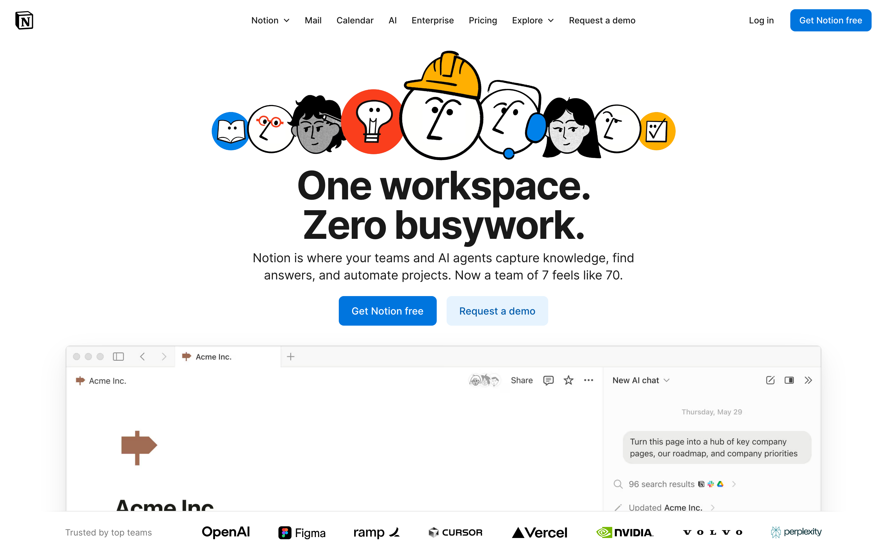
Notion: The Block-Based Revolution
“We want to make it so that everyone can tailor the software they use, every day, to their exact needs.” — Ivan Zhao, Notion CEO
Notion transformed productivity software by making everything a block. The seemingly simple abstraction created infinite flexibility while maintaining usability—a design challenge most thought impossible.
Why Notion Matters
Notion proved that complexity can be composable. Instead of rigid features, they created building blocks that users combine in ways the designers never anticipated.
Key achievements: - Made databases accessible to non-developers - Created an infinite canvas that feels familiar - Proved that flexibility and usability aren’t opposites - Pioneered collaborative document editing at scale
Key Takeaways
- Everything is a block - The atomic unit approach means every piece of content (text, images, databases) behaves identically: draggable, transformable, linkable
- Progressive disclosure scales complexity - Slash commands reveal power features only when invoked; beginners see simplicity, experts find depth
- Consistency trumps cleverness - Every block has the same handle, the same drag behavior, and can convert to any other type
- The infinite canvas removes constraints - Pages contain pages, databases contain pages, everything links everywhere—no artificial hierarchy
- Calm typography lets content shine - Understated design with generous line-height (1.7) and comfortable reading width (720px) keeps focus on user content
Core Design Principles
1. Everything is a Block
The atomic unit of Notion is the block. Every piece of content is a block that can be: - Moved - Transformed - Referenced - Embedded
TRADITIONAL DOCUMENT:
┌─────────────────────────────────────┐
│ [Fixed header]                      │
│ ─────────────────────────────────   │
│ Paragraph of text that's just text  │
│ and can only be text.               │
│                                     │
│ [Fixed image]                       │
│                                     │
│ Another paragraph, same deal.       │
└─────────────────────────────────────┘

NOTION'S BLOCK MODEL:
┌─────────────────────────────────────┐
│ ⋮⋮ [Heading block - H1]             │  ← Drag to reorder
│ ─────────────────────────────────   │
│ ⋮⋮ [Text block]                     │  ← Turn into toggle, callout, etc.
│     Paragraph that can transform    │
│ ⋮⋮ [Image block]                    │  ← Resize, caption, link
│     [caption]                       │
│ ⋮⋮ [Database block]                 │  ← Full database, inline
│     │ Task │ Status │ Due │         │
│ ⋮⋮ [Text block]                     │
│     Another paragraph               │
└─────────────────────────────────────┘
The genius: Every block has the same handle (⋮⋮), the same drag behavior, and can be converted to any other block type.
CSS Pattern (Block Handle):
.block {
  position: relative;
  padding-left: var(--block-indent);
}

.block-handle {
  position: absolute;
  left: 0;
  opacity: 0;
  transition: opacity 0.15s ease;
  cursor: grab;
}

.block:hover .block-handle,
.block-handle:focus {
  opacity: 1;
}

/* Universal block spacing */
.block + .block {
  margin-top: var(--space-2);
}
SwiftUI Pattern:
struct BlockView: View {
    @State private var isHovering = false
    let block: Block

    var body: some View {
        HStack(alignment: .top, spacing: 4) {
            // Universal handle
            Image(systemName: "line.3.horizontal")
                .opacity(isHovering ? 1 : 0)
                .animation(.easeOut(duration: 0.15), value: isHovering)

            // Block content (polymorphic)
            BlockContentView(block: block)
        }
        .onHover { isHovering = $0 }
    }
}
2. Progressive Disclosure
Notion reveals complexity only when needed. The default state is clean; power features emerge on demand.
The “/” Menu:
User types: /
           ↓
┌────────────────────────────────┐
│ BASIC BLOCKS                   │
│  [T] Text                      │
│  [P] Page                      │
│  [x] To-do list                │
│   *  Bulleted list             │
│                                │
│ DATABASE                       │
│  [=] Table                     │
│  [#] Board                     │
│  [D] Calendar                  │
│                                │
│ MEDIA                          │
│  [I] Image                     │
│  [V] Video                     │
│  [@] File                      │
└────────────────────────────────┘
Progressive Complexity:
Level 1: Just type (text block)
Level 2: "/" for block types
Level 3: "@" for mentions and links
Level 4: "[" for inline databases
Level 5: Templates and formulas
Implementation Principle:
/* Hidden until needed */
.property-options,
.advanced-settings,
.formula-builder {
  display: none;
}

/* Revealed by explicit action */
.block.selected .property-options,
.settings-expanded .advanced-settings,
.formula-mode .formula-builder {
  display: block;
  animation: fadeSlideIn 0.2s ease-out;
}
3. The Infinite Canvas
Pages contain pages. Databases contain pages. Pages link everywhere. The workspace has no walls.
TRADITIONAL HIERARCHY:
Folders → Documents → Content
   │
   └── Rigid, one location per doc

NOTION'S CANVAS:
Everything → Links to → Everything
   │
   └── Page can exist anywhere
   └── Same data, multiple views
   └── Inline or full-page
Key insight: There’s no “file system.” There’s a graph of connected content.
Pattern - Inline vs Full Page:
/* Same content, different containers */
.database-inline {
  max-height: 400px;
  overflow-y: auto;
  border: 1px solid var(--border-light);
  border-radius: var(--radius-md);
}

.database-fullpage {
  height: 100%;
  border: none;
}

/* Content adapts to container */
.database-view {
  display: flex;
  flex-direction: column;
  height: 100%;
}
4. Calm Typography
Notion’s typography is deliberately understated. It lets content shine.
HIERARCHY THROUGH SIZE AND WEIGHT:

Page Title         ← 40px, Bold, little personality
═══════════════════════════════════════════════

Heading 1          ← 30px, Semibold
───────────────────────────────────────────────

Heading 2          ← 24px, Semibold
. . . . . . . . . . . . . . . . . . . . . . .

Heading 3          ← 20px, Semibold

Body text flows naturally at 16px with         ← 16px, Regular
generous line-height (1.7) and comfortable
measure. Long-form content remains readable.
Typography System:
:root {
  /* Notion-inspired scale */
  --font-title: 40px;
  --font-h1: 30px;
  --font-h2: 24px;
  --font-h3: 20px;
  --font-body: 16px;
  --font-small: 14px;

  /* Generous line height for readability */
  --line-height-tight: 1.3;
  --line-height-normal: 1.5;
  --line-height-relaxed: 1.7;

  /* Neutral, readable font stack */
  --font-family: -apple-system, BlinkMacSystemFont,
    'Segoe UI', 'Roboto', sans-serif;
}

.page-content {
  max-width: 720px;  /* Comfortable reading measure */
  margin: 0 auto;
  font-family: var(--font-family);
  line-height: var(--line-height-relaxed);
}
Transferable Patterns
Pattern 1: Slash Commands
The mechanism: Type “/” to reveal contextual actions.
// Slash command registry
interface SlashCommand {
  trigger: string;
  icon: string;
  label: string;
  shortcut?: string;
  action: () => void;
}

const commands: SlashCommand[] = [
  { trigger: 'h1', icon: 'H1', label: 'Heading 1', action: createH1 },
  { trigger: 'bullet', icon: '•', label: 'Bullet list', action: createBullet },
  { trigger: 'todo', icon: '☐', label: 'To-do', action: createTodo },
];

// Filter as user types
function filterCommands(query: string): SlashCommand[] {
  return commands.filter(cmd =>
    cmd.trigger.includes(query.toLowerCase()) ||
    cmd.label.toLowerCase().includes(query.toLowerCase())
  );
}
Pattern 2: Block Transformation
The mechanism: Any block can become any other block.
enum BlockType: CaseIterable {
    case text, heading1, heading2, heading3
    case bulletList, numberedList, toggleList, todo
    case quote, callout, divider
    case image, video, embed

    var icon: String {
        switch self {
        case .text: return "text.alignleft"
        case .heading1: return "textformat.size.larger"
        // ...
        }
    }
}

struct BlockTransformMenu: View {
    let currentBlock: Block
    let onTransform: (BlockType) -> Void

    var body: some View {
        Menu {
            ForEach(BlockType.allCases, id: \.self) { type in
                Button {
                    onTransform(type)
                } label: {
                    Label(type.label, systemImage: type.icon)
                }
            }
        } label: {
            Image(systemName: "arrow.triangle.turn.up.right.circle")
        }
    }
}
Pattern 3: Inline Mentions
The mechanism: “@” to link to anything in the workspace.
.mention {
  display: inline-flex;
  align-items: center;
  gap: 4px;
  padding: 2px 6px;
  background: var(--bg-mention);
  border-radius: var(--radius-sm);
  color: var(--text-link);
  text-decoration: none;
  cursor: pointer;
}

.mention:hover {
  background: var(--bg-mention-hover);
}

.mention-icon {
  width: 16px;
  height: 16px;
}
Design Lessons
- Composability over features: Build blocks that combine, not monolithic tools
- Progressive disclosure: Simple by default, powerful on demand
- Consistent interactions: Every block works the same way
- Calm interface: Let content be the focus, not chrome
- Infinite flexibility: No artificial constraints on structure
Frequently Asked Questions
What is Notion’s block-based architecture?
Every piece of content in Notion is a “block”—text, images, databases, embeds, and even pages themselves. Each block has identical behavior: a handle for dragging, the ability to transform into other block types, and consistent spacing. This atomic approach means users learn one interaction pattern that applies everywhere.
How does Notion’s slash command system work?
Typing “/” opens a contextual menu of all available block types. The menu filters as users type (e.g., “/todo” shows to-do list). This pattern combines discoverability (see all options) with speed (power users type shortcuts directly). The slash command has become an industry standard pattern.
What is progressive disclosure and how does Notion use it?
Progressive disclosure means revealing complexity only when needed. In Notion, Level 1 is just typing (creates text block), Level 2 is “/” for block types, Level 3 is “@” for mentions, Level 4 is “[” for databases, and Level 5 is templates and formulas. Beginners never see overwhelming options.
How does Notion’s infinite canvas differ from traditional document structure?
Traditional apps use folder hierarchies where each document exists in one location. Notion treats content as a graph: pages contain pages, databases contain pages, and anything can link to anything. The same database can appear inline in multiple pages, and pages have no fixed “location” in a file system.
Why does Notion use such understated typography?
Notion’s calm typography (system fonts, 16px body, 1.7 line-height, 720px max-width) deliberately avoids personality. Users create wildly different content—meeting notes, wikis, project trackers—so the interface must be a neutral canvas that lets any content type feel native.
Resources
- Website: notion.so
- Design blog: Notion’s behind-the-scenes design decisions
- Template gallery: Community patterns and use cases
- API documentation: Building with Notion’s block model