Notion:積木式革命
Notion如何讓複雜變得可組合:區塊架構、漸進式呈現、斜線命令和無限畫布。附CSS和TS程式碼。
「我們希望讓每個人都能根據自己的確切需求,量身打造每天使用的軟體。」— Ivan Zhao,Notion 執行長
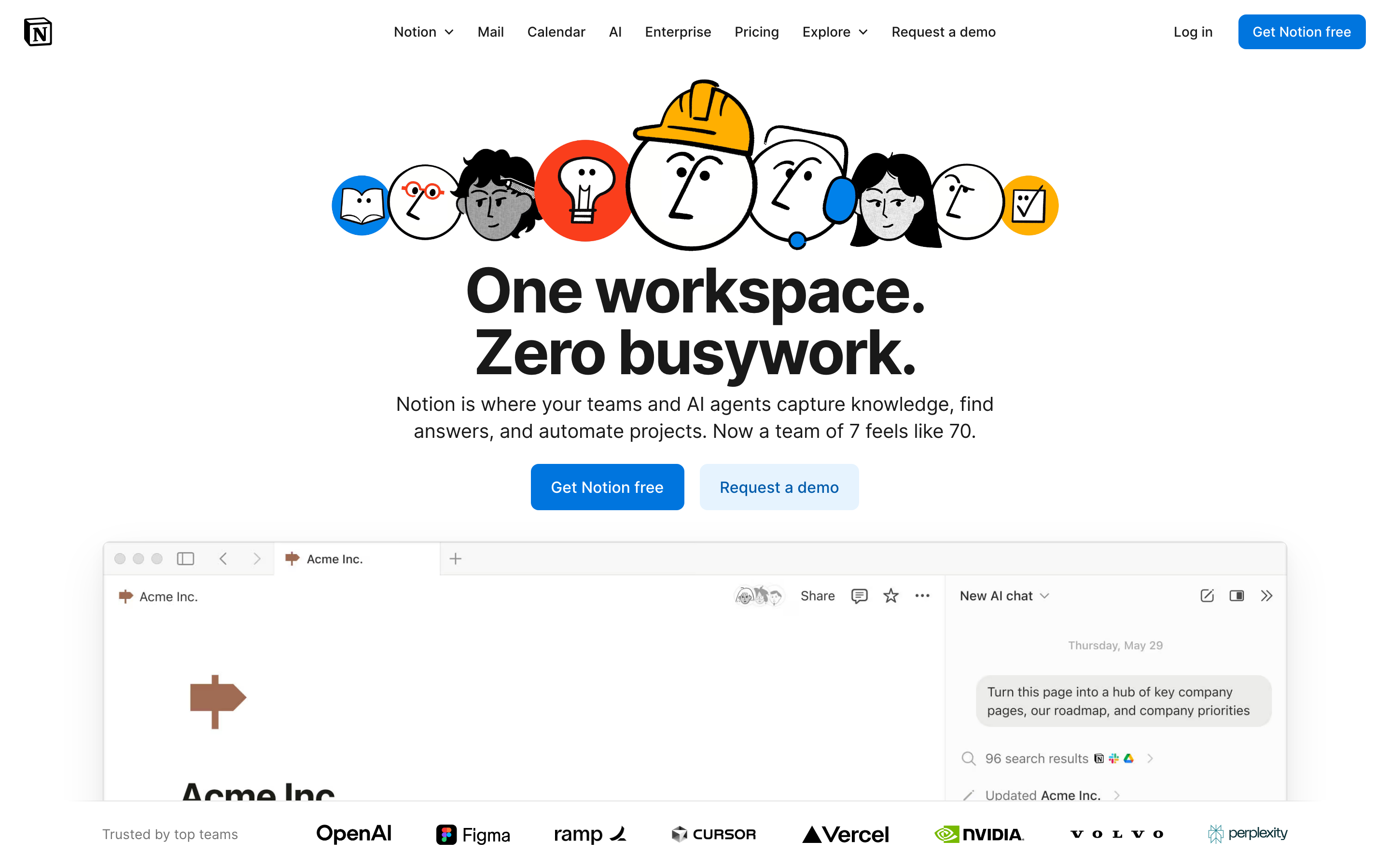
Notion 將一切化為區塊,徹底改變了生產力軟體的面貌。這個看似簡單的抽象概念,在維持易用性的同時創造了無限的靈活性——這是大多數人認為不可能達成的設計挑戰。
為什麼 Notion 如此重要
Notion 證明了複雜性可以被組合。他們沒有打造僵化的功能,而是創造了讓使用者能以設計師從未預想過的方式自由組合的構建模組。
關鍵成就: - 讓非開發者也能使用資料庫 - 創造了一個感覺熟悉的無限畫布 - 證明靈活性與易用性並非對立 - 開創了大規模協作文件編輯的先河
核心要點
- 一切皆區塊 - 原子化單位的設計意味著每一段內容(文字、圖片、資料庫)都具有相同的行為:可拖曳、可轉換、可連結
- 漸進式揭露擴展複雜度 - 斜線指令僅在被呼叫時才顯示進階功能;初學者看到的是簡潔,專家則能發現深度
- 一致性勝過小聰明 - 每個區塊都有相同的把手、相同的拖曳行為,且可以轉換為任何其他類型
- 無限畫布移除了限制 - 頁面包含頁面,資料庫包含頁面,萬物皆可相互連結——沒有人為的層級限制
- 沉靜的排版讓內容發光 - 低調的設計搭配寬鬆的行高(1.7)與舒適的閱讀寬度(720px),讓焦點保持在使用者的內容上
核心設計原則
1. 一切皆區塊
Notion 的原子單位是區塊。每一段內容都是一個可以被: - 移動 - 轉換 - 引用 - 嵌入的區塊
TRADITIONAL DOCUMENT:
┌─────────────────────────────────────┐
│ [Fixed header]                      │
│ ─────────────────────────────────   │
│ Paragraph of text that's just text  │
│ and can only be text.               │
│                                     │
│ [Fixed image]                       │
│                                     │
│ Another paragraph, same deal.       │
└─────────────────────────────────────┘

NOTION'S BLOCK MODEL:
┌─────────────────────────────────────┐
│ ⋮⋮ [Heading block - H1]             │  ← Drag to reorder
│ ─────────────────────────────────   │
│ ⋮⋮ [Text block]                     │  ← Turn into toggle, callout, etc.
│     Paragraph that can transform    │
│ ⋮⋮ [Image block]                    │  ← Resize, caption, link
│     [caption]                       │
│ ⋮⋮ [Database block]                 │  ← Full database, inline
│     │ Task │ Status │ Due │         │
│ ⋮⋮ [Text block]                     │
│     Another paragraph               │
└─────────────────────────────────────┘
設計精髓:每個區塊都有相同的把手(⋮⋮)、相同的拖曳行為,且可以轉換為任何其他區塊類型。
CSS 模式(區塊把手):
.block {
  position: relative;
  padding-left: var(--block-indent);
}

.block-handle {
  position: absolute;
  left: 0;
  opacity: 0;
  transition: opacity 0.15s ease;
  cursor: grab;
}

.block:hover .block-handle,
.block-handle:focus {
  opacity: 1;
}

/* Universal block spacing */
.block + .block {
  margin-top: var(--space-2);
}
SwiftUI 模式:
struct BlockView: View {
    @State private var isHovering = false
    let block: Block

    var body: some View {
        HStack(alignment: .top, spacing: 4) {
            // Universal handle
            Image(systemName: "line.3.horizontal")
                .opacity(isHovering ? 1 : 0)
                .animation(.easeOut(duration: 0.15), value: isHovering)

            // Block content (polymorphic)
            BlockContentView(block: block)
        }
        .onHover { isHovering = $0 }
    }
}
2. 漸進式揭露
Notion 僅在需要時才揭示複雜性。預設狀態是簡潔的;進階功能按需浮現。
「/」選單:
User types: /
           ↓
┌────────────────────────────────┐
│ BASIC BLOCKS                   │
│  [T] Text                      │
│  [P] Page                      │
│  [x] To-do list                │
│   *  Bulleted list             │
│                                │
│ DATABASE                       │
│  [=] Table                     │
│  [#] Board                     │
│  [D] Calendar                  │
│                                │
│ MEDIA                          │
│  [I] Image                     │
│  [V] Video                     │
│  [@] File                      │
└────────────────────────────────┘
漸進式複雜度:
Level 1: Just type (text block)
Level 2: "/" for block types
Level 3: "@" for mentions and links
Level 4: "[" for inline databases
Level 5: Templates and formulas
實作原則:
/* Hidden until needed */
.property-options,
.advanced-settings,
.formula-builder {
  display: none;
}

/* Revealed by explicit action */
.block.selected .property-options,
.settings-expanded .advanced-settings,
.formula-mode .formula-builder {
  display: block;
  animation: fadeSlideIn 0.2s ease-out;
}
3. 無限畫布
頁面包含頁面。資料庫包含頁面。頁面可連結至任何地方。工作空間沒有圍牆。
TRADITIONAL HIERARCHY:
Folders → Documents → Content
   │
   └── Rigid, one location per doc

NOTION'S CANVAS:
Everything → Links to → Everything
   │
   └── Page can exist anywhere
   └── Same data, multiple views
   └── Inline or full-page
關鍵洞見:這裡沒有「檔案系統」。有的是一個相互連結的內容圖譜。
模式 - 內嵌 vs 整頁:
/* Same content, different containers */
.database-inline {
  max-height: 400px;
  overflow-y: auto;
  border: 1px solid var(--border-light);
  border-radius: var(--radius-md);
}

.database-fullpage {
  height: 100%;
  border: none;
}

/* Content adapts to container */
.database-view {
  display: flex;
  flex-direction: column;
  height: 100%;
}
4. 沉靜的排版
Notion 的排版刻意保持低調。它讓內容成為主角。
HIERARCHY THROUGH SIZE AND WEIGHT:

Page Title         ← 40px, Bold, little personality
═══════════════════════════════════════════════

Heading 1          ← 30px, Semibold
───────────────────────────────────────────────

Heading 2          ← 24px, Semibold
. . . . . . . . . . . . . . . . . . . . . . .

Heading 3          ← 20px, Semibold

Body text flows naturally at 16px with         ← 16px, Regular
generous line-height (1.7) and comfortable
measure. Long-form content remains readable.
排版系統:
:root {
  /* Notion-inspired scale */
  --font-title: 40px;
  --font-h1: 30px;
  --font-h2: 24px;
  --font-h3: 20px;
  --font-body: 16px;
  --font-small: 14px;

  /* 寬鬆的行高以提升可讀性 */
  --line-height-tight: 1.3;
  --line-height-normal: 1.5;
  --line-height-relaxed: 1.7;

  /* 中性、易讀的字型堆疊 */
  --font-family: -apple-system, BlinkMacSystemFont,
    'Segoe UI', 'Roboto', sans-serif;
}

.page-content {
  max-width: 720px;  /* 舒適的閱讀寬度 */
  margin: 0 auto;
  font-family: var(--font-family);
  line-height: var(--line-height-relaxed);
}
可遷移的設計模式
模式一:斜線命令
運作機制:輸入「/」即可顯示情境相關的操作選單。
// 斜線命令註冊表
interface SlashCommand {
  trigger: string;
  icon: string;
  label: string;
  shortcut?: string;
  action: () => void;
}

const commands: SlashCommand[] = [
  { trigger: 'h1', icon: 'H1', label: 'Heading 1', action: createH1 },
  { trigger: 'bullet', icon: '•', label: 'Bullet list', action: createBullet },
  { trigger: 'todo', icon: '☐', label: 'To-do', action: createTodo },
];

// 根據使用者輸入進行篩選
function filterCommands(query: string): SlashCommand[] {
  return commands.filter(cmd =>
    cmd.trigger.includes(query.toLowerCase()) ||
    cmd.label.toLowerCase().includes(query.toLowerCase())
  );
}
模式二:區塊轉換
運作機制:任何區塊都可以轉換為其他類型的區塊。
enum BlockType: CaseIterable {
    case text, heading1, heading2, heading3
    case bulletList, numberedList, toggleList, todo
    case quote, callout, divider
    case image, video, embed

    var icon: String {
        switch self {
        case .text: return "text.alignleft"
        case .heading1: return "textformat.size.larger"
        // ...
        }
    }
}

struct BlockTransformMenu: View {
    let currentBlock: Block
    let onTransform: (BlockType) -> Void

    var body: some View {
        Menu {
            ForEach(BlockType.allCases, id: \.self) { type in
                Button {
                    onTransform(type)
                } label: {
                    Label(type.label, systemImage: type.icon)
                }
            }
        } label: {
            Image(systemName: "arrow.triangle.turn.up.right.circle")
        }
    }
}
模式三:行內提及
運作機制:輸入「@」即可連結到工作區中的任何內容。
.mention {
  display: inline-flex;
  align-items: center;
  gap: 4px;
  padding: 2px 6px;
  background: var(--bg-mention);
  border-radius: var(--radius-sm);
  color: var(--text-link);
  text-decoration: none;
  cursor: pointer;
}

.mention:hover {
  background: var(--bg-mention-hover);
}

.mention-icon {
  width: 16px;
  height: 16px;
}
設計啟示
- 組合性優於功能性:打造可組合的積木,而非龐大的工具
- 漸進式揭露:預設簡單,按需展現強大功能
- 一致的互動方式:每個區塊的運作方式都相同
- 平靜的介面:讓內容成為焦點,而非裝飾元素
- 無限的彈性:結構上不設人為限制
常見問題
什麼是 Notion 的區塊式架構?
Notion 中的每一段內容都是一個「區塊」——文字、圖片、資料庫、嵌入內容,甚至頁面本身也是區塊。每個區塊都具有相同的行為:可拖曳的把手、轉換為其他區塊類型的能力,以及一致的間距。這種原子化的方法意味著使用者只需學習一種互動模式,便能處處適用。
Notion 的斜線命令系統如何運作?
輸入「/」會開啟一個包含所有可用區塊類型的情境選單。選單會隨著使用者輸入進行篩選(例如輸入「/todo」會顯示待辦清單)。這種模式結合了可發現性(查看所有選項)與速度(進階使用者可直接輸入快捷指令)。斜線命令已成為業界標準模式。
什麼是漸進式揭露,Notion 如何運用它?
漸進式揭露意味著只在需要時才顯示複雜功能。在 Notion 中,第一層是直接打字(建立文字區塊),第二層是「/」用於區塊類型,第三層是「@」用於提及,第四層是「[」用於資料庫,第五層是範本和公式。初學者永遠不會看到令人不知所措的選項。
Notion 的無限畫布與傳統文件結構有何不同?
傳統應用程式使用資料夾層級結構,每份文件只存在於一個位置。Notion 則將內容視為圖形結構:頁面可包含頁面、資料庫可包含頁面,任何內容都可連結到任何內容。同一個資料庫可以內嵌顯示在多個頁面中,頁面在檔案系統中沒有固定的「位置」。
為什麼 Notion 使用如此低調的字體排版?
Notion 平靜的字體排版(系統字型、16px 內文、1.7 行高、720px 最大寬度)刻意避免展現個性。使用者會建立截然不同的內容——會議記錄、知識庫、專案追蹤器——因此介面必須是中性的畫布,讓任何類型的內容都能自然融入。
資源
- 網站: notion.so
- 設計部落格: Notion 的幕後設計決策
- 範本庫: 社群模式與使用案例
- API 文件: 使用 Notion 的區塊模型進行開發