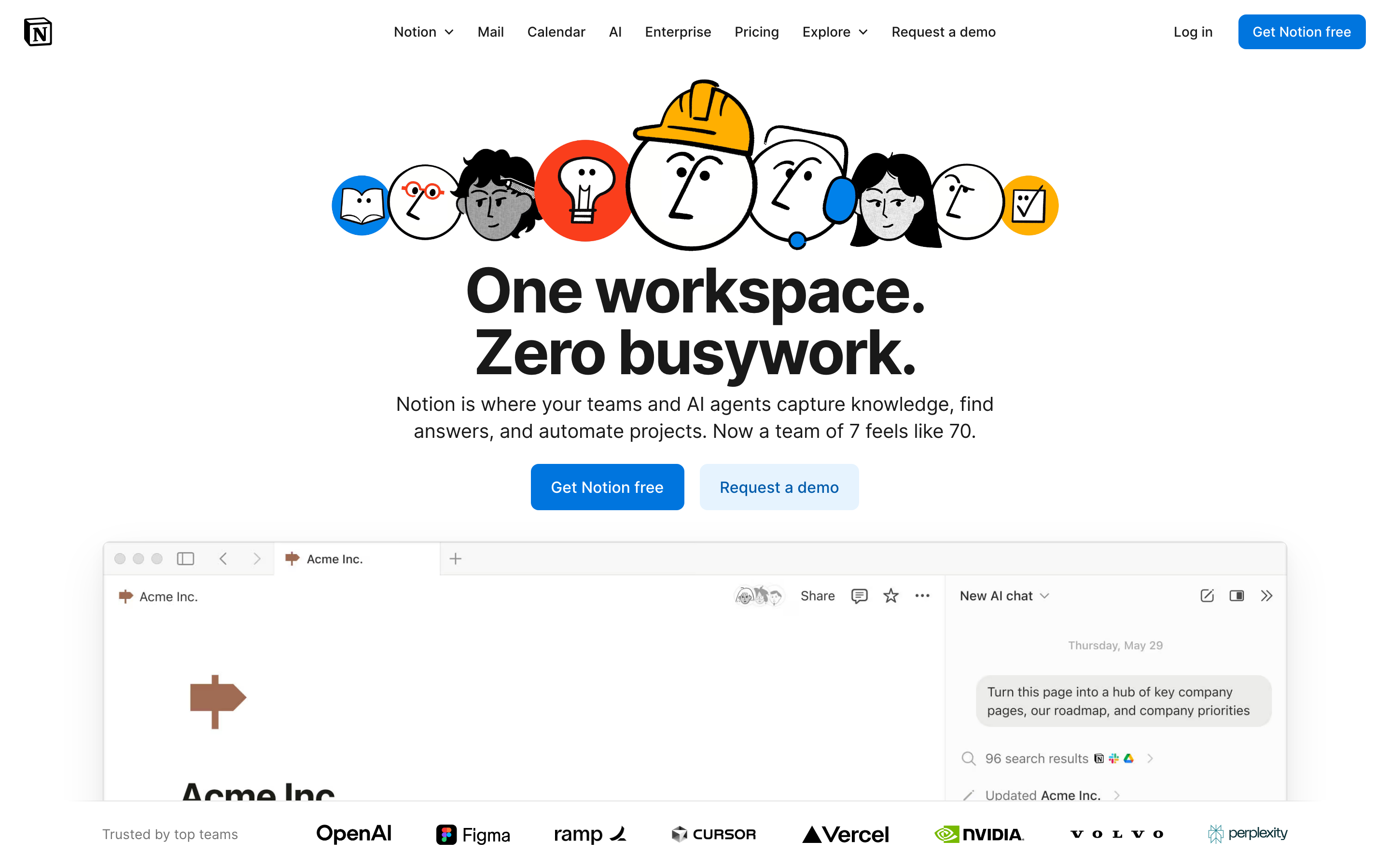
Notion:基于块的革命
Notion如何让复杂变得可组合:块架构、渐进式呈现、斜杠命令和无限画布。附CSS和TS代码。
"我们希望让每个人都能根据自己的具体需求,定制他们每天使用的软件。" — Ivan Zhao,Notion CEO
Notion 将一切变成块,彻底革新了生产力软件。这个看似简单的抽象创造了无限的灵活性,同时保持了易用性——这是大多数人认为不可能实现的设计挑战。
为什么 Notion 很重要
Notion 证明了复杂性可以是可组合的。他们没有创建固定的功能,而是创建了用户可以以设计师从未预料到的方式组合的构建块。
关键成就: - 让非开发者也能使用数据库 - 创建了一个感觉熟悉的无限画布 - 证明了灵活性和易用性并非对立 - 开创了大规模协作文档编辑的先河
核心要点
- 一切皆为块 - 原子单元方法意味着每一段内容(文本、图片、数据库)的行为都完全相同:可拖拽、可转换、可链接
- 渐进式披露扩展复杂性 - 斜杠命令仅在调用时才显示高级功能;初学者看到的是简洁,专家能发现深度
- 一致性胜过巧妙 - 每个块都有相同的手柄、相同的拖拽行为,并且可以转换为任何其他类型
- 无限画布消除约束 - 页面包含页面,数据库包含页面,一切都可以互相链接——没有人为的层级限制
- 沉静的排版让内容闪耀 - 低调的设计配合慷慨的行高(1.7)和舒适的阅读宽度(720px),让焦点始终在用户内容上
核心设计原则
1. 一切皆为块
Notion 的原子单元是块。每一段内容都是一个可以被: - 移动 - 转换 - 引用 - 嵌入 的块。
TRADITIONAL DOCUMENT:
┌─────────────────────────────────────┐
│ [Fixed header]                      │
│ ─────────────────────────────────   │
│ Paragraph of text that's just text  │
│ and can only be text.               │
│                                     │
│ [Fixed image]                       │
│                                     │
│ Another paragraph, same deal.       │
└─────────────────────────────────────┘

NOTION'S BLOCK MODEL:
┌─────────────────────────────────────┐
│ ⋮⋮ [Heading block - H1]             │  ← Drag to reorder
│ ─────────────────────────────────   │
│ ⋮⋮ [Text block]                     │  ← Turn into toggle, callout, etc.
│     Paragraph that can transform    │
│ ⋮⋮ [Image block]                    │  ← Resize, caption, link
│     [caption]                       │
│ ⋮⋮ [Database block]                 │  ← Full database, inline
│     │ Task │ Status │ Due │         │
│ ⋮⋮ [Text block]                     │
│     Another paragraph               │
└─────────────────────────────────────┘
精妙之处:每个块都有相同的手柄(⋮⋮),相同的拖拽行为,并且可以转换为任何其他块类型。
CSS 模式(块手柄):
.block {
  position: relative;
  padding-left: var(--block-indent);
}

.block-handle {
  position: absolute;
  left: 0;
  opacity: 0;
  transition: opacity 0.15s ease;
  cursor: grab;
}

.block:hover .block-handle,
.block-handle:focus {
  opacity: 1;
}

/* Universal block spacing */
.block + .block {
  margin-top: var(--space-2);
}
SwiftUI 模式:
struct BlockView: View {
    @State private var isHovering = false
    let block: Block

    var body: some View {
        HStack(alignment: .top, spacing: 4) {
            // Universal handle
            Image(systemName: "line.3.horizontal")
                .opacity(isHovering ? 1 : 0)
                .animation(.easeOut(duration: 0.15), value: isHovering)

            // Block content (polymorphic)
            BlockContentView(block: block)
        }
        .onHover { isHovering = $0 }
    }
}
2. 渐进式披露
Notion 仅在需要时才展示复杂性。默认状态是简洁的;高级功能按需出现。
"/" 菜单:
User types: /
           ↓
┌────────────────────────────────┐
│ BASIC BLOCKS                   │
│  [T] Text                      │
│  [P] Page                      │
│  [x] To-do list                │
│   *  Bulleted list             │
│                                │
│ DATABASE                       │
│  [=] Table                     │
│  [#] Board                     │
│  [D] Calendar                  │
│                                │
│ MEDIA                          │
│  [I] Image                     │
│  [V] Video                     │
│  [@] File                      │
└────────────────────────────────┘
复杂性递进:
Level 1: Just type (text block)
Level 2: "/" for block types
Level 3: "@" for mentions and links
Level 4: "[" for inline databases
Level 5: Templates and formulas
实现原则:
/* Hidden until needed */
.property-options,
.advanced-settings,
.formula-builder {
  display: none;
}

/* Revealed by explicit action */
.block.selected .property-options,
.settings-expanded .advanced-settings,
.formula-mode .formula-builder {
  display: block;
  animation: fadeSlideIn 0.2s ease-out;
}
3. 无限画布
页面包含页面。数据库包含页面。页面可以链接到任何地方。工作空间没有围墙。
TRADITIONAL HIERARCHY:
Folders → Documents → Content
   │
   └── Rigid, one location per doc

NOTION'S CANVAS:
Everything → Links to → Everything
   │
   └── Page can exist anywhere
   └── Same data, multiple views
   └── Inline or full-page
关键洞察:这里没有"文件系统",只有一个相互连接的内容图谱。
模式 - 内联与全页面:
/* Same content, different containers */
.database-inline {
  max-height: 400px;
  overflow-y: auto;
  border: 1px solid var(--border-light);
  border-radius: var(--radius-md);
}

.database-fullpage {
  height: 100%;
  border: none;
}

/* Content adapts to container */
.database-view {
  display: flex;
  flex-direction: column;
  height: 100%;
}
4. 沉静的排版
Notion 的排版刻意保持低调。它让内容成为焦点。
HIERARCHY THROUGH SIZE AND WEIGHT:

Page Title         ← 40px, Bold, little personality
═══════════════════════════════════════════════

Heading 1          ← 30px, Semibold
───────────────────────────────────────────────

Heading 2          ← 24px, Semibold
. . . . . . . . . . . . . . . . . . . . . . .

Heading 3          ← 20px, Semibold

Body text flows naturally at 16px with         ← 16px, Regular
generous line-height (1.7) and comfortable
measure. Long-form content remains readable.
排版系统:
:root {
  /* Notion-inspired scale */
  --font-title: 40px;
  --font-h1: 30px;
  --font-h2: 24px;
  --font-h3: 20px;
  --font-body: 16px;
  --font-small: 14px;

  /* 宽松的行高以提升可读性 */
  --line-height-tight: 1.3;
  --line-height-normal: 1.5;
  --line-height-relaxed: 1.7;

  /* 中性、易读的字体栈 */
  --font-family: -apple-system, BlinkMacSystemFont,
    'Segoe UI', 'Roboto', sans-serif;
}

.page-content {
  max-width: 720px;  /* 舒适的阅读宽度 */
  margin: 0 auto;
  font-family: var(--font-family);
  line-height: var(--line-height-relaxed);
}
可迁移模式
模式 1:斜杠命令
机制:输入"/"以显示上下文相关的操作选项。
// 斜杠命令注册表
interface SlashCommand {
  trigger: string;
  icon: string;
  label: string;
  shortcut?: string;
  action: () => void;
}

const commands: SlashCommand[] = [
  { trigger: 'h1', icon: 'H1', label: 'Heading 1', action: createH1 },
  { trigger: 'bullet', icon: '•', label: 'Bullet list', action: createBullet },
  { trigger: 'todo', icon: '☐', label: 'To-do', action: createTodo },
];

// 根据用户输入实时过滤
function filterCommands(query: string): SlashCommand[] {
  return commands.filter(cmd =>
    cmd.trigger.includes(query.toLowerCase()) ||
    cmd.label.toLowerCase().includes(query.toLowerCase())
  );
}
模式 2:块转换
机制:任何块都可以转换为其他类型的块。
enum BlockType: CaseIterable {
    case text, heading1, heading2, heading3
    case bulletList, numberedList, toggleList, todo
    case quote, callout, divider
    case image, video, embed

    var icon: String {
        switch self {
        case .text: return "text.alignleft"
        case .heading1: return "textformat.size.larger"
        // ...
        }
    }
}

struct BlockTransformMenu: View {
    let currentBlock: Block
    let onTransform: (BlockType) -> Void

    var body: some View {
        Menu {
            ForEach(BlockType.allCases, id: \.self) { type in
                Button {
                    onTransform(type)
                } label: {
                    Label(type.label, systemImage: type.icon)
                }
            }
        } label: {
            Image(systemName: "arrow.triangle.turn.up.right.circle")
        }
    }
}
模式 3:行内提及
机制:使用"@"链接到工作区中的任何内容。
.mention {
  display: inline-flex;
  align-items: center;
  gap: 4px;
  padding: 2px 6px;
  background: var(--bg-mention);
  border-radius: var(--radius-sm);
  color: var(--text-link);
  text-decoration: none;
  cursor: pointer;
}

.mention:hover {
  background: var(--bg-mention-hover);
}

.mention-icon {
  width: 16px;
  height: 16px;
}
设计启示
- 组合优于功能堆砌:构建可组合的模块,而非单一的庞大工具
- 渐进式披露:默认保持简洁,按需展现强大功能
- 交互一致性:每个 block 的操作方式完全相同
- 克制的界面:让内容成为焦点,而非界面装饰
- 无限灵活性:不对结构施加人为限制
常见问题
什么是 Notion 的 block 架构?
Notion 中的每一段内容都是一个"block"——文本、图片、数据库、嵌入内容,甚至页面本身也是 block。每个 block 都具有相同的行为:用于拖拽的手柄、转换为其他 block 类型的能力,以及一致的间距。这种原子化的方法意味着用户只需学习一种交互模式,就能应用于所有场景。
Notion 的斜杠命令系统如何工作?
输入"/"会打开一个包含所有可用 block 类型的上下文菜单。菜单会随着用户输入进行过滤(例如,"/todo"会显示待办事项列表)。这种模式将可发现性(查看所有选项)与速度(高级用户可直接输入快捷方式)完美结合。斜杠命令已成为行业标准模式。
什么是渐进式披露,Notion 如何运用它?
渐进式披露意味着只在需要时才展示复杂功能。在 Notion 中,第一层是直接输入(创建文本 block),第二层是"/"调出 block 类型,第三层是"@"用于提及,第四层是"["用于数据库,第五层是模板和公式。初学者永远不会看到令人眼花缭乱的选项。
Notion 的无限画布与传统文档结构有何不同?
传统应用使用文件夹层级结构,每个文档只能存在于一个位置。Notion 将内容视为图结构:页面包含页面,数据库包含页面,任何内容都可以链接到任何其他内容。同一个数据库可以内联显示在多个页面中,页面在文件系统中没有固定的"位置"。
为什么 Notion 使用如此低调的排版风格?
Notion 克制的排版风格(系统字体、16px 正文、1.7 行高、720px 最大宽度)刻意避免个性化。用户创建的内容差异极大——会议记录、知识库、项目追踪器——因此界面必须成为一块中性的画布,让任何类型的内容都能自然融入。
相关资源
- 官方网站: notion.so
- 设计博客: Notion 设计决策的幕后故事
- 模板库: 社区模式与使用案例
- API 文档: 基于 Notion block 模型进行开发