Darkroom: Immersive Dark UI for Photo-Centric Editing
How Darkroom uses near-black canvases and whisper-quiet typography to make photographs the undisputed hero of every interface.
Darkroom: Immersive Dark UI for Photo-Centric Editing
“The interface should disappear so the photograph can occupy your full attention.” — Jasper Hauser, Darkroom Co-founder
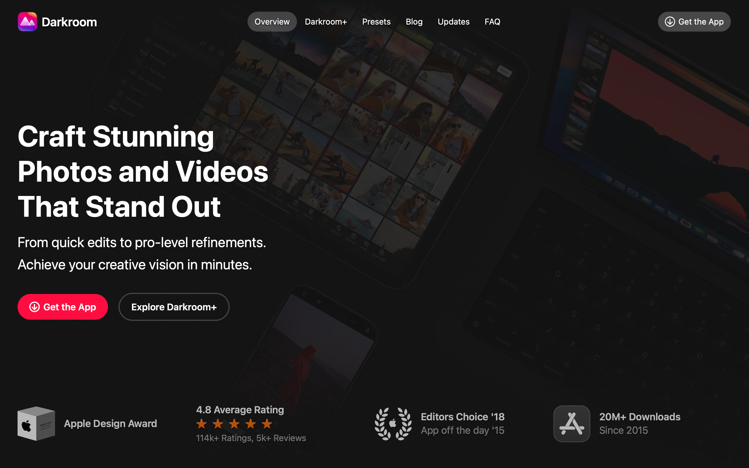
Darkroom was built on the belief that mobile photo editing should be as powerful as desktop editing without inheriting desktop complexity. Co-founded by Bergen Reiten and Jasper Hauser (formerly of Sofa and Facebook), the app reimagines what photo editing means when your fingers are the cursor. Recognized with an Apple Design Award, Darkroom proves that professional-grade tools and consumer-friendly interfaces are not mutually exclusive.
Key Takeaways
- The interface must not compete with the content - Darkroom’s near-black canvas (rgb(17,17,17)) ensures that photographs are always the brightest, most prominent element on screen
- Dark-mode-only is a functional requirement - For photo editing, dark UI is not a preference but a necessity for accurate color perception and reduced eye strain
- Non-destructive editing shapes the UI - Every adjustment is stored as an instruction, not baked into the image, requiring the interface to communicate that changes are pending, adjustable, and removable
- Touch-first interaction unlocks new paradigms - Swipe to adjust, pinch to zoom, long-press to compare — gestures replace buttons when the entire screen becomes a control surface
- Whisper-quiet typography lets content speak - At 14px body text and 80% white, the type is readable but deliberately recessive, deferring visual authority to the photographs
Why Darkroom Matters
Darkroom represents a rare achievement: bringing professional non-destructive photo editing to mobile without porting a desktop paradigm. Instead of shrinking Lightroom’s panel-heavy interface onto a phone screen, Darkroom reimagined photo editing around touch gestures and progressive disclosure. The result is an app where beginners feel comfortable and professionals feel powerful.
Key achievements: - Won an Apple Design Award for bringing pro-level capability to consumer-friendly interfaces - Proved that mobile photo editing can match desktop quality without mimicking desktop complexity - Established gesture-first editing as a viable alternative to panel-based workflows - Demonstrated that a dark-only theme can be both a brand identity and a functional requirement
Core Design Principles
1. Photo as Hero
On the marketing site and in the app, photographs dominate the visual hierarchy. Every design decision serves a single question: does this help or hinder the photograph? The UI is designed to frame photos, not compete with them.
The marketing site leads with photography — screenshots and sample edits — rather than feature lists. Features are demonstrated through results. This philosophy extends into every pixel of the editing interface: adjustment sliders use thin lines and small circular handles, tool icons are minimal outlines rather than filled shapes, and the histogram overlays are semi-transparent. Everything is visible enough to operate but subdued enough to keep the photograph as the visual focus.
2. Immersive Dark Canvas
The name “Darkroom” is literal. The interface uses rgb(17,17,17) as its primary canvas — not pure black, but close enough to eliminate visual competition with the photograph. There is no light theme. This is not a preference toggle but a functional decision: light UI elements would create contrast that interferes with color perception.
The depth system avoids traditional drop shadows. Instead, Darkroom uses 1px border-top highlights (a single lighter line) to create separation between surfaces:
┌──────────────────────────────────────────────────┐
│  Photo Canvas                                    │
│  ████████████████████████████████████████████    │
│  ████████████████████████████████████████████    │
│  ████████████████████████████████████████████    │
├──────────────────────────────────────────────────┤  ← 1px highlight
│  Toolbar  rgb(28,28,30)                          │
│  ○ Adjust   ○ Crop   ○ Filters   ○ HSL         │
├──────────────────────────────────────────────────┤  ← 1px highlight
│  Controls  rgb(17,17,17)                         │
│  Exposure  ────────●────────  +0.5  ●(yellow)   │
│  Contrast  ──────●──────────   0.0              │
└──────────────────────────────────────────────────┘
The yellow dot beside the exposure slider indicates a value changed from its default — a non-destructive editing indicator that communicates state at a glance without adding visual clutter.
3. Gesture-First Controls
Darkroom was designed for touch from the ground up. Sliders respond to horizontal swipes on the entire editing pane, not just on the slider handle. The whole screen becomes a control surface, matching how photographers naturally want to work on mobile devices.
The comparison interaction is a perfect example of gesture-first thinking: long-press shows the original photo, release returns to the edited version. This ephemeral hold-to-compare interaction is more natural and faster than a toggle button, and it leaves zero visual footprint when not in use.
4. Functional Color Only
Color appears in the Darkroom interface only when it carries functional meaning. The UI controls themselves are exclusively white, gray, and black. Color is reserved for:
| Color | Meaning |
|---|---|
| Yellow (rgb(255,214,10)) | Value modified from default |
| Blue (rgb(10,132,255)) | Active tool or comparison mode |
| Red (rgb(255,69,58)) | Destructive action (delete, reset all) |
| Green (rgb(48,209,88)) | Export or save confirmation |
This discipline ensures that color in the interface never competes with color in the photograph.
5. Minimal Iconography
Tool icons throughout Darkroom are thin-line outlines, never filled shapes. This keeps them visible for operation but visually subordinate to the photograph. The distinction matters: filled icons at the same size would command more visual attention and begin competing with the image content.
Transferable Patterns
Darkroom’s design system translates to any application where content must take precedence over chrome — media players, document viewers, portfolio sites, and creative tools of all kinds.
The immersive dark palette is built on a three-tier surface hierarchy that creates depth through subtle value shifts rather than shadows:
:root {
  /* Darkroom's immersive dark palette */
  --color-background: rgb(17, 17, 17);
  --color-surface: rgb(28, 28, 30);
  --color-elevated: rgb(44, 44, 46);
  --color-text: rgb(204, 204, 204);
  --color-text-secondary: rgb(142, 142, 147);
  --color-text-dimmed: rgb(99, 99, 102);
  --color-accent: rgb(255, 255, 255);
  --color-border: rgba(255, 255, 255, 0.06);

  /* Functional colors — only these carry meaning */
  --color-modified: rgb(255, 214, 10);
  --color-active: rgb(10, 132, 255);
  --color-destructive: rgb(255, 69, 58);
  --color-success: rgb(48, 209, 88);

  /* Typography — system font, deliberately small */
  --font-sans: system, -apple-system, Roboto, "SF Pro Display",
    "Helvetica Neue", sans-serif;

  /* Depth via borders, not shadows */
  --border-highlight: 0 -1px 0 rgba(255, 255, 255, 0.06);
}

body {
  font-family: var(--font-sans);
  font-size: 14px;
  line-height: 21px;
  color: var(--color-text);
  background-color: var(--color-background);
}

h1 {
  font-size: 50px;
  font-weight: 700;
  line-height: 55px;
  letter-spacing: -0.5px;
  color: #FFFFFF;
}
The SwiftUI implementation demonstrates how the non-destructive editing indicator works in practice — a small yellow dot that appears only when a slider has been adjusted from its default:
extension Color {
    static let drBg = Color(red: 17/255, green: 17/255, blue: 17/255)
    static let drSurface = Color(red: 28/255, green: 28/255, blue: 30/255)
    static let drElevated = Color(red: 44/255, green: 44/255, blue: 46/255)
    static let drText = Color(red: 204/255, green: 204/255, blue: 204/255)
    static let drTextSecondary = Color(red: 142/255, green: 142/255, blue: 147/255)
    static let drModified = Color(red: 255/255, green: 214/255, blue: 10/255)
}

struct AdjustmentSlider: View {
    let label: String
    @Binding var value: Double
    let isModified: Bool

    var body: some View {
        VStack(spacing: 4) {
            HStack {
                Text(label)
                    .font(.system(size: 11, weight: .medium))
                    .tracking(0.2)
                    .foregroundStyle(Color.drTextSecondary)
                Spacer()
                if isModified {
                    Circle()
                        .fill(Color.drModified)
                        .frame(width: 5, height: 5)
                }
            }
            Slider(value: $value, in: -1...1)
                .tint(.white)
        }
    }
}
The typography system is worth studying in isolation. At 14px, the body text is smaller than the web standard of 16px — a deliberate choice for a site where photographs are the content. The 11px control labels in the app match the editing tool interface: readable at high contrast (white on dark) but never visually dominant. System fonts (resolving to SF Pro on Apple platforms) ensure the app feels native without introducing a custom typeface that would compete for attention.
Design Lessons
Darkroom teaches that restraint is the highest form of design craft in content-centric applications. Every element that is not the photograph is a potential distraction, and the team treats each UI component with suspicion until it earns its place.
The dark-only approach is instructive: rather than treating dark mode as a toggle, Darkroom commits fully to darkness as a functional requirement. This eliminates the design overhead of maintaining two themes and allows every color decision to be optimized for a single context.
Avoid decorative design in creative tools. No gradients, no illustrations, no background patterns — the interface should be purely functional. Avoid heavyweight typography: no display fonts, no extra-bold body weights. In a tool where the user’s content is the visual star, the interface should whisper, not shout.
Frequently Asked Questions
What makes Darkroom’s design distinctive?
Darkroom commits fully to a dark-only interface where the photograph is always the brightest element on screen. Combined with gesture-first controls, minimal iconography, and functional-only color usage, the result is an editing experience where the tools feel invisible and the content feels paramount.
How does Darkroom handle non-destructive editing in its UI?
Every adjustment is stored as a reversible instruction rather than a permanent modification. The interface communicates this through subtle indicators — small yellow dots mark sliders that have been changed from their defaults. Long-press comparison lets users see the original instantly. The entire editing history remains accessible and adjustable at any time.
Why does Darkroom have no light theme?
The dark interface is a functional requirement for accurate photo editing, not merely an aesthetic preference. Light UI elements create contrast that interferes with color perception when evaluating photographs. The “darkroom” metaphor is literal — you edit photos in controlled darkness so you can see the image accurately, just as film photographers worked in physical darkrooms.
What can designers learn from Darkroom?
The central lesson is that content-centric applications benefit from maximum restraint in their UI. If your product’s value is the user’s content (photos, video, documents), every interface element should be evaluated against a single criterion: does this help or hinder the content? Darkroom’s 14px body text, thin-line icons, and border-based depth system all answer that question in favor of the photograph.
References
- Darkroom — Official homepage with product overview and photography showcases
- Darkroom on the App Store — App listing with screenshots and user reviews
- Jasper Hauser — Portfolio of Darkroom’s co-founder and designer
- Apple Design Awards — Apple’s recognition of outstanding app design