Signal: Security Through Simplicity
How Signal hides end-to-end encryption behind a minimal, trustworthy interface — proving that privacy-first design means no dark patterns.
Signal: Security Through Simplicity
“We can’t expect everyone to become a cryptography expert. We need to build technology that is as private and secure as possible by default.” — Moxie Marlinspike, Signal creator
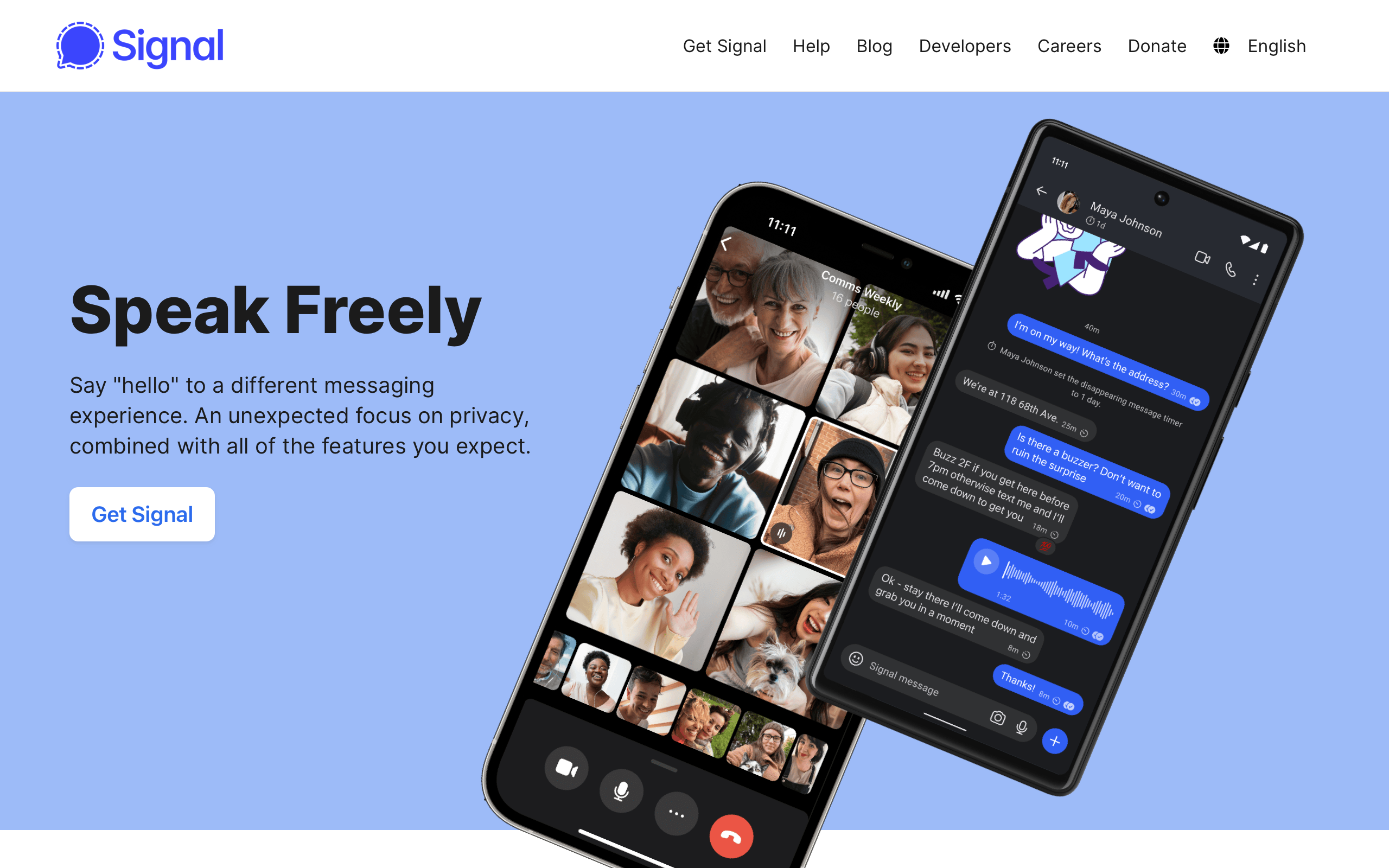
Signal is the most secure mainstream messaging app in the world. End-to-end encryption, disappearing messages, sealed sender, zero metadata collection. Yet using Signal feels exactly like using any other messaging app. You open it, you text, you call. The encryption is invisible. The interface is quiet. There are no upsells, no social feeds, no stories, no marketplace. There is only the conversation.
This restraint is Signal’s design thesis: security should be invisible, and trust is earned through the absence of manipulation. In an industry where every messaging app has become a platform — WeChat is a super-app, Messenger is a marketplace, Telegram is a media network — Signal stubbornly remains a messaging app. That refusal to expand is itself a design decision, and one of the most deliberate in consumer software.
Why Signal Matters
Signal proved that security and usability are not tradeoffs. You can have both.
Key achievements: - Made end-to-end encryption the default for millions of users who never think about cryptography - Created a design language where trust comes from what is absent, not what is present - Operated as a nonprofit with zero advertising, zero data collection, and zero dark patterns - Influenced the entire messaging industry (WhatsApp, Google Messages adopted the Signal Protocol) - Demonstrated that an open-source aesthetic can feel premium, not unfinished
Key Takeaways
- Invisible security is the only security that scales - If users have to understand encryption to benefit from it, most users will not benefit; Signal encrypts everything by default with no opt-in, no toggle, no explanation required
- Trust is built through absence - No ads, no tracking, no read receipts by default, no social features, no algorithmic feeds; every missing feature is a trust signal that says “we do not want your data”
- Minimalism is a security posture - Fewer features mean fewer attack surfaces; every feature Signal does not build is a feature that cannot be exploited, surveilled, or monetized
- Open source builds credibility - Signal’s code is public, auditable, and peer-reviewed; transparency about how the system works enables trust that no marketing copy can replicate
- Design for the adversarial case - Signal designs for journalists in authoritarian regimes, not just friends sharing memes; when you design for the highest-stakes user, every other user benefits
Core Design Principles
1. The Invisible Encryption Model
Signal’s most important design decision is what it does not show. There is no “encrypt this message” toggle. No lock icon that users must activate. No security settings to configure.
Comparison with other approaches:
TELEGRAM (opt-in security):
┌─────────────────────────────────────┐
│  Chat with Alice                    │
│  ─────────────────────────────────  │
│  Regular chat — NOT encrypted       │
│                                     │
│  To encrypt, you must:              │
│  1. Start a "Secret Chat"          │
│  2. Both parties must be online     │
│  3. Cannot sync across devices      │
│  4. Separate conversation thread    │
│                                     │
│  Result: <5% of chats are encrypted │
└─────────────────────────────────────┘

SIGNAL (default security):
┌─────────────────────────────────────┐
│  Chat with Alice                    │
│  ─────────────────────────────────  │
│  Every message is encrypted.        │
│  Every call is encrypted.           │
│  Every file is encrypted.           │
│  Every group chat is encrypted.     │
│                                     │
│  There is no unencrypted mode.      │
│                                     │
│  Result: 100% of communication      │
│  is encrypted, always.              │
└─────────────────────────────────────┘
The UX implication: Users never make a security decision. They never see a security dialog. They never choose between convenience and privacy. The product has already made that choice for them, correctly, every time.
2. Trust Through Visual Restraint
Signal’s interface is defined by what it does not have. Every absent element is a deliberate trust signal.
:root {
  /* Signal's palette is intentionally quiet */
  --signal-blue: #3a76f0;       /* Primary brand, message bubbles */
  --signal-blue-dark: #2c6bed;  /* Active/pressed states */

  --background: #ffffff;
  --surface: #f6f6f6;
  --text-primary: #000000;
  --text-secondary: #5e5e5e;
  --text-tertiary: #959595;

  /* Dark mode — equally restrained */
  --dm-background: #1b1b1b;
  --dm-surface: #2b2b2b;
  --dm-text-primary: #e9e9e9;
  --dm-text-secondary: #a5a5a5;

  /* Minimal elevation */
  --shadow-subtle: 0 1px 2px rgba(0, 0, 0, 0.08);
}

/* Message bubbles — clean, no gradients, no decoration */
.message-bubble--sent {
  background: var(--signal-blue);
  color: #ffffff;
  border-radius: 18px 18px 4px 18px;
  padding: 10px 14px;
  max-width: 75%;
}

.message-bubble--received {
  background: var(--surface);
  color: var(--text-primary);
  border-radius: 18px 18px 18px 4px;
  padding: 10px 14px;
  max-width: 75%;
}

/* No read receipts by default — privacy choice */
.message-status {
  font-size: 11px;
  color: var(--text-tertiary);
  /* Only shows sent/delivered, not "read" unless opted in */
}
What Signal omits (and why):
| Feature | Present in competitors | Why Signal omits it |
|---|---|---|
| Read receipts (default) | iMessage, WhatsApp | Social pressure to respond; privacy violation |
| Online status | WhatsApp, Telegram | Surveillance vector; social pressure |
| Stories/Status | WhatsApp, Telegram, Messenger | Engagement farming; not messaging |
| Link previews (default) | Most apps | Leaks URLs to servers for preview generation |
| Contact upload to server | Metadata collection; Signal uses private contact discovery | |
| Algorithmic feed | Messenger, WeChat | Data mining; attention manipulation |
| Ads | Messenger | Revenue model incompatible with privacy |
| Typing indicators (default, can’t disable) | iMessage | Signal includes typing indicators but makes them user-disableable per conversation |
3. The Disappearing Messages Pattern
Signal pioneered disappearing messages as a first-class feature, not a gimmick. The design communicates impermanence without creating confusion.
DISAPPEARING MESSAGE INDICATOR:
┌─────────────────────────────────────┐
│  Chat with Alice                    │
│  ─────────────────────────────────  │
│                                     │
│  ┌─ Alice ──────────────────────┐   │
│  │ Hey, meeting at 3pm?     ⏱   │   │  ← Timer icon on message
│  └──────────────────────────────┘   │
│                                     │
│           ┌──────────────────── ─┐  │
│           │ Sounds good!      ⏱  │  │
│           └──────────────────────┘  │
│                                     │
│  ┌──────────────────────────────┐   │
│  │ 🕐 Disappearing messages:    │   │  ← System message
│  │    set to 4 hours            │   │     (visible to both parties)
│  └──────────────────────────────┘   │
│                                     │
└─────────────────────────────────────┘
Design decisions: - A small timer icon on each message communicates which messages will disappear - A system message announces when the timer setting changes (transparency) - Both parties see the same setting (no asymmetric information) - Timer options are practical (30 seconds to 4 weeks), not arbitrary
/* Disappearing message subtle indicator */
.message-timer {
  display: inline-flex;
  align-items: center;
  gap: 4px;
  font-size: 11px;
  color: var(--text-tertiary);
  opacity: 0.7;
}

.message-timer-icon {
  width: 12px;
  height: 12px;
  /* Simple clock icon — not alarming, just informative */
}

/* System message for setting changes */
.system-message {
  text-align: center;
  font-size: 13px;
  color: var(--text-secondary);
  padding: 8px 16px;
  margin: 8px auto;
  background: transparent;
  /* No background, no border — minimal visual weight */
}
Design Patterns Worth Stealing
Safety Number Verification
Signal must solve a genuinely hard UX problem: how do you let users verify that their encrypted conversation has not been intercepted, without requiring them to understand public key cryptography?
SAFETY NUMBER SCREEN:
┌─────────────────────────────────────┐
│  ← Verify Safety Number             │
│                                     │
│  Scan the QR code on Alice's        │
│  device, or compare the numbers     │
│  below.                             │
│                                     │
│        ┌─────────────────┐          │
│        │  ┌───────────┐  │          │
│        │  │  QR CODE   │  │          │
│        │  │            │  │          │
│        │  └───────────┘  │          │
│        └─────────────────┘          │
│                                     │
│  12345 67890 12345 67890            │
│  12345 67890 12345 67890            │
│  12345 67890 12345 67890            │
│                                     │
│  If these numbers match Alice's      │
│  screen, your conversation is        │
│  secure.                             │
│                                     │
│  [ Mark as Verified ]               │
│                                     │
└─────────────────────────────────────┘
What makes this good security UX: - Two verification methods (QR scan for in-person, numbers for remote) - Plain language explanation (“if these match, you’re secure”) - No cryptographic jargon (no “public key fingerprint” in the UI) - Optional — you can use Signal without ever verifying, but the option exists for high-risk users - Visual confirmation (the verified state is marked with a checkmark in the conversation header)
The No-Dark-Patterns Philosophy
Signal’s business model (nonprofit, donation-funded) means there is no incentive to manipulate user behavior. This results in a UI that is strikingly clean compared to competitors.
TYPICAL MESSAGING APP:
┌─────────────────────────────────────┐
│  [Ad Banner]                        │
│  ─────────────────────────────────  │
│  📣 Try our new AI features!        │  ← Upsell
│  ─────────────────────────────────  │
│  Stories: ○ ○ ○ ○ ○ ○ ○ ○ →        │  ← Engagement
│  ─────────────────────────────────  │
│  🤖 AI suggested replies:           │  ← Data mining
│     "Sounds good!" "On my way!"    │
│  ─────────────────────────────────  │
│  Recent chats...                    │
│  ─────────────────────────────────  │
│  [Tab: Chats] [Calls] [People]     │
│  [Stories] [Discover] [Marketplace] │  ← Feature bloat
└─────────────────────────────────────┘

SIGNAL:
┌─────────────────────────────────────┐
│  Signal                    [Search] │
│  ─────────────────────────────────  │
│  Alice · 2m ago                     │
│  Hey, meeting at 3pm?              │
│                                     │
│  Bob · 1h ago                       │
│  See you tomorrow                   │
│                                     │
│  Work Group · 3h ago                │
│  Carol: Updated the doc             │
│                                     │
│  ─────────────────────────────────  │
│  [Compose]                          │
└─────────────────────────────────────┘
Zero manipulation patterns: - No notification badges designed to create anxiety - No “X people are typing” in group chats by default - No algorithmic reordering of conversations - No “suggested friends” or contact discovery prompts - No premium upsells or feature gates - No engagement metrics visible to users - Conversations are ordered chronologically, always
The Verdict
Signal is proof that the best design is often the design you do not do. In an industry obsessed with engagement metrics, feature expansion, and data monetization, Signal’s restraint is radical. The app does one thing — private messaging — and does it with such clarity that the encryption disappears entirely.
The deeper lesson is about alignment between business model and design. Signal can afford to be minimal because it does not need to monetize attention. There are no ads to show, no data to collect, no engagement loops to optimize. The nonprofit model enables a design philosophy that is structurally impossible for ad-funded competitors. When your revenue does not depend on time-on-app, you can design for the user’s actual goal: communicate and leave.
Best for learning: How to design trust through absence, how to make security invisible, and how business model alignment shapes every design decision in a product.
Frequently Asked Questions
How does Signal make encryption invisible to users?
Every message, call, and file in Signal is end-to-end encrypted by default. There is no opt-in, no toggle, no “secure mode.” Users never make a security decision because the product has already made it for them. This is fundamentally different from Telegram’s approach, which requires users to manually start “Secret Chats” for encryption, resulting in the vast majority of Telegram messages being unencrypted.
Why does Signal have so few features compared to other messaging apps?
Signal’s minimal feature set is a deliberate design and security decision. Every feature is a potential attack surface, a data collection point, and a UX complexity cost. By limiting the product to messaging, calls, and groups, Signal reduces the vectors for surveillance, simplifies the privacy model, and keeps the interface focused. The nonprofit business model means there is no financial pressure to add engagement features.
How does Signal handle the verification of encrypted conversations?
Signal provides “Safety Numbers” — a visual representation of the encryption keys for a conversation. Users can verify by scanning a QR code in person or comparing a string of numbers remotely. The feature uses plain language (“if these numbers match, your conversation is secure”) and avoids cryptographic jargon. Verification is optional, ensuring that casual users are not burdened while high-risk users (journalists, activists) have the tools they need.
What can commercial products learn from Signal’s no-dark-patterns approach?
Signal demonstrates that removing manipulation (engagement loops, notification anxiety, algorithmic feeds) does not kill a product. Signal has millions of active users retained through genuine utility, not psychological tricks. Commercial products can adopt specific Signal patterns: chronological ordering, opt-in read receipts, no online status by default, and clear system messages when settings change.
How does Signal’s open-source approach contribute to trust?
Signal’s code is publicly available on GitHub. Security researchers can audit the encryption implementation, verify that no backdoors exist, and confirm that the app does what it claims. This transparency is more credible than any marketing promise. When WhatsApp says it uses the Signal Protocol, users can verify this because the protocol’s code is open. Closed-source security is fundamentally “trust us”; open-source security is “verify us.”
Resources
- Website: signal.org
- Source Code: github.com/signalapp — Full client and protocol source
- Signal Protocol: Technical documentation of the encryption protocol
- Blog: signal.org/blog — Engineering and policy posts
- Donate: signal.org/donate — Signal is funded by donations, not data