Arc Browser: Reimagining the Browser Chrome
Deep dive into Arc's design: sidebar navigation, Spaces, Command Bar, and Boosts. With CSS, SwiftUI, and TypeScript code examples.
Arc Browser: Reimagining the Browser Chrome
“The browser is the operating system now. So why does it still look like software from 2008?” — Josh Miller, The Browser Company
Arc questioned every browser assumption, from tab placement to window management. The result is a browser that feels more like a creative tool than a utility application.
Key Takeaways
- Vertical sidebar beats horizontal tabs - Tab titles remain readable, and vertical space is abundant on modern widescreen monitors
- Spaces separate mental contexts - Work, personal, and project tabs never mix, reducing cognitive friction
- Command Bar > URL bar - Universal search across tabs, history, and actions eliminates the need for perfect organization
- User customization builds loyalty - Boosts let users fix annoying sites themselves, creating personal investment
- Match interface weight to task - Little Arc proves not every task needs the full browser chrome
Why Arc Matters
Arc proved that even the most entrenched interfaces can be reimagined. Chrome, Firefox, Safari all follow the same basic layout established decades ago. Arc broke free by treating the browser as a workspace, not a window manager.
Key achievements: - Eliminated the traditional tab bar entirely - Made browser chrome feel native to macOS - Created meaningful personal/work separation - Pioneered browser-level site customization - Built for keyboard-first navigation
Core Design Principles
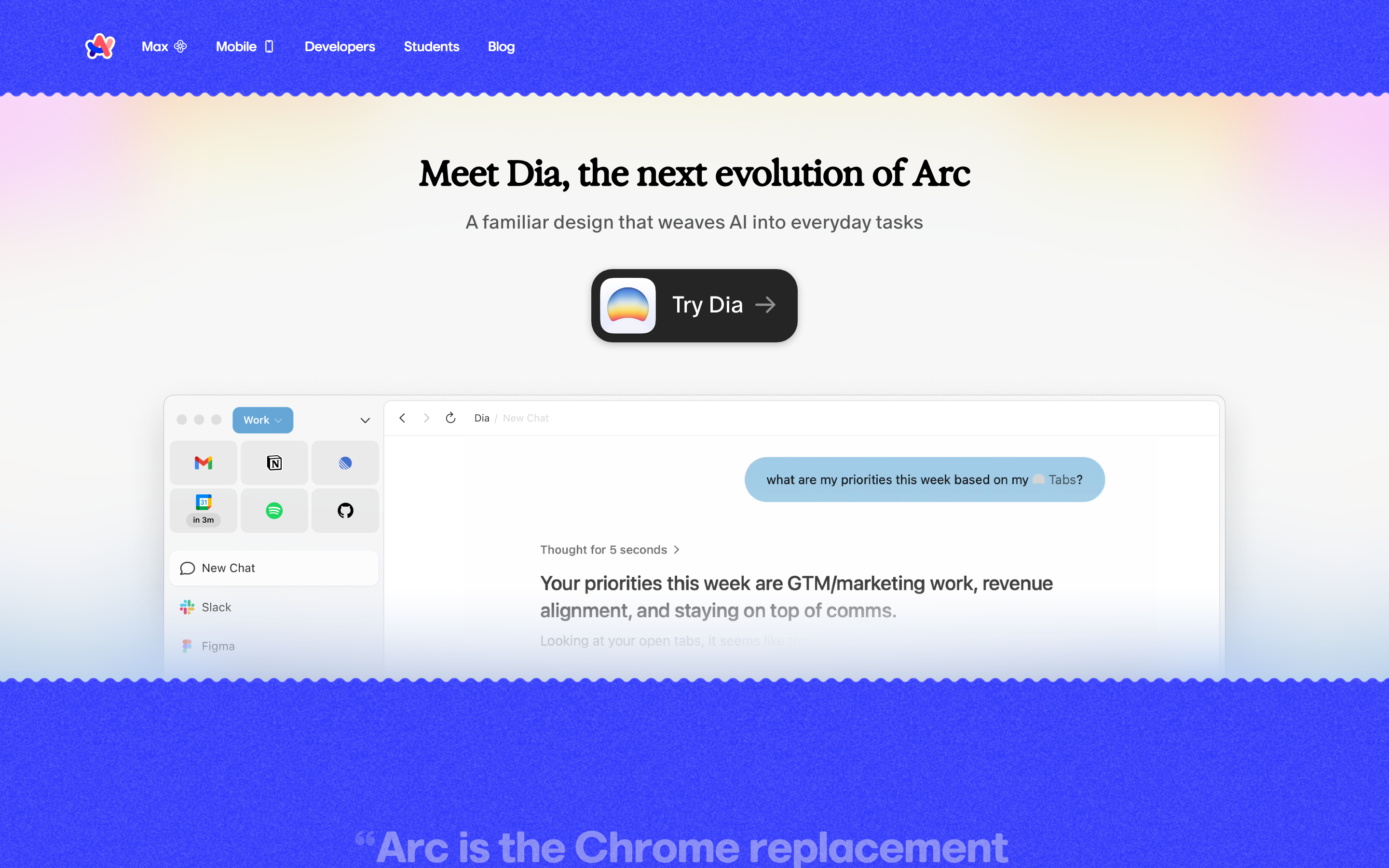
1. The Sidebar Revolution
Arc’s most visible innovation: replacing horizontal tabs with a vertical sidebar that organizes content by context, not recency.
TRADITIONAL TAB BAR:
┌──────────────────────────────────────────────────────────────┐
│ [←][→][↻] │ Tab 1 │ Tab 2 │ Tab 3 │ Tab 4 │ Tab 5 │ ... │ + │
├──────────────────────────────────────────────────────────────┤
│                                                              │
│                    Page Content                              │
│                                                              │
└──────────────────────────────────────────────────────────────┘
 Problems: Tabs shrink to unreadable, no organization, endless row

ARC'S SIDEBAR MODEL:
┌────────────────┬─────────────────────────────────────────────┐
│  [*] Space     │                                             │
│  ───────────── │                                             │
│  Pinned        │                                             │
│    Gmail       │                                             │
│    Calendar    │          Page Content                       │
│    Notion      │          (full width)                       │
│                │                                             │
│  ───────────── │                                             │
│  Today         │                                             │
│    Tab 1       │                                             │
│    Tab 2       │                                             │
│    Tab 3       │                                             │
│                │                                             │
│  [+ New Tab]   │                                             │
└────────────────┴─────────────────────────────────────────────┘
 Benefits: Readable titles, pinned favorites, organized by purpose
The Key Insight: Horizontal space is premium; vertical space is abundant. Using the sidebar lets tab titles breathe.
CSS Pattern (Collapsible Sidebar):
.sidebar {
  --sidebar-width: 240px;
  --sidebar-collapsed: 48px;

  width: var(--sidebar-width);
  height: 100vh;
  display: flex;
  flex-direction: column;
  background: var(--surface-1);
  transition: width 0.2s ease-out;
}

.sidebar.collapsed {
  width: var(--sidebar-collapsed);
}

.sidebar.collapsed .tab-title {
  opacity: 0;
  pointer-events: none;
}

/* Hover to peek */
.sidebar.collapsed:hover {
  width: var(--sidebar-width);
}

.sidebar.collapsed:hover .tab-title {
  opacity: 1;
  transition: opacity 0.15s ease-in 0.1s; /* Delay for smooth reveal */
}
SwiftUI Pattern:
struct SidebarView: View {
    @State private var isCollapsed = false
    @State private var isHovering = false

    private var effectiveWidth: CGFloat {
        isCollapsed && !isHovering ? 48 : 240
    }

    var body: some View {
        VStack(alignment: .leading, spacing: 0) {
            PinnedSection()
            Divider()
            TodaySection()
            Spacer()
            NewTabButton()
        }
        .frame(width: effectiveWidth)
        .animation(.easeOut(duration: 0.2), value: effectiveWidth)
        .onHover { isHovering = $0 }
    }
}
2. Spaces: Context-Based Organization
Spaces separate work from personal, project from project. Each Space is a complete browser context with its own tabs, pinned sites, and even theme.
SPACE ARCHITECTURE:

┌─────────────────────────────────────────────────────────────┐
│                        Arc Browser                          │
├───────────┬───────────┬───────────┬─────────────────────────┤
│  Work     │  Personal │  Project  │                         │
│  Space    │  Space    │  Space    │    Content Area         │
│  ─────    │  ─────    │  ─────    │                         │
│  • Slack  │  • Gmail  │  • GitHub │                         │
│  • Docs   │  • Reddit │  • Figma  │                         │
│  • Jira   │  • Netflix│  • Notion │                         │
└───────────┴───────────┴───────────┴─────────────────────────┘

Each Space has:
├── Unique pinned tabs
├── Separate "Today" tabs
├── Own color theme/gradient
├── Isolated browsing context
└── Keyboard shortcut (Cmd+1, Cmd+2, etc.)
The Key Insight: Mental contexts shouldn’t leak. Work tabs appearing during personal time creates cognitive friction.
Data Model:
interface Space {
  id: string;
  name: string;
  icon?: string;
  gradient: {
    from: string;
    to: string;
    angle: number;
  };
  pinnedTabs: Tab[];
  todayTabs: Tab[];
  archivedTabs: Tab[];
  profile?: BrowserProfile; // Different cookies, history, etc.
}

interface Tab {
  id: string;
  url: string;
  title: string;
  favicon?: string;
  isPinned: boolean;
  lastAccessed: Date;
  parentFolderId?: string;
}
SwiftUI Implementation:
struct SpaceSwitcher: View {
    @Binding var currentSpace: Space
    let spaces: [Space]

    var body: some View {
        HStack(spacing: 8) {
            ForEach(spaces) { space in
                SpaceButton(
                    space: space,
                    isActive: space.id == currentSpace.id
                ) {
                    withAnimation(.spring(response: 0.3, dampingFraction: 0.7)) {
                        currentSpace = space
                    }
                }
            }
        }
        .padding(.horizontal, 12)
    }
}

struct SpaceButton: View {
    let space: Space
    let isActive: Bool
    let action: () -> Void

    var body: some View {
        Button(action: action) {
            Circle()
                .fill(
                    LinearGradient(
                        colors: [space.gradient.from, space.gradient.to],
                        startPoint: .topLeading,
                        endPoint: .bottomTrailing
                    )
                )
                .frame(width: 24, height: 24)
                .overlay {
                    if isActive {
                        Circle()
                            .strokeBorder(.white, lineWidth: 2)
                    }
                }
        }
        .buttonStyle(.plain)
        .keyboardShortcut(space.keyboardShortcut)
    }
}
3. Command Bar: Spotlight for the Browser
Arc’s Command Bar (Cmd+T) is more than a URL bar. It provides universal search across tabs, history, bookmarks, and actions.
COMMAND BAR INTERACTION:

┌─────────────────────────────────────────────────────────────┐
│  > Search tabs, history, or type a URL...                   │
├─────────────────────────────────────────────────────────────┤
│  OPEN TABS                                                  │
│    [doc] Notion - Project Planning            Cmd+1         │
│    [doc] GitHub - Pull Request #123                         │
│                                                             │
│  HISTORY                                                    │
│    [>] Figma - Design System (2 hours ago)                  │
│    [>] MDN - CSS Grid Guide (yesterday)                     │
│                                                             │
│  ACTIONS                                                    │
│    [*] New Note                               Cmd+Shift+N   │
│    [*] Split View                             Cmd+Shift+\   │
│    [*] Copy URL                               Cmd+Shift+C   │
└─────────────────────────────────────────────────────────────┘
The Key Insight: Finding should be faster than organizing. Good search eliminates the need for perfect organization.
CSS Pattern:
.command-bar {
  --bar-width: min(600px, 90vw);

  position: fixed;
  top: 20%;
  left: 50%;
  transform: translateX(-50%);
  width: var(--bar-width);
  background: var(--surface-elevated);
  border-radius: var(--radius-lg);
  box-shadow:
    0 4px 24px rgba(0, 0, 0, 0.2),
    0 0 0 1px rgba(255, 255, 255, 0.1);
  overflow: hidden;
}

.command-input {
  width: 100%;
  padding: 16px 20px;
  font-size: 18px;
  background: transparent;
  border: none;
  color: var(--text-primary);
}

.command-results {
  max-height: 400px;
  overflow-y: auto;
  border-top: 1px solid var(--border-subtle);
}

.command-result {
  display: flex;
  align-items: center;
  gap: 12px;
  padding: 10px 20px;
  cursor: pointer;
}

.command-result:hover,
.command-result.selected {
  background: var(--surface-hover);
}

.command-result-shortcut {
  margin-left: auto;
  font-size: 12px;
  color: var(--text-secondary);
  font-family: var(--font-mono);
}
4. Boosts: User-Level Customization
Boosts let users inject custom CSS and JavaScript into any website: personal dark modes, decluttered interfaces, or enhanced functionality.
BOOST CONCEPT:

Without Boost:                    With Boost:
┌─────────────────────┐          ┌─────────────────────┐
│ [Header]            │          │                     │
│ [Navigation]        │          │                     │
│ [Sidebar] [Content] │    →     │     [Content]       │
│ [Footer]            │          │     (clean, focused)│
│ [Cookie Banner]     │          │                     │
└─────────────────────┘          └─────────────────────┘

User-created CSS:
- Hide distracting elements
- Change colors/fonts
- Improve readability
The Key Insight: Every user has sites they visit daily but wish worked differently. Give them control.
Implementation Pattern:
interface Boost {
  id: string;
  name: string;
  domain: string; // "github.com" or "*.google.com"
  enabled: boolean;
  css?: string;
  js?: string;
  createdAt: Date;
}

// Example Boost: Clean YouTube
const youtubeBoost: Boost = {
  id: 'youtube-clean',
  name: 'Clean YouTube',
  domain: 'youtube.com',
  enabled: true,
  css: `
    /* Hide recommendations */
    #secondary,
    ytd-browse[page-subtype="home"] ytd-rich-grid-renderer {
      display: none !important;
    }

    /* Hide comments */
    #comments {
      display: none !important;
    }

    /* Expand video */
    #primary {
      max-width: 100% !important;
    }
  `
};
SwiftUI Boost Editor:
struct BoostEditor: View {
    @Binding var boost: Boost
    @State private var activeTab: BoostTab = .css

    enum BoostTab: String, CaseIterable {
        case css = "CSS"
        case javascript = "JavaScript"
    }

    var body: some View {
        VStack(spacing: 0) {
            // Domain selector
            HStack {
                Image(systemName: "globe")
                TextField("Domain (e.g., github.com)", text: $boost.domain)
                    .textFieldStyle(.plain)
            }
            .padding()
            .background(.ultraThinMaterial)

            // Tab selector
            Picker("", selection: $activeTab) {
                ForEach(BoostTab.allCases, id: \.self) { tab in
                    Text(tab.rawValue).tag(tab)
                }
            }
            .pickerStyle(.segmented)
            .padding()

            // Code editor
            CodeEditor(
                text: activeTab == .css ? $boost.css : $boost.js,
                language: activeTab == .css ? .css : .javascript
            )
        }
    }
}
5. Little Arc: Minimal by Design
Little Arc is a separate, minimal window for quick tasks: one tab, no chrome, distraction-free.
FULL ARC:                         LITTLE ARC:
┌────────┬────────────────┐      ┌────────────────────────┐
│Sidebar │                │      │ ← google.com/search... │
│        │    Content     │      ├────────────────────────┤
│        │                │      │                        │
│        │                │  →   │    Search Results      │
│        │                │      │    (just the content)  │
└────────┴────────────────┘      └────────────────────────┘

Use cases:
- Quick search
- Checking one thing
- Opening links from other apps
The Key Insight: Not every task needs the full browser. Match the interface to the task’s weight.
CSS Pattern (Minimal Chrome):
.mini-browser {
  --chrome-height: 36px;

  border-radius: var(--radius-lg);
  overflow: hidden;
  box-shadow: 0 8px 32px rgba(0, 0, 0, 0.3);
}

.mini-chrome {
  height: var(--chrome-height);
  display: flex;
  align-items: center;
  padding: 0 12px;
  background: var(--surface-1);
  gap: 8px;
}

.mini-url-bar {
  flex: 1;
  padding: 4px 8px;
  font-size: 13px;
  background: var(--surface-2);
  border-radius: var(--radius-sm);
  color: var(--text-secondary);
}

.mini-content {
  height: calc(100% - var(--chrome-height));
}
Transferable Patterns
Pattern 1: Ephemeral vs. Persistent
Arc’s “Today” section auto-archives tabs after 12 hours. Persistent items must be explicitly pinned.
interface EphemeralityConfig {
  defaultLifetime: number; // milliseconds
  onExpire: 'archive' | 'close' | 'prompt';
  exceptions: string[]; // domains that never expire
}

function shouldArchive(tab: Tab, config: EphemeralityConfig): boolean {
  const age = Date.now() - tab.lastAccessed.getTime();
  if (config.exceptions.includes(new URL(tab.url).hostname)) {
    return false;
  }
  return age > config.defaultLifetime;
}
Pattern 2: Split View
Side-by-side browsing without managing separate windows.
struct SplitView: View {
    @State private var splitRatio: CGFloat = 0.5
    let leftTab: Tab
    let rightTab: Tab

    var body: some View {
        GeometryReader { geometry in
            HStack(spacing: 1) {
                WebView(tab: leftTab)
                    .frame(width: geometry.size.width * splitRatio)

                // Draggable divider
                Rectangle()
                    .fill(.quaternary)
                    .frame(width: 4)
                    .gesture(
                        DragGesture()
                            .onChanged { value in
                                let newRatio = value.location.x / geometry.size.width
                                splitRatio = max(0.2, min(0.8, newRatio))
                            }
                    )

                WebView(tab: rightTab)
            }
        }
    }
}
Pattern 3: Gradient Identities
Each Space has a unique gradient that provides instant visual recognition.
.space-gradient {
  --gradient-work: linear-gradient(135deg, #667eea 0%, #764ba2 100%);
  --gradient-personal: linear-gradient(135deg, #f093fb 0%, #f5576c 100%);
  --gradient-project: linear-gradient(135deg, #4facfe 0%, #00f2fe 100%);
}

.space-indicator {
  width: 100%;
  height: 4px;
  background: var(--current-gradient);
}

.space-badge {
  width: 28px;
  height: 28px;
  border-radius: 50%;
  background: var(--current-gradient);
  display: flex;
  align-items: center;
  justify-content: center;
}
Design Lessons
- Challenge assumptions: The tab bar isn’t sacred; nothing is
- Context separation: Different tasks deserve different environments
- Keyboard-first: Power users navigate without a mouse
- Progressive complexity: Simple by default, powerful when needed
- User customization: Let people make software their own
- Appropriate weight: Match interface complexity to task complexity
Frequently Asked Questions
Why did Arc use a vertical sidebar instead of horizontal tabs?
Horizontal tabs shrink to unreadable widths when you open many pages. Vertical sidebars use abundant screen height on modern widescreen monitors, keeping tab titles fully visible. The sidebar also enables organization features like pinned sections and folders that don’t work well horizontally.
How do Arc Spaces differ from browser profiles?
Spaces are lighter-weight than full browser profiles. While profiles create completely separate browser instances (different cookies, history, extensions), Spaces share your browser setup but organize tabs by context. You can switch Spaces instantly with keyboard shortcuts, whereas switching profiles requires relaunching or opening new windows.
What happens to tabs in Arc’s “Today” section?
Tabs in the Today section auto-archive after 12 hours of inactivity. They aren’t deleted but move to a searchable archive. This prevents tab hoarding while keeping content recoverable. Pinned tabs never auto-archive.
Can I use Arc’s design patterns in my own app?
Yes. The patterns documented here (collapsible sidebar, command palette, Spaces architecture, Boost system) are transferable concepts. The code examples show CSS, SwiftUI, and TypeScript implementations you can adapt. The sidebar and command bar patterns work particularly well for any content-heavy application.
How does Arc’s Command Bar improve on traditional URL bars?
Traditional URL bars search history and suggest URLs. Arc’s Command Bar searches open tabs, history, bookmarks, and available actions from a single input. You can find an open tab, run a command, or navigate somewhere new without switching context or remembering where something lives.
References
- Josh Miller (The Browser Company CEO) on Arc’s design philosophy: The Browser Company Blog
- Browser interface evolution and the persistence of the tab bar: Nielsen Norman Group - Browser UX
- Keyboard-first interface design patterns: Human Interface Guidelines - Keyboard Navigation
- Command palette patterns in modern software: Superhuman, Linear, and Raycast implementations