Things 3: The Art of Focused Simplicity
How Things 3 achieved simplicity through constraints: natural hierarchy, When vs Deadline separation, and keyboard-first design. SwiftUI code included.
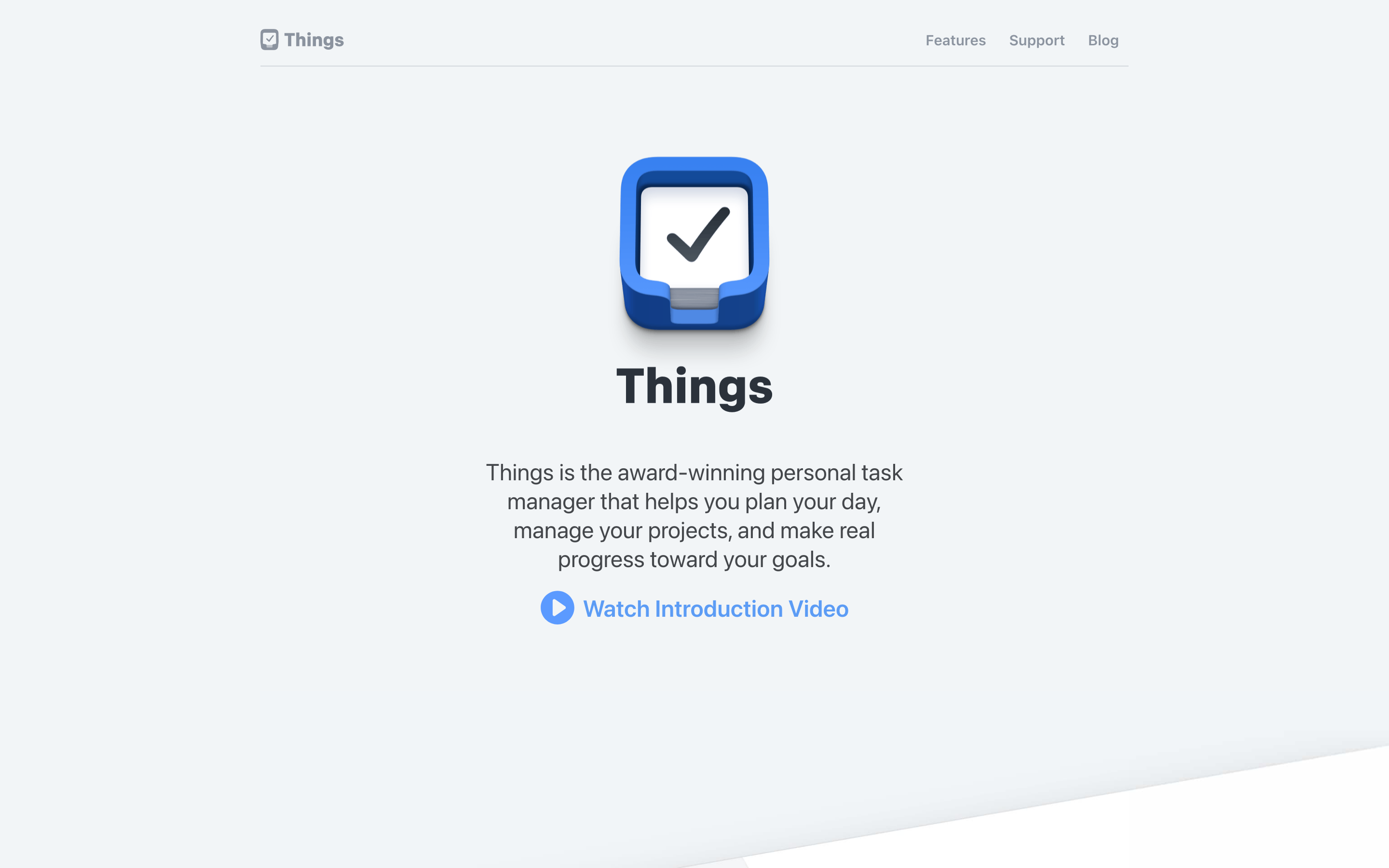
Things 3: The Art of Focused Simplicity
“We believe simple is hard.” — Cultured Code
Things 3 is often called the most beautiful task manager ever made. That beauty emerges from ruthless focus on what matters and elimination of everything else.
Why Things 3 Matters
Things 3 demonstrates that constraints create clarity. While competitors pile on features (recurring tasks with 47 options, projects with dependencies and Gantt charts), Things asks: what does a person actually need to get things done?
Key achievements: - Achieved visual simplicity without sacrificing depth - Made dates meaningful (Today, Evening, Someday) - Created a hierarchy that mirrors how humans think about work - Proved keyboard-first can be beautiful - Set the standard for macOS/iOS native app design
Key Takeaways
- Separate “when will I do this?” from “when is it due?” - Things’ dual-date model (When + Deadline) eliminates the ambiguity that plagues most task apps; schedule intention and hard deadlines serve different purposes
- Someday is a feature, not a failure state - Giving ideas a pressure-free home prevents inbox anxiety; tasks in Someday don’t clutter Today or trigger guilt
- Areas never complete, Projects do - This distinction mirrors human cognition: “Work” is an ongoing life domain, “Ship v2.0” has a finish line; mixing these creates confusion
- Reserve color for meaning - Things’ interface is 95% neutral (black, white, gray); color appears only for semantic information (yellow=Today, red=Deadline, indigo=Evening)
- Completion should feel rewarding - The checkbox animation (fill → checkmark → sound) takes 500ms but delivers dopamine; completing tasks becomes intrinsically motivating
Core Design Principles
1. The Natural Hierarchy
Things organizes work the way humans think about it: from the broad (areas of life) to the specific (individual tasks).
THINGS HIERARCHY:

Area (Work, Personal, Health)     ← Broad life categories
  │
  └── Project (Launch App)        ← Finite goal with tasks
        │
        └── Heading (Design)      ← Optional grouping
              │
              └── To-Do           ← Single actionable item
                    │
                    └── Checklist ← Sub-steps within task

Example:
┌─────────────────────────────────────────────────────────────┐
│ [A] WORK (Area)                                             │
│   ├── [P] Ship Version 2.0 (Project)                        │
│   │     ├── [H] Design                                      │
│   │     │     ├── [ ] Create new icons                      │
│   │     │     └── [ ] Update color palette                  │
│   │     └── [H] Development                                 │
│   │           ├── [ ] Implement auth flow                   │
│   │           └── [ ] Add analytics                         │
│   └── [P] Website Redesign (Project)                        │
│         └── [ ] Write copy for landing page                 │
└─────────────────────────────────────────────────────────────┘
The Key Insight: Areas never complete (they’re life categories). Projects complete (ship by Friday). The distinction eliminates planning paralysis.
Data Model:
// Things' hierarchy expressed in code
struct Area: Identifiable {
    let id: UUID
    var title: String
    var projects: [Project]
    var tasks: [Task]  // Loose tasks not in projects
}

struct Project: Identifiable {
    let id: UUID
    var title: String
    var notes: String?
    var deadline: Date?
    var headings: [Heading]
    var tasks: [Task]
    var isComplete: Bool
}

struct Heading: Identifiable {
    let id: UUID
    var title: String
    var tasks: [Task]
}

struct Task: Identifiable {
    let id: UUID
    var title: String
    var notes: String?
    var when: TaskSchedule?
    var deadline: Date?
    var tags: [Tag]
    var checklist: [ChecklistItem]
    var isComplete: Bool
}

enum TaskSchedule {
    case today
    case evening
    case specificDate(Date)
    case someday
}
2. When, Not Just Due
Things separates “when will I do this?” (Today, Evening, Someday) from “when must this be done?” (Deadline). Most apps conflate these.
TRADITIONAL DATE MODEL:
┌──────────────────────────────────────────────────────────────┐
│ Task: Write report                                           │
│ Due: March 15th                                              │
│                                                              │
│ Problem: Is March 15th when I'll do it, or when it's due?   │
│          If it's due, when should I start?                  │
└──────────────────────────────────────────────────────────────┘

THINGS DATE MODEL:
┌──────────────────────────────────────────────────────────────┐
│ Task: Write report                                           │
│ When: Today (I'll work on it today)                         │
│ Deadline: March 15th (must be complete by then)             │
│                                                              │
│ Clarity: Two separate questions, two separate answers       │
└──────────────────────────────────────────────────────────────┘

SMART LISTS (automatic filtering):

┌───────────────────┬─────────────────────────────────────────┐
│ [I] INBOX         │ Uncategorized captures                  │
├───────────────────┼─────────────────────────────────────────┤
│ [*] TODAY         │ when == .today OR deadline == today     │
├───────────────────┼─────────────────────────────────────────┤
│ [E] THIS EVENING  │ when == .evening                        │
├───────────────────┼─────────────────────────────────────────┤
│ [D] UPCOMING      │ when == .specificDate (future)          │
├───────────────────┼─────────────────────────────────────────┤
│ [A] ANYTIME       │ when == nil AND deadline == nil         │
├───────────────────┼─────────────────────────────────────────┤
│ [S] SOMEDAY       │ when == .someday                        │
├───────────────────┼─────────────────────────────────────────┤
│ [L] LOGBOOK       │ isComplete == true                      │
└───────────────────┴─────────────────────────────────────────┘
The Key Insight: “Someday” isn’t a failure state—it’s a pressure release. Ideas have a place without cluttering Today.
SwiftUI Implementation:
struct WhenPicker: View {
    @Binding var schedule: TaskSchedule?
    @Binding var deadline: Date?
    @State private var showDatePicker = false

    var body: some View {
        VStack(spacing: 12) {
            // Quick options
            HStack(spacing: 8) {
                WhenButton(
                    icon: "star.fill",
                    label: "Today",
                    color: .yellow,
                    isSelected: schedule == .today
                ) {
                    schedule = .today
                }

                WhenButton(
                    icon: "moon.fill",
                    label: "Evening",
                    color: .indigo,
                    isSelected: schedule == .evening
                ) {
                    schedule = .evening
                }

                WhenButton(
                    icon: "calendar",
                    label: "Pick Date",
                    color: .red,
                    isSelected: showDatePicker
                ) {
                    showDatePicker = true
                }

                WhenButton(
                    icon: "archivebox.fill",
                    label: "Someday",
                    color: .brown,
                    isSelected: schedule == .someday
                ) {
                    schedule = .someday
                }
            }

            // Deadline (separate from "when")
            if let deadline = deadline {
                HStack {
                    Image(systemName: "flag.fill")
                        .foregroundStyle(.red)
                    Text("Deadline: \(deadline, style: .date)")
                    Spacer()
                    Button("Clear") { self.deadline = nil }
                }
                .font(.caption)
            }
        }
    }
}

struct WhenButton: View {
    let icon: String
    let label: String
    let color: Color
    let isSelected: Bool
    let action: () -> Void

    var body: some View {
        Button(action: action) {
            VStack(spacing: 4) {
                Image(systemName: icon)
                    .font(.title2)
                Text(label)
                    .font(.caption2)
            }
            .frame(maxWidth: .infinity)
            .padding(.vertical, 8)
            .background(isSelected ? color.opacity(0.2) : .clear)
            .cornerRadius(8)
        }
        .buttonStyle(.plain)
        .foregroundStyle(isSelected ? color : .secondary)
    }
}
3. Keyboard-First, Mouse-Friendly
Things can be operated entirely via keyboard with muscle-memory efficiency, yet remains intuitive for mouse users.
KEYBOARD SHORTCUTS (memorizable patterns):

NAVIGATION:
  Cmd+1-6      Jump to smart lists (Inbox, Today, etc.)
  Cmd+Up/Down  Move between sections
  Space        Quick Look (preview task details)

TASK MANIPULATION:
  Cmd+K        Complete task
  Cmd+S        Schedule (When picker)
  Cmd+Shift+D  Set deadline
  Cmd+Shift+M  Move to project
  Cmd+Shift+T  Add tags

CREATION:
  Space/Return Create new task (context-aware)
  Cmd+N        New task in Inbox
  Cmd+Opt+N    New project

Quick Entry (global hotkey):
  Ctrl+Space   Opens floating quick entry from anywhere
  ┌─────────────────────────────────────────────────┐
  │ [ ] |                                           │
  │   New task appears wherever you are             │
  └─────────────────────────────────────────────────┘
The Key Insight: Shortcuts should be discoverable but not required. The interface hints at keys without demanding them.
CSS Pattern (Shortcut Hints):
.action-button {
  display: flex;
  align-items: center;
  gap: 8px;
  padding: 8px 12px;
}

.shortcut-hint {
  font-size: 11px;
  font-family: var(--font-mono);
  padding: 2px 6px;
  background: var(--surface-subtle);
  border-radius: 4px;
  color: var(--text-tertiary);
  opacity: 0;
  transition: opacity 0.15s ease;
}

/* Show on hover */
.action-button:hover .shortcut-hint {
  opacity: 1;
}

/* Always visible when focused via keyboard */
.action-button:focus-visible .shortcut-hint {
  opacity: 1;
}
SwiftUI Quick Entry:
struct QuickEntryPanel: View {
    @Binding var isPresented: Bool
    @State private var taskTitle = ""
    @FocusState private var isFocused: Bool

    var body: some View {
        VStack(spacing: 0) {
            HStack(spacing: 12) {
                // Checkbox (visual only)
                Circle()
                    .strokeBorder(.tertiary, lineWidth: 1.5)
                    .frame(width: 20, height: 20)

                // Task input
                TextField("New To-Do", text: $taskTitle)
                    .textFieldStyle(.plain)
                    .font(.body)
                    .focused($isFocused)
                    .onSubmit {
                        createTask()
                    }
            }
            .padding()
            .background(.ultraThinMaterial)
            .cornerRadius(12)
            .shadow(color: .black.opacity(0.2), radius: 20, y: 10)
        }
        .frame(width: 500)
        .onAppear {
            isFocused = true
        }
        .onExitCommand {
            isPresented = false
        }
    }

    private func createTask() {
        guard !taskTitle.isEmpty else { return }
        // Create task in Inbox
        TaskStore.shared.createTask(title: taskTitle)
        taskTitle = ""
    }
}
4. Visual Restraint
Things uses color sparingly, reserving it only for meaning. Most of the interface is neutral, letting colored elements stand out.
COLOR USAGE IN THINGS:

Neutral (95% of interface):
├── Background: Pure white / Deep gray
├── Text: Black / White
├── Borders: Very subtle gray
└── Icons: Monochrome

Meaningful Color (5%):
├── Yellow [*] = Today
├── Red [!] = Deadline / Overdue
├── Blue [#] = Tags (user-assigned)
├── Green [x] = Completion animation
└── Indigo [E] = Evening

VISUAL EXAMPLE:

┌─────────────────────────────────────────────────────────────┐
│ TODAY                                        [*] (yellow)   │
├─────────────────────────────────────────────────────────────┤
│ ( ) Write documentation                                     │
│     Project Name - [!] Due tomorrow (red)                   │
│                                                             │
│ ( ) Review pull requests                                    │
│     [#] work (blue tag)                                     │
│                                                             │
│ ( ) Call dentist                                            │
│     [E] This Evening (indigo badge)                         │
└─────────────────────────────────────────────────────────────┘

Notice: Most text is black. Color only appears where it carries meaning.
The Key Insight: When everything is colorful, nothing stands out. Reserve color for information.
CSS Pattern:
:root {
  /* Neutral palette (most of UI) */
  --surface-primary: #ffffff;
  --surface-secondary: #f5f5f7;
  --text-primary: #1d1d1f;
  --text-secondary: #86868b;
  --border: rgba(0, 0, 0, 0.08);

  /* Semantic colors (used sparingly) */
  --color-today: #f5c518;
  --color-deadline: #ff3b30;
  --color-evening: #5856d6;
  --color-complete: #34c759;
  --color-tag: #007aff;
}

/* Task row - mostly neutral */
.task-row {
  display: flex;
  align-items: flex-start;
  gap: 12px;
  padding: 12px 16px;
  border-bottom: 1px solid var(--border);
  background: var(--surface-primary);
  color: var(--text-primary);
}

/* Color only for meaning */
.deadline-badge {
  font-size: 12px;
  color: var(--color-deadline);
}

.deadline-badge.overdue {
  font-weight: 600;
  color: var(--color-deadline);
}

.tag {
  font-size: 12px;
  padding: 2px 8px;
  border-radius: 4px;
  background: var(--color-tag);
  color: white;
}

.evening-badge {
  color: var(--color-evening);
}
5. Delightful Completion
The completion animation delivers reward, not mere feedback. A satisfying “plink” sound and smooth check animation make completing tasks feel good.
COMPLETION SEQUENCE:

Frame 1:     ○ Task title
Frame 2-4:   ◔ (circle fills clockwise)
Frame 5-7:   ● (fully filled, brief pause)
Frame 8-10:  ✓ (check appears, scales up slightly)
Frame 11+:   Row slides away, list closes gap

Audio: Soft "plink" at Frame 7-8 (completion moment)
Haptic: Light tap on iOS at completion
SwiftUI Implementation:
struct CompletableCheckbox: View {
    @Binding var isComplete: Bool
    @State private var animationPhase: AnimationPhase = .unchecked

    enum AnimationPhase {
        case unchecked, filling, checked, done
    }

    var body: some View {
        Button {
            completeWithAnimation()
        } label: {
            ZStack {
                // Background circle
                Circle()
                    .strokeBorder(.tertiary, lineWidth: 1.5)
                    .frame(width: 22, height: 22)

                // Fill animation
                Circle()
                    .trim(from: 0, to: fillAmount)
                    .stroke(.green, lineWidth: 1.5)
                    .frame(width: 22, height: 22)
                    .rotationEffect(.degrees(-90))

                // Checkmark
                Image(systemName: "checkmark")
                    .font(.system(size: 12, weight: .bold))
                    .foregroundStyle(.green)
                    .scaleEffect(checkScale)
                    .opacity(checkOpacity)
            }
        }
        .buttonStyle(.plain)
        .sensoryFeedback(.success, trigger: animationPhase == .checked)
    }

    private var fillAmount: CGFloat {
        switch animationPhase {
        case .unchecked: return 0
        case .filling: return 1
        case .checked, .done: return 1
        }
    }

    private var checkScale: CGFloat {
        animationPhase == .checked ? 1.2 : (animationPhase == .done ? 1.0 : 0)
    }

    private var checkOpacity: CGFloat {
        animationPhase == .unchecked || animationPhase == .filling ? 0 : 1
    }

    private func completeWithAnimation() {
        // Phase 1: Fill the circle
        withAnimation(.easeInOut(duration: 0.2)) {
            animationPhase = .filling
        }

        // Phase 2: Show checkmark with bounce
        DispatchQueue.main.asyncAfter(deadline: .now() + 0.2) {
            withAnimation(.spring(response: 0.3, dampingFraction: 0.5)) {
                animationPhase = .checked
            }
        }

        // Phase 3: Settle and mark complete
        DispatchQueue.main.asyncAfter(deadline: .now() + 0.5) {
            withAnimation(.easeOut(duration: 0.15)) {
                animationPhase = .done
            }
            isComplete = true
        }
    }
}
Transferable Patterns
Pattern 1: Progressive Task Details
Task details expand inline rather than navigating to a separate view.
struct ExpandableTask: View {
    let task: Task
    @State private var isExpanded = false

    var body: some View {
        VStack(alignment: .leading, spacing: 0) {
            // Always visible row
            TaskRow(task: task, isExpanded: $isExpanded)

            // Expandable details
            if isExpanded {
                TaskDetails(task: task)
                    .padding(.leading, 44) // Align with title
                    .transition(.asymmetric(
                        insertion: .push(from: .top).combined(with: .opacity),
                        removal: .push(from: .bottom).combined(with: .opacity)
                    ))
            }
        }
        .animation(.spring(response: 0.3, dampingFraction: 0.8), value: isExpanded)
    }
}
Pattern 2: Natural Language Input
Things parses natural language to set dates: “tomorrow”, “next week”, “June 15”.
function parseNaturalDate(input: string): TaskSchedule | null {
  const lower = input.toLowerCase();

  // Today shortcuts
  if (['today', 'tod', 'now'].includes(lower)) {
    return { type: 'today' };
  }

  // Evening
  if (['tonight', 'evening', 'eve'].includes(lower)) {
    return { type: 'evening' };
  }

  // Tomorrow
  if (['tomorrow', 'tom', 'tmrw'].includes(lower)) {
    const date = new Date();
    date.setDate(date.getDate() + 1);
    return { type: 'date', date };
  }

  // Someday
  if (['someday', 'later', 'eventually'].includes(lower)) {
    return { type: 'someday' };
  }

  // Relative days
  const inMatch = lower.match(/in (\d+) days?/);
  if (inMatch) {
    const date = new Date();
    date.setDate(date.getDate() + parseInt(inMatch[1]));
    return { type: 'date', date };
  }

  // Day names
  const days = ['sunday', 'monday', 'tuesday', 'wednesday', 'thursday', 'friday', 'saturday'];
  const dayIndex = days.findIndex(d => lower.startsWith(d.slice(0, 3)));
  if (dayIndex !== -1) {
    const date = getNextDayOfWeek(dayIndex);
    return { type: 'date', date };
  }

  return null;
}
Pattern 3: List-Based Drag and Drop
Reordering is direct manipulation with clear visual feedback.
.task-row {
  transition: transform 0.15s ease, box-shadow 0.15s ease;
}

.task-row.dragging {
  transform: scale(1.02);
  box-shadow:
    0 4px 12px rgba(0, 0, 0, 0.15),
    0 0 0 2px var(--color-focus);
  z-index: 100;
}

.task-row.drop-above::before {
  content: '';
  position: absolute;
  top: -2px;
  left: 44px;
  right: 16px;
  height: 4px;
  background: var(--color-focus);
  border-radius: 2px;
}

.task-row.drop-below::after {
  content: '';
  position: absolute;
  bottom: -2px;
  left: 44px;
  right: 16px;
  height: 4px;
  background: var(--color-focus);
  border-radius: 2px;
}
Design Lessons
- Separate concerns: “When will I do this?” vs “When is it due?” are different questions
- Restraint with color: Reserve color for meaning; neutral is the default
- Completion is reward: Make finishing tasks feel good
- Keyboard accelerates, mouse welcomes: Design for both without compromising either
- Natural hierarchies: Mirror how humans already think about work (areas → projects → tasks)
- Someday is a feature: Give ideas a home that doesn’t create pressure
Frequently Asked Questions
What is the difference between “When” and “Deadline” in Things 3?
“When” answers “when will I work on this?” (Today, This Evening, Someday, or a specific date). “Deadline” answers “when must this be complete?” Most task apps conflate these, but they serve different purposes. A task might be due Friday (Deadline) but you plan to work on it Wednesday (When). This separation lets you plan your day around intentions while still tracking hard due dates.
How does Things 3’s hierarchy work (Areas, Projects, Tasks)?
Areas are broad life categories that never complete (Work, Personal, Health). Projects are finite goals with a clear end state (Launch App, Plan Vacation). Tasks are single actionable items. Headings optionally group tasks within projects. This mirrors how humans naturally think about work: ongoing responsibilities contain time-bound goals, which contain discrete actions.
Why does Things 3 use so little color?
Things reserves color exclusively for semantic meaning. The interface is 95% neutral (black, white, gray) so that when color appears, it communicates: yellow means Today, red means Deadline/Overdue, indigo means Evening, blue marks tags. If everything were colorful, nothing would stand out. The restraint makes the meaningful colors impossible to miss.
What is “Someday” in Things 3 and why is it valuable?
Someday is a dedicated space for tasks you want to remember but don’t want cluttering your active lists. It’s not a failure state—it’s a pressure release valve. Ideas for “someday” (learn Spanish, read that book) have a home without creating daily guilt. You can review Someday weekly and promote tasks to Today when you’re ready.
How does Things 3’s completion animation work?
When you tap the checkbox, the circle fills clockwise (200ms), then a checkmark appears with a slight bounce (spring animation), accompanied by a soft “plink” sound and haptic feedback on iOS. The row then slides away (150ms). The total sequence takes about 500ms, but this deliberate timing creates a small dopamine hit that makes completing tasks feel rewarding.
Resources
- Website: culturedcode.com/things
- Design philosophy: Cultured Code blog posts on simplicity
- Keyboard shortcuts: Built-in Help menu (Cmd+/)
- GTD integration: How Things maps to Getting Things Done methodology