Todoist: 17 Years of Warm Minimalism and Maximum Restraint
How Todoist uses a single red accent, opacity-based text hierarchy, and warm off-white canvas to achieve inevitable, timeless design.
Todoist: 17 Years of Warm Minimalism and Maximum Restraint
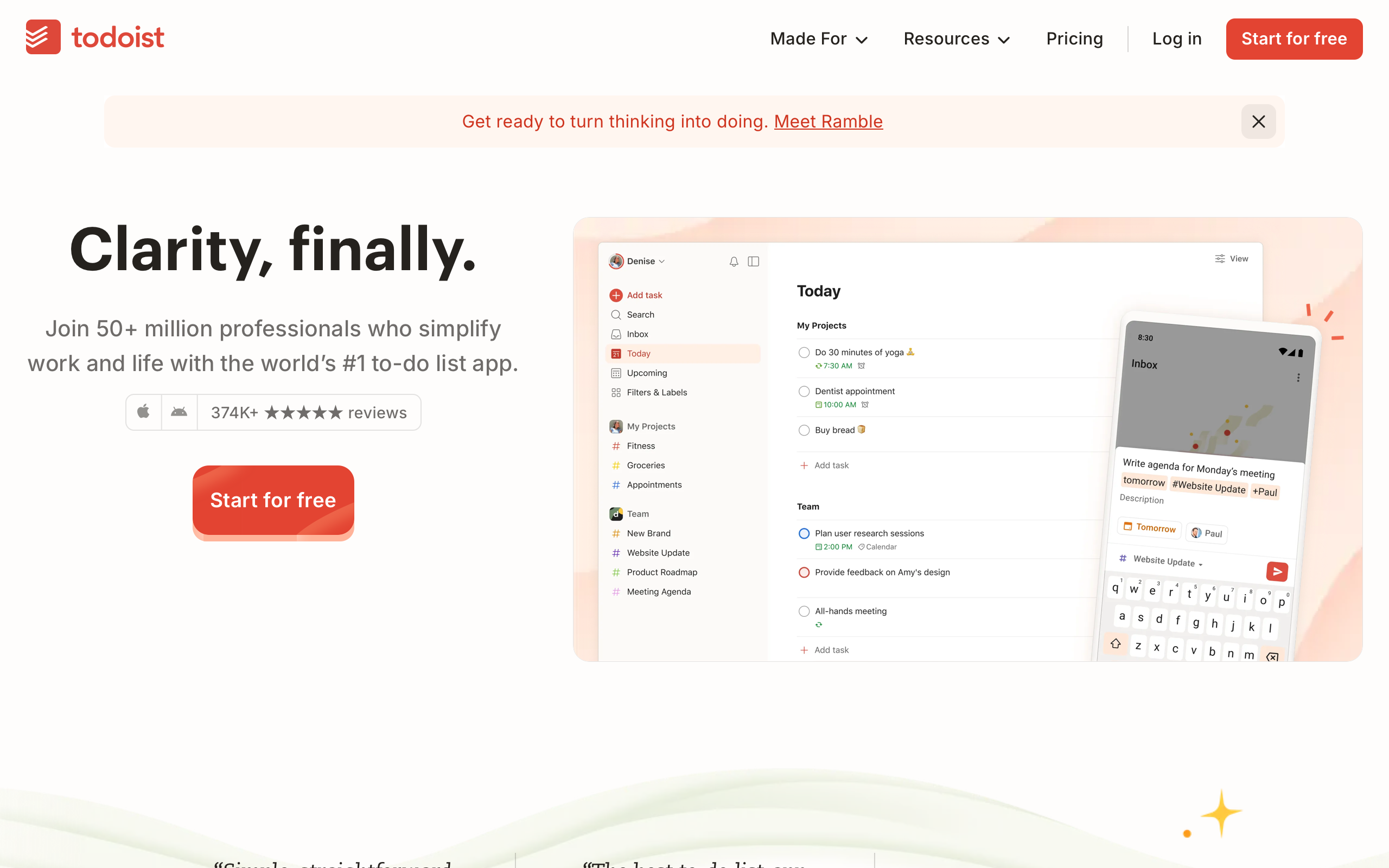
“Clarity, finally.” — Todoist
Todoist has operated on a single thesis for over 17 years: the best task manager is the one you actually use. Founded by Amir Salihefendic in 2007, Todoist has survived every productivity trend — GTD, bullet journaling, second brain, AI agents — by refusing to chase complexity. Doist, the fully remote and profitable company behind it, serves over 50 million professionals with a design philosophy built on consistency and restraint rather than novelty. No growth hacks, no dark patterns, no “upgrade to unlock” gates on core features. The result is a product that feels inevitable, as though this is obviously how a task manager should look.
Key Takeaways
- One brand color is enough - Todoist uses red (#E34432) for the primary CTA and the logo, and nowhere else. This extreme restraint makes every red element feel important.
- Opacity-based text hierarchy creates effortless harmony - All text derives from a single warm dark brown (
rgb(37,34,30)) at varying opacities (100%, 66%, 49%, 18%, 7%), eliminating the need for multiple gray values. - Warm off-white is not white - The background at #FEFDFB (barely-perceptible cream) makes the difference between clinical and inviting, and most users will never consciously notice it.
- Shadows are almost never the answer - Todoist achieves its entire visual hierarchy through color and spacing. Nearly zero shadows appear anywhere in the design.
- 17 years of refinement beats 17 features - Nothing in the design feels new or trendy. Everything feels like it has been tested, refined, and proven over nearly two decades.
Why Todoist Matters
Todoist demonstrates that longevity and restraint are competitive advantages in design. While competitors chase feature parity and visual trends, Todoist’s design has evolved through subtraction — removing what does not serve the core loop of capture, organize, and do. The product’s approach to AI (“Ramble,” which turns voice input into structured tasks) reflects the same philosophy: serve the existing workflow rather than creating a new interaction paradigm.
Key achievements: - Serves 50M+ professionals across every platform (web, iOS, Android, Mac, Windows) with consistent visual language - Maintained a generous freemium model as a profitable, independent company of approximately 100 people - Built natural language input parsing (“Buy groceries every Tuesday at 5pm” becomes a recurring task) that eliminates form-filling friction
Core Design Principles
1. The Single-Color Brand
Red (#E34432) is the only brand color. It appears on the primary CTA button, the logo, and in brand moments. That is it. No secondary accent, no gradient, no color system. This discipline is the design — when everything competes for attention, nothing wins. By restricting red to the moments that matter, Todoist ensures that the eye is drawn precisely where it needs to go.
The hover state darkens to #CF3520, and text links use a separate blue (#0F66AE) to maintain the convention that underlined blue text is clickable. But the brand itself is a single color, applied with surgical precision.
The in-app priority system introduces color only where it carries functional meaning: P1 urgent (#D1453B), P2 high (#EB8909), P3 medium (#246FE0), and P4 default (no color). Even here, the colors serve information, not decoration.
2. Opacity-Based Text Hierarchy
The most disciplined typographic system in any modern productivity tool. Every piece of text on the page is rgb(37,34,30) — a warm dark brown-black with a subtle warm undertone that matches the off-white background. Headlines use 100% opacity. Body text uses 66%. Muted captions use 49%. Borders and subtle dividers use 18%. Background tints use 7%.
This single-hue approach creates harmony that multiple gray values cannot achieve, because every text element shares the same base color and simply varies in presence. There are zero gray values and zero secondary colors in the text system.
Opacity Scale:
100% ████████████████████ Headlines, primary text
 66% █████████████        Body, descriptions
 49% ██████████           Captions, metadata
 18% ████                 Borders, subtle dividers
  7% ██                   Background tints

All derived from rgb(37, 34, 30)
3. Warm Minimalism
The background color #FEFDFB — rgb(254,253,252) — is barely distinguishable from pure white. But the difference is everything. This warm off-white creates an inviting canvas that makes the app feel like opening a well-organized notebook rather than launching clinical software. Product screenshots float naturally in the layout without requiring heavy shadows or borders to separate them from the background.
The green surface (#F4FBF7) and sage surface (#F6FAEB) provide section differentiation through equally subtle shifts in hue. These are not bold section dividers — they are gentle environmental changes that guide the eye without demanding attention.
Transferable Patterns
Todoist’s design system is remarkably portable because of its simplicity. The opacity-based text hierarchy works in any project — replace rgb(37,34,30) with your own base text color and the five opacity levels create an instant, harmonious type system.
The CSS implementation reveals the elegance of the approach:
:root {
  /* Todoist's warm minimal palette */
  --color-background: #FEFDFB;
  --color-surface-green: #F4FBF7;
  --color-surface-sage: #F6FAEB;
  --color-text: rgb(37, 34, 30);
  --color-text-secondary: rgba(37, 34, 30, 0.66);
  --color-text-muted: rgba(37, 34, 30, 0.49);
  --color-text-faint: rgba(37, 34, 30, 0.18);
  --color-text-whisper: rgba(37, 34, 30, 0.07);
  --color-brand: #E34432;
  --color-brand-hover: #CF3520;
  --color-link: #0F66AE;

  /* Typography */
  --font-sans: Graphik, "Graphik fallback", Arial, Helvetica, sans-serif;
}

/* Warm off-white body */
body {
  font-family: var(--font-sans);
  font-size: 16px;
  color: var(--color-text);
  background-color: var(--color-background);
}

/* Hero — confident but not aggressive */
h1 {
  font-size: 55px;
  font-weight: 600;
  line-height: 1.15;
  letter-spacing: -0.55px;
}

/* Single-color CTA — red IS the elevation */
.button-primary {
  background-color: var(--color-brand);
  color: white;
  border-radius: 8px;
  padding: 12px 24px;
  font-weight: 600;
  border: none;
  transition: background-color 0.15s ease;
}
.button-primary:hover {
  background-color: var(--color-brand-hover);
}
The custom Graphik typeface (from Commercial Type) sits in a sweet spot between geometric and humanist — warmer than Inter, less formal than Helvetica. Its neutral warmth matches the off-white background and brown-black text. The hashed filename pattern (Graphik-af49fcca2967e850) indicates Next.js font optimization, ensuring consistent cross-platform rendering that system fonts cannot guarantee.
The headline at 55px/600 weight with 1.15 line-height is notably more approachable than the monumental 1.0 line-heights seen in brands like Rivian or Obsidian. The negative letter-spacing maintains a consistent -1% ratio across sizes (-0.55px at 55px, -0.38px at 38px), creating proportional tightening rather than arbitrary values.
For SwiftUI, the opacity-based text system translates cleanly:
extension Color {
    static let todoistBg = Color(red: 254/255, green: 253/255, blue: 252/255)
    static let todoistText = Color(red: 37/255, green: 34/255, blue: 30/255)
    static let todoistSecondary = Color(red: 37/255, green: 34/255, blue: 30/255).opacity(0.66)
    static let todoistMuted = Color(red: 37/255, green: 34/255, blue: 30/255).opacity(0.49)
    static let todoistBrand = Color(red: 227/255, green: 68/255, blue: 50/255)
    static let todoistSurface = Color(red: 244/255, green: 251/255, blue: 247/255)
}

// Opacity-based text hierarchy in practice
VStack(alignment: .leading, spacing: 8) {
    Text("Clarity, finally.")
        .font(.system(size: 55, weight: .semibold))
        .tracking(-0.55)
        .foregroundStyle(Color.todoistText)

    Text("Join 50+ million professionals who simplify work and life.")
        .font(.system(size: 16))
        .foregroundStyle(Color.todoistText.opacity(0.66))
}
Design Lessons
Restraint is a competitive advantage. Todoist’s single brand color forces every red element to be meaningful. When competitors use three or four accent colors, nothing stands out. When Todoist uses one, the CTA is unmissable.
Warm off-white backgrounds change the emotional register. The difference between #FFFFFF and #FEFDFB is three RGB points — nearly imperceptible in isolation, but transformative in aggregate. The warm background makes the entire experience feel inviting and human. Clinical white makes interfaces feel like tools. Warm off-white makes them feel like spaces you want to inhabit.
Opacity hierarchies are more harmonious than gray scales. Five levels of one base color create effortless cohesion because every text element shares the same hue. Five different gray values (e.g., #333, #666, #999, #CCC, #EEE) create subtle discord because each is a different color, not just a different intensity.
Avoid shadows when spacing and color will do. Todoist proves that an entire visual hierarchy can function without drop shadows. The red CTA is prominent because it is the only saturated color on a warm, muted canvas — not because it floats above the surface. This approach ages better and renders more consistently across devices.
Avoid dark mode on marketing when warmth is the brand. The warm off-white canvas is Todoist’s identity. Dark mode exists in the app (where long sessions make it practical), but the marketing site is always light. The lesson: if warmth is central to your brand, protect it in your most visible surfaces.
Avoid trendy typographic extremes. No 100px+ display text, no extreme negative tracking, no weight 800. Graphik at 600 is as bold as it gets. This restraint means the design does not date itself — it looked appropriate five years ago and will look appropriate five years from now.
Frequently Asked Questions
What makes Todoist’s design feel “inevitable” rather than “designed”?
Seventeen years of continuous refinement. Every element has survived multiple design trends without being replaced by something trendier. The warm off-white background, single red accent, opacity-based text hierarchy, and Graphik typeface are not fashionable choices — they are durable ones that have proven themselves over nearly two decades. When nothing feels added or trendy, the design feels inevitable.
How does Todoist’s opacity-based text hierarchy work?
All text on the page uses a single color — rgb(37,34,30), a warm dark brown-black — at five opacity levels: 100% for headlines, 66% for body text, 49% for captions, 18% for borders, and 7% for background tints. Because every element shares the same base hue, the hierarchy feels naturally cohesive without requiring a palette of different gray values.
Why does Todoist use only one brand color?
Restraint is the design strategy. By restricting red (#E34432) to the CTA button and brand moments, Todoist ensures that the eye goes exactly where it needs to. No secondary accent competes for attention. The discipline of a single brand color also simplifies cross-platform consistency — the same red works identically across web, iOS, Android, Mac, and Windows without a complex color system.
What can designers learn from Todoist’s approach to AI features?
Todoist’s AI feature “Ramble” turns voice input into structured tasks rather than introducing a chatbot or new interaction paradigm. The lesson is that AI should serve existing workflows, not create new ones. The design supports this by keeping natural language input as the most prominent element — type or speak a sentence, and the system does the parsing. No AI branding, no chat bubbles, no novelty for its own sake.
How does Todoist achieve visual hierarchy without shadows?
Through color and spacing alone. The warm off-white background (#FEFDFB) provides a subtle canvas. The single red CTA is prominent because it is the only saturated color in the entire palette. Typography hierarchy comes from size and opacity variations of one base color. Section differentiation uses gentle shifts to green (#F4FBF7) or sage (#F6FAEB) surfaces. The result is a flat, cohesive design that ages well and renders consistently across every device.
References
- Todoist Homepage — Product marketing with warm minimal design
- Todoist Inspiration Blog — Productivity content and product philosophy
- Doist (Parent Company) — Remote-first company culture and values
- Todoist on App Store — iOS app and cross-platform availability
- Graphik Typeface (Commercial Type) — Custom font selection and foundry details