Teenage Engineering: Constraints as Aesthetic
How Teenage Engineering's brutalist design philosophy turns hardware constraints into iconic interfaces. OP-1 UI, monospaced type, and modular thinking.
Teenage Engineering: Constraints as Aesthetic
“If it doesn’t look good, it doesn’t sound good.” — Jesper Kouthoofd, Teenage Engineering CEO
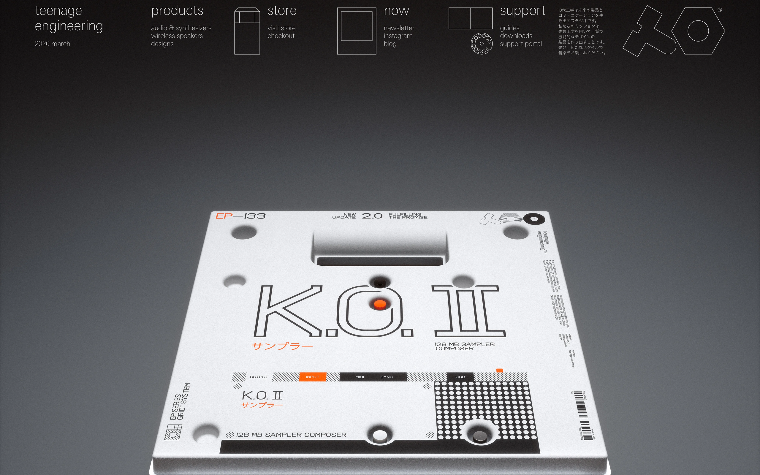
Teenage Engineering is a Swedish electronics company that designs synthesizers, speakers, and audio tools with a visual identity so distinctive it has become shorthand for a design philosophy: the constraint is the point. Their products, the OP-1, the Pocket Operators, the OB-4, look like no other consumer electronics on the market because they refuse to hide their engineering. Exposed screws, monospaced type, raw materials, and interfaces that celebrate limitation rather than apologize for it.
From a design perspective, Teenage Engineering is a masterclass in what happens when you stop trying to make technology invisible and instead make it beautiful on its own terms. Their approach rejects both skeuomorphism (making digital things look physical) and flat minimalism (making things look like nothing). Instead, they occupy a third space: brutalist honesty about what a thing is, combined with obsessive care about how it looks being that thing.
Why Teenage Engineering Matters
Key achievements: - Created the most recognizable product design language in consumer audio since Braun - Proved that brutalist design can be warm, playful, and desirable - Built a brand identity so strong that their orange-and-black palette is instantly recognizable even on unrelated products (their IKEA collaboration, the Nothing Phone co-design) - Demonstrated that hardware constraints can drive software interface innovation - Turned the synthesizer from a niche instrument into a cultural object
Key Takeaways
- Constraints breed invention - The OP-1’s single screen and four knobs forced interface designs that professionals find faster than full-featured DAWs with unlimited screen real estate
- Monospaced typography carries authority - Their exclusive use of monospaced type communicates precision, engineering, and technical honesty without any supporting narrative
- Anti-skeuomorphism is not flat design - Teenage Engineering’s interfaces have depth, texture, and character; they simply refuse to pretend a synth screen is an analog control panel
- Brand palette as ideology - Orange and black is not a color choice but a design manifesto: industrial, high-visibility, unapologetic
- Modular thinking scales - Their design philosophy (interchangeable, repairable, combinable) works identically from hardware to software to brand identity
Core Design Principles
1. The OP-1 Interface Philosophy
The OP-1 field synthesizer has a 2.4-inch OLED screen and four rotary encoders. That is the entire interface surface for a device that contains a synthesizer, sampler, drum machine, sequencer, mixer, and four-track recorder. This extreme constraint produced some of the most inventive interface design in any medium.
How they solved the density problem:
┌─────────────────────────────────────┐
│                                     │
│    ┌─ Synth mode ─────────────┐     │
│    │ ╔═══════════════════════╗ │     │
│    │ ║  ~  ~  ~  ~  ~  ~  ~ ║ │     │  <- Waveform visualizer
│    │ ║ ~  ~  ~  ~  ~  ~  ~  ║ │     │     (real-time, animated)
│    │ ╚═══════════════════════╝ │     │
│    │                           │     │
│    │  FREQ    RES   ENV   LFO  │     │  <- Four parameters
│    │  1.2k   0.45  0.8   3Hz  │     │     mapped to four knobs
│    │  [1]    [2]   [3]   [4]  │     │
│    └───────────────────────────┘     │
│                                     │
│    [ 1 ]  [ 2 ]  [ 3 ]  [ 4 ]      │  <- Physical knobs below screen
│                                     │
└─────────────────────────────────────┘
Key interface decisions: - Each mode (synth, drum, tape, mixer) completely takes over the screen - no persistent navigation chrome - Four parameters are always visible, always mapped to the four physical knobs - Visual feedback is animated and playful: waveforms dance, tape reels spin, the mixer shows bouncing levels - No menus within menus - every function is at most two button presses away
The lesson for software: When you cannot add more UI surface area, you are forced to prioritize ruthlessly. The OP-1’s interface is faster than Pro Tools for many tasks precisely because there are fewer choices at each step.
2. Monospaced Typography as Identity
Teenage Engineering uses monospaced type exclusively across all touchpoints: products, packaging, website, documentation, social media. This is not a stylistic affectation - it is a philosophical position.
/* Teenage Engineering typographic system */
:root {
  --te-font: 'TE-Regular', 'SF Mono', 'Fira Code', monospace;
  --te-font-weight: 400;

  /* Scale is deliberately tight */
  --te-text-xs: 9px;     /* Component labels */
  --te-text-sm: 11px;    /* Metadata, specs */
  --te-text-base: 13px;  /* Body copy */
  --te-text-lg: 16px;    /* Section heads */
  --te-text-xl: 22px;    /* Product names */
  --te-text-display: 48px; /* Hero statements */
}

/* All-caps for labels, mixed case for prose */
.te-label {
  font-family: var(--te-font);
  font-size: var(--te-text-xs);
  text-transform: uppercase;
  letter-spacing: 0.12em;
  color: var(--te-text-secondary);
}

.te-body {
  font-family: var(--te-font);
  font-size: var(--te-text-base);
  line-height: 1.65;
  letter-spacing: 0;
}

/* Price tags, specs - tabular alignment for free */
.te-spec-table {
  font-family: var(--te-font);
  font-variant-numeric: tabular-nums;
  /* Monospace means columns align without table markup */
}
Why monospace works for them: - It signals engineering and precision without saying it - Tabular figures align naturally, critical for specs and pricing - It creates visual rhythm on the page where every character occupies equal space - It looks distinctive in a world where every brand uses geometric sans-serifs - It pairs perfectly with their grid-based layout philosophy
3. Orange and Black as Design Manifesto
The Teenage Engineering color palette is deliberately limited and deliberately confrontational.
:root {
  /* The entire palette */
  --te-orange: #ff6600;        /* THE orange - action, identity */
  --te-black: #000000;         /* True black, not dark gray */
  --te-white: #ffffff;         /* True white for contrast */
  --te-aluminum: #d4d4d4;      /* Raw material color */
  --te-screen-green: #00ff66;  /* OLED display accent */

  /* That's it. Five colors total. */
}

/* Product page: white background, black type, orange accents */
.te-product-page {
  background: var(--te-white);
  color: var(--te-black);
}

.te-product-page .price,
.te-product-page .cta {
  color: var(--te-orange);
}

/* The CTA button is a study in confidence */
.te-button {
  background: var(--te-orange);
  color: var(--te-white);
  font-family: var(--te-font);
  font-size: var(--te-text-sm);
  text-transform: uppercase;
  letter-spacing: 0.1em;
  padding: 12px 24px;
  border: none;
  border-radius: 0;  /* Explicitly zero, not default */
  cursor: pointer;
  transition: background 100ms;
}

.te-button:hover {
  background: #e65c00;  /* Slightly darker orange */
}
The palette philosophy: High-visibility orange comes from industrial safety equipment, construction sites, space suits. It says “important,” “engineered,” “not to be ignored.” Combined with true black (never dark gray), it creates maximum contrast with minimum palette. This is anti-trendy design: it does not follow fashion because it is rooted in function.
Design Patterns Worth Stealing
3D Product Renders as Hero Content
Teenage Engineering’s website features their products as 3D-rendered objects against clean backgrounds, rotatable and explorable. The product is the hero, not a lifestyle photograph of someone using it.
/* Product hero section */
.product-hero {
  display: flex;
  align-items: center;
  justify-content: center;
  min-height: 80vh;
  background: #f5f5f5;
  overflow: hidden;
}

.product-render {
  max-width: 900px;
  width: 100%;
  /* Product image/3D render is the sole focus */
}

/* Specs appear below, not overlaid */
.product-specs {
  display: grid;
  grid-template-columns: repeat(auto-fit, minmax(200px, 1fr));
  gap: 1px;
  background: var(--te-black);
  margin-top: 0;
}

.product-spec {
  background: var(--te-white);
  padding: 24px;
  font-family: var(--te-font);
}

.product-spec .label {
  font-size: var(--te-text-xs);
  text-transform: uppercase;
  letter-spacing: 0.12em;
  color: #999;
  margin-bottom: 8px;
}

.product-spec .value {
  font-size: var(--te-text-lg);
  color: var(--te-black);
}
The grid-of-specs pattern: Specifications are displayed in a grid with 1px black gaps between cells, creating a brutalist table without any border-radius or shadow softening. Each cell contains a monospaced label and value. This makes technical information feel like engineering documentation rather than marketing copy, which increases trust.
Modular Design Thinking
Every Teenage Engineering product is designed to connect with others. Pocket Operators sync via audio cable. The OP-1 records to “tape” that can be exported. The TX-6 is a mixer that connects everything. This philosophy extends to their visual design:
MODULE THINKING IN UI:
┌──────────┐  ┌──────────┐  ┌──────────┐
│ SYNTH    │──│ EFFECTS  │──│ RECORDER │
│          │  │          │  │          │
│ [1][2]   │  │ [1][2]   │  │ [1][2]   │
│ [3][4]   │  │ [3][4]   │  │ [3][4]   │
└──────────┘  └──────────┘  └──────────┘
     │              │              │
     └──────────────┴──────────────┘
            SHARED TRANSPORT

Each module:
- Has its own screen takeover
- Uses the same 4-knob mapping
- Operates independently
- Connects through standard interfaces
The software lesson: Design components as independent modules that communicate through standard interfaces. Each module should work alone and combine with others. This is the Unix philosophy applied to product design: do one thing well, connect through standard pipes.
The Verdict
Teenage Engineering proves that constraint is not the enemy of creativity but its engine. Their five-color palette, monospaced-only typography, and hardware-limited interfaces produce designs that are more distinctive, more functional, and more emotionally resonant than products with unlimited resources and unlimited screen space. They demonstrate that brutalism need not be cold - their products are playful, warm, and deeply human despite (because of) their industrial aesthetic.
The broader lesson is about honesty in design. Teenage Engineering never hides what their products are. Screws are visible. Materials are raw. Interfaces show exactly what is happening. In a design culture obsessed with seamlessness and invisibility, Teenage Engineering makes a compelling case that showing the work is the work.
Best for learning: How to turn limitations into distinctive design language, and how a radically constrained color/type palette can create stronger brand recognition than elaborate design systems.
Frequently Asked Questions
Why does Teenage Engineering use only monospaced typography?
Monospaced type signals precision and engineering without explicit messaging. It creates natural alignment in specifications and pricing, establishes a distinctive visual rhythm where every character occupies equal space, and differentiates the brand in a market dominated by geometric sans-serifs. It is a philosophical choice that says “we are engineers who care about aesthetics” rather than “we are a lifestyle brand.”
What is the OP-1’s interface design philosophy?
The OP-1 has a 2.4-inch screen and four knobs controlling a full synthesizer, sampler, drum machine, and four-track recorder. This extreme constraint forced a design where each mode completely takes over the screen, four parameters are always visible and knob-mapped, and every function is two button presses away. The result is often faster than software with unlimited UI space because there are fewer choices at each step.
How does the orange-and-black palette create brand recognition?
The palette has only five colors total: orange, black, white, aluminum, and screen-green. Orange originates from industrial safety equipment and signals “engineered” and “important.” True black (not dark gray) creates maximum contrast. The extreme limitation means every Teenage Engineering product is instantly recognizable, and the palette has become so iconic that collaborations (IKEA, Nothing) inherit its identity.
What is modular design thinking in software?
Inspired by Teenage Engineering’s hardware approach, modular design means building independent components that communicate through standard interfaces. Each module operates alone, has its own UI space, and connects with others through defined contracts. This mirrors the Unix philosophy: do one thing well, connect through standard pipes.
Resources
- Website: teenage.engineering
- Products: OP-1 field, TX-6, Pocket Operators, OB-4
- Design Philosophy: Visible in their packaging, manuals, and product photography
- Collaborations: IKEA FREKVENS, Nothing Phone, AIAIAI headphones