Strava: The Social Layer of Fitness
How Strava turns GPS data into social currency through route art, effort graphs, segment leaderboards, and community motivation loops.
Strava: The Social Layer of Fitness
“We’re not a fitness app. We’re a social network for athletes.” — Mark Gainey, Strava Co-Founder
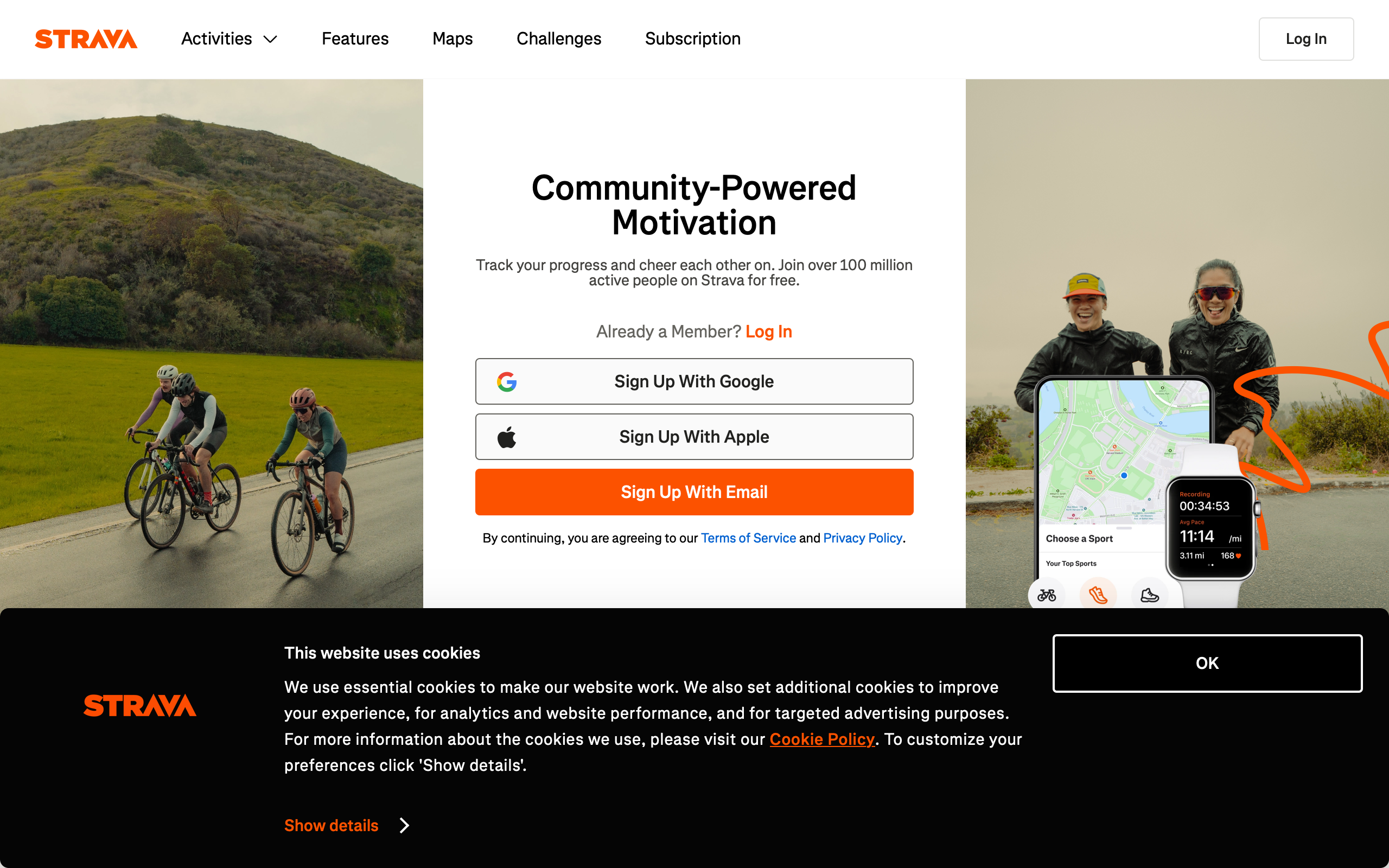
Strava transformed fitness tracking from a solitary data exercise into a communal experience. While competitors focused on calorie counts and step targets, Strava recognized that the most powerful motivator is not personal metrics but social accountability. The result is a platform where 120 million athletes share, compete, and encourage each other through the universal language of effort.
What makes Strava exceptional from a design perspective is how it translates raw GPS coordinates and heart rate data into emotionally resonant experiences. A morning run becomes a piece of route art. A hill climb becomes a leaderboard position. A completed workout becomes a social post that earns kudos from friends. Every design decision serves this transformation from data to motivation.
Why Strava Matters
Founded in 2009 by Mark Gainey and Michael Horvath, Strava has become the default social platform for endurance athletes.
Key achievements: - 120+ million athletes across 195 countries - 40 million activities uploaded per week - Pioneered the segment competition model - Global heatmap from 7+ billion GPS activities - Strava Metro data used by city planners worldwide - Beacon safety feature adopted by solo athletes globally
Key Takeaways
- Social proof drives behavior change - Kudos, comments, and leaderboards create accountability loops that gym reminders never could
- Data is most powerful when comparative - Segment times mean nothing alone; they become motivating when stacked against friends and personal bests
- GPS data is inherently visual - Routes on maps are beautiful, shareable, and immediately comprehensible in ways that spreadsheets never are
- Safety features build trust - Beacon and privacy zones show that Strava understands the vulnerability of sharing real-time location data
- Freemium works when free is genuinely useful - The core experience is complete without payment; premium adds depth, not necessity
Core Design Principles
1. The Activity Feed as Social Currency
Strava’s feed is designed like a social network, not a fitness log. Every activity becomes a shareable moment with a map, stats, and social interactions.
ACTIVITY CARD
┌─────────────────────────────────────────┐
│ [Avatar] Blake Crosley                  │
│ Today at 6:42 AM • Sarasota, FL         │
│                                         │
│ Morning Run                             │
│                                         │
│ ┌─────────────────────────────────────┐ │
│ │                                     │ │
│ │         [GPS Route Map]             │ │
│ │         on satellite/street view    │ │
│ │                                     │ │
│ └─────────────────────────────────────┘ │
│                                         │
│  5.2 mi    7:24/mi    42:18            │
│  Distance   Pace      Time             │
│                                         │
│  ♥ 23 kudos   💬 4 comments            │
└─────────────────────────────────────────┘
The card hierarchy is deliberate: who did it, where they did it, the visual route, then numbers. The map is always the hero because it communicates effort spatially in a way raw numbers cannot.
2. Effort Graphs as Emotional Storytelling
Strava’s elevation and heart rate graphs do more than display data. They narrate the experience of the workout. A sharp elevation spike tells the story of a brutal climb. A heart rate plateau shows sustained effort. These graphs are designed to be legible at a glance while rewarding closer inspection.
/* Effort graph gradient — steeper sections get warmer colors */
.effort-graph-segment {
    fill: var(--effort-color);
    transition: fill 0.2s ease;
}

.effort-graph-segment[data-grade="flat"] {
    --effort-color: #4CAF50;  /* Green — easy */
}

.effort-graph-segment[data-grade="moderate"] {
    --effort-color: #FF9800;  /* Orange — working */
}

.effort-graph-segment[data-grade="steep"] {
    --effort-color: #F44336;  /* Red — suffering */
}

/* The filled area under the elevation profile */
.elevation-fill {
    fill: url(#elevation-gradient);
    opacity: 0.3;
}

/* Hover state reveals exact metrics at that point */
.effort-graph-tooltip {
    position: absolute;
    background: rgba(0, 0, 0, 0.85);
    color: #fff;
    padding: 8px 12px;
    border-radius: 6px;
    font-size: 13px;
    pointer-events: none;
    transform: translateX(-50%);
}
3. Segment Competition Psychology
Segments are Strava’s most addictive feature. Any stretch of road or trail can be a timed segment, creating an asynchronous leaderboard where athletes compete across time and space.
SEGMENT LEADERBOARD
┌─────────────────────────────────────────┐
│ ⚡ Bayshore Blvd Northbound              │
│    1.2 mi • 12 ft gain                  │
│                                         │
│  👑 KOM/QOM                             │
│  1. @speedster_mike    4:52  ⚡         │
│  2. @running_sarah     5:01             │
│  3. @tri_dave          5:08             │
│  ─────────────────────────────────       │
│  47. You               6:24             │
│      PR: 6:18 (Jan 12)                  │
│                                         │
│  [Compare] [View Efforts] [Star ☆]     │
└─────────────────────────────────────────┘
The design choices here are psychologically precise. Showing your rank relative to the top and your personal record creates two simultaneous motivations: competitive (beat others) and personal (beat yourself). The PR notation ensures that even athletes who will never reach the podium have a target.
Design Patterns Worth Stealing
Route Art and GPS Visualization
Strava’s route rendering turns raw GPS coordinates into clean, visually appealing map overlays. The route line uses a consistent stroke weight with rounded joins, and the map style is subdued to let the route be the focal point.
/* Route rendering on map canvas */
.route-polyline {
    stroke: #FC4C02;  /* Strava orange */
    stroke-width: 3px;
    stroke-linecap: round;
    stroke-linejoin: round;
    fill: none;
    filter: drop-shadow(0 1px 2px rgba(0, 0, 0, 0.15));
}

/* Start and end markers */
.route-marker-start {
    width: 12px;
    height: 12px;
    border-radius: 50%;
    background: #4CAF50;
    border: 2px solid #fff;
    box-shadow: 0 1px 3px rgba(0, 0, 0, 0.3);
}

.route-marker-end {
    width: 12px;
    height: 12px;
    border-radius: 50%;
    background: #F44336;
    border: 2px solid #fff;
    box-shadow: 0 1px 3px rgba(0, 0, 0, 0.3);
}

/* Desaturated map style to emphasize route */
.map-container {
    filter: saturate(0.6) brightness(1.05);
}

.map-container .route-polyline {
    filter: none;  /* Route stays fully saturated */
}
The deliberate desaturation of the underlying map is a subtle but critical choice. It ensures the Strava-orange route line pops visually, making every activity screenshot instantly recognizable as a Strava share.
The Kudos System
Kudos is Strava’s equivalent of a like, but the design is intentionally lower-friction than a comment. A single tap acknowledges effort without requiring the social energy of composing a response. This creates a high-volume, low-effort encouragement loop.
KUDOS INTERACTION
┌─────────────────────────────────────────┐
│                                         │
│  [Tap anywhere on activity card]        │
│                                         │
│  ♥ → ♥ (filled, with haptic pulse)     │
│                                         │
│  Animation: heart scales up 1.2x,       │
│  returns to 1.0x over 200ms            │
│  Haptic: light impact                   │
│                                         │
│  Count increments with CSS transition    │
│  transition (no page reload)            │
│                                         │
└─────────────────────────────────────────┘
/* Kudos button animation */
.kudos-button {
    transition: transform 0.2s cubic-bezier(0.175, 0.885, 0.32, 1.275);
}

.kudos-button:active {
    transform: scale(1.2);
}

.kudos-button.given {
    color: #FC4C02;
    animation: kudos-pulse 0.3s ease-out;
}

@keyframes kudos-pulse {
    0% { transform: scale(1); }
    50% { transform: scale(1.3); }
    100% { transform: scale(1); }
}

/* Kudos count transition */
.kudos-count {
    display: inline-block;
    transition: transform 0.2s ease, opacity 0.2s ease;
}

.kudos-count.incrementing {
    animation: count-bump 0.3s ease;
}

@keyframes count-bump {
    0% { transform: translateY(0); opacity: 1; }
    50% { transform: translateY(-4px); opacity: 0.7; }
    100% { transform: translateY(0); opacity: 1; }
}
Beacon Safety as Trust Architecture
Strava Beacon shares your real-time location with up to three safety contacts during an activity. The design communicates trust: your contacts see your live position, but Strava does not make this data public or permanent.
BEACON VIEW (Contact's perspective)
┌─────────────────────────────────────────┐
│ 🔵 Blake is on a run                    │
│    Started 32 min ago                   │
│                                         │
│ ┌─────────────────────────────────────┐ │
│ │                                     │ │
│ │    [Live map with pulsing dot]      │ │
│ │    Route trail fading behind        │ │
│ │                                     │ │
│ └─────────────────────────────────────┘ │
│                                         │
│  Current pace: 7:42/mi                  │
│  Battery: 68%                           │
│  Last updated: 12 sec ago               │
│                                         │
│  [Send Encouragement]  [Call Blake]     │
└─────────────────────────────────────────┘
The battery indicator and “last updated” timestamp are critical trust signals. They tell the safety contact that the system is actively working. The encouragement button creates a positive feedback loop: the runner gets a mid-activity notification, the contact feels involved.
Privacy Zones
Athletes need to share routes without revealing their home address. Strava’s privacy zones hide the start and end of activities within a configurable radius.
PRIVACY ZONE VISUALIZATION
┌─────────────────────────────────────────┐
│                                         │
│    ┌ ─ ─ ─ ─ ─ ┐                       │
│    │  Hidden     │  ← 200m radius       │
│    │  zone ●────┼──────────────────     │
│    │  (home)    │  Route visible here →  │
│    └ ─ ─ ─ ─ ─ ┘                       │
│                                         │
│  Route starts/ends at zone boundary     │
│  Other athletes see truncated route     │
│  Your own view shows the full route     │
│                                         │
└─────────────────────────────────────────┘
This is a masterclass in communicating a privacy feature. The dashed boundary makes the hidden zone visible to the user while being invisible to everyone else. The athlete understands exactly what is shared and what is protected.
The Verdict
Strava succeeds because it understood something fundamental: fitness is social before it is personal. The entire design language reinforces this insight. Maps are more prominent than metrics. Segments create shared competition. Kudos acknowledge effort with zero friction. Even safety features like Beacon are built on social trust.
The visual identity — that unmistakable Strava orange on a desaturated map — has become the universal symbol for “I was active today.” That level of brand recognition through a single design choice is remarkable.
Best for learning: How to transform raw data (GPS coordinates, timestamps, heart rates) into social experiences that drive behavior change. Study the segment leaderboard psychology, the effort graph storytelling, and how privacy zones communicate trust.
Frequently Asked Questions
How does Strava’s segment system create motivation?
Segments turn any stretch of road into an asynchronous competition. Athletes race against the leaderboard across time — someone who ran a segment in 2019 is competing with someone running it today. The system creates two motivation layers: external competition (leaderboard rank) and internal competition (personal records). Even athletes far from the podium stay engaged because beating their own PR is always within reach.
What makes Strava’s route visualization effective?
Strava desaturates the underlying map and renders routes in high-contrast orange with rounded line joins. This makes every shared activity instantly recognizable as Strava content. The route becomes the hero of the card, communicating distance, terrain, and effort spatially before the user reads any numbers.
How does Strava Beacon balance safety with privacy?
Beacon shares live location with up to three chosen contacts during an activity, but this data is not public or permanent. The contact’s view includes battery level and last-updated timestamps as trust signals. Privacy zones ensure home addresses are never revealed, even to safety contacts viewing the full route.
Why is the kudos system more effective than comments?
Kudos require a single tap with no composition. This makes acknowledgment nearly frictionless, which dramatically increases the volume of social feedback an athlete receives. A runner who gets 20 kudos on a morning jog experiences more social reinforcement than one who gets 2 thoughtful comments. The quantity of low-effort encouragement outweighs the quality of high-effort responses for motivation.
How does Strava’s heatmap serve city planning?
Strava Metro aggregates anonymized GPS data from billions of activities into heat maps showing where athletes run, ride, and walk. City planners use this data to identify where bike lanes, running paths, and pedestrian infrastructure would have the greatest impact. The design lesson: aggregate user data, properly anonymized, can create value far beyond the original product.