Spotify: Color, Emotion, and Design at Scale
How Spotify uses color as emotion, typographic hierarchy, card-based architecture, and design tokens to create a cohesive music experience at global scale.
Spotify: Color, Emotion, and Design at Scale
“We think of Spotify as a platform where design serves the music, not the other way around.” — Spotify Design Team
Spotify is a design system operating at planetary scale: 600+ million users, 100+ million tracks, dozens of surfaces from mobile to car dashboards to smart speakers. Yet it feels cohesive. The brand is instantly recognizable whether you encounter it on a billboard, inside a playlist, or buried in your notification tray. That consistency is not accidental. It is the product of a design system called Encore, a dark-first philosophy rooted in album art, and a team that treats color as emotional infrastructure.
What makes Spotify worth studying is not a single feature but the orchestration. Typography, color extraction, editorial layouts, personalization algorithms, and marketing campaigns like Wrapped all feed into a unified design language. Every pixel serves the music.
Why Spotify Matters
Spotify redefined how digital products use color, motion, and personalization to create emotional resonance at scale.
Key achievements: - Built Encore, a design system serving web, iOS, Android, desktop, TV, car, and embedded devices - Pioneered algorithmic color extraction from album art to generate dynamic UI palettes - Turned an annual data recap (Wrapped) into the most shared marketing campaign in social media history - Proved that dark-first interfaces reduce visual fatigue for content-heavy media applications - Scaled editorial design layouts across 180+ markets with localized content
Key Takeaways
- Color is emotional infrastructure, not decoration - Spotify extracts dominant colors from album art and floods the UI with them, turning every listening session into an immersive visual environment tied to the music
- Dark-first design elevates content - A near-black canvas (#121212) makes album art, typography, and accent colors pop; it also reduces eye strain for an app people use hours per day
- Card-based architecture scales infinitely - From Home to Search to Library, every surface is built from the same card primitive, enabling consistent layouts across screen sizes and device types
- Design tokens enforce consistency at scale - Encore’s token system (spacing, color, typography, motion) ensures that a button on iOS and a button on a smart TV share the same DNA without sharing code
- Personalization is a design principle, not just a feature - Spotify treats algorithmic recommendations as a first-class design surface, giving Discover Weekly and Daily Mixes the same editorial treatment as hand-curated playlists
Core Design Principles
1. Color as Emotion
Spotify’s most distinctive design decision is extracting color from album art and using it to transform the entire interface. When you open an album page, the background gradient is not a fixed brand color. It is computed from the artwork.
The extraction pipeline:
Album Art → Dominant Color Extraction → Vibrancy Filter → Contrast Check → Gradient Generation
The system avoids muddy or low-contrast results by filtering extracted colors through accessibility thresholds. If the dominant color is too dark against the #121212 background, it shifts toward a more vibrant variant.
Implementation pattern:
/* Spotify's dynamic gradient approach */
.album-header {
  background: linear-gradient(
    to bottom,
    var(--extracted-color) 0%,
    rgba(18, 18, 18, 1) 100%
  );
  min-height: 340px;
  padding: 24px;
  transition: background 300ms ease;
}

/* The extracted color becomes a CSS custom property */
:root {
  --extracted-color: #1a6b3c;  /* Set dynamically per album */
  --extracted-color-light: #2d9d5a;
  --surface-base: #121212;
  --surface-elevated: #1a1a1a;
  --text-primary: #ffffff;
  --text-secondary: #b3b3b3;
}
Why it works: The color creates an emotional bridge between the visual and auditory experience. A jazz album with warm amber tones feels different from a metal album with deep crimson. The design amplifies the mood the artist intended.
2. Dark-First Design System
Spotify committed to dark mode years before it became an industry trend. This was not aesthetic preference but a deliberate product decision.
The rationale: - Album art is the hero content. A white background competes with it; a dark background frames it. - Music listening sessions can last hours. Dark surfaces reduce eye strain. - Accent colors (the signature green, extracted art colors) are more vibrant against dark backgrounds. - Screen glow in dim environments (bedrooms, clubs, cars) is less intrusive.
Spotify’s dark palette:
:root {
  /* Surface hierarchy */
  --background-base: #121212;
  --background-elevated: #1a1a1a;
  --background-tinted: #282828;
  --background-highlight: #333333;

  /* Text hierarchy */
  --text-base: #ffffff;
  --text-subdued: #a7a7a7;
  --text-disabled: #6a6a6a;

  /* Brand accent */
  --essential-positive: #1ed760;  /* The green */
  --essential-negative: #e91429;
  --essential-announcement: #3d91f4;

  /* Elevation through brightness, not shadow */
  --card-surface: #181818;
  --card-surface-hover: #282828;
}

/* Cards get lighter on hover — inverse of light-mode convention */
.card {
  background: var(--card-surface);
  border-radius: 8px;
  padding: 16px;
  transition: background-color 200ms ease;
}

.card:hover {
  background: var(--card-surface-hover);
}
Critical insight: In dark mode, elevation is communicated through brightness, not shadows. Spotify’s raised surfaces are lighter, not darker. This is the opposite of light-mode conventions and requires rethinking your entire elevation model.
3. Typographic Hierarchy at Scale
Spotify uses Circular, a geometric typeface licensed from Lineto and customized for their brand. The typographic system needs to work at sizes ranging from 11px playlist metadata to 96px Wrapped headlines.
The type scale:
/* Spotify's typographic hierarchy */
.type-canon {
  font-size: 96px;
  font-weight: 900;
  line-height: 1.0;
  letter-spacing: -0.04em;
  /* Used in Wrapped, marketing, hero moments */
}

.type-title-large {
  font-size: 32px;
  font-weight: 700;
  line-height: 1.2;
  letter-spacing: -0.02em;
  /* Album titles, playlist names */
}

.type-title-medium {
  font-size: 24px;
  font-weight: 700;
  line-height: 1.2;
  /* Section headers on Home */
}

.type-title-small {
  font-size: 16px;
  font-weight: 700;
  line-height: 1.3;
  /* Card titles */
}

.type-body {
  font-size: 14px;
  font-weight: 400;
  line-height: 1.5;
  color: var(--text-subdued);
  /* Descriptions, metadata */
}

.type-caption {
  font-size: 11px;
  font-weight: 400;
  line-height: 1.4;
  letter-spacing: 0.02em;
  text-transform: uppercase;
  color: var(--text-subdued);
  /* Labels, overlines */
}
The principle: Bold, tight-tracked headlines create energy. Subdued, regular-weight body text recedes. The contrast between these two extremes is what creates hierarchy without needing additional visual elements like dividers or boxes.
Design Patterns Worth Stealing
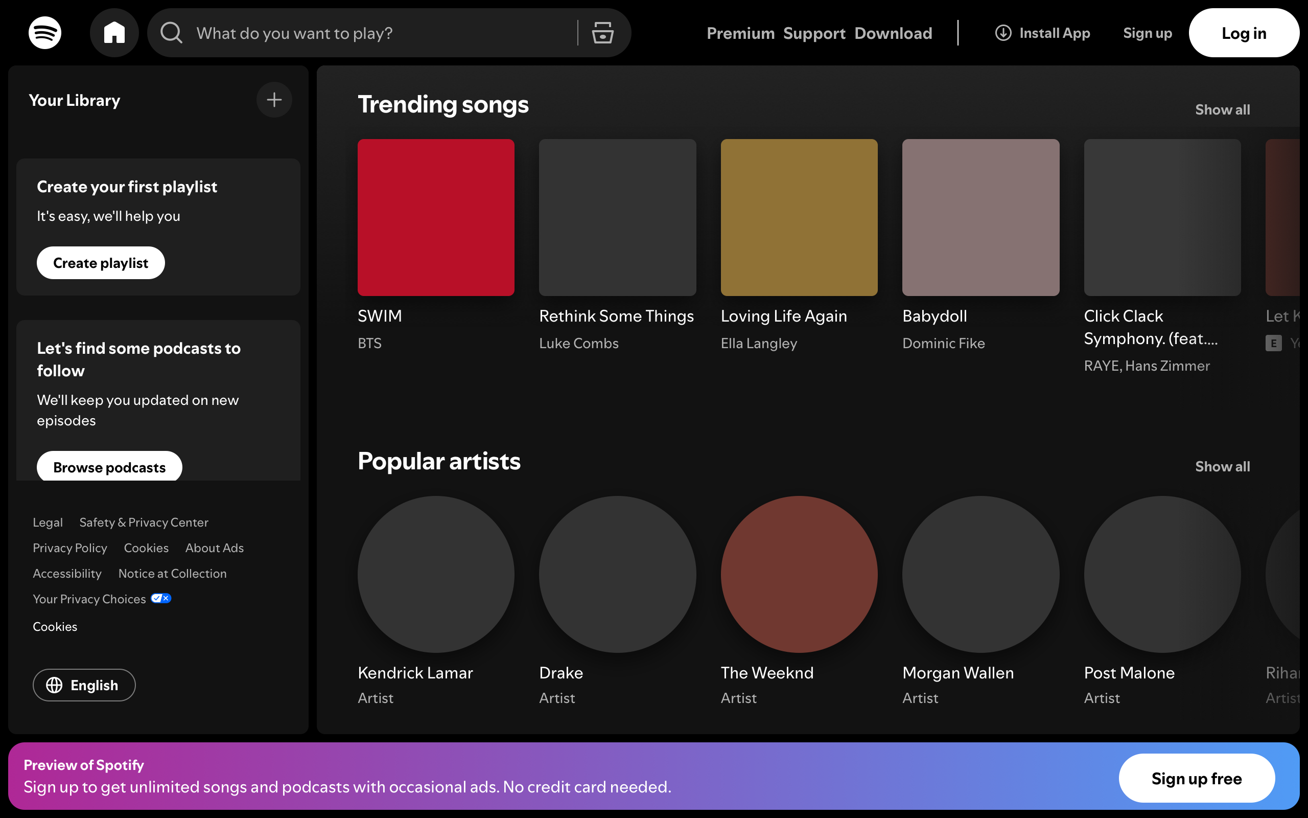
The Card Architecture
Every surface in Spotify is built from cards. Playlists, albums, artists, podcasts, audiobooks — they all share the same primitive.
HOME FEED LAYOUT:
┌─────────────────────────────────────────────────────────┐
│  Good evening                                           │
│  ┌──────────┬──────────┬──────────┐                     │
│  │ ■ Daily  │ ■ Liked  │ ■ Chill  │  ← Quick-access    │
│  │   Mix 1  │   Songs  │   Hits   │    (2-column grid)  │
│  ├──────────┼──────────┼──────────┤                     │
│  │ ■ Rock   │ ■ Jazz   │ ■ Focus  │                     │
│  │   Clas.  │   Vibes  │   Flow   │                     │
│  └──────────┴──────────┴──────────┘                     │
│                                                         │
│  Made for you                           [Show all →]    │
│  ┌────────┐ ┌────────┐ ┌────────┐ ┌────────┐           │
│  │        │ │        │ │        │ │        │           │
│  │  ■ Art │ │  ■ Art │ │  ■ Art │ │  ■ Art │  ← Scroll│
│  │        │ │        │ │        │ │        │           │
│  │ Discov │ │ Daily  │ │ Releas │ │ Repeat │           │
│  │ Weekly │ │ Mix 2  │ │ Radar  │ │ Rewind │           │
│  └────────┘ └────────┘ └────────┘ └────────┘           │
│                                                         │
│  Recently played                        [Show all →]    │
│  ┌────────┐ ┌────────┐ ┌────────┐ ┌────────┐           │
│  │ ○ Art  │ │  ■ Art │ │ ○ Art  │ │  ■ Art │           │
│  │ Artist │ │ Album  │ │ Artist │ │ Plist  │           │
│  └────────┘ └────────┘ └────────┘ └────────┘           │
└─────────────────────────────────────────────────────────┘

○ = circular (artist)   ■ = square with radius (album/playlist)
The card itself:
.content-card {
  width: 100%;
  background: var(--card-surface);
  border-radius: 8px;
  padding: 16px;
  cursor: pointer;
  transition: background-color 200ms ease;
  position: relative;
}

.content-card:hover {
  background: var(--card-surface-hover);
}

/* Play button appears on hover */
.content-card:hover .play-button {
  opacity: 1;
  transform: translateY(0);
}

.play-button {
  position: absolute;
  bottom: 88px;
  right: 16px;
  width: 48px;
  height: 48px;
  border-radius: 50%;
  background: var(--essential-positive);
  opacity: 0;
  transform: translateY(8px);
  transition: opacity 200ms ease, transform 200ms ease;
  box-shadow: 0 8px 16px rgba(0, 0, 0, 0.3);
}

.card-image {
  width: 100%;
  aspect-ratio: 1;
  border-radius: 4px;
  object-fit: cover;
  margin-bottom: 16px;
}

/* Artists get circular images */
.card-image--artist {
  border-radius: 50%;
}
Shape communicates type: Square images with rounded corners are albums and playlists. Circular images are artists. This convention is so deeply ingrained that users instantly understand what they are looking at without reading labels.
Wrapped: Editorial Design as Product
Spotify Wrapped is the most studied annual design campaign in tech. It transforms personal listening data into a shareable, story-format experience.
What makes Wrapped work as design:
WRAPPED STORY FORMAT:
┌─────────────────────────────────┐
│                                 │
│     Your top genre              │  ← Overline (caption)
│                                 │
│     INDIE                       │  ← Hero text (canon size)
│     ROCK                        │
│                                 │
│     You listened to 847         │  ← Supporting stat
│     indie rock songs            │
│     this year                   │
│                                 │
│     That's more than 94%        │  ← Social proof
│     of listeners                │
│                                 │
│  ┌───────────────────────────┐  │
│  │     Share to Instagram    │  │  ← CTA
│  └───────────────────────────┘  │
│                                 │
│           ● ○ ○ ○ ○             │  ← Story progress
└─────────────────────────────────┘
  Background: bold duotone gradient
  Typography: oversized, heavy weight
  Layout: centered, mobile-first
Design decisions that drive sharing: - Bold, full-bleed color backgrounds photograph well in screenshots - Text is large enough to read in a social media thumbnail - Personal data creates emotional investment (“my year in music”) - Percentile comparisons add competitive/social dimension - The vertical story format maps directly to Instagram and TikTok
The Verdict
Spotify demonstrates that a design system is not a style guide collecting dust in a wiki. It is living infrastructure that enables hundreds of teams across dozens of platforms to ship cohesive experiences. The dark-first philosophy, the color extraction pipeline, the card architecture, and the typographic system all work in concert to keep the music as the protagonist.
The most transferable lesson is color as emotion. Most products treat color as branding (use our hex codes) or as signaling (red for errors, green for success). Spotify treats color as environmental design — the entire room changes when you change the album. That level of dynamic, content-driven theming is rare and powerful.
Best for learning: How to build a design system that scales across platforms, how dark mode elevates content-rich interfaces, and how to use data personalization as a design surface rather than just an engineering feature.
Frequently Asked Questions
How does Spotify extract colors from album art?
Spotify uses a color extraction algorithm that identifies the dominant color palette from album artwork, filters for vibrancy and contrast against the dark background, and applies the result as a gradient on album and playlist pages. The system ensures accessibility by checking that extracted colors maintain sufficient contrast with white text.
Why does Spotify use a dark interface instead of offering both light and dark modes?
Dark-first design was a deliberate product choice, not just aesthetic preference. Album art is Spotify’s hero content, and a dark canvas frames it without competition. Accent colors like the signature green are more vibrant against dark surfaces. Extended listening sessions benefit from reduced eye strain. The consistency of a single mode also simplifies the design system.
What is Spotify’s Encore design system?
Encore is Spotify’s internal design system that provides design tokens (color, spacing, typography, motion), reusable components, and guidelines for building consistent experiences across all Spotify platforms — web, iOS, Android, desktop, TV, car displays, and embedded devices. It uses tokens rather than hard-coded values to maintain consistency across codebases.
How does Spotify Wrapped achieve such high social sharing rates?
Wrapped combines personal data (emotional investment), bold visual design (screenshots look striking on social media), percentile comparisons (competitive/social motivation), and native story format (maps directly to Instagram Stories and TikTok). The typography is large enough to read in thumbnails, and the full-bleed color backgrounds photograph well.
What can designers learn from Spotify’s card-based architecture?
Spotify proves that a single card primitive can serve as the foundation for an entire product. By varying the image shape (square for albums, circular for artists), metadata, and interaction patterns while keeping the structural container consistent, Spotify achieves both variety and cohesion. The pattern scales from phone screens to TV interfaces.
Resources
- Website: spotify.com
- Design Blog: spotify.design — Case studies from the design team
- Encore: Spotify’s public design system documentation
- Wrapped: Annual campaign — study the visual design evolution year over year
- Engineering Blog: engineering.atspotify.com — Technical deep dives on design infrastructure