Rivian: Monumental Automotive Typography Meets Adventure Photography
How Rivian uses 120px headlines, 10px micro body text, and full-bleed landscape photography to position EVs as adventure instruments.
Rivian: Monumental Automotive Typography Meets Adventure Photography
“We believe that the world’s transition to sustainable energy can enhance, not compromise, the adventure of life.” — RJ Scaringe, Founder & CEO
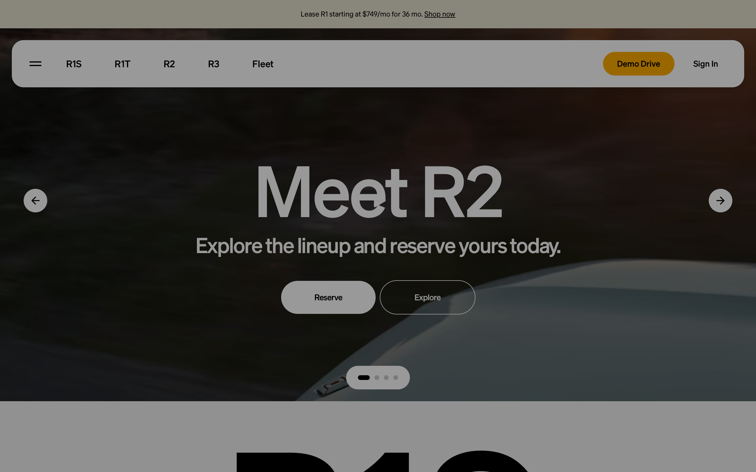
Rivian was founded on the thesis that electric vehicles and outdoor adventure are complementary, not contradictory. Where Tesla positioned EVs as urban tech objects — minimalist interiors, software-defined everything — Rivian positioned them as adventure instruments with gear tunnel storage, a camp kitchen accessory, and wade mode for river crossings. The website must bridge two audiences simultaneously: tech-forward EV buyers and outdoor enthusiasts, urban professionals and weekend adventurers. Rivian’s design language accomplishes this through monumental typography, cinematic landscape photography, and an earth-toned palette that feels simultaneously refined and rugged.
Key Takeaways
- Photography is the primary design element - Full-bleed landscape images with vehicles in dramatic natural settings carry the brand. The photograph is not decoration; it is the design.
- Extreme typographic scale creates editorial hierarchy - 120px headlines paired with 10px body text produce a magazine-spread effect where imagery and headlines tell the story, and body text serves those who lean in.
- Earth tones derived from the product itself - The brand palette mirrors the vehicle paint options (Rivian Blue, Forest Green, Canyon Red, El Cap Granite), making the marketing palette inseparable from the product.
- Warm amber replaces the cold blue CTA - The #E8A000 accent evokes campfire and sunrise, connecting every call-to-action to the adventure ethos rather than defaulting to SaaS blue.
- Specifications are secondary to experience - Performance numbers appear but never dominate. The experience sells the vehicle; specs confirm the purchase decision.
Why Rivian Matters
Rivian proved that an electric vehicle brand could own the outdoor adventure space without compromising on technology. Its 2021 IPO was one of the largest in US history, and the company has navigated production scaling challenges while maintaining a brand premium. The marketing design plays a crucial role in sustaining that premium — every touchpoint reinforces the message that Rivian vehicles are worth the wait, worth the price, and fundamentally different from other EVs.
Key achievements: - Created a product line (R1T, R1S, R2, R3) that spans pickup trucks to compact crossovers, all designed for both daily driving and off-road capability - Commissioned a proprietary “Adventure” typeface that embodies the brand’s dual identity of geometric precision and organic warmth - Developed a photography-first design language that positions vehicles as protagonists in adventure narratives, never as sterile studio subjects
Core Design Principles
1. Full-Bleed Photography as Design
Rivian’s most powerful design asset is its photography. Vehicles are shot in dramatic natural settings — mountain passes, desert dunes, coastal cliffs, dense forests — always in motion or positioned as if they belong to the landscape. The color grading is warm and natural: lifted shadows (never pure black), golden-hour highlights, muted earth-tone midtones, and authentic unsaturated skies. These are adventure narratives with the vehicle as protagonist, not studio product shots.
The photographs fill the entire viewport. No margins, no decorative frames. Text overlays directly on the image, with the monumental headline and the landscape photograph forming a single compositional unit. The effect is cinematic — each page feels like a spread from a premium outdoor magazine.
2. Monumental Typography and Micro Body Text
The custom “Adventure” typeface is Rivian’s typographic signature — a geometric sans-serif with slightly organic curves that feel both modern and grounded. At 120px with -3px letter-spacing, hero headlines are among the largest in any production website. The tight tracking (-2.5%) prevents the large text from feeling loose, ensuring it reads as a single visual unit rather than individual characters. At this scale, semi-bold (weight 600) provides authority without the overwhelming heaviness that full bold (700) would create.
The body text at 10px is the deliberate counterpoint. Well below accessibility guidelines for comfortable reading (typically 16px minimum), this micro typography is an editorial choice: the body text is supporting detail, not primary content. The photography and headlines are the content. This approach works on automotive sites where specifications and descriptions are secondary to the visual experience. Positive letter-spacing on small text (0.2-0.5px) compensates for the tiny size by opening up letterforms for legibility — the exact opposite of the tight tracking on headlines.
Typography Scale:
120px ████████████████████████ Hero Headlines (wt 600, -3px tracking)
 56px ██████████████           Section Headers (wt 600, -1.5px)
 32px ████████                 Feature Titles (wt 500, -0.5px)
 14px ███                      CTA Buttons (wt 600, +0.3px)
 12px ██                       Navigation (wt 500, +0.5px)
 10px █                        Body Text (wt 400, +0.2px)
3. Earth-Tone Palette from the Product
Rivian’s color system is derived directly from its vehicle paint options, making the marketing palette inseparable from the product itself. Rivian Blue (rgb(0,95,145)) is deep ocean; Forest Green (rgb(55,85,60)) is dark pine; El Cap Granite (rgb(170,165,155)) is warm gray stone; Canyon Red (rgb(160,55,40)) is desert rock. These are not abstract brand colors — they are the literal colors of the vehicles, grounding the entire visual system in the physical world.
The primary UI palette stays within the same warm temperature. White (rgb(255,255,255)) and near-black (rgb(21,21,21)) provide the structural contrast, while rgb(110,110,110) serves secondary text. The warm surface color rgb(245,245,240) — an off-white with a yellow undertone — prevents the sterile feeling that pure white would introduce. Even the border color (rgb(225,225,220)) carries warmth.
The amber accent (#E8A000) anchors the entire interactive layer. Every CTA button glows with this warm gold, evoking campfire and sunrise. It stands out against both light and dark backgrounds without the coldness of a blue or the aggression of a red.
Transferable Patterns
Rivian’s design system demonstrates how automotive and editorial approaches can merge into a cohesive web experience. The full-bleed hero with text overlay is the most impactful pattern — it requires high-quality photography but creates an emotional response that no amount of illustration or UI polish can replicate.
The CSS implementation reveals the precision behind the monumental scale:
:root {
  /* Rivian's adventure palette */
  --color-bg-light: rgb(255, 255, 255);
  --color-bg-dark: rgb(21, 21, 21);
  --color-text-dark: #151515;
  --color-text-light: rgb(255, 255, 255);
  --color-text-secondary: rgb(110, 110, 110);
  --color-amber: #E8A000;
  --color-amber-dark: rgb(220, 145, 0);
  --color-surface: rgb(245, 245, 240);
  --color-border: rgb(225, 225, 220);

  /* Shadows — restrained, photography carries the weight */
  --shadow-card: 0 2px 12px rgba(0, 0, 0, 0.08);
  --shadow-cta: 0 4px 16px rgba(232, 160, 0, 0.25);

  /* Typography — custom Adventure face */
  --font-display: "Adventure", HelveticaNeue, "Helvetica Neue",
    Helvetica, Arial, sans-serif;

  /* Border radius — minimal, automotive */
  --radius-sm: 2px;
  --radius-md: 4px;
  --radius-lg: 8px;
}

/* Monumental hero headline */
h1 {
  font-family: var(--font-display);
  font-size: 120px;
  font-weight: 600;
  line-height: 120px;
  letter-spacing: -3px;
  color: var(--color-text-light);
}

/* Micro body text — editorial approach */
body {
  font-family: var(--font-display);
  font-size: 10px;
  line-height: 16px;
  letter-spacing: 0.2px;
  color: var(--color-text-dark);
}

/* Amber CTA button with warm glow */
.button-primary {
  background-color: var(--color-amber);
  color: var(--color-bg-dark);
  font-family: var(--font-display);
  font-size: 14px;
  font-weight: 600;
  letter-spacing: 0.3px;
  padding: 14px 32px;
  border-radius: var(--radius-md);
  box-shadow: var(--shadow-cta);
  transition: background-color 0.2s ease;
}
.button-primary:hover {
  background-color: var(--color-amber-dark);
}

/* Full-bleed hero section */
.hero {
  position: relative;
  width: 100vw;
  height: 100vh;
  overflow: hidden;
}
.hero img {
  width: 100%;
  height: 100%;
  object-fit: cover;
}
The same principles scale to native applications. In SwiftUI, the monumental headline scales down for mobile while preserving the same weight and tracking relationships:
extension Color {
    static let rivianDark = Color(red: 21/255, green: 21/255, blue: 21/255)
    static let rivianAmber = Color(red: 232/255, green: 160/255, blue: 0/255)
    static let rivianSurface = Color(red: 245/255, green: 245/255, blue: 240/255)
    static let rivianSecondary = Color(red: 110/255, green: 110/255, blue: 110/255)
}

// Monumental headline over hero photography
ZStack(alignment: .bottomLeading) {
    Image("r2-mountain-hero")
        .resizable()
        .scaledToFill()
        .ignoresSafeArea()
    Text("Meet R2")
        .font(.system(size: 80, weight: .semibold))
        .tracking(-2)
        .foregroundStyle(.white)
        .padding(24)
}

// Amber CTA with warm glow shadow
Button("Reserve Now") { }
    .font(.system(size: 14, weight: .semibold))
    .tracking(0.3)
    .padding(.horizontal, 32)
    .padding(.vertical, 14)
    .background(Color.rivianAmber)
    .foregroundStyle(Color.rivianDark)
    .clipShape(RoundedRectangle(cornerRadius: 4))
    .shadow(color: Color.rivianAmber.opacity(0.25), radius: 16, y: 4)
Design Lessons
Photography carries more emotional weight than any UI pattern. Rivian’s vehicles in dramatic landscapes create desire and aspiration that no amount of feature grids or specification tables can replicate. If your product has a physical or experiential dimension, invest in contextual photography over studio shots.
Extreme typographic contrast creates editorial hierarchy. The 12:1 ratio between hero headlines (120px) and body text (10px) forces a clear reading order: image, headline, details. This mirrors how people actually browse — scanning visually first, reading only if interested. The approach is not universally appropriate, but for aspirational products it directs attention precisely where it belongs.
Warm color temperature changes everything. Rivian avoids cold aesthetics entirely. The off-white surface (rgb(245,245,240)), warm charcoal text, and amber CTAs create an approachable warmth that tech-first brands often lack. Even the shadows and borders carry warm undertones. This is a deliberate choice to signal “outdoor” and “human” rather than “tech” and “digital.”
Avoid sterile studio photography for aspirational products. No white-background turntable shots appear as hero images. Vehicles are always in context — in nature, in motion, in use. The environment is part of the product proposition.
Avoid leading with specifications. Performance numbers (range, horsepower, towing capacity) appear in small, organized grids rather than hero positions. The experience sells the vehicle; specifications confirm a decision that has already been made emotionally.
Frequently Asked Questions
What makes Rivian’s web design distinctive from other automotive brands?
Rivian combines monumental typography (120px headlines), full-bleed adventure photography, and an earth-tone palette derived from its actual vehicle paint colors. Unlike traditional automotive sites that lead with performance specifications, Rivian leads with the emotional experience — landscapes, adventure, and the feeling of exploration. The 10px micro body text creates an editorial hierarchy more akin to a premium magazine than a car configurator.
How does Rivian position electric vehicles as adventure tools through design?
Every design decision reinforces the adventure narrative. Photography shows vehicles in dramatic natural settings rather than sterile studios. The amber CTA (#E8A000) evokes campfire and sunrise. The color palette mirrors earth tones. The custom “Adventure” typeface name says it all. Even the scroll behavior has vehicles appearing to drive into frame, reinforcing movement and exploration.
Why does Rivian use such small body text?
The 10px body text is a deliberate editorial choice, not an oversight. By making body copy secondary to photography and headlines, Rivian creates a browsing experience closer to a magazine spread than a content website. The eye processes: image first, headline second, body text only if interested. This mimics how people actually engage with automotive sites and keeps the focus on aspiration rather than specification.
What can designers learn from Rivian’s use of amber as a CTA color?
Amber (#E8A000) is warm, distinctive, and emotionally resonant. In a landscape of blue CTAs, it immediately stands apart while connecting to Rivian’s adventure ethos (campfire, golden hour, sunrise). It works against both light and dark backgrounds and carries an inviting warmth that cold accent colors cannot achieve. The lesson: CTA color should reinforce brand narrative, not default to convention.
References
- Rivian Homepage — Primary marketing and vehicle pages
- Rivian R1T — Pickup truck product page
- Rivian R1S — SUV product page
- Rivian R2 — Compact SUV reveal page
- Rivian Stories — Adventure editorial content and photography
- CNBC IPO Coverage — Historic IPO and market positioning