Readwise Reader: Cosmic Branding for Deep Reading Instruments
How Readwise Reader pairs aurora-gradient marketing with brutally minimal reading surfaces and warm paper-like highlight colors.
Readwise Reader: Cosmic Branding for Deep Reading Instruments
“Reading is the input, thinking is the output.” — Daniel Doyon, Co-founder
Readwise Reader occupies the space between consuming content and doing something meaningful with it. Where Pocket and Instapaper built consumption tools, co-founders Daniel Doyon and Tristan Homsi built a thinking tool — one where highlights, annotations, and marginalia are first-class citizens, not afterthoughts. The result is a reading instrument that closes the loop from save to read to highlight to review to integration into your knowledge system.
Key Takeaways
- Marketing and product can be visual opposites - Reader’s cosmic aurora-gradient marketing creates drama, while the reading surface is brutally minimal. The contrast works because each serves its context perfectly.
- Warm highlight colors create physical associations - Soft yellow (#FBDA83), coral (#E4938E), and blue (#8DBBFF) feel like actual highlighter markers on paper, not digital overlays.
- Marginalia is a proven interaction pattern - Tufte-style sidenotes keep annotations visible without interrupting reading flow, respecting a centuries-old tradition of margin notes.
- Content-type unification simplifies mental models - Articles, PDFs, newsletters, YouTube transcripts, and EPUBs all render through one consistent interface, normalizing wildly different sources.
- Keyboard-first design enables flow states - Every action has a shortcut, so extended reading sessions never require reaching for the mouse.
Why Readwise Reader Matters
Reader proved that read-it-later apps could be more than bookmarking services. By treating annotations as the input mechanism for a knowledge management pipeline — with exports to Obsidian, Notion, Logseq, and Anki — Reader transformed passive reading into active thinking. The design challenge was immense: build an interface that disappears during reading but provides powerful tools the moment you need them.
Key achievements: - Unified reading experience across articles, PDFs, newsletters, YouTube transcripts, Twitter threads, and EPUBs - Keyboard-native interaction model that supports extended reading sessions without mouse dependency - Highlight-to-export pipeline that connects reading directly to knowledge management workflows
Core Design Principles
1. Dual Identity: Cosmic Marketing, Minimal Reading
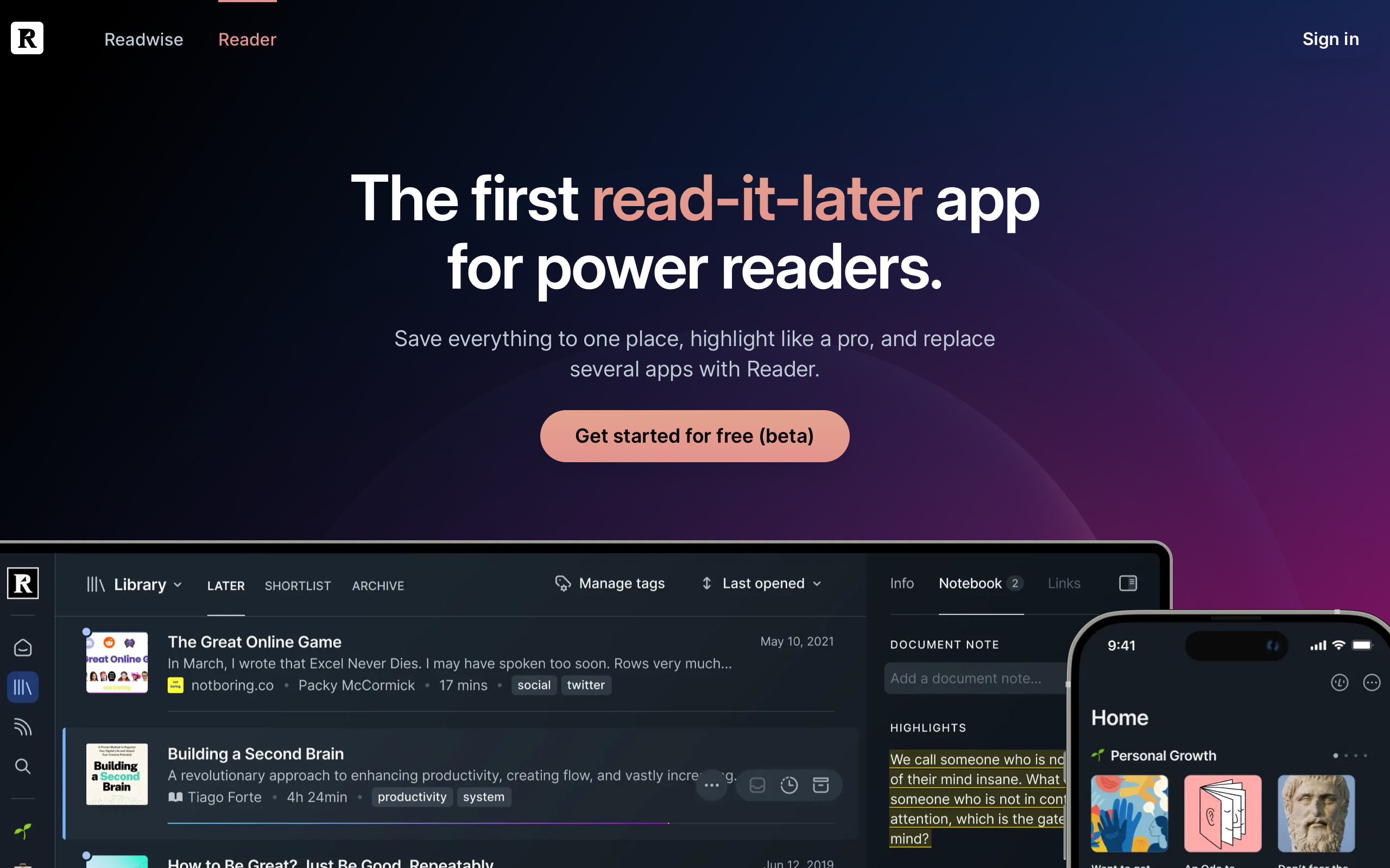
Reader’s marketing site opens with a cosmic dark gradient — pure black (#000000) base with aurora-like purple and magenta orbs floating in space. It is dramatic and cinematic, evoking the feeling of entering a focused reading chamber. The typography uses Inter at 58px/600 weight for display headlines, with a clear hierarchy down through 40px section headings to 16px body text.
The app itself is starkly different. Clean, bright reading surfaces (light mode) or deep dark surfaces (dark mode) put content center-stage. The design borrows from the best e-reader principles: generous margins, optimal line length around 65 characters, and carefully tuned typography for extended sessions. This dual identity works because the marketing sells the promise (a powerful reading system) while the product delivers on it (an invisible interface).
Marketing Site                    Reading Surface
┌────────────────────┐           ┌────────────────────┐
│ ▓▓ COSMIC BLACK ▓▓ │           │                    │
│ ▓ Aurora Gradients ▓│           │  Clean, bright     │
│ ▓ Floating Orbs   ▓│           │  reading surface.  │
│ ▓ BOLD HEADLINES  ▓│           │                    │
│ ▓▓▓▓▓▓▓▓▓▓▓▓▓▓▓▓▓▓│           │  Marginalia ───┐  │
│  Dramatic CTAs     │           │  in the right   │  │
│  Feature Showcases │           │  margin.        │  │
└────────────────────┘           └────────────────────┘
2. The Marginalia System
Inspired by Edward Tufte’s sidenote pattern, Reader places highlights and notes in the right margin rather than inline or in a separate panel. This preserves the reading flow — your eyes never leave the text column — while keeping annotations visible and contextual. The approach honors a centuries-old tradition of margin notes in physical books, making digital annotation feel natural rather than imposed.
The highlight system uses warm, muted colors that deliberately evoke physical highlighter markers: soft yellow (#FBDA83) for default highlights, coral (#E4938E) for important or flagged passages, blue (#8DBBFF) for references and definitions, and a muted gray (#7D7D7D) for archived notes. These are not the neon overlays of most digital tools — they feel like ink on paper.
3. Content Normalization
Reader’s most ambitious design challenge is rendering wildly different source formats through one consistent interface. A longform article, a dense PDF, an email newsletter, a YouTube transcript, and a Twitter thread all appear in the same reading view with the same typography, the same highlight system, and the same keyboard shortcuts. The interface adapts to the content rather than forcing users to learn different interaction models for different formats.
This normalization extends to the reading experience itself: users control font, size, spacing, and theme. Reader does not impose a “correct” reading style, recognizing that optimal reading conditions are personal and context-dependent.
Transferable Patterns
Reader’s design system offers several patterns worth studying. The warm highlight palette is the most immediately applicable — these colors work on both light and dark backgrounds and create a physical-book association that makes digital annotation feel more natural.
The marketing palette demonstrates how to build a dramatic dark theme:
:root {
  /* Readwise Reader dark marketing palette */
  --color-background: #000000;
  --color-text: #F5F5F5;
  --color-text-body: rgb(190, 201, 214);
  --color-text-muted: rgb(156, 159, 176);
  --color-accent: rgb(55, 110, 242);

  /* Warm paper-like highlight colors */
  --color-highlight-yellow: #FBDA83;
  --color-highlight-coral: #E4938E;
  --color-highlight-blue: #8DBBFF;

  /* UI chrome */
  --color-sidebar: rgb(40, 49, 59);

  /* Typography */
  --font-sans: Inter, -apple-system, BlinkMacSystemFont, sans-serif;

  /* Pill-shaped buttons — modern and approachable */
  --btn-radius: 18px;
  --btn-padding: 8px 18px;
}
The text hierarchy on the marketing site uses three distinct shades on the dark background: near-white (#F5F5F5) for headlines, a soft blue-gray (rgb(190,201,214)) for body text, and a muted lavender-gray (rgb(156,159,176)) for captions. This three-tier system prevents the flatness that dark themes often suffer from.
For iOS applications, the highlight colors translate directly:
extension Color {
    static let readerBackground = Color.black
    static let readerText = Color(red: 245/255, green: 245/255, blue: 245/255)
    static let readerAccent = Color(red: 55/255, green: 110/255, blue: 242/255)
    static let highlightYellow = Color(hex: "FBDA83")
    static let highlightCoral = Color(hex: "E4938E")
    static let highlightBlue = Color(hex: "8DBBFF")
}
The pill-shaped buttons (18px border-radius) and generous CTA padding (8px 18px) create comfortable touch targets that feel modern without being trendy. Reader loads Inter explicitly (not as a variable font) to ensure consistent cross-platform rendering — a pragmatic choice that prioritizes reliability over file size optimization.
Design Lessons
A reading surface should disappear. The actual reading view is almost brutally minimal: no sidebars, no visible toolbars during reading, just text and margins. Every pixel of chrome is a potential distraction during a 30-minute reading session. The interface reveals itself on hover or keyboard invocation, then gets out of the way.
Highlight colors should feel physical. The warm, muted tones (#FBDA83, #E4938E, #8DBBFF) create an association with real highlighter markers on paper. Neon or oversaturated colors would feel like a digital imposition rather than a natural annotation act.
Marketing drama and product restraint can coexist. Reader proves that a cosmic, cinematic marketing site and a minimal, utilitarian product interface are not contradictory. Each serves its context: marketing captures attention and communicates ambition; the product earns trust through quiet competence.
Keep social features out of focused workflows. Reader has no share buttons, comment threads, or social signals in the reading view. The reading experience is private and focused. Social features exist elsewhere in the product, but never where they would interrupt concentration.
Frequently Asked Questions
What makes Readwise Reader’s design distinctive from other read-it-later apps?
Reader treats annotations as first-class citizens through Tufte-inspired marginalia rather than hiding them in separate panels. Combined with warm paper-like highlight colors and a keyboard-first interaction model, it feels more like annotating a physical book than using a digital tool. The unified reading interface for articles, PDFs, newsletters, and more is unique in the category.
How does Reader handle the contrast between its marketing and product design?
The marketing site uses cosmic dark gradients with aurora-like orbs — dramatic and cinematic. The product itself is the opposite: clean, bright reading surfaces where content takes center stage. This works because each design serves its purpose. Marketing captures attention and communicates ambition; the product disappears so you can focus on reading.
Why does Reader use warm highlight colors instead of standard digital colors?
The highlight palette — soft yellow (#FBDA83), coral (#E4938E), and blue (#8DBBFF) — deliberately mimics physical highlighter markers on paper. This creates a familiar, tactile association that makes digital annotation feel natural. Neon or oversaturated colors would constantly remind users they are interacting with software rather than engaging with ideas.
What can designers learn from Reader’s keyboard-first approach?
Reader demonstrates that keyboard-first design is not just an accessibility feature — it is a flow-state enabler. When every action (navigate, highlight, tag, annotate) has a keyboard shortcut, users can maintain deep focus for extended sessions without the context-switching that mouse interactions introduce. The lesson: for any tool designed for extended use, keyboard navigation should be a first-class design consideration.
References
- Readwise Reader Marketing — Product landing page with cosmic brand identity
- Readwise Reader App — The reading interface itself
- Readwise Blog — Product updates and reading philosophy
- Readwise Case Study (Lazer Technologies) — Technical and design analysis
- Readwise Reader Documentation — Feature documentation and keyboard shortcuts