Pitch: Bold Geometric Confidence on a Purple Stage
How Pitch uses 800-weight headlines, vivid purple gradients, and 3D glass shapes to make presentations feel presentation-grade.
Pitch: Bold Geometric Confidence on a Purple Stage
“The tool you use to make presentations should itself be the best presentation in the room.” — Christian Reber, Founder
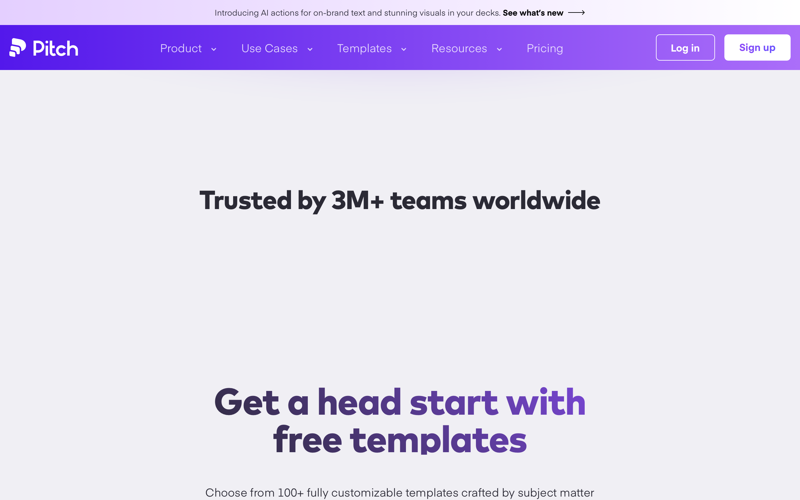
Pitch exists because presentation software stopped evolving aesthetically in the 1990s. Founded in Berlin by Christian Reber and the team behind Wunderlist, Pitch reimagined what happens when designers build a presentation tool for designers. Where Google Slides feels utilitarian and PowerPoint feels corporate, Pitch opens with a full-bleed purple gradient hero populated with floating 3D glass shapes — immediately establishing that this is a product with opinions about what presentations should be.
Key Takeaways
- Purple as stage, not accent - Most brands use their color as a button tint. Pitch uses purple as the entire environment for its hero section, creating a theatrical opening that doubles as a product demonstration.
- Extra-bold conviction signals authority - 800-weight headlines (heavier than nearly any SaaS competitor) communicate zero hesitation about the product’s positioning.
- Two-speed typography creates rhythm - Dense, heavy headlines at 1.0 line-height followed by airy body text at 2.0 line-height produce a dramatic shift between “grab attention” and “let them read.”
- Custom typefaces are competitive moats - Eina01’s geometric softness is impossible to replicate with system fonts, making every competitor using Inter look generic by comparison.
- Template-first onboarding solves blank canvas - The template gallery is the front door, teaching users what “good” looks like before they create anything.
Why Pitch Matters
Pitch proved that productivity software can have the same level of visual craft as the artifacts it produces. In a category dominated by tools that look nothing like their output, Pitch practices what it preaches: its marketing site is itself a presentation, and the product’s template gallery sets a quality bar that elevates every user’s output.
Key achievements: - Built by the Wunderlist team (acquired by Microsoft), bringing consumer-grade design sensibility to B2B software - Pioneered real-time multiplayer collaboration with visible cursors as a design element, not just a feature - Introduced AI actions for on-brand text and visuals that push users toward higher quality output rather than adding complexity
Core Design Principles
1. The Purple Stage
The hero gradient is not a colored section — it is a presentation stage. A vivid purple gradient fills the entire viewport, populated with translucent 3D glass objects that catch light and demonstrate Pitch’s understanding of material, depth, and composition. The product sells itself by being a presentation.
Below the hero, sections transition to clean white backgrounds with warm charcoal text (rgb(43,42,53)) — a color with a subtle purple undertone that harmonizes with the brand identity rather than creating harsh contrast against it.
┌─────────────────────────────────────────┐
│  ░░░░ VIVID PURPLE GRADIENT ░░░░░░░░░  │
│  ░░░░ 3D Glass Shapes Float ░░░░░░░░░  │
│  ░░░░░ WHITE BOLD HEADLINE ░░░░░░░░░░  │
│  ░░░░░░░░░░░░░░░░░░░░░░░░░░░░░░░░░░░  │
├─────────────────────────────────────────┤
│                                         │
│  Clean White Section                    │
│  Warm charcoal text (43,42,53)          │
│  Generous 2.0 line-height body copy     │
│                                         │
└─────────────────────────────────────────┘
2. Monumental Typography with Eina01
Pitch commissioned Eina01, a geometric sans-serif with soft, rounded terminals that give every heading a distinctive warmth. At 800 weight (extra-bold), headlines carry the assertiveness of a keynote speaker who knows their material.
The type scale operates in two distinct modes. Headlines are dense and impactful: 80px display text at 1.0 line-height with -1.6px letter-spacing, where ascenders and descenders nearly touch between lines, creating graphic elements rather than mere text. Body copy is the opposite — 18px at 2.0 line-height, exceptionally generous spacing that gives prose a relaxed, editorial quality like reading a well-typeset magazine.
Negative letter-spacing scales proportionally with size: -2% at both 80px (-1.6px) and 42px (-0.84px), maintaining optical density at every headline size.
3. Restrained Interactive Design
Every interactive element occupies the space between sharp corporate edges and playful consumer roundness. The 6px button radius signals “professional creative tool” — deliberate enough to notice, restrained enough to take seriously. Button padding at 24px horizontal provides comfortable click targets without sprawl.
The navigation bar at 60px is deliberately compact. For a presentation tool, the content should always feel larger than the chrome. An announcement bar adds 72px of promotional real estate above the nav without crowding the layout.
Transferable Patterns
Pitch’s design system offers several patterns that translate directly to other projects. The warm charcoal text color is the most immediately applicable: rgb(43,42,53) avoids the harshness of pure black while maintaining readability, and its subtle purple undertone creates cohesion with any purple-adjacent brand palette.
The two-speed typography system works in any context where you need to balance impact with readability:
:root {
  /* Pitch-inspired confident purple palette */
  --color-background: rgb(255, 255, 255);
  --color-text-primary: rgb(43, 42, 53);
  --color-brand-purple: #7B2FF2;
  --color-white: rgb(255, 255, 255);

  /* Typography */
  --font-display: "Eina01", -apple-system, BlinkMacSystemFont,
    "Segoe UI", Roboto, "Helvetica Neue", Arial, sans-serif;

  /* Spacing */
  --nav-height: 3.75rem;
  --button-radius: 6px;
  --button-padding: 0 24px;
}

/* Display headline — dense, heavy, tight */
.display {
  font-family: var(--font-display);
  font-size: 80px;
  font-weight: 800;
  line-height: 1.0;
  letter-spacing: -1.6px;
  color: var(--color-text-primary);
}

/* Section headline */
.section-heading {
  font-family: var(--font-display);
  font-size: 42px;
  font-weight: 800;
  line-height: 1.4;
  letter-spacing: -0.84px;
  color: var(--color-text-primary);
}

/* Body — generous breathing room */
.body {
  font-family: var(--font-display);
  font-size: 18px;
  font-weight: 400;
  line-height: 2.0;
  color: var(--color-text-primary);
}

/* Hero gradient stage */
.hero {
  background: linear-gradient(135deg, #7B2FF2 0%, #4A0E8F 100%);
  color: var(--color-white);
  min-height: 100vh;
  display: flex;
  align-items: center;
  justify-content: center;
}

/* CTA button — 6px radius, professional creative */
.button-primary {
  border-radius: 6px;
  padding: 0 24px;
  font-weight: 600;
  color: rgb(255, 255, 255);
  background: var(--color-brand-purple);
  border: none;
  cursor: pointer;
  transition: opacity 0.2s ease;
}
For iOS applications, the same principles translate through system weight mappings and SwiftUI’s leading modifiers:
extension Color {
    static let pitchBackground = Color.white
    static let pitchText = Color(red: 43/255, green: 42/255, blue: 53/255)
    static let pitchPurple = Color(red: 123/255, green: 47/255, blue: 242/255)
}

extension Font {
    static let pitchDisplay = Font.system(size: 80, weight: .heavy)
        .leading(.tight)
    static let pitchHeading = Font.system(size: 42, weight: .heavy)
    static let pitchBody = Font.system(size: 18, weight: .regular)
        .leading(.loose)
}

struct PitchButtonStyle: ButtonStyle {
    func makeBody(configuration: Configuration) -> some View {
        configuration.label
            .padding(.horizontal, 24)
            .padding(.vertical, 12)
            .background(Color.pitchPurple)
            .foregroundColor(.white)
            .clipShape(RoundedRectangle(cornerRadius: 6))
            .opacity(configuration.isPressed ? 0.85 : 1.0)
    }
}
Design Lessons
Choosing purple in a blue sea pays off. In a landscape where Slack, Notion, Linear, and Figma all anchor on blue, Pitch’s purple immediately separates it from the pack. Purple signals creativity and premium positioning — exactly the associations a presentation tool needs.
Weight 800 is a brand voice decision. Most SaaS sites use 600-700 for headlines. Pitch’s extra-bold choice is not about readability — it is about personality. The brand does not suggest you try it; it tells you this is the tool. Use heavy weights only when your product’s positioning supports that level of assertion.
Line-height 1.0 on display text creates graphic elements. When ascenders and descenders nearly touch, headlines stop reading as text and start functioning as visual architecture. This only works at large sizes (60px+) where individual letterforms are clearly distinguishable.
Avoid pure black text with a colored brand. Pitch’s warm charcoal (rgb(43,42,53)) maintains page cohesion because its undertone matches the purple palette. Pure black creates a disconnect that undermines the visual system.
Avoid thin font weights in a confidence-driven brand. The lightest heading weight Pitch uses is 800. Body text at 400 is the only exception. Mixing in 300 or 400 weight headlines would undermine the assertive positioning the brand works to establish.
Frequently Asked Questions
What makes Pitch’s design distinctive from other presentation tools?
Pitch uses its marketing site as a demonstration of its own product philosophy. The full-bleed purple gradient hero with 3D glass shapes, 800-weight Eina01 headlines, and two-speed typography (dense headlines, airy body) create an aesthetic that is unmistakably different from the utilitarian feel of Google Slides or the corporate weight of PowerPoint.
How does Pitch use color differently from typical SaaS products?
Most SaaS brands use their primary color as an accent — colored buttons on white backgrounds. Pitch inverts this by using vivid purple as the entire environment for its hero section, creating an immersive stage rather than decorative touches. The purple is unapologetically saturated, never diluted with gray or white.
Why does Pitch use such heavy font weights?
The 800-weight (extra-bold) headlines are a deliberate brand voice decision. At this weight, typography communicates conviction and expertise rather than just labeling content. It matches Pitch’s positioning as a tool with strong opinions about what presentations should be, created by designers who are confident in those opinions.
What can designers learn from Pitch’s approach to multiplayer collaboration?
Pitch treats real-time collaboration cursors and co-editing as part of its visual identity, not just a feature checkbox. Seeing other people’s cursors makes the tool feel alive and reinforces the team-artifact philosophy. The lesson is that collaborative features are design elements that shape how a product feels, not just what it does.
References
- Pitch Homepage — Product and marketing site
- Pitch About Page — Company story and team
- Pitch Template Gallery — Template-first onboarding in action
- Pitch Blog — Product updates and design thinking
- TechCrunch Series B Coverage — $85M raise at $600M valuation
- Christian Reber Interview (Sifted) — Founder on design philosophy
- Pitch on Product Hunt — Launch and community reception