Overcast: Audio Engineering as Interface Design
How Marco Arment's indie podcast app proves that invisible audio processing, minimalist UI, and single-developer focus create a premium listening experience.
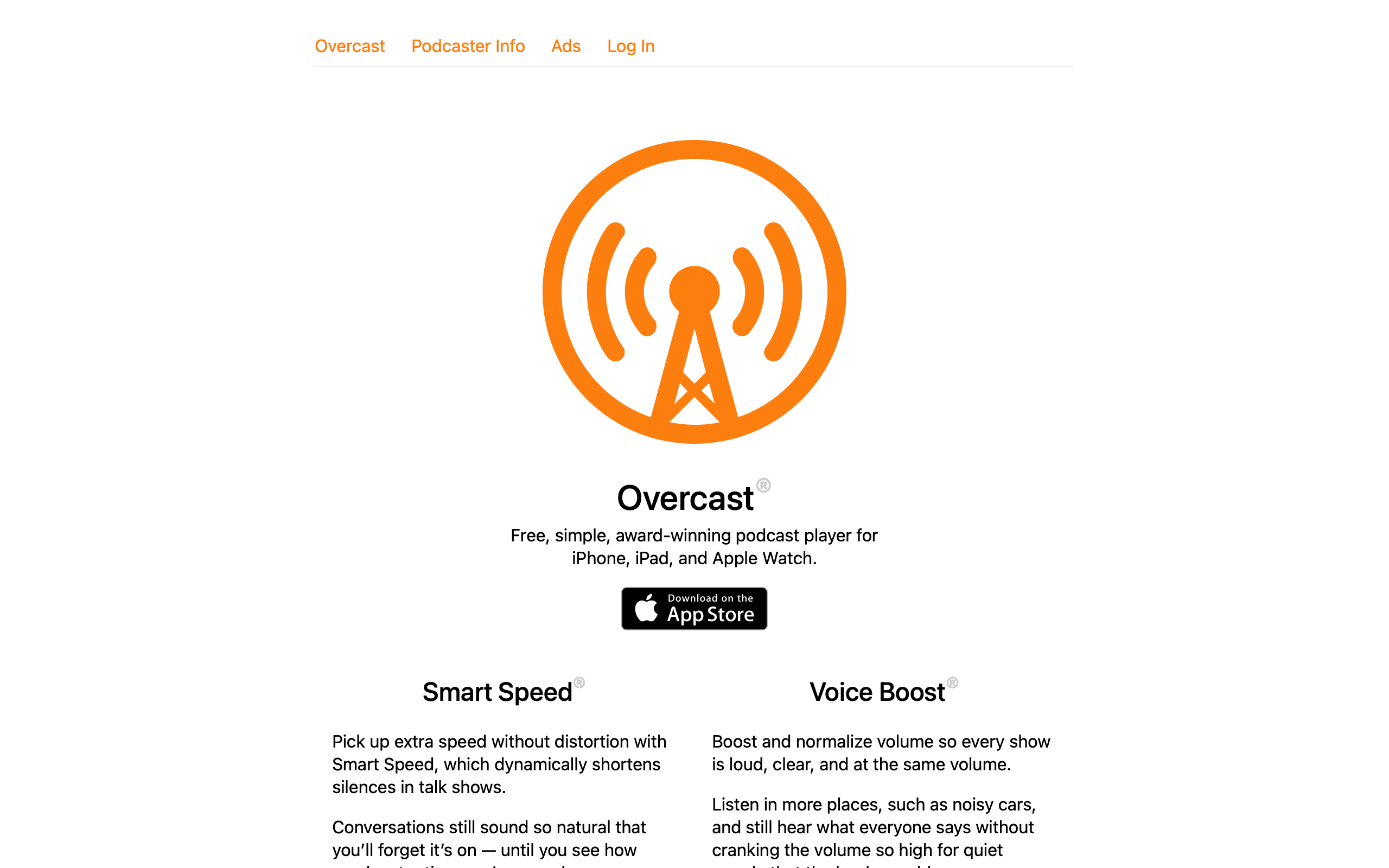
Overcast: Audio Engineering as Interface Design
“The best design work in Overcast is stuff you’ll never see. Smart Speed and Voice Boost are invisible — they just make everything sound better.” — Marco Arment, creator
Overcast is the definitive case study in invisible design. Built and maintained by a single developer — Marco Arment, former Tumblr CTO and creator of Instapaper — it competes against teams of hundreds at Spotify and Apple by doing less, better. Its two flagship features, Smart Speed and Voice Boost, are audio processing algorithms that most users never consciously notice. Smart Speed dynamically shortens silences without pitch distortion. Voice Boost normalizes volume and boosts vocal frequencies. Together they make every podcast sound like it was professionally mastered, and they work without any user configuration.
For designers, Overcast inverts the usual product narrative. Most apps ship visible features — new tabs, new screens, new badges. Overcast’s most important work is inaudible. The interface is deliberately minimal not because of laziness but because the real product happens in the audio pipeline. This raises a fundamental design question: when your best work is invisible, how do you communicate value?
Why Overcast Matters
A solo developer competing against Apple Podcasts (pre-installed on every iPhone) and Spotify (500M+ users) and winning on quality. Overcast proves that focused execution by one person can create a better product than a hundred-person team spreading effort across features.
Key achievements: - Top-rated podcast app on iOS for over a decade - Smart Speed has collectively saved users over 1 billion minutes of listening time - Built and maintained by one developer with no employees - Pioneered audio enhancement features now copied by competitors - Free with no ads — sustained by a single premium tier - Consistently rated above Apple Podcasts and Spotify for podcast listening
Key Takeaways
- Invisible features can be your strongest differentiator - Smart Speed and Voice Boost are the reasons people choose Overcast, yet they have no visible UI beyond a toggle; the product is in the audio processing, not the interface
- Single-developer focus produces coherent design - Every pixel and every decision flows through one person’s taste, creating a consistency that committee-designed apps struggle to achieve
- Orange as identity, not decoration - Overcast’s orange (#FC7E0F) is used sparingly and consistently, making it one of the most recognizable app icons on any home screen
- Playlist management for audio is fundamentally different from music - Podcasts are serial, varied-length, partially-consumed content; Overcast’s queue and playlist system was designed for these constraints rather than adapted from music UX
- Respect for listener time is a design principle - Smart Speed, chapter markers, custom playback speeds, and skip intervals all optimize for the listener’s scarcest resource: attention hours
Core Design Principles
1. Invisible Audio Processing
Smart Speed and Voice Boost are Overcast’s core product, and they are both invisible by default. The only UI is a toggle and a cumulative time-saved counter. This is a deliberate design choice: the best audio processing is the kind you do not notice.
SMART SPEED: Dynamic Silence Shortening

Standard playback:
  "So... [400ms pause] ...the thing about... [600ms pause] ...podcasts is..."

Smart Speed:
  "So... [150ms] ...the thing about... [200ms] ...podcasts is..."

NOT the same as 1.5x speed:
  - Does not change pitch
  - Does not compress speech
  - Only shortens pauses dynamically
  - Adapts to each speaker's cadence
  - More aggressive on long pauses, gentle on short ones

RESULT: 10-20% time savings on most podcasts
         with zero perceptible quality loss

VOICE BOOST: Vocal Enhancement

Standard podcast audio:
  ┌─────────────────────────────────┐
  │  ▁▂▃▅▃▂▁  ← Quiet, muddy       │
  │  Wide dynamic range             │
  │  Background noise audible       │
  └─────────────────────────────────┘

Voice Boost enabled:
  ┌─────────────────────────────────┐
  │  ▃▅▇█▇▅▃  ← Loud, clear        │
  │  Compressed dynamic range       │
  │  Vocals boosted, noise reduced  │
  └─────────────────────────────────┘

Processing chain:
  1. Volume normalization (loudness targeting)
  2. Dynamic range compression
  3. Vocal frequency EQ boost (~1kHz-4kHz)
  4. Noise floor reduction
The UI for these features is intentionally minimal:
NOW PLAYING CONTROLS
┌─────────────────────────────────────────────┐
│                                             │
│  [Podcast Art]                              │
│                                             │
│  Episode Title                              │
│  Podcast Name                               │
│                                             │
│  ────────────●───────  32:15 / 1:04:22      │
│                                             │
│    -15s     ▶︎ / ⏸     +30s                  │
│                                             │
│  1.5×    [Smart Speed ✓]    [Voice Boost ✓] │
│          ↑                  ↑               │
│          Toggle only.       Toggle only.    │
│          No sliders.        No EQ curves.   │
│          No configuration.  No settings.    │
│                                             │
│  Smart Speed has saved you 142 hours        │
│  ↑                                          │
│  This one line IS the value proposition.    │
└─────────────────────────────────────────────┘
The cumulative time-saved counter is a masterclass in value communication. It takes an invisible feature and gives it one concrete, growing number. After months of use, seeing “Smart Speed has saved you 142 hours” makes the feature’s value undeniable — even though the user never consciously noticed it working.
2. Orange as Systematic Brand Identity
Overcast uses a single accent color — orange (#FC7E0F) — with the discipline of a system, not the enthusiasm of a brand guideline. Orange appears only where it carries meaning: active states, primary actions, and the app icon.
/* Overcast's color system */
:root {
  /* The orange: used sparingly, means "active" or "primary" */
  --overcast-orange: #FC7E0F;
  --overcast-orange-light: #FFA54C;

  /* Backgrounds: near-black in dark mode */
  --bg-primary: #1C1C1E;
  --bg-secondary: #2C2C2E;
  --bg-tertiary: #3A3A3C;

  /* Text hierarchy */
  --text-primary: #FFFFFF;
  --text-secondary: #8E8E93;
  --text-tertiary: #636366;
}

/* Orange appears ONLY in these contexts: */

/* 1. Now Playing progress bar */
.progress-bar-fill {
  background: var(--overcast-orange);
  height: 4px;
  border-radius: 2px;
  transition: width 0.1s linear;
}

/* 2. Active/playing episode indicator */
.episode-playing-indicator {
  color: var(--overcast-orange);
}

/* 3. Primary action buttons */
.btn-primary {
  background: var(--overcast-orange);
  color: white;
  border: none;
  border-radius: 8px;
  padding: 12px 20px;
  font-weight: 600;
}

/* 4. Toggle states */
.toggle-active {
  background: var(--overcast-orange);
}

/* Everything else: white, gray, or black.
   No secondary accent color. No gradients.
   The restraint IS the brand. */
What makes this work: When orange means something every time it appears, users develop an unconscious association. Orange = active, important, or interactive. Remove the orange and Overcast’s interface is entirely monochromatic. This creates what designers call “progressive disclosure through color” — the eye is drawn to orange elements first, naturally creating a visual hierarchy without layout changes.
3. Podcast-Native Queue Management
Most podcast apps adapted music queue UX (play next, play later, shuffle). Overcast recognized that podcasts have fundamentally different consumption patterns and designed its queue system around them.
MUSIC QUEUE vs PODCAST QUEUE

Music:
  - Songs are 3-5 minutes
  - Fully consumed in one sitting
  - Order matters for mood/flow
  - Shuffle is common
  - Rarely return to partially-played

Podcasts:
  - Episodes are 30-120 minutes
  - Often consumed across multiple sessions
  - Recency and priority matter more than flow
  - Shuffle is almost never desired
  - Partially-played episodes are the norm

OVERCAST'S QUEUE DESIGN:
┌─────────────────────────────────────────────┐
│  Up Next                          [Edit]    │
│                                             │
│  ┌─────────────────────────────────────┐    │
│  │ ▶ Currently Playing                 │    │
│  │   The Talk Show · 45:22 remaining   │    │
│  │   ████████████░░░░░░░  68%          │    │
│  └─────────────────────────────────────┘    │
│                                             │
│  ┌─────────────────────────────────────┐    │
│  │ 1. ATP · 2:14:00                    │    │
│  │    Priority: ⚡ Next                 │    │
│  └─────────────────────────────────────┘    │
│                                             │
│  ┌─────────────────────────────────────┐    │
│  │ 2. Cortex · 1:32:00                 │    │
│  │    Priority: Normal                 │    │
│  └─────────────────────────────────────┘    │
│                                             │
│  Smart Playlists:                           │
│  [All Episodes] [Priority] [Short <30m]     │
│                                             │
│  Custom playlists with filter rules:        │
│  - By podcast                               │
│  - By duration                              │
│  - By age                                   │
│  - Played/unplayed state                    │
└─────────────────────────────────────────────┘
/* Episode card with progress state */
.episode-card {
  display: flex;
  gap: 12px;
  padding: 12px 16px;
  border-bottom: 1px solid var(--bg-tertiary);
}

.episode-artwork {
  width: 56px;
  height: 56px;
  border-radius: 8px;
  flex-shrink: 0;
}

.episode-info {
  flex: 1;
  min-width: 0;
}

.episode-title {
  font-size: 15px;
  font-weight: 600;
  color: var(--text-primary);
  white-space: nowrap;
  overflow: hidden;
  text-overflow: ellipsis;
}

.episode-podcast-name {
  font-size: 13px;
  color: var(--text-secondary);
}

/* Inline progress bar showing partial consumption */
.episode-progress {
  height: 3px;
  background: var(--bg-tertiary);
  border-radius: 1.5px;
  margin-top: 8px;
  overflow: hidden;
}

.episode-progress-fill {
  height: 100%;
  background: var(--overcast-orange);
  border-radius: 1.5px;
}

/* Duration badge — crucial for podcast queue planning */
.episode-duration {
  font-size: 12px;
  color: var(--text-tertiary);
  font-variant-numeric: tabular-nums;
}

.episode-duration.short::before {
  content: "";
  display: inline-block;
  width: 6px;
  height: 6px;
  border-radius: 50%;
  background: #50C878;
  margin-right: 4px;
  vertical-align: middle;
}
Design Patterns Worth Stealing
The Time-Saved Counter as Value Metric
Overcast’s “Smart Speed has saved you X hours” is the single most effective feature communication pattern in any app. It transforms an invisible feature into a concrete, growing number.
FIRST WEEK:
  "Smart Speed has saved you 23 minutes"
  → User thinks: "That's nice"

FIRST MONTH:
  "Smart Speed has saved you 4.2 hours"
  → User thinks: "Wow, that adds up"

FIRST YEAR:
  "Smart Speed has saved you 52 hours"
  → User thinks: "I could never switch apps"

THE PSYCHOLOGY:
  - Cumulative metrics create switching costs
  - Growing numbers trigger loss aversion
  - Concrete time > abstract "better quality"
  - Shareable ("I've saved 100 hours!")
This pattern applies to any product with invisible value. An ad blocker could show “blocked 45,000 trackers.” A password manager could show “auto-filled 892 logins.” A CDN dashboard could show “served 2.3TB without downtime.” The principle: when your product works by removing friction, quantify the friction removed.
Chapter Markers as Navigation
Overcast surfaces chapter markers (when podcasts include them) as a navigation bar. This treats long-form audio the way a book treats its table of contents — letting listeners jump to relevant sections.
CHAPTER NAVIGATION
┌─────────────────────────────────────────────┐
│  Chapters                                   │
│                                             │
│  ✓  0:00  Introduction                      │
│  ✓  4:22  News roundup                      │
│  ▶  18:45  Interview: Guest Name    ← active│
│     35:10  Deep dive: Topic                 │
│     52:30  Listener questions               │
│     1:02:15  Wrap-up                        │
│                                             │
│  Tap any chapter to jump.                   │
│  ✓ = already listened                       │
└─────────────────────────────────────────────┘
/* Chapter list */
.chapter-list {
  list-style: none;
  padding: 0;
  margin: 0;
}

.chapter-item {
  display: flex;
  align-items: center;
  gap: 12px;
  padding: 10px 16px;
  border-bottom: 1px solid var(--bg-tertiary);
  cursor: pointer;
  transition: background 0.1s ease;
}

.chapter-item:hover {
  background: var(--bg-secondary);
}

.chapter-item.active {
  background: var(--bg-secondary);
}

.chapter-item.active .chapter-title {
  color: var(--overcast-orange);
  font-weight: 600;
}

.chapter-item.played .chapter-title {
  color: var(--text-tertiary);
}

.chapter-timestamp {
  font-size: 13px;
  font-variant-numeric: tabular-nums;
  color: var(--text-tertiary);
  min-width: 52px;
}

.chapter-title {
  font-size: 15px;
  color: var(--text-primary);
}

/* Played checkmark */
.chapter-item.played::before {
  content: "✓";
  color: var(--text-tertiary);
  font-size: 12px;
  min-width: 16px;
}

.chapter-item:not(.played)::before {
  content: "";
  min-width: 16px;
}

.chapter-item.active::before {
  content: "▶";
  color: var(--overcast-orange);
  font-size: 10px;
  min-width: 16px;
}
Customizable Skip Intervals
A small feature that reveals deep user understanding. Overcast lets users set independent skip-forward and skip-back intervals. Most users settle on -15s/+30s — but the fact that it is configurable signals respect for varied listening habits.
SKIP INTERVAL SETTINGS
┌─────────────────────────────────────────────┐
│  Playback                                   │
│                                             │
│  Skip Back:    [-]  15 seconds  [+]         │
│  Skip Forward: [-]  30 seconds  [+]         │
│                                             │
│  Available: 5, 10, 15, 30, 45, 60, 90s     │
│                                             │
│  WHY ASYMMETRIC DEFAULTS:                   │
│  - Skip back: recover missed content (15s)  │
│  - Skip forward: skip ads/intros (30s)      │
│  - Different use cases → different durations│
└─────────────────────────────────────────────┘
The Verdict
Overcast proves that a single developer with deep domain expertise can build a better product than a large team spreading effort thin. The app’s most important features — Smart Speed and Voice Boost — are invisible audio processing that most users never consciously notice. Its interface is minimal not from a lack of ideas but from disciplined restraint: orange means active, progress bars show partially-consumed episodes, and the time-saved counter turns invisible value into a concrete number. For designers, Overcast is the counterargument to feature bloat. It asks: what if your best work was the thing users never had to think about?
Best for learning: Communicating invisible value through metrics, systematic color restraint as brand identity, designing for partially-consumed serial content, and how single-developer focus creates coherent product vision.
Frequently Asked Questions
How does Smart Speed differ from playing at 1.5x or 2x speed?
Playback speed multipliers compress everything uniformly — speech, music, and silence all get faster, and pitch shifts at higher speeds. Smart Speed only targets silences and pauses, dynamically shortening them based on length and context. A 200ms breath pause might be shortened to 100ms, while a 2-second gap between segments might be shortened to 500ms. Speech itself is untouched. The result is 10-20% time savings with zero perceptible quality change.
Why does Overcast use only one accent color?
Single-color branding creates a clear visual hierarchy without competing for attention. When orange appears, it always means “active,” “playing,” or “primary action.” This consistency lets users scan the interface faster because color carries reliable meaning. It also makes the app icon instantly recognizable on any home screen. The restraint is the brand — removing the orange leaves a clean monochromatic interface where content (podcast artwork) provides the color.
Can the “time saved” counter pattern work for non-audio products?
Absolutely. Any product that removes friction or saves time can adopt this pattern. Password managers could show “auto-filled 892 logins.” Ad blockers could show “blocked 45,000 trackers and saved 12 GB of bandwidth.” Even a well-optimized website could show “loaded 3.2 seconds faster than average.” The key is choosing a metric that grows over time and maps to something the user values (time, bandwidth, security events avoided).
How does Overcast handle the business model as a solo developer?
Overcast is free with all features available. A single premium subscription removes a small banner and supports development. There are no ads, no tracking, and no freemium feature gates. This simplicity is itself a design decision — users never encounter upsell screens, locked features, or “upgrade to unlock” modals. The entire app experience is the same for free and paying users, which eliminates the design complexity of multi-tier feature access.
What makes podcast queue design different from music queue design?
Podcasts are serial (order matters), long-form (30-120 minutes), and partially consumed across sessions. Music is short-form, fully consumed, and often shuffled. Overcast’s queue shows progress bars on each episode, displays remaining time rather than total duration for in-progress episodes, and supports smart playlists filtered by duration, podcast, and recency. These design choices would be wrong for a music player but are essential for podcast listening.