Obsidian: Dark Intellectual Composability for Knowledge Workers
How Obsidian uses CSS variable architecture, a signature purple accent, and local-first Markdown to let users design their own thinking tool.
Obsidian: Dark Intellectual Composability for Knowledge Workers
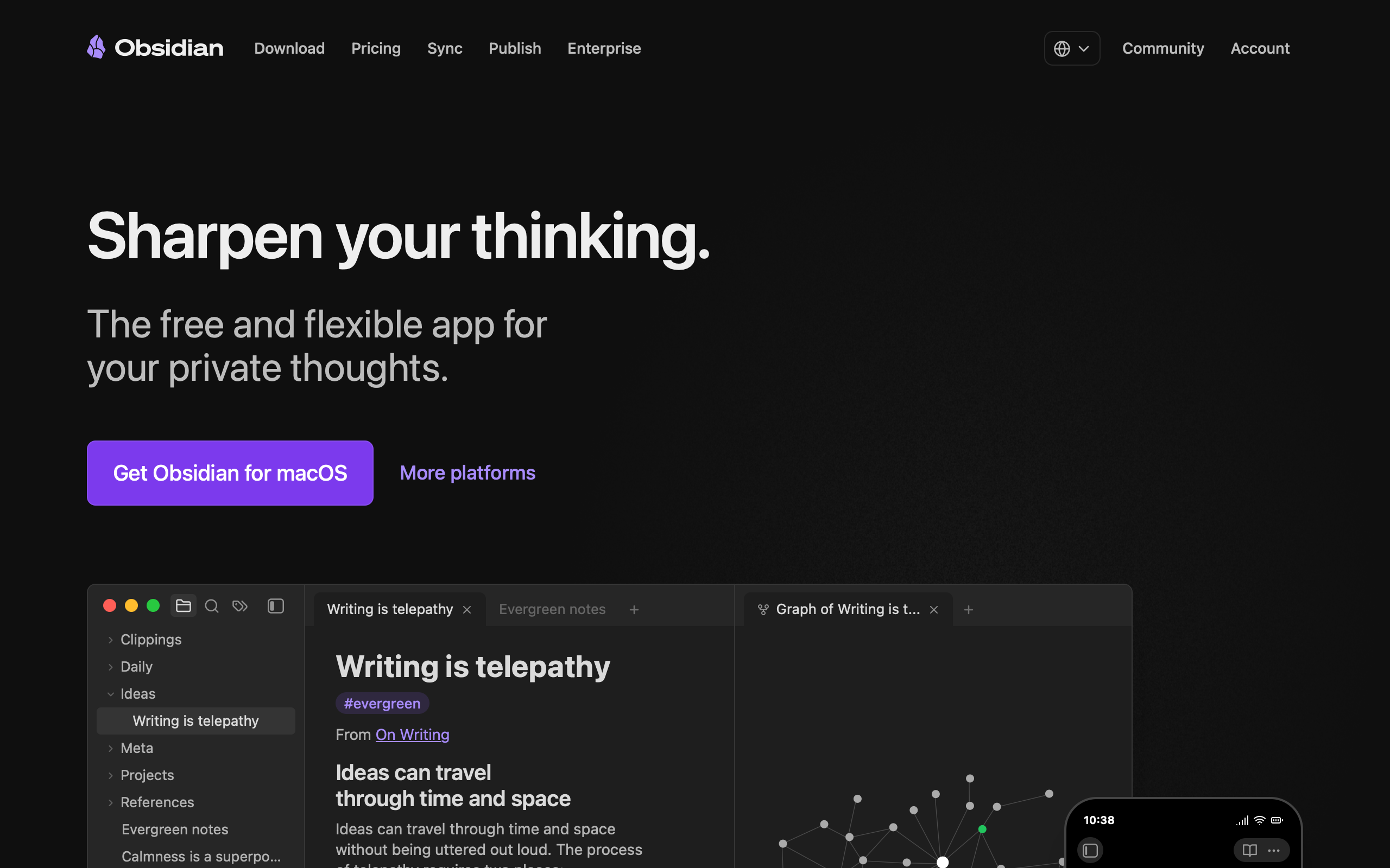
“Sharpen your thinking.” — Obsidian
Obsidian’s design philosophy is composability through constraint. The app stores everything as plain-text Markdown files in local folders — no proprietary format, no cloud lock-in, no database. This radical simplicity at the data layer frees the UI layer to be infinitely customizable through CSS theming and a plugin architecture with over 2,000 community plugins. CEO Steph Ango (kepano) personally created the “Minimal” theme — winner of Obsidian’s official Best Theme award — establishing the design language most users associate with the product: distraction-free, typographically driven, and respectful of content over chrome. The tagline “Sharpen your thinking” captures it perfectly: Obsidian is a tool, not a product, and it gets sharper the more you shape it to your workflow.
Key Takeaways
- CSS custom properties are a design API - Obsidian exposes hundreds of variables organized by category, making every pixel of the app user-customizable. The default theme is just one opinion among thousands
- System fonts signal confidence - Loading zero custom web fonts means zero FOIT/FOUT, instant rendering, and a statement that the platform’s native type is good enough
- Dark mode serves function, not fashion - The dark default reduces visual noise so linked notes, graph views, and Markdown content become the focal point
- Local-first simplifies the UI - No loading states for cloud sync, no collaboration cursors, no presence indicators. The interface is simpler because the data model is simpler
- The knowledge graph is both feature and brand - The force-directed graph visualization is Obsidian’s most distinctive element and its primary differentiator in a crowded note-taking market
Why Obsidian Matters
Obsidian proved that design can be a system of composable primitives rather than a fixed opinion. Where most apps ship a single visual identity and ask users to accept it, Obsidian provides the raw materials — variables, selectors, a plugin API — and lets users build their own experience. This is a radical position: the developer ships the constraints, the community ships the aesthetics.
Key achievements: - Built a theme system that treats CSS custom properties as a public API contract between the app and its ecosystem - Demonstrated that local-first architecture creates UI simplicity by eliminating cloud synchronization states - Established the knowledge graph visualization as a brand identity element recognizable across the entire note-taking category - Created a plugin ecosystem of 2,000+ extensions without losing core performance or design coherence - Proved that a tool designed for deep work can grow through community rather than marketing spend
Core Design Principles
1. The Theme System: CSS as API
Obsidian’s approach to design is fundamentally different from most applications. Rather than shipping a fixed visual identity, it exposes hundreds of CSS custom properties organized into logical categories — colors, typography, spacing, borders — across body, .theme-light, and .theme-dark selectors. Every pixel of the app is user-customizable.
OBSIDIAN'S THEME ARCHITECTURE:

┌─────────────────────────────────────────┐
│  body { /* Base variables */             │
│    --background-primary: ...;            │
│    --background-secondary: ...;          │
│    --text-normal: ...;                   │
│    --text-muted: ...;                    │
│    --text-faint: ...;                    │
│    --interactive-accent: ...;            │
│    --interactive-accent-hover: ...;      │
│  }                                       │
│                                          │
│  body.theme-light {                      │
│    --background-primary: #ffffff;        │
│    --text-normal: #1e1e1e;              │
│  }                                       │
│                                          │
│  body.theme-dark {                       │
│    --background-primary: #1e1e1e;        │
│    --text-normal: #dcddde;              │
│  }                                       │
└─────────────────────────────────────────┘
     ↓ Theme creators override these ↓
┌─────────────────────────────────────────┐
│  2,000+ community themes and plugins     │
│  all targeting the same variable API     │
└─────────────────────────────────────────┘
The Style Settings plugin extends this further by allowing theme creators to expose configuration panels to users. A theme creator defines settings in CSS comments, and the plugin renders them as toggles, color pickers, and dropdowns — giving non-technical users design control without writing CSS.
2. Dark-Mode Intellectual Aesthetic
The default aesthetic is dark-mode intellectual: deep backgrounds in the #0F172A to #1E293B range (slate-900 to slate-800), soft light text at #EEEEEE, and a signature purple (#A882FF) as the primary accent. The overall feel is a developer’s IDE crossed with a scholar’s study — serious, focused, and built for hours of deep work.
OBSIDIAN'S VISUAL LAYERS:

┌────────────────────────────────────────────┐
│  #0F172A — Deep navy-black canvas          │
│  ┌──────────────────────────────────────┐  │
│  │  #1E293B — Surface (cards, panels)   │  │
│  │  ┌──────────────────────────────┐    │  │
│  │  │  #EEEEEE — Primary text      │    │  │
│  │  │  #94A3B8 — Muted text        │    │  │
│  │  │  #A882FF — Accent (purple)   │    │  │
│  │  └──────────────────────────────┘    │  │
│  └──────────────────────────────────────┘  │
└────────────────────────────────────────────┘
The marketing site amplifies this: enormous 60px headlines with -1.2px letter-spacing against a dark void background that makes the purple CTA practically glow. Product screenshots float in the darkness, creating a sense that Obsidian is a window into your knowledge graph rather than just another application.
3. System Fonts as a Design Statement
Obsidian loads zero custom web fonts. The font stack — ui-sans-serif, system-ui, -apple-system, BlinkMacSystemFont, Roboto, Inter, "Helvetica Neue", Arial, "Noto Sans", sans-serif — defers entirely to the operating system. This is not a budget decision but a design statement: the platform’s native type is good enough, and instant rendering matters more than typographic branding.
Headlines at 60px/600 weight with -1.2px letter-spacing and a 1.0 line-height create a monumental, architectural feel. The text sits directly on its baseline with zero extra leading. Body text at 16px/400/1.5 returns to convention. The personality lives in the size and tightness of the display type, not in a proprietary font.
4. Eight-Color Harmony
Obsidian uses a carefully calibrated eight-color accent palette that serves double duty across UI elements and code syntax highlighting. The same tokens that color tags, links, and status indicators also provide syntax highlighting:
EIGHT-COLOR ACCENT PALETTE:

Red    #FB464C  │ Errors, tags, code operators
Orange #E9973F  │ Warnings, highlights, important
Yellow #E0DE71  │ Annotations, functions
Green  #44CF6E  │ Success, checkboxes, strings
Cyan   #53DFDD  │ Links, references, properties
Blue   #027AFF  │ Interactive elements
Purple #A882FF  │ Brand accent, selected state, values
Pink   #FA99CD  │ Decorative, tags, keywords
This is an elegant approach: syntax colors reference the same accent tokens as the UI, creating visual harmony between the interface and the code displayed within it. A single palette governs every colored element in the application.
Transferable Patterns
Obsidian’s most transferable pattern is the CSS custom property architecture that enables infinite theming. The foundation is remarkably clean:
:root {
  /* Obsidian dark knowledge aesthetic */
  --color-background: #0F172A;
  --color-surface: #1E293B;
  --color-text: #EEEEEE;
  --color-text-muted: #94A3B8;
  --color-accent: #A882FF;
  --color-link: #027AFF;

  /* 8-color functional palette */
  --color-red: #FB464C;
  --color-orange: #E9973F;
  --color-yellow: #E0DE71;
  --color-green: #44CF6E;
  --color-cyan: #53DFDD;
  --color-blue: #027AFF;
  --color-purple: #A882FF;
  --color-pink: #FA99CD;

  /* System font stack */
  --font-sans: ui-sans-serif, system-ui, -apple-system, sans-serif;

  /* Spacing */
  --space-xs: 4px;
  --space-sm: 8px;
  --space-md: 16px;
  --space-lg: 24px;
  --space-xl: 48px;
}
The code syntax highlighting system demonstrates how the eight accent colors create harmony between UI and content. Each syntax token references the same color variable used elsewhere in the interface:
/* Syntax colors reference the same 8 accent tokens */
--code-normal: var(--text-muted);
--code-comment: var(--text-faint);
--code-function: var(--color-yellow);
--code-important: var(--color-orange);
--code-keyword: var(--color-pink);
--code-operator: var(--color-red);
--code-property: var(--color-cyan);
--code-string: var(--color-green);
--code-tag: var(--color-red);
--code-value: var(--color-purple);
The CTA button uses the signature purple with a glow effect that emerges naturally from the dark background. No additional decoration is needed — the purple against #0F172A creates its own luminance:
.button-cta {
  background: #A882FF;
  color: white;
  border-radius: 8px;
  padding: 12px 24px;
  font-weight: 600;
}
In SwiftUI, the system font approach translates directly. The tight display tracking at -1.2px and zero line spacing create the same monumental headline treatment:
extension Color {
    static let obsidianBackground = Color(red: 15/255, green: 23/255, blue: 42/255)
    static let obsidianSurface = Color(red: 30/255, green: 41/255, blue: 59/255)
    static let obsidianText = Color(red: 238/255, green: 238/255, blue: 238/255)
    static let obsidianMuted = Color(red: 148/255, green: 163/255, blue: 184/255)
    static let obsidianAccent = Color(red: 168/255, green: 130/255, blue: 255/255)
}

// Display headline — monumental, architectural
Text("Sharpen your thinking")
    .font(.system(size: 60, weight: .semibold))
    .tracking(-1.2)
    .lineSpacing(0)
    .foregroundStyle(Color.obsidianText)

// Body text — conventional, readable
Text("A second brain, for you, forever.")
    .font(.system(size: 16))
    .lineSpacing(4)
    .foregroundStyle(Color.obsidianMuted)
Design Lessons
Treat CSS variables as a public API. When your design tokens are the contract between your app and its plugin ecosystem, you gain a community of designers extending your product for free. Obsidian’s 2,000+ themes exist because the variable architecture is well-organized, well-named, and stable across versions.
Local-first is a UI simplification strategy. Every cloud-first feature — sync indicators, collaboration cursors, conflict resolution dialogs, loading states — is UI complexity that local-first architecture eliminates. Obsidian’s interface is simpler not despite being offline-first, but because of it.
System fonts are a legitimate design choice. Loading custom web fonts is not always better. Zero FOIT/FOUT, instant rendering, and platform-native familiarity are real benefits. When your product’s identity lives in layout, color, and interaction rather than typography, system fonts are the right call.
Let your most distinctive feature become your brand. The knowledge graph visualization is Obsidian’s most recognizable element. It appears on the marketing site, in social media imagery, and in the app icon. Rather than designing a brand identity separately and applying it to the product, Obsidian let the product’s most compelling feature become the brand.
Dark mode should serve the content. Obsidian’s dark default is not a trend-following choice. It reduces visual noise so that linked notes, graph views, and rendered Markdown become the focal point. The purple accent at #A882FF glows against the dark canvas, drawing attention to interactive elements without competing with the written content that fills most of the screen.
Frequently Asked Questions
What makes Obsidian’s design approach unique among note-taking apps?
Obsidian treats design as a composable system rather than a fixed opinion. By exposing hundreds of CSS custom properties as a public API, it lets users and theme creators customize every pixel of the interface. Most note-taking apps ship a single visual identity; Obsidian ships the primitives for building one. This has produced a community of 2,000+ themes and plugins that extend the app’s design in ways the core team never anticipated.
How does Obsidian’s local-first architecture affect the user interface?
Local-first architecture eliminates an entire category of UI states: loading spinners for cloud sync, conflict resolution dialogs, collaboration cursors, presence indicators, and offline/online transitions. The result is a simpler, faster interface. There are no “syncing” states because data lives on your machine. This architectural decision directly enables the minimal, distraction-free aesthetic that defines the Obsidian experience.
Why does Obsidian use system fonts instead of custom web fonts?
This is a deliberate design statement, not a cost-saving measure. System fonts render instantly with zero FOIT (Flash of Invisible Text) or FOUT (Flash of Unstyled Text), which matters for an app where you spend hours reading and writing. The platform’s native type renders crisply on each operating system, and loading one fewer external resource keeps the experience fast. Obsidian’s visual identity lives in layout, color, and interaction design rather than in proprietary typography.
What can designers learn from Obsidian’s theme system?
The key lesson is variable architecture. Obsidian organizes CSS custom properties into clear categories (colors, typography, spacing, borders) with consistent naming conventions. Theme creators override these variables rather than writing custom selectors, which means themes are compatible across Obsidian versions. The Style Settings plugin adds another layer by letting theme creators expose user-facing configuration panels — defined in CSS comments — without building custom UI.
How does the knowledge graph function as both feature and brand?
The force-directed graph visualization showing linked notes as nodes and connections is Obsidian’s most distinctive and recognizable element. It serves a functional role (revealing relationships between ideas) and a brand role (appearing in marketing, social media, and the app icon). This dual purpose happened organically — the graph was built as a feature, and its visual distinctiveness made it the natural symbol for the product. It is more memorable than any logo because it represents what the product actually does.
References
- Obsidian Homepage — Marketing design and product overview
- Obsidian Theme Documentation — CSS variable architecture and theme creation guide
- Minimal Theme by Kepano — The official Best Theme award winner, created by Obsidian’s CEO
- Style Settings Plugin — Plugin that enables user-facing theme configuration
- Obsidian Design Principles Forum — Community discussion of core design philosophy
- Obsidian on Land-book — Landing page design gallery entry