Notion Calendar: Swiss Precision Meets Workspace Integration
How Notion Calendar combines Cron's keyboard-first minimalism with extreme typographic scale contrast to create a professional time instrument.
Notion Calendar: Swiss Precision Meets Workspace Integration
“The calendar should be an active instrument for time management, not a passive display.” — Raphael Schaad, Cron Founder
Notion Calendar began life as Cron — a calendar app built by Raphael Schaad with an obsessive focus on keyboard shortcuts and speed. The thesis was that calendars had become passive display tools when they should be active instruments. Cron reimagined the calendar as a keyboard-navigable workspace where creating, moving, and reshaping events was as fast as editing text in Vim. When Notion acquired Cron in 2022, the philosophy evolved from “fast calendar” to time blocking meets workspace — your calendar connects directly to Notion pages, databases, and documents. An event is not just “Product Review at 2pm” but a link to the product spec, the metrics dashboard, and the decision log.
Key Takeaways
- Extreme typographic scale creates hierarchy without decoration - A 64px headline next to a 12px label (5.3:1 ratio) communicates importance through size alone, no gradients or shadows needed
- Keyboard-first design rewards power users - Arrow keys to navigate, ‘n’ to create events, ‘g’ for go-to-date. The entire calendar works without a mouse
- One font family can do everything - NotionInter handles 11px time labels and 64px display type alike. No display/body font split required when one family has sufficient range
- Near-black transparency softens white backgrounds - Using
rgba(0,0,0,0.9)instead of pure black creates an imperceptibly softer rendering that reduces eye strain - Integration should be available, not visible - Linked-page indicators stay small and expandable. Information is accessible on demand, not on permanent display
Why Notion Calendar Matters
Notion Calendar demonstrates that minimalism is not the absence of features but the discipline to reveal them progressively. The product integrates deeply with Notion’s workspace — pages, databases, properties, relations — yet the calendar view remains clean enough to parse in a glance. This is a design achievement that most productivity tools fail to accomplish: connecting structured data to time without overwhelming the temporal view.
Key achievements: - Inherited Cron’s keyboard-first interaction model, proving that calendar apps can be as fast as code editors - Created a visual hierarchy using only typography and whitespace, eliminating decorative elements entirely - Integrated workspace data (Notion pages, database properties) into calendar events without cluttering the time grid - Established the label-style section header (12px, medium weight, positive tracking, uppercase) as a pattern for information architecture - Made time blocking a first-class interaction through click-and-drag event creation with 15-minute snap precision
Core Design Principles
1. Scale Contrast as Information Architecture
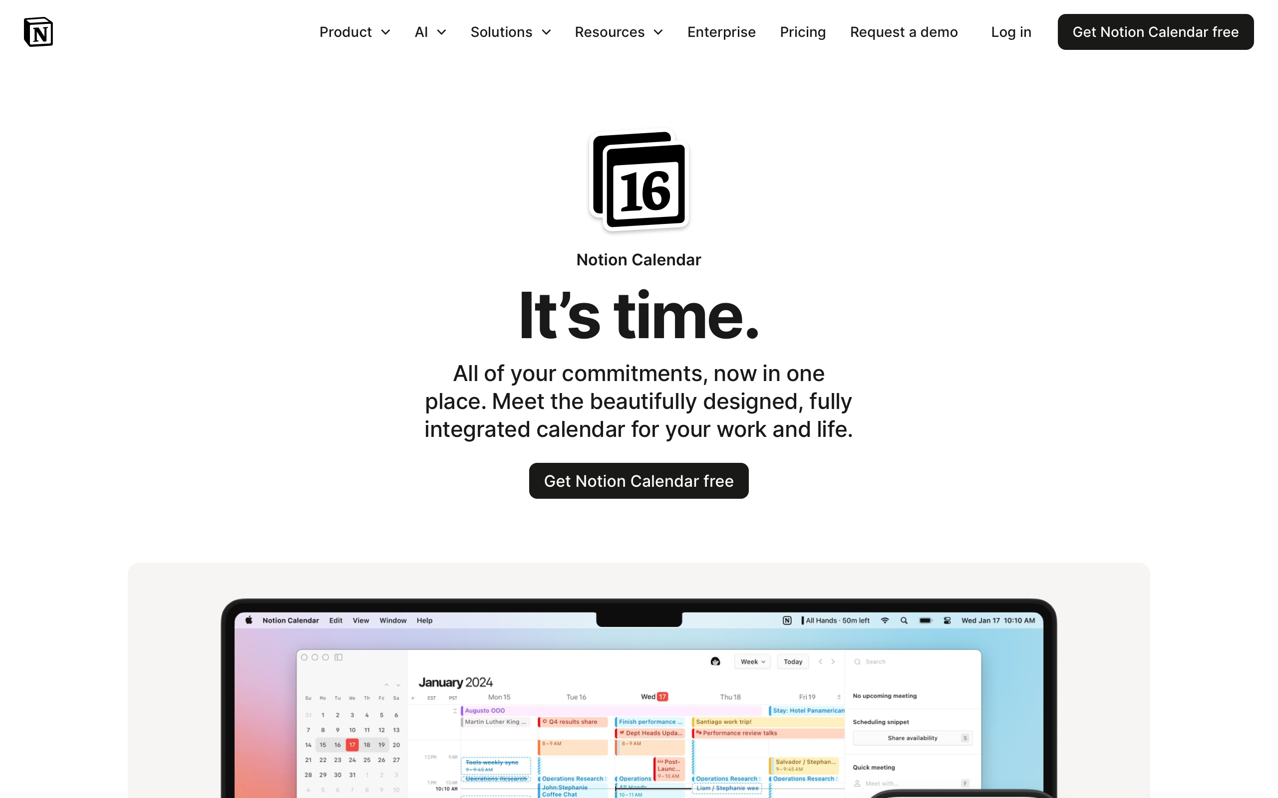
Notion Calendar’s marketing page is strikingly restrained. White background, minimal color, and one of the most dramatic typographic scale contrasts in modern product design. The 64px H1 at weight 700 with -2.125px letter-spacing creates a bold statement that fills the viewport. Immediately below, 12px label-weight text provides context.
SCALE CONTRAST COMPARISON:

Typical SaaS scale:          Notion Calendar scale:
H1: 36px                     H1: 64px
H2: 24px                     H2: 12px (label style)
H3: 20px                     H3: 18px
Body: 16px                   Body: 16px

Ratio H1:H2 = 1.5:1          Ratio H1:H2 = 5.3:1
(gradual, predictable)        (dramatic, intentional)
The 5.3:1 ratio between H1 and H2 is far beyond typical typographic scales (usually 2-3:1 between adjacent levels). The drama comes from juxtaposition — a massive headline paired with a tiny label creates a clear hierarchy without any colors, borders, or backgrounds needed to differentiate levels. The H1 sits at a line-height of 1.0 with -2.125px letter-spacing (-3.3% of font size), creating tight, poster-like headline blocks that feel architectural rather than decorative.
2. Keyboard-First Interaction
Inherited from Cron, the keyboard model treats the calendar as a navigable surface. Arrow keys move between days, ‘n’ creates new events, ‘g’ opens go-to-date. The entire calendar is operable without a mouse. This is not an accessibility afterthought — it is the primary interaction model, with mouse/touch as the fallback.
KEYBOARD NAVIGATION:

  ←  →  Move between days
  ↑  ↓  Move between time slots
  n     Create new event
  g     Go to date
  t     Jump to today
  /     Open command palette
  ⌘P    Quick find (anything)

The UI can be minimal BECAUSE
keyboard commands handle complexity
This interaction model justifies the sparse visual design. When power users can navigate, create, and modify events without leaving the keyboard, the interface doesn’t need large touch targets, prominent buttons, or visible toolbars. The command palette (Cmd+P) follows the same pattern as code editors — type to find, enter to act.
3. Swiss Precision in the Grid
The calendar grid itself is a study in restraint. Grid lines use 1px borders at 9% opacity (rgba(0,0,0,0.09)) — visible enough to organize but not heavy enough to compete with event content. Events use soft color fills with darker text, drawn from Notion’s eight-color palette. The time gutter uses monospaced numerals for perfect vertical alignment, ensuring that 9:00, 10:00, and 11:00 form a clean column regardless of digit width.
CALENDAR GRID DETAIL:

Time Gutter    Day Columns (1px border at 9% opacity)
──────────────┬──────────────┬──────────────
 09:00        │              │
              │  ┌─────────┐ │
 10:00        │  │ Standup │ │
              │  │ 10-10:30│ │
              │  └─────────┘ │
 11:00        │              │  ┌──────────┐
              │              │  │ Design   │
 12:00        │              │  │ Review   │
──────────────┴──────────────┴──┴──────────┴──

Monospaced       Soft color      Events connect
time numerals    fills, not      to Notion pages
align perfectly  heavy borders   on expansion
4. Warm Neutrals on White
While the design inherits Cron’s engineering-first minimalism, Notion softens it with warm touches. The primary text color uses rgba(0,0,0,0.9) rather than pure black, and the surface color is a warm gray (rgb(247,247,245)) rather than a cool one. The font is NotionInter — a custom fork of Inter with Notion-specific metric adjustments. These differences are subtle individually but compound into a design that feels precise without being cold.
Transferable Patterns
The most broadly applicable pattern from Notion Calendar is the label-style section header. This pattern — small size, medium weight, positive letter-spacing, uppercase text — creates clear information architecture without visual weight:
:root {
  /* Notion Calendar's precise palette */
  --color-background: rgb(255, 255, 255);
  --color-text: rgba(0, 0, 0, 0.9);
  --color-text-secondary: rgba(0, 0, 0, 0.54);
  --color-text-tertiary: rgba(0, 0, 0, 0.35);
  --color-blue: rgb(35, 131, 226);
  --color-surface: rgb(247, 247, 245);
  --color-border: rgba(0, 0, 0, 0.09);

  /* Shadows — minimal */
  --shadow-popover: 0 4px 12px rgba(0, 0, 0, 0.12);

  /* Typography */
  --font-sans: "NotionInter", Inter, -apple-system, ui-sans-serif, sans-serif;

  /* Border radius — subtle, not rounded */
  --radius-sm: 4px;
  --radius-md: 6px;
}

/* Display headline — enormous, tight */
h1 {
  font-size: 64px;
  font-weight: 700;
  line-height: 64px;
  letter-spacing: -2.125px;
  color: var(--color-text);
}

/* Label-style section header */
.section-label {
  font-size: 12px;
  font-weight: 500;
  letter-spacing: 0.125px;
  text-transform: uppercase;
  color: var(--color-text-secondary);
}
The calendar event color system inherits from Notion’s eight-color palette, where each color serves a semantic role rather than a decorative one. This pattern works well in any application where users categorize items:
/* Calendar event colors from Notion's system */
--event-default: rgb(227, 226, 224);
--event-blue: rgb(35, 131, 226);
--event-green: rgb(15, 123, 108);
--event-yellow: rgb(203, 145, 47);
--event-red: rgb(212, 76, 71);
--event-purple: rgb(144, 101, 176);
--event-pink: rgb(193, 76, 138);
--event-orange: rgb(217, 115, 13);
In SwiftUI, the display headline and label header demonstrate the extreme scale contrast that defines Notion Calendar’s visual identity:
// Display headline — poster-scale, tight tracking
Text("Your calendar,\nconnected")
    .font(.system(size: 64, weight: .bold))
    .tracking(-2.125)
    .lineSpacing(0)
    .foregroundStyle(Color.black.opacity(0.9))

// Label-style section header
Text("FEATURES")
    .font(.system(size: 12, weight: .medium))
    .tracking(0.125)
    .foregroundStyle(Color.black.opacity(0.54))

// Calendar time gutter — monospaced for alignment
Text("09:00")
    .font(.system(size: 11, weight: .medium).monospacedDigit())
    .foregroundStyle(Color.black.opacity(0.35))
Design Lessons
Scale contrast is free hierarchy. Jumping from 64px to 12px creates unmistakable information levels without spending any design budget on colors, borders, or backgrounds. This approach works on any project with a marketing page and requires only typographic discipline.
Monospaced numerals matter in data-aligned interfaces. When numbers need to form columns — times, prices, quantities — proportional numerals create ragged alignment. A single .monospacedDigit() modifier or font-variant-numeric: tabular-nums solves it.
Borders should organize, not decorate. At 9% opacity, Notion Calendar’s grid lines are barely visible. They guide the eye without competing with content. This is the difference between a border as structure and a border as style.
Keyboard-first justifies visual minimalism. When every action has a keyboard shortcut, the interface doesn’t need visible buttons, toolbars, or menus for common tasks. The command palette becomes the universal affordance.
Integration should be progressive disclosure. Notion Calendar connects to a rich workspace, but linked-page indicators stay small until the user explicitly expands them. The lesson: show that more data exists without displaying it all upfront.
Frequently Asked Questions
What makes Notion Calendar’s typography unusual?
The extreme scale contrast between the 64px display headline and the 12px label-style section header creates a 5.3:1 size ratio — far beyond the typical 2-3:1 between adjacent typographic levels. This, combined with a line-height of 1.0 on the headline and -2.125px letter-spacing, creates a poster-like visual impact using only a single font family (NotionInter).
How does Notion Calendar inherit from Cron?
Cron was a keyboard-first calendar built by Raphael Schaad before Notion acquired it in 2022. Notion Calendar retains Cron’s keyboard navigation model (arrow keys for days, ‘n’ for new events, ‘g’ for go-to-date), its engineering-precision minimalism, and its philosophy that calendars should be active instruments rather than passive displays. Notion added workspace integration — linking calendar events to Notion pages and databases.
Why does Notion Calendar use near-black transparency instead of pure black?
Using rgba(0,0,0,0.9) instead of rgb(0,0,0) creates a softer text rendering on white backgrounds. The 10% transparency allows a subtle amount of the background to show through, reducing the harsh contrast of pure black on pure white. This is nearly imperceptible consciously but reduces eye strain over extended reading sessions.
What can designers learn from Notion Calendar’s grid design?
The grid demonstrates that structural lines should be as light as possible while still being functional. At 9% opacity (rgba(0,0,0,0.09)), the grid lines organize the calendar into readable rows and columns without competing with the event content. Combined with monospaced time numerals in the gutter, the grid achieves precision through subtlety rather than weight.
References
- Notion Calendar Product Page — Marketing design and feature overview
- Cron (original product) — Redirects to Notion Calendar; historical context for the keyboard-first approach
- Notion Design — Notion’s broader design philosophy
- Raphael Schaad — Cron founder’s personal site and design thinking
- Cron Joins Notion — Acquisition announcement and integration vision
- Notion Calendar Keyboard Shortcuts — Full keyboard navigation reference