Mercury: Cinematic Sophistication in Banking
How Mercury uses a custom Arcadia typeface, cinematic photography, and dark premium palettes to redefine what startup banking looks like.
Mercury: Cinematic Sophistication in Banking
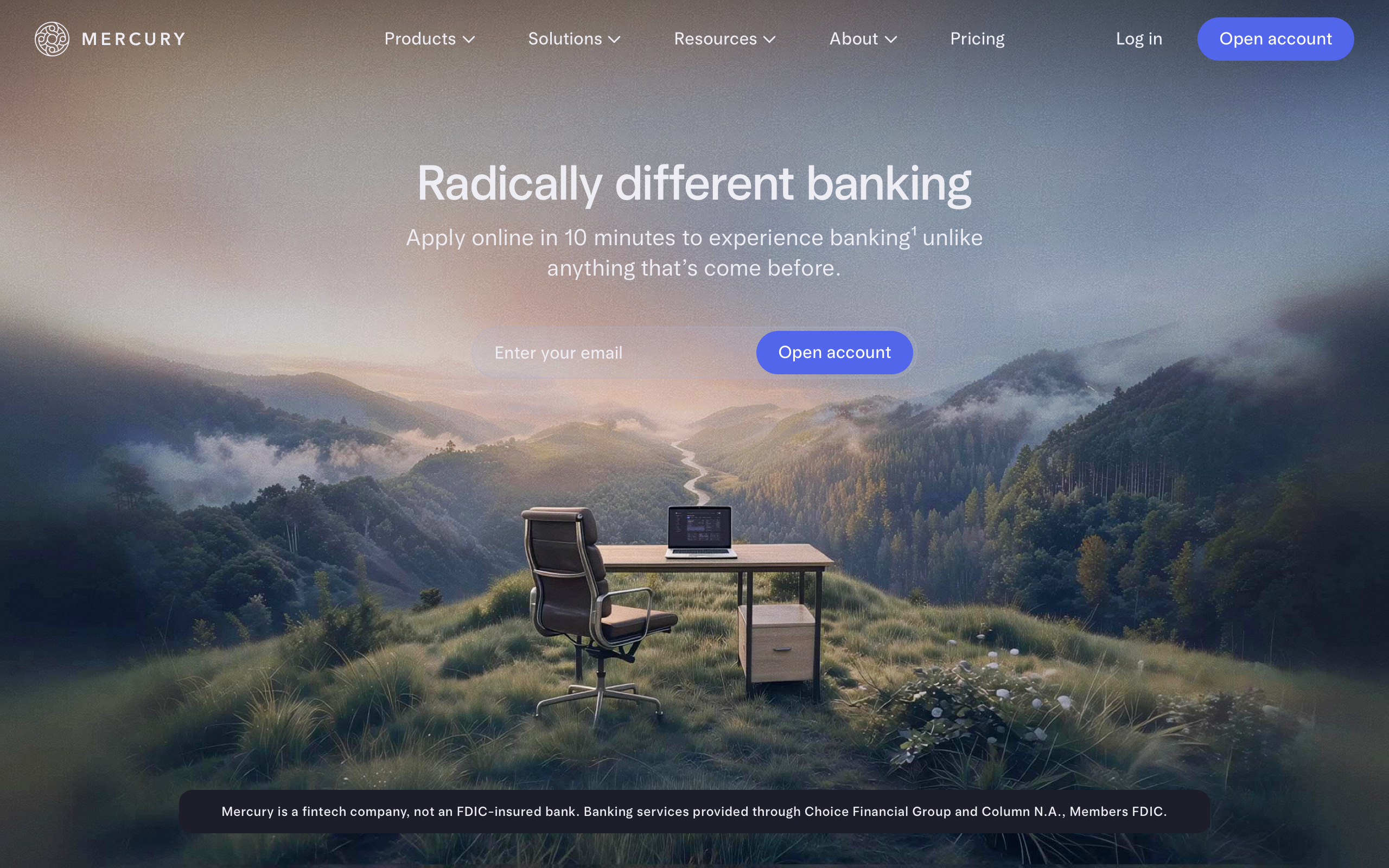
“Radically different banking.” — Mercury
Mercury was founded on the premise that startup banking is broken, and the fix requires rethinking the entire experience — not just the features. Co-founder Immad Akhund recognized that the banking products available to startups were either consumer-grade (simple but limiting) or enterprise-grade (powerful but hostile). Mercury aimed for a third path: a platform with the sophistication startups need — treasury management, team cards, API access, multi-entity support — wrapped in an experience that feels effortless. The bet: founders who obsess over product quality in their own companies will choose a bank that obsesses over product quality too.
Key Takeaways
- Custom typography is a defensible brand moat - Mercury’s Arcadia typeface, with its unusual 480 weight headlines, creates a visual identity no competitor can replicate
- Dark mode signals premium positioning - The dark-first palette positions Mercury alongside luxury brands, not playful consumer fintech apps
- Cinematic photography replaces stock imagery - Art-directed brand photography with dramatic lighting borrows from automotive and fashion advertising to make banking aspirational
- Micro-calibrated details compound into identity - A font weight of 480 (not 400, not 500) and body line-height of 1.625 (not 1.5) demonstrate obsessive attention that sophisticated users recognize
- Purple in banking is intentional differentiation - Avoiding the standard blue and green of financial services is a deliberate signal that Mercury is not a traditional bank
Why Mercury Matters
Mercury proved that banking can be a product design problem, not just a financial engineering problem. Every transaction, every statement, every approval workflow is designed with the same attention that a consumer app gives to its onboarding flow. The company has grown from a YC W19 batch startup to managing billions in deposits, and the design has evolved in lockstep — from “clean fintech dashboard” to something far more ambitious.
Key achievements: - Established a new design standard for fintech by treating banking as a premium digital product - Commissioned the Arcadia typeface family, creating a proprietary visual voice that reads as both modern and institutional - Demonstrated that dark-mode-first branding can work in financial services, a category historically associated with bright blues and greens - Used cinematic brand photography to position banking as aspirational rather than transactional - Built a design language where nothing is default — every typographic weight, every color value, every shadow is precisely calibrated
Core Design Principles
1. The Arcadia Typeface: Precision as Identity
Mercury’s most striking design decision is the custom Arcadia typeface family — ArcadiaDisplay for headlines, Arcadia for body text. The font has an unusual character: slightly condensed, with distinctive letter forms that read as simultaneously modern and institutional, technology and finance.
TYPOGRAPHIC WEIGHT SPECTRUM:

Standard approach:          Mercury's approach:
    400 (Regular)                 480 (Custom)
    500 (Medium)                  ↑
    600 (Semibold)           Fine-grained control
    700 (Bold)               via variable font

Most SaaS products:         Mercury:
"Pick the closest           "Calibrate to the exact
 standard weight"            weight that feels right"
The headline weight of 480 is the typographic equivalent of hand-tailoring. Most fonts use increments of 100, but Mercury is using a variable font with fine-grained weight control to find the exact value that looks authoritative without being heavy. Body text uses a generous 1.625 line-height — more spacious than the typical 1.5, giving text breathing room on dark backgrounds where readability demands extra leading.
2. Cinematic Photography as Brand Strategy
Mercury’s hero images aren’t stock photos of people at laptops. They use dramatic composition, aspirational settings, and cinematic color grading — a desk on a mountainside, a founder gazing at a horizon. This photographic approach borrows directly from luxury automotive and high-end fashion advertising.
PHOTOGRAPHY TREATMENT:

Stock Fintech Photo:            Mercury Photo:
┌─────────────────────┐        ┌─────────────────────┐
│ Person at laptop     │        │ Dramatic landscape   │
│ Generic office       │        │ Cinematic lighting   │
│ Bright, flat light   │   →    │ Cool shadows,        │
│ "Trust us" vibe      │        │ warm highlights      │
│                      │        │ Subtle vignette      │
└─────────────────────┘        └─────────────────────┘
  Commodity signal               Aspirational signal
Text over hero images uses carefully calibrated gradient overlays — linear-gradient(rgba(15,15,20,0) 0%, rgba(15,15,20,0.8) 100%) — that ensure readability without obscuring the photography. The gradient is the interface between brand and function.
3. Dark Mode as Premium Signal
Mercury’s dark palette is non-negotiable for the brand. The primary background at rgb(15,15,20), surfaces at rgb(25,25,32), and elevated elements at rgb(38,38,48) create a layered depth system. Light text at rgb(237,237,243) against these dark surfaces conveys sophistication and modernity — dark themes are associated with premium digital products, from high-end audio software to luxury automotive interfaces.
The palette is deliberately muted. No bright greens for “money” or loud blues for “trust.” Mercury signals trust through design quality, not color psychology cues. The accent purple (rgb(108,92,231)) is unusual for banking, and that’s the point — Mercury doesn’t want to look like a traditional bank.
4. Financial Data as Typography
Account balances and transaction amounts receive their own typographic treatment: 28px size, 500 weight, -0.5px tracking, 1.0 line-height. This creates instantly scannable financial data that is visually distinct from both headlines and body text. Semantic colors — green for credits (rgb(52,211,153)), red for debits (rgb(248,113,113)), amber for pending (rgb(251,191,36)) — follow established financial conventions while remaining desaturated enough to harmonize with the dark palette.
Transferable Patterns
Mercury’s design system demonstrates how a dark palette with precise typographic control can elevate any product category. The CSS foundation reveals the level of calibration involved:
:root {
  /* Mercury's cinematic dark palette */
  --color-background: rgb(15, 15, 20);
  --color-surface: rgb(25, 25, 32);
  --color-elevated: rgb(38, 38, 48);
  --color-text: rgb(237, 237, 243);
  --color-text-secondary: rgb(170, 170, 185);
  --color-text-tertiary: rgb(120, 120, 140);
  --color-accent: rgb(108, 92, 231);
  --color-accent-light: rgb(140, 125, 245);
  --color-border: rgba(255, 255, 255, 0.08);

  /* Financial semantic colors */
  --color-credit: rgb(52, 211, 153);
  --color-debit: rgb(248, 113, 113);
  --color-pending: rgb(251, 191, 36);

  /* Shadows + glow */
  --shadow-card: 0 4px 24px rgba(0, 0, 0, 0.4);
  --shadow-cta: 0 0 24px rgba(108, 92, 231, 0.3);

  /* Typography — custom Arcadia */
  --font-display: "ArcadiaDisplay", "ArcadiaDisplay Fallback", ui-sans-serif, sans-serif;
  --font-body: "Arcadia", "Arcadia Fallback", ui-sans-serif, -apple-system, sans-serif;
}
The unusual 480-weight headline is the detail that best illustrates Mercury’s philosophy. Notice it is not 400 or 500 — it is the exact weight the team determined looks right:
h1 {
  font-family: var(--font-display);
  font-size: 45px;
  font-weight: 480;
  line-height: 50px;
  letter-spacing: normal;
  color: #EDEDF3;
}
The CTA button pairs the accent purple with a glow effect — the shadow uses the same purple at reduced opacity, creating a luminous quality against the dark background:
.button-primary {
  background-color: var(--color-accent);
  color: white;
  font-family: var(--font-body);
  font-weight: 500;
  padding: 14px 28px;
  border-radius: 8px;
  box-shadow: var(--shadow-cta);
  transition: box-shadow 0.2s ease, background-color 0.2s ease;
}
.button-primary:hover {
  background-color: var(--color-accent-light);
  box-shadow: 0 0 32px rgba(108, 92, 231, 0.45);
}
In SwiftUI, the financial balance display demonstrates the distinct typographic treatment for monetary data — medium weight, negative tracking, and a clear label-to-value hierarchy:
extension Color {
    static let mercuryBg = Color(red: 15/255, green: 15/255, blue: 20/255)
    static let mercurySurface = Color(red: 25/255, green: 25/255, blue: 32/255)
    static let mercuryText = Color(red: 237/255, green: 237/255, blue: 243/255)
    static let mercurySecondary = Color(red: 170/255, green: 170/255, blue: 185/255)
    static let mercuryAccent = Color(red: 108/255, green: 92/255, blue: 231/255)
}

// Financial balance display
VStack(alignment: .leading, spacing: 4) {
    Text("Checking")
        .font(.system(size: 12, weight: .medium))
        .tracking(0.5)
        .foregroundStyle(Color.mercurySecondary)
    Text("$2,847,392.00")
        .font(.system(size: 28, weight: .medium))
        .tracking(-0.5)
        .foregroundStyle(Color.mercuryText)
}
Design Lessons
Invest in custom typography if you want defensible identity. Arcadia is unique to Mercury. No competitor can achieve the same typographic feel, making Mercury’s design identity a true moat. The 480-weight headline is a detail that only Mercury can own.
Dark mode is a positioning choice, not just a preference toggle. Mercury’s dark palette is integral to the brand — it communicates sophistication and seriousness. The marketing site doesn’t offer a light mode toggle because the darkness is the message, not a user preference.
Muted color builds more trust than saturated color. Mercury avoids the bright greens and blues that financial products typically use to signal “money” and “trust.” By keeping the palette desaturated and letting design quality speak for itself, Mercury appeals to founders who recognize craft over convention.
Treat financial data as a first-class typographic element. Account balances are not body text. They deserve their own size, weight, tracking, and semantic color system. Mercury’s distinct treatment makes financial data instantly scannable without competing with the narrative text around it.
Commission photography, don’t license it. Art-directed brand photography with cinematic color grading cannot be replicated by competitors buying from the same stock libraries. The investment in original photography pays compounding returns as the brand scales.
Frequently Asked Questions
What makes Mercury’s design different from other fintech products?
Mercury treats banking as a premium design problem. While most fintech products use bright palettes and stock photography to signal friendliness, Mercury uses a dark cinematic palette, a custom typeface (Arcadia), and art-directed photography to position itself alongside luxury brands. The design signals that this is banking for founders who care about craft.
Why does Mercury use a font weight of 480 instead of a standard value?
Mercury uses a variable font that allows fine-grained weight control beyond the traditional 100-increment scale. The 480 weight was calibrated to feel authoritative without being heavy — subtler than medium (500) but stronger than regular (400). This micro-attention to typographic detail is central to Mercury’s identity: nothing is a default value.
How does Mercury’s dark palette affect usability for a banking product?
The dark palette actually enhances usability for financial data by reducing visual noise and making colored elements (green for credits, red for debits) more prominent against the neutral background. Body text uses a generous 1.625 line-height for readability on dark surfaces, and the text color is a soft off-white (rgb(237,237,243)) rather than pure white to reduce eye strain.
What can designers learn from Mercury’s approach to brand photography?
Mercury’s photography borrows techniques from luxury automotive and fashion advertising — dramatic lighting, aspirational settings, and cinematic color grading. The lesson is that the same techniques used to sell aspiration in physical products can reposition digital products from commodities to brands. A gradient overlay system ensures text remains readable over the imagery without sacrificing its impact.
References
- Mercury Homepage — Primary marketing and brand design
- Mercury About Page — Brand photography and company positioning
- Mercury Blog — Product updates and design evolution
- Mercury on Y Combinator — YC W19 batch context
- Mercury on Product Hunt — Launch and community reception
- Arcadia Typeface — Custom commissioned for Mercury (not publicly available)