Linear: The New Standard for Software Design
How Linear set the design standard for modern software: keyboard-first UX, optimistic UI, command palette, and dark mode. CSS and TS code included.
Linear: The New Standard for Software Design
“Software should be opinionated and fast.” — Karri Saarinen, Linear CEO
Linear is a project management tool that redefined what modern software can feel like. Launched in 2019 by former Uber and Airbnb designers, it proves that B2B software doesn’t have to be ugly or slow.
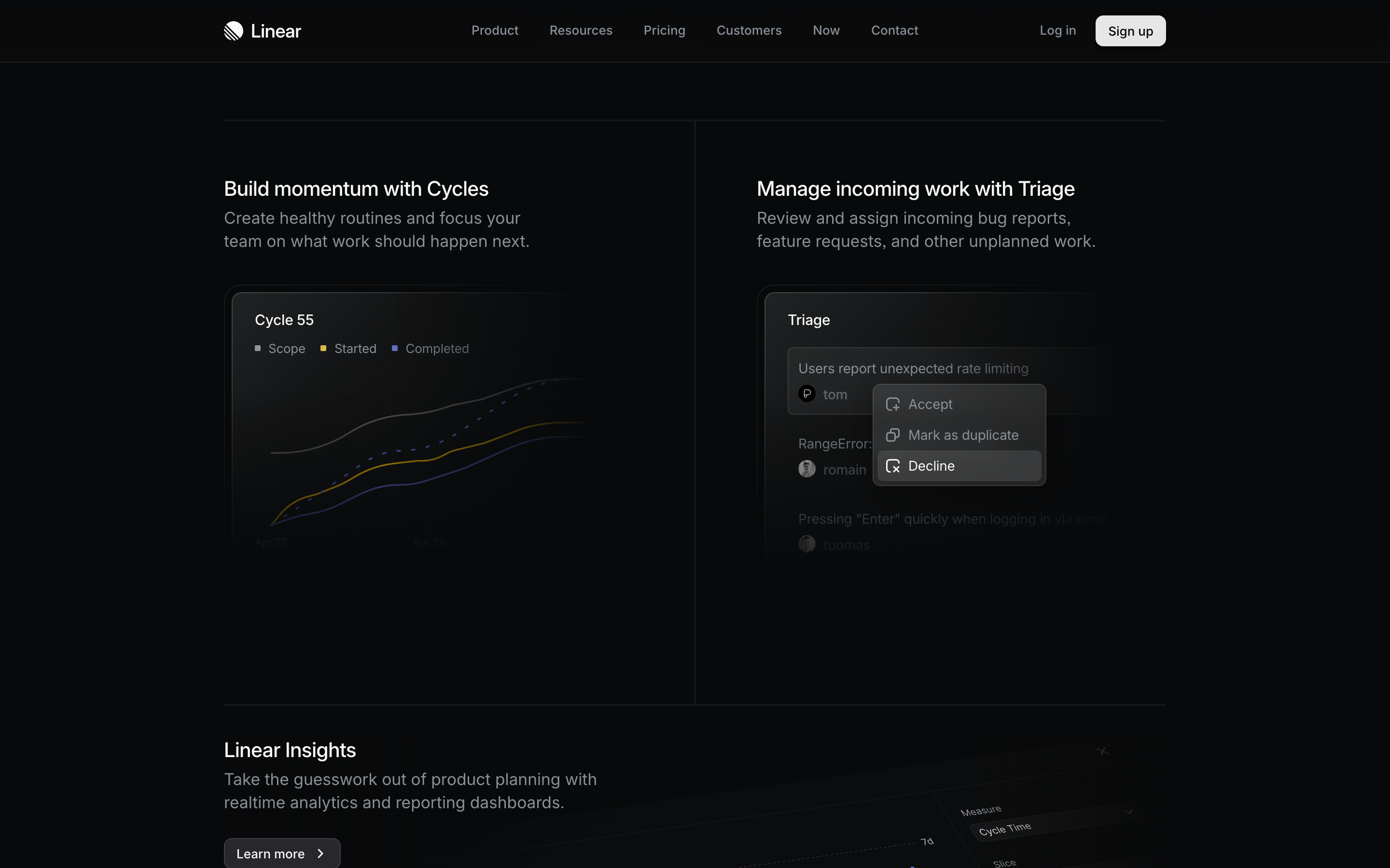
Why Linear Matters
Linear stands as a design statement against bloated, committee-designed enterprise software. It shows what happens when designers build for designers.
Key achievements: - Made enterprise software feel like consumer software - Proved keyboard-first interfaces can be beautiful - Demonstrated that performance is a feature - Set a new bar for SaaS product quality
Key Takeaways
- Speed is a feature, not a metric - Linear’s obsessive focus on sub-100ms interactions proves that perceived performance creates emotional response
- Keyboard-first means power users win - Command palette (Cmd+K) and mnemonic shortcuts (S for Status, P for Priority) accelerate experts without blocking beginners
- Information density beats whitespace - Show more data with less chrome; reveal detail on hover rather than hiding behind clicks
- Dark mode as the primary experience - Designing dark-first creates premium aesthetic and reduces eye strain for power users
- Optimistic UI eliminates waiting - Update locally first, sync in background, and only show errors when they actually happen
Core Design Principles
1. Speed as a Feature
Linear is obsessively fast. Every interaction feels instant.
How they achieve it: - Optimistic UI updates (assume success, rollback on failure) - Local-first architecture - Aggressive caching - Minimal network requests
Implementation insight:
// Optimistic update pattern
function updateIssue(id: string, changes: Partial<Issue>) {
  // 1. Update local state immediately
  localStore.update(id, changes)

  // 2. Show success state
  ui.showSaved()

  // 3. Sync with server in background
  api.updateIssue(id, changes).catch(() => {
    // 4. Rollback only on failure
    localStore.rollback(id)
    ui.showError()
  })
}
Design application: - Loading states should be invisible when possible - Skeleton screens only when necessary - Never block the user from their next action
2. Keyboard-First, Mouse-Friendly
Linear is designed for power users but welcoming to beginners.
The command palette (Cmd+K): - Universal entry point for all actions - Fuzzy search across everything - Keyboard shortcuts discoverable - Never requires leaving keyboard
┌────────────────────────────────────────────────────────────┐
│ Cmd+K                                                      │
├────────────────────────────────────────────────────────────┤
│ > Search issues, projects, or commands...                  │
│                                                            │
│   Recent                                                   │
│   ├─ FE-123 Fix navigation animation              Cmd+O   │
│   ├─ BE-456 API rate limiting                     Cmd+O   │
│   └─ Create new issue                             C       │
│                                                            │
│   Commands                                                 │
│   ├─ Change status                                S       │
│   ├─ Assign issue                                 A       │
│   └─ Set priority                                 P       │
│                                                            │
└────────────────────────────────────────────────────────────┘
Implementation principles: - Every action has a keyboard shortcut - Shortcuts are mnemonic (S for Status, P for Priority) - Mouse works perfectly. Keyboard is faster - Help is always one keystroke away
3. Information Density Done Right
Linear shows a lot of information without feeling cluttered.
How they balance density:
CLUTTERED (typical enterprise):
┌────────────────────────────────────────────────────────────┐
│ [ ] * FE-123 | Fix bug | John | High | In Progress | 2d   │
│     Tags: frontend, urgent, sprint-12, reviewed           │
│     Created: Jan 1 | Updated: Jan 5 | Due: Jan 10         │
│     Comments: 5 | Attachments: 2 | Subtasks: 3/5          │
├────────────────────────────────────────────────────────────┤
│ [ ] * FE-124 | Another bug | Jane | Medium | Todo | 1d    │
│     ... (repeating all metadata)                          │
└────────────────────────────────────────────────────────────┘

LINEAR'S APPROACH:
┌────────────────────────────────────────────────────────────┐
│ [x] FE-123  Fix navigation animation bug      ^  John  ** │
│ [ ] FE-124  Update user profile endpoint         Jane  *  │
│ [x] FE-125  Add dark mode toggle              ^  Alex  ***│
└────────────────────────────────────────────────────────────┘
                                                     ^    ^
                                          Priority  Assignee  Estimate
                                          (caret)   (name)    (dots)
Principles: - Show only what’s needed at each level - Use icons and symbols over text labels - Reveal detail on hover/selection - Progressive disclosure on demand
4. Consistent Visual Language
Linear’s design system is tight and consistent.
Color system:
/* Linear-inspired semantic colors */
:root {
  /* Status colors - highly saturated, distinct */
  --status-backlog: #6B7280;    /* Gray - not started */
  --status-todo: #3B82F6;       /* Blue - ready */
  --status-progress: #F59E0B;   /* Amber - in work */
  --status-done: #10B981;       /* Green - complete */
  --status-cancelled: #EF4444;  /* Red - cancelled */

  /* Priority - consistent hue shift */
  --priority-urgent: #EF4444;   /* Red */
  --priority-high: #F97316;     /* Orange */
  --priority-medium: #EAB308;   /* Yellow */
  --priority-low: #6B7280;      /* Gray */
  --priority-none: #374151;     /* Dark gray */

  /* Surface hierarchy */
  --bg-primary: #0D0D0D;        /* Main background */
  --bg-elevated: #141414;       /* Cards, panels */
  --bg-hover: #1F1F1F;          /* Hover states */
  --bg-active: #292929;         /* Active/selected */
}
Typography:
/* Linear uses Inter for everything */
:root {
  --font-family: 'Inter', -apple-system, sans-serif;

  /* Tight scale, high readability */
  --text-xs: 11px;    /* Metadata */
  --text-sm: 12px;    /* Secondary */
  --text-base: 13px;  /* Body (smaller than typical) */
  --text-lg: 14px;    /* Emphasis */
  --text-xl: 16px;    /* Headings */
  --text-2xl: 20px;   /* Page titles */
}
5. Dark Mode by Default
Linear chose dark mode as the primary experience.
Why this works: - Reduces eye strain for power users (long hours) - Creates premium, focused aesthetic - Makes status colors pop - Aligns with developer tooling aesthetic
Implementation:
/* Dark-first design */
:root {
  color-scheme: dark;

  --text-primary: rgba(255, 255, 255, 0.95);
  --text-secondary: rgba(255, 255, 255, 0.65);
  --text-tertiary: rgba(255, 255, 255, 0.45);

  --border-default: rgba(255, 255, 255, 0.08);
  --border-hover: rgba(255, 255, 255, 0.12);
}

/* Light mode as override */
[data-theme="light"] {
  --text-primary: rgba(0, 0, 0, 0.90);
  --text-secondary: rgba(0, 0, 0, 0.60);
  /* ... */
}
6. Micro-Interactions That Delight
Every interaction in Linear has been considered.
Examples: - Issue cards lift slightly on hover - Status changes have subtle color transitions - Drag-and-drop has smooth, physics-based motion - Checkboxes have satisfying click feedback
Animation principles:
/* Linear's motion */
:root {
  --ease-out: cubic-bezier(0.16, 1, 0.3, 1);
  --ease-in-out: cubic-bezier(0.65, 0, 0.35, 1);

  --duration-fast: 100ms;     /* Micro feedback */
  --duration-normal: 150ms;   /* Standard transitions */
  --duration-slow: 250ms;     /* Page transitions */
}

.issue-card {
  transition:
    transform var(--duration-fast) var(--ease-out),
    box-shadow var(--duration-normal) var(--ease-out);
}

.issue-card:hover {
  transform: translateY(-1px);
  box-shadow: 0 4px 12px rgba(0, 0, 0, 0.15);
}
Design Patterns to Learn From
The Command Palette
Linear’s Cmd+K is now an expected pattern in modern software.
Implementation guide:
<!-- Command palette structure -->
<dialog class="command-palette" aria-label="Command menu">
  <header>
    <input
      type="text"
      placeholder="Search issues or commands..."
      aria-describedby="command-hint"
    />
  </header>

  <nav aria-label="Command results">
    <section aria-label="Recent">
      <h3>Recent</h3>
      <ul role="listbox">
        <li role="option" tabindex="0">
          <span class="issue-id">FE-123</span>
          <span class="issue-title">Fix bug</span>
          <kbd>Cmd+O</kbd>
        </li>
      </ul>
    </section>

    <section aria-label="Commands">
      <h3>Commands</h3>
      <!-- ... -->
    </section>
  </nav>
</dialog>
Contextual Menus
Right-click menus that show exactly what you need.
Right-click on issue:
┌────────────────────────────────┐
│  Open issue            Cmd+O  │
│  Open in new tab   Cmd+Shft+O │
├────────────────────────────────┤
│  Set status                S  │
│  Set priority              P  │
│  Assign                    A  │
├────────────────────────────────┤
│  Copy link             Cmd+C  │
│  Copy ID                      │
├────────────────────────────────┤
│  Delete              Backspace│
└────────────────────────────────┘
Inline Editing
Edit without modal dialogs.
BEFORE (click to edit):
┌────────────────────────────────────────┐
│  Fix navigation bug          [Edit]   │
└────────────────────────────────────────┘

AFTER (inline edit on click):
┌────────────────────────────────────────┐
│  Fix navigation bug|                   │  ← Cursor appears
│  ──────────────────                    │    in place
└────────────────────────────────────────┘
What to Steal from Linear
For Any Software Project
- Speed is non-negotiable - Optimize perceived and actual performance
- Keyboard shortcuts everywhere - But don’t require them
- Command palette - Universal access point
- Dark mode done right - Not an afterthought
- Information density - Show more with less
- Consistent design language - Every element feels related
Specific Techniques
| Technique | How to Apply |
|---|---|
| Optimistic UI | Update locally first, sync in background |
| Fuzzy search | Use Fuse.js or similar for command palette |
| Mnemonic shortcuts | S for Status, P for Priority, A for Assign |
| Subtle elevation | 1-2px lift on hover, not dramatic shadows |
| Semantic colors | Consistent status/priority color system |
| Tight typography | 13px body text, dense but readable |
Key Quotes from Linear Team
“We think of speed as a feature. If something takes 300ms, it feels broken.”
“Every pixel should be intentional. If you can’t explain why something is there, remove it.”
“Keyboard-first doesn’t mean keyboard-only. It means respecting power users.”
Frequently Asked Questions
What makes Linear faster than other project management tools?
Linear uses optimistic UI updates, local-first architecture, and aggressive caching. When you change an issue’s status, the UI updates immediately while syncing happens in the background. Most interactions feel instant because Linear assumes success and only shows errors when they occur, rather than blocking on network requests.
How does Linear’s command palette (Cmd+K) work?
The command palette is a universal entry point that uses fuzzy search across issues, projects, and commands. It supports mnemonic keyboard shortcuts (S for Status, P for Priority, A for Assign) that users can discover through the palette, then use directly without opening it. This creates a progressive learning path from beginner to power user.
Why did Linear choose dark mode as the default?
Linear designed for power users who spend long hours in the application. Dark mode reduces eye strain, creates a premium aesthetic that differentiates from typical enterprise software, and makes status colors more vibrant. Light mode exists as an override, but dark mode is the primary design target.
How does Linear achieve high information density without feeling cluttered?
Linear uses symbols and icons instead of text labels, shows only essential metadata at the list level, and reveals detail on hover or selection. The typography scale is tighter than typical (13px body text), and consistent spacing creates visual rhythm without wasted whitespace.
What is Linear’s approach to keyboard shortcuts?
Every action in Linear has a keyboard shortcut, and shortcuts are mnemonic (easy to remember). The command palette teaches shortcuts by showing them next to each action. This means mouse users can work perfectly well, but keyboard users can work much faster. The design philosophy is “keyboard-first, mouse-friendly.”
Resources
- Website: linear.app
- Changelog: Linear’s changelog is itself beautifully designed
- Blog: Engineering and design posts from the team
- Twitter: @linear for design updates