Letterboxd: Cinema as Social Object
How Letterboxd turned film logging into editorial design art: poster grids, diary UX, star micro-interactions, and community without toxicity.
Letterboxd: Cinema as Social Object
“We wanted to make something that felt like a film magazine you could carry in your pocket.” — Matthew Buchanan, Letterboxd Co-founder
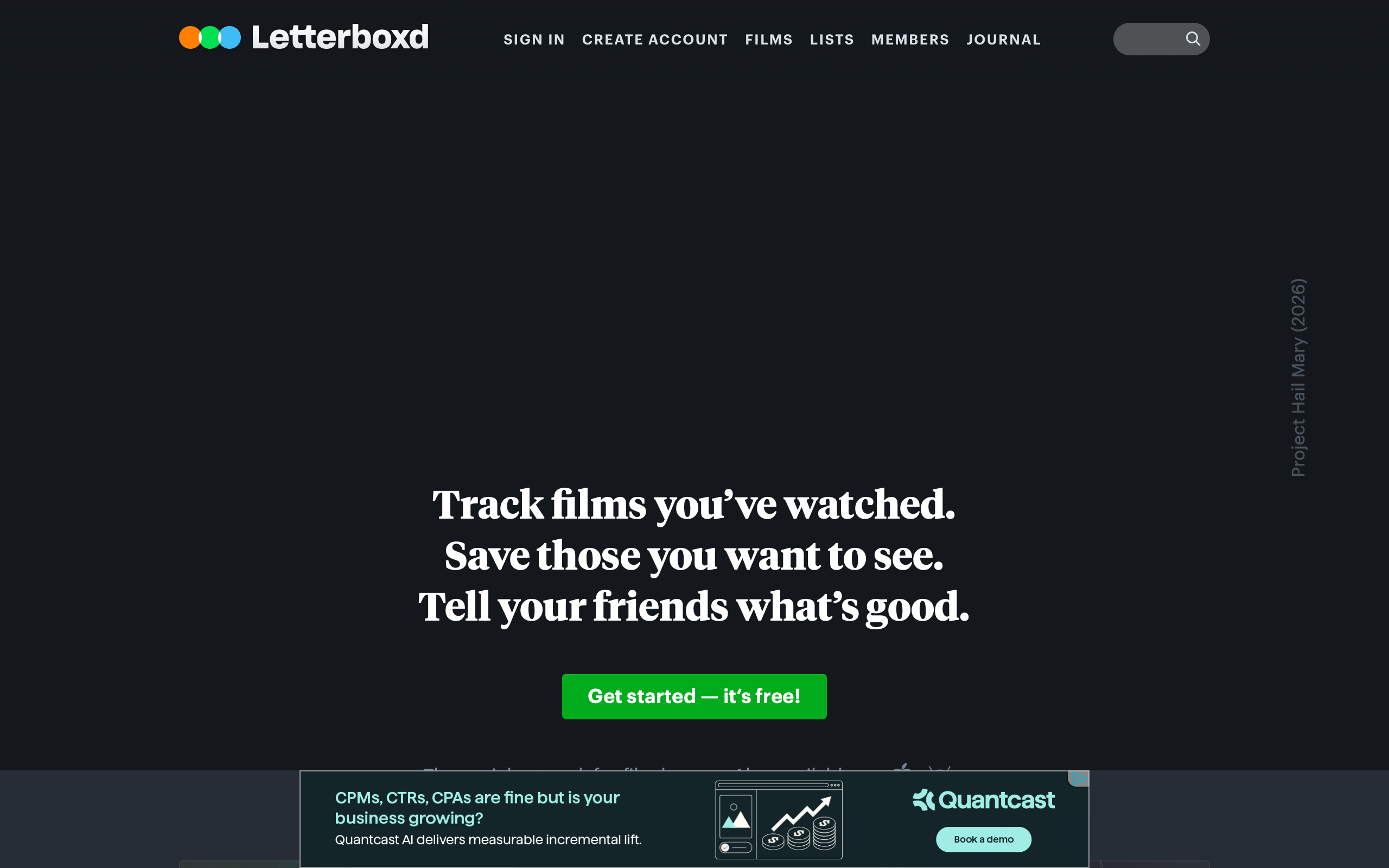
Letterboxd is a social film-logging platform that has become the cultural center of gravity for cinephiles. In a landscape where social networks breed toxicity and engagement-bait, Letterboxd built something rare: a community centered on genuine taste, personal reflection, and editorial beauty. It proves that social software can elevate its subject rather than reduce it.
What makes Letterboxd remarkable from a design perspective is how thoroughly it respects cinema as a visual medium. Every design decision, from the poster-driven grid layouts to the green-and-orange brand palette, treats film as art worth framing. The result is an app that feels less like a social network and more like a personal film journal with a communal reading room attached.
Why Letterboxd Matters
Key achievements: - Built the dominant film social network with zero algorithmic feed manipulation - Proved editorial design can scale to millions of users without dumbing down - Created a social object (the diary entry) that encourages reflection over reaction - Maintained a distinctive brand identity in a sea of flat, interchangeable social apps - Demonstrated that community moderation through design is more effective than moderation through rules
Key Takeaways
- Poster art is the interface - Film posters are not decoration; they are the primary navigation and discovery mechanism, creating an experience that feels like browsing a curated cinema lobby
- The diary reframes social posting - By calling entries “diary” rather than “reviews” or “posts,” Letterboxd shifts user psychology from performing for an audience to reflecting for themselves
- Micro-interactions carry emotional weight - The half-star rating system with its tactile hover states turns the act of scoring a film into a considered gesture rather than a throwaway tap
- Brand palette creates instant recognition - The green/orange/dark combination is so distinctive that screenshots are identifiable without any logo present
- Curation over algorithm - Watchlists, lists, and diary entries are all human-curated, creating discovery that feels personal rather than optimized
Core Design Principles
1. Poster-Driven Visual Architecture
Letterboxd’s most recognizable design pattern is the poster grid. Rather than text-heavy lists, films are represented by their poster art, creating pages that feel like walking through a gallery.
The poster grid system:
/* Letterboxd-inspired poster grid */
.film-grid {
  display: grid;
  grid-template-columns: repeat(auto-fill, minmax(110px, 1fr));
  gap: 8px;
  padding: 0;
}

.film-poster {
  aspect-ratio: 2 / 3;
  border-radius: 4px;
  overflow: hidden;
  position: relative;
  transition: transform 150ms ease-out, box-shadow 150ms ease-out;
}

.film-poster:hover {
  transform: scale(1.05);
  box-shadow: 0 8px 24px rgba(0, 0, 0, 0.4);
  z-index: 1;
}

.film-poster img {
  width: 100%;
  height: 100%;
  object-fit: cover;
}
Why this works: Film posters are one of the most information-dense artifacts in visual culture. A single poster communicates genre, era, tone, and quality in a fraction of a second. By making posters the primary UI element, Letterboxd leverages decades of graphic design work that studios have already done, and makes browsing someone’s film history feel like scanning a curated shelf.
The hover reveal pattern:
/* Overlay appears on hover with film details */
.film-poster .overlay {
  position: absolute;
  inset: 0;
  background: linear-gradient(
    to top,
    rgba(0, 0, 0, 0.85) 0%,
    rgba(0, 0, 0, 0.3) 50%,
    transparent 100%
  );
  opacity: 0;
  transition: opacity 200ms ease;
  display: flex;
  flex-direction: column;
  justify-content: flex-end;
  padding: 10px;
}

.film-poster:hover .overlay {
  opacity: 1;
}

.overlay .film-title {
  color: #fff;
  font-size: 13px;
  font-weight: 600;
  line-height: 1.2;
}

.overlay .film-year {
  color: rgba(255, 255, 255, 0.6);
  font-size: 11px;
}
2. The Diary as Social Object
Letterboxd’s most brilliant design decision is framing film logging as diary entries rather than reviews. This single naming choice transforms user behavior.
A diary entry contains: - Date watched (not date posted, an important distinction) - Star rating (half-star increments, 0.5 to 5.0) - Optional written reflection - “Liked” heart toggle - Rewatch indicator
The diary calendar view:
┌──────────────────────────────────────────────┐
│  March 2026                                   │
├──────┬──────┬──────┬──────┬──────┬──────┬────┤
│  Mon │  Tue │  Wed │  Thu │  Fri │  Sat │ Sun│
├──────┼──────┼──────┼──────┼──────┼──────┼────┤
│      │      │      │      │      │  1   │  2 │
│      │      │      │      │      │ [##] │    │
├──────┼──────┼──────┼──────┼──────┼──────┼────┤
│  3   │  4   │  5   │  6   │  7   │  8   │  9 │
│      │ [##] │      │      │ [##] │ [##] │    │
│      │ ★★★★ │      │      │ ★★★  │ ★★★★★│    │
└──────┴──────┴──────┴──────┴──────┴──────┴────┘
  [##] = poster thumbnail in calendar cell
This creates a visual record that feels personal and reflective. Users can see their own viewing patterns, notice gaps, and feel a gentle motivation to watch more, not because an algorithm tells them to, but because blank calendar days feel like missed opportunities.
3. Star Rating Micro-Interactions
The half-star rating system is one of Letterboxd’s most tactile design elements.
Rating interaction design:
/* Star rating hover states */
.star-rating {
  display: inline-flex;
  gap: 2px;
  cursor: pointer;
}

.star {
  width: 24px;
  height: 24px;
  position: relative;
  color: #556677; /* Unrated: muted slate */
  transition: color 100ms ease;
}

.star.active {
  color: #00e054; /* Letterboxd green */
}

.star.half-active {
  background: linear-gradient(
    to right,
    #00e054 50%,
    #556677 50%
  );
  -webkit-background-clip: text;
  -webkit-text-fill-color: transparent;
}

/* Hover preview - show potential rating */
.star-rating:hover .star {
  color: rgba(0, 224, 84, 0.3); /* Ghost preview */
}

.star-rating .star:hover,
.star-rating .star:hover ~ .star {
  color: #556677;
}

.star-rating:hover .star:hover,
.star-rating:hover .star:hover ~ .star:not(:hover) {
  /* Stars before hovered one light up */
}
Design insight: The half-star system (10-point scale disguised as 5 stars) gives users enough granularity to feel their rating is meaningful without the paralysis of a 10-point or 100-point scale. The green color for active stars ties ratings directly to the brand, making every rated film feel stamped with Letterboxd’s identity.
Design Patterns Worth Stealing
The Backdrop Banner
Every film page features the film’s backdrop image (a wide cinematic still) as a page header, with a gradient fade into the dark background. This creates instant atmosphere.
/* Film page backdrop */
.film-backdrop {
  width: 100%;
  height: 400px;
  position: relative;
  overflow: hidden;
}

.film-backdrop img {
  width: 100%;
  height: 100%;
  object-fit: cover;
  object-position: center 20%;
}

.film-backdrop::after {
  content: '';
  position: absolute;
  inset: 0;
  background: linear-gradient(
    to bottom,
    transparent 0%,
    rgba(20, 24, 28, 0.4) 50%,
    #14181c 100%
  );
}

/* Film info overlays the fade */
.film-header {
  position: relative;
  margin-top: -120px;
  z-index: 1;
  display: grid;
  grid-template-columns: 230px 1fr;
  gap: 32px;
  padding: 0 var(--container-padding);
}
This pattern, cinematic backdrop fading into content, is now widely copied but Letterboxd perfected the execution. The key is the gradient: it must feel like the image naturally dissolves into the page rather than being cut off.
The Green/Orange Brand Palette
Letterboxd’s color system is deceptively simple but incredibly effective at creating visual hierarchy.
:root {
  /* Core brand */
  --lb-green: #00e054;         /* Primary action, ratings, CTAs */
  --lb-orange: #ff8000;        /* Pro badge, premium features */
  --lb-blue: #40bcf4;          /* Links, secondary actions */

  /* Surfaces */
  --lb-body: #14181c;          /* Page background */
  --lb-card: #1c2228;          /* Card backgrounds */
  --lb-elevated: #242c34;      /* Hover, elevated surfaces */
  --lb-border: #2c3440;        /* Subtle borders */

  /* Text */
  --lb-text-primary: #d8dfe6;  /* Body text - not pure white */
  --lb-text-secondary: #9ab;   /* Metadata, secondary info */
  --lb-text-muted: #667788;    /* Timestamps, counts */
}
Why green and orange? Green is the color of action and affirmation: it means “I watched this,” “I liked this,” “I rated this.” Orange is exclusivity: it marks Pro and Patron features. This two-color hierarchy means users always know what is earned (green) versus what is paid (orange) without any labels.
Community Without Toxicity
Letterboxd’s design actively discourages toxic behavior through structural choices rather than content moderation alone:
- No follower counts on profiles by default - Removes status competition
- No algorithmic feed - Chronological following means no engagement optimization
- Diary framing - “Dear diary” energy discourages performative hot takes
- Film as anchor - Every interaction is grounded in a specific film, preventing abstract culture-war drift
- Like, don’t dislike - No downvote mechanism on reviews
The Verdict
Letterboxd succeeds because it treats its subject, cinema, with the reverence it deserves. The poster-driven interface honors film as a visual medium. The diary metaphor encourages personal reflection over performative posting. The green/orange palette creates instant brand recognition in any screenshot. And the community design choices, no algorithmic feed, no follower counts, no downvotes, prove that social software can foster genuine culture rather than manufactured outrage.
Best for learning: How to build a content-driven social platform where the content (not engagement metrics) is the hero, and how brand palette choices can encode meaning into every interaction.
Frequently Asked Questions
Why does Letterboxd use poster art as the primary UI element instead of text lists?
Film posters communicate genre, era, tone, and quality at a glance. By using posters as the primary navigation element, Letterboxd leverages the visual language of cinema itself, making browsing feel like scanning a curated shelf rather than reading a database. This also creates beautiful, sharable profile pages that function as visual taste maps.
How does the “diary” metaphor change user behavior?
Calling entries “diary” rather than “reviews” shifts the psychological framing from performing for an audience to reflecting for oneself. Users write more honestly, more personally, and more briefly. The date-watched field (rather than date-posted) reinforces that this is a personal record, not a publication.
What makes Letterboxd’s community less toxic than other social platforms?
Letterboxd uses structural design choices: no algorithmic feed (chronological only), no visible follower counts, no downvote mechanism, and every interaction anchored to a specific film. These choices remove the incentives for performative outrage and status competition that drive toxicity on other platforms.
How does the half-star rating system work?
Users rate on a 0.5 to 5.0 scale in half-star increments, creating an effective 10-point scale that feels intuitive. The green color of active stars ties every rating to the brand identity. The hover preview shows what your rating would look like before committing, making the act of rating feel considered rather than throwaway.
Resources
- Website: letterboxd.com
- App Store: Available on iOS and Android
- Blog: Engineering and design posts about building for cinephiles
- Twitter: @letterboxd for design updates and community highlights