Ivory: Playful Precision from Tapbots' 15-Year Craft Legacy
How Tapbots brings 15 years of timeline UX refinement to Mastodon through whimsical 3D art, ProMotion animation, and sound design as UI.
Ivory: Playful Precision from Tapbots’ 15-Year Craft Legacy
“We wanted to build the Mastodon client we’d want to use ourselves.” — Mark Jardine, Tapbots
Ivory was born from the ashes of Tweetbot when Twitter killed third-party API access in 2023. But rather than a hasty port, Tapbots — the two-person team of designer Mark Jardine and developer Paul Haddad — rebuilt their 15 years of timeline UX refinement for a new social protocol. The result is the smoothest, most responsive Mastodon client available: no stutters on ProMotion scrolling, fluid 120fps animations, and a personality that makes checking your timeline feel like opening a favorite toy.
Key Takeaways
- Personality belongs in art and sound, not typography - Ivory uses system fonts exclusively, channeling all brand identity through 3D mascot illustrations, haptic feedback, and distinctive audio cues
- 15 years of iteration compounds - Tapbots has refined the timeline interface since the original Tweetbot, and that accumulated craft knowledge produces an app where every scroll, tap, and swipe feels inevitable
- Customizable themes respect user preference - Rather than imposing a single palette, Ivory offers multiple themes (light, dark, OLED black) with user-selectable accent colors, making the design system parametric rather than fixed
- Sound design is a UI layer - Pull-to-refresh, posting, and favoriting each have distinctive audio signatures that provide feedback without requiring visual attention
- ProMotion-native animation separates good from great - Built for 120fps from the ground up, every transition and scroll is tuned for ProMotion displays rather than retrofitted
Why Ivory Matters
Ivory demonstrates what happens when a designer-engineer pair spends over a decade refining a single interaction paradigm. While most Mastodon clients are competent but unremarkable, Ivory carries the accumulated wisdom of every Tweetbot iteration — every scroll optimization, every timeline rendering refinement, every gesture that was added, tested, and either kept or discarded.
Key achievements: - Proved that a two-person team can build the definitive client for an entire social protocol - Transferred 15 years of timeline UX refinement from Twitter to Mastodon without losing craft quality - Established that app personality (mascots, sounds, haptics) can coexist with platform-native interface conventions - Achieved ProMotion-native 120fps scrolling that most apps with larger teams cannot match
Core Design Principles
1. Personality Through Art, Not Chrome
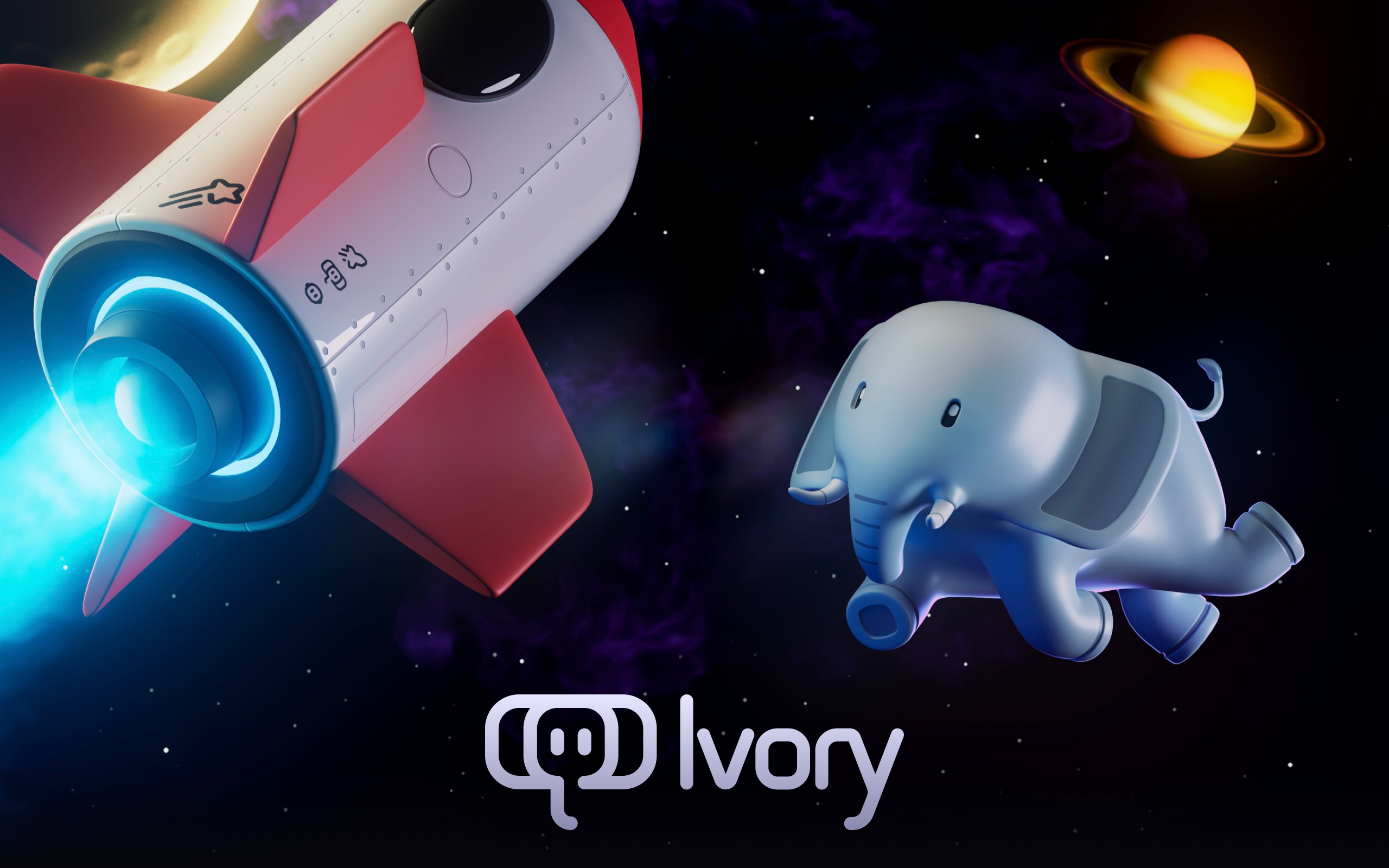
Ivory’s visual identity pairs whimsical 3D mascot art — a cartoon elephant in space, complete with rockets and planets — with a meticulously crafted app interface. The marketing site is dark with cosmic imagery, while the app itself is clean and systematic.
This division is deliberate. The mascot and space imagery create emotional connection and brand recognition on the marketing site, App Store listing, and social media. Inside the app, the interface is purely functional — system fonts, standard controls, platform-appropriate density. All personality comes from iconography, animation, and sound rather than typographic or chromatic novelty.
The marketing page reflects this philosophy: no CSS custom properties, no design system tokens, no framework. Just carefully placed imagery and clean system fonts. The design system lives in the app, not the website.
2. The Timeline as Primary Interface
The infinite-scroll timeline is the core UX pattern. Everything else — compose, profile, settings — is secondary to the reading flow. This hierarchy has been refined across every version of Tweetbot and now Ivory, producing a timeline that feels frictionless in a way that is difficult to articulate but immediately apparent in use.
┌──────────────────────────────────────────────────┐
│  ↓ Pull to refresh (with audio cue)              │
├──────────────────────────────────────────────────┤
│  🐘 User Name                            2m ago  │
│  Post content flows naturally with proper         │
│  line spacing and readable density...             │
│  ♡ 12    ↺ 4    ⤴ Share                          │
├──────────────────────────────────────────────────┤
│  🐘 Another User                         15m ago │
│  The timeline is the product. Everything else    │
│  exists to support the reading experience.       │
│  ♡ 8     ↺ 2    ⤴ Share                          │
├──────────────────────────────────────────────────┤
│  Scroll continues at 120fps...                   │
└──────────────────────────────────────────────────┘
The timeline’s performance is not merely a technical achievement — it is a design decision. A timeline that stutters or drops frames interrupts the reading flow and breaks the illusion of a continuous stream. Tapbots treats 120fps scrolling as a design requirement, not an optimization target.
3. Sound Design as Interface
Tapbots apps have distinctive sounds for pull-to-refresh, posting, favoriting, and boosting. These audio cues serve a functional purpose beyond delight: they confirm that an action succeeded without requiring the user to look at the screen. Pull-to-refresh sounds different from a failed refresh. Posting has a satisfying confirmation tone. Favoriting produces a subtle click.
This audio layer works in concert with haptic feedback on devices that support it. The combination of sound and haptics creates a physical-feeling interaction that reinforces Tapbots’ long-standing design principle: apps should feel like tangible objects.
4. Parametric Theme System
Ivory does not impose a single visual identity. Users choose from multiple app themes — light, dark, and OLED black — with customizable accent colors. This means no single “Ivory palette” exists by design. The underlying architecture is parametric: colors are defined by role (background, surface, accent, text) and resolved at runtime based on user preference.
This approach respects that a social timeline app lives on the user’s home screen and is opened dozens of times per day. The colors need to fit the user’s aesthetic, not the designer’s portfolio.
5. Native-Only, No Compromise
Ivory is built exclusively for iOS and macOS using native platform capabilities. No Electron, no React Native, no cross-platform abstractions. This commitment shows in every interaction: the app responds to system dynamic type settings, respects platform accessibility features, integrates with ShareSheet and Shortcuts, and uses native navigation patterns that feel correct on each device size.
The typography choice underscores this commitment. The font stack is purely system: -apple-system, helvetica-neue, helvetica, arial, sans-serif. Zero custom fonts. On Apple devices, this resolves to San Francisco — the same typeface used by every native system element, ensuring Ivory feels like a seamless extension of the platform rather than a third-party overlay.
Transferable Patterns
Ivory’s approach to personality is the most transferable pattern: invest in distinctive art, sound, and animation rather than custom typography or unusual color schemes. This strategy creates strong brand identity while maintaining platform-native usability.
The theme system demonstrates how to build a customizable design foundation:
struct AppTheme {
    let backgroundColor: Color
    let surfaceColor: Color
    let accentColor: Color
    let textPrimary: Color
    let textSecondary: Color
}

static let defaultTheme = AppTheme(
    backgroundColor: .black,
    surfaceColor: Color(white: 0.1),
    accentColor: Color(hex: "6C63FF"),  // Purple-blue default
    textPrimary: .white,
    textSecondary: Color(white: 0.8)
)
The key insight is that the theme struct defines roles, not specific colors. Background, surface, accent, text — these roles remain constant while their values change based on user preference. This parametric approach allows Ivory to support light, dark, and OLED black modes without maintaining three separate design systems.
For web implementations, the same pattern works with CSS custom properties and minimal overhead:
:root {
  /* System-native approach — let the platform carry the weight */
  --font-sans: -apple-system, helvetica-neue, helvetica, arial, sans-serif;
  --body-size: 18px;
  --body-line-height: 1.5;
}
The typography scale is deliberately modest. The largest heading (H3) is only 28px at weight 600. H1 and body share the same 18px size — an inversion of typical hierarchy that works because imagery, not text, carries the marketing narrative. On a page where 3D elephant art is the hero, headlines do not need to compete for attention.
| Level | Size | Weight | Line Height | Role |
|---|---|---|---|---|
| H3 | 28px | 600 | 1.1 | Feature headlines |
| H2 | 20px | 400 | 1.7 | Section descriptions |
| H1 / Body | 18px | 400 | 1.5 | Standard text |
Design Lessons
Ivory teaches that brand personality and platform-native design are not in conflict. By channeling all personality into art, sound, and haptics — and leaving typography, controls, and navigation to the platform — Tapbots achieves both strong brand recognition and seamless usability.
The 15-year iteration lesson is harder to replicate but important to understand: Ivory’s quality comes from accumulated refinement, not a single brilliant design sprint. Every small decision about scroll physics, tap targets, and animation timing has been tested across millions of users over more than a decade. This compound craft advantage is Tapbots’ true moat.
Avoid the temptation to differentiate through visual novelty in timeline-based apps. Trendy typography, unusual color schemes, and non-standard navigation patterns all create friction in an interface that users visit dozens of times per day. Ivory proves that native controls with distinctive personality elements (mascots, sounds, haptics) create a more memorable and more usable product than visual differentiation alone.
Avoid feature overload on marketing pages. The Ivory site is almost entirely visual — 3D art and minimal text. Features are discovered in the app, not sold on a landing page. This approach trusts that the quality of the experience will sell itself once users download the app.
Frequently Asked Questions
What makes Ivory’s design distinctive?
Ivory achieves distinctiveness through personality rather than visual departure from platform conventions. The whimsical 3D elephant mascot, distinctive sound design, and satisfying haptic feedback create strong brand recognition, while the actual interface uses system fonts, standard controls, and platform-native navigation. The result is an app that feels uniquely Tapbots yet entirely at home on iOS and macOS.
How does Ivory achieve such smooth scrolling performance?
Ivory was built for 120fps ProMotion displays from the ground up, not retrofitted. Developer Paul Haddad’s performance obsession means every timeline rendering optimization, every scroll physics calculation, and every animation curve has been tuned specifically for high-refresh-rate displays. The native-only approach (no cross-platform frameworks) eliminates abstraction layers that typically introduce frame drops.
What can designers learn from Ivory?
The primary lesson is that brand personality can live in art, sound, and haptics rather than in typography and color. By using system fonts and standard controls, Ivory maintains native usability while the elephant mascot, custom sounds, and satisfying haptics create a memorable identity. This approach is more durable than visual novelty because it works with platform updates rather than against them.
How does Ivory’s theme system work?
Rather than imposing a fixed color palette, Ivory defines colors by role (background, surface, accent, text) and lets users choose from multiple themes — light, dark, and OLED black — with customizable accent colors. This parametric approach means the design system adapts to user preference while maintaining visual consistency and proper contrast ratios across all combinations.
Why did Tapbots choose a two-person team structure?
Mark Jardine (design) and Paul Haddad (development) have worked as a pair since the original Tweetbot. This tight collaboration eliminates the communication overhead of larger teams and allows design decisions to be implemented immediately. Jardine’s craft obsession meets Haddad’s performance obsession, producing an app where aesthetic quality and technical performance are both treated as non-negotiable.
References
- Ivory for Mastodon — Official product page from Tapbots
- MacStories Review — Federico Viticci’s comprehensive review of Ivory
- TechCrunch Launch Coverage — Coverage of Ivory’s launch after Twitter’s API shutdown
- Texas Monthly Profile — Profile of the Tapbots team and their transition from Tweetbot to Ivory