Headspace: Designing for Calm
How Headspace uses custom illustration, breathing animations, and calming design language to make meditation accessible and drive wellness UX.
Headspace: Designing for Calm
“We wanted it to feel like your wisest, warmest friend was guiding you through meditation.” — Andy Puddicombe, Headspace Co-Founder
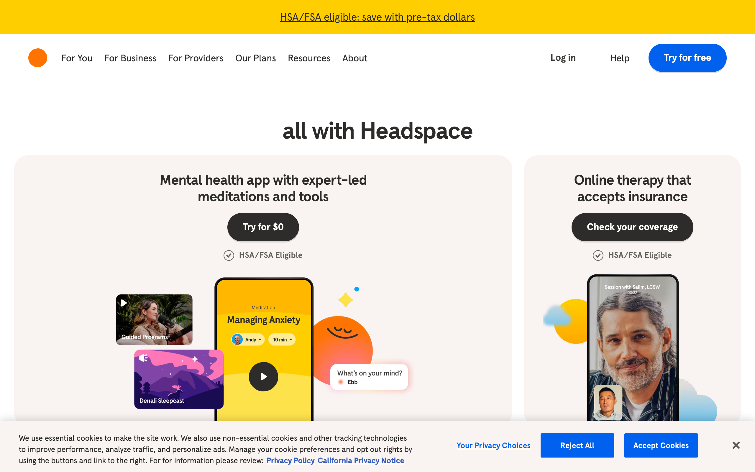
Headspace is a design argument: that an app can change how you feel before you interact with it. Most apps are designed to be efficient, informative, or entertaining. Headspace is designed to be calming. Every color, illustration, animation, and transition serves a single emotional objective — reduce anxiety, invite stillness, make the idea of sitting quietly for ten minutes feel approachable rather than intimidating.
This is a harder design problem than it appears. Meditation is inherently abstract. You cannot show a user what meditation looks like the way you can show them what a photo filter does or how a route looks on a map. Headspace solved this by creating an entire visual language from scratch — rounded characters, warm gradients, breathing animations that synchronize with the user’s body. The result is a brand so visually distinct that a single illustration communicates “calm” without a word of text.
Why Headspace Matters
Co-founded by Andy Puddicombe (a former Buddhist monk) and Rich Pierson in 2010, Headspace mainstreamed meditation for a generation skeptical of wellness apps.
Key achievements: - 70+ million downloads across 190 countries - Apple and Google App of the Year - Netflix animated series extending the brand language to video - Clinical studies published in peer-reviewed journals - Merged with Ginger to form Headspace Health (2021) - Custom illustration system with 3,000+ original assets - Breathing animation engine synced to guided audio - Sleep content as a major driver of user engagement and retention
Key Takeaways
- Illustration is brand - Headspace’s characters are more recognizable than its logo; the visual system carries the entire brand identity
- Animation timing communicates emotion - Slow easing curves and long transitions physically calm the user’s nervous system before meditation begins
- Guided experiences reduce decision fatigue - Users in a stressed state cannot handle complex navigation; Headspace funnels them to content in 1-2 taps
- Sleep UI needs different rules - Dark backgrounds, minimal contrast, and large touch targets for users lying in bed with half-closed eyes
- Subscription conversion must not create anxiety - A wellness app that pressures users into paying undermines its core value proposition
Core Design Principles
1. The Illustration System
Headspace’s illustrations are its most recognizable design element. Created by a dedicated in-house team, the system follows strict rules that maintain consistency across thousands of assets.
ILLUSTRATION PRINCIPLES
──────────────────────────────────────────

SHAPES
  All characters and objects use rounded forms
  No sharp corners, no angular geometry
  Circles and ovals are the base primitives
  Even "square" objects have generous border-radius

COLOR
  Warm palette: oranges, corals, soft blues, sage greens
  No pure black (#000) anywhere in illustrations
  No pure white (#fff) — warmest neutral is #FFF8F0
  Shadows use colored overlay, never gray

CHARACTERS
  Simple faces: two dots for eyes, curved line for mouth
  No detailed features (no noses, no ears, no teeth)
  Emotions conveyed through body posture and color
  Characters are always doing something (sitting, floating)

EMOTION MAPPING
  Calm:     Soft blues + sage greens + slow-moving clouds
  Focus:    Warm oranges + concentrated single-character
  Sleep:    Deep navy + stars + horizontal compositions
  Stress:   Tangled lines that slowly untangle
  Joy:      Bright coral + upward-floating elements
/* Headspace illustration color palette */
:root {
    /* Primary warm palette */
    --hs-orange: #F47D31;
    --hs-coral: #FF8C69;
    --hs-peach: #FFDAB9;
    --hs-warm-white: #FFF8F0;

    /* Calm palette */
    --hs-sky-blue: #91C8E4;
    --hs-sage: #A8C686;
    --hs-soft-teal: #7EC8C8;

    /* Sleep palette */
    --hs-deep-navy: #1B2838;
    --hs-night-blue: #2C3E6B;
    --hs-star-yellow: #FFE082;
    --hs-moon-glow: #E8D5B7;

    /* Never use */
    --forbidden-pure-black: #000000;  /* Use #1B2838 instead */
    --forbidden-pure-white: #FFFFFF;  /* Use #FFF8F0 instead */
    --forbidden-gray: #808080;        /* Use colored neutrals */
}

/* Illustration container — always warm background */
.illustration-container {
    background: var(--hs-warm-white);
    border-radius: 24px;
    overflow: hidden;
    padding: 32px;
}

/* Character styling — rounded everything */
.hs-character {
    border-radius: 50%;
}

.hs-character-body {
    border-radius: 40% 40% 50% 50%;
}

/* Shadows use colored overlay, never gray */
.hs-shadow {
    box-shadow: 0 8px 24px rgba(244, 125, 49, 0.12);
}
The prohibition against pure black and pure white is a foundational rule. Pure black creates harsh contrast that contradicts the calming intent. Pure white feels clinical. By constraining the palette to warm neutrals, every screen feels like it was painted rather than coded.
2. Breathing Animations
Headspace’s breathing exercises use an expanding and contracting circle that synchronizes with the guided instruction. The animation timing is the design. A circle that expands over 4 seconds and contracts over 6 seconds physically paces the user’s breath.
BREATHING ANIMATION STATES
──────────────────────────────────────────

INHALE (4 seconds)
  Circle expands from 40% to 100% of container
  Opacity increases from 0.6 to 1.0
  Color shifts from cool blue to warm orange
  Easing: ease-in-out (slow start, slow end)

HOLD (2 seconds)
  Circle holds at 100%
  Gentle pulsing glow (opacity 0.9-1.0)
  No size change
  Communicates stillness

EXHALE (6 seconds)
  Circle contracts from 100% to 40%
  Opacity decreases from 1.0 to 0.6
  Color shifts from warm orange back to cool blue
  Easing: ease-in-out (slow start, slow end)
  Exhale is deliberately longer than inhale
/* Breathing circle animation */
.breathing-circle {
    width: 200px;
    height: 200px;
    border-radius: 50%;
    background: radial-gradient(
        circle,
        var(--hs-coral) 0%,
        var(--hs-orange) 60%,
        transparent 70%
    );
    animation: breathe 12s ease-in-out infinite;
}

@keyframes breathe {
    /* Inhale: 0% to 33% (4s of 12s) */
    0% {
        transform: scale(0.4);
        opacity: 0.6;
        background: radial-gradient(
            circle,
            var(--hs-sky-blue) 0%,
            var(--hs-soft-teal) 60%,
            transparent 70%
        );
    }

    /* Hold: 33% to 50% (2s of 12s) */
    33% {
        transform: scale(1);
        opacity: 1;
        background: radial-gradient(
            circle,
            var(--hs-coral) 0%,
            var(--hs-orange) 60%,
            transparent 70%
        );
    }

    50% {
        transform: scale(1);
        opacity: 0.95;
    }

    /* Exhale: 50% to 100% (6s of 12s) */
    100% {
        transform: scale(0.4);
        opacity: 0.6;
        background: radial-gradient(
            circle,
            var(--hs-sky-blue) 0%,
            var(--hs-soft-teal) 60%,
            transparent 70%
        );
    }
}

/* Glow effect during hold phase */
.breathing-circle::after {
    content: '';
    position: absolute;
    inset: -20px;
    border-radius: 50%;
    background: radial-gradient(
        circle,
        rgba(244, 125, 49, 0.15) 0%,
        transparent 70%
    );
    animation: glow-pulse 2s ease-in-out infinite;
}

@keyframes glow-pulse {
    0%, 100% { opacity: 0.5; transform: scale(1); }
    50% { opacity: 1; transform: scale(1.05); }
}
The 4-2-6 timing (inhale-hold-exhale) is not arbitrary. It is based on the physiological fact that longer exhalations activate the parasympathetic nervous system, lowering heart rate. The animation is a medical intervention disguised as a design element.
3. Guided Experience Design
Users opening Headspace are often anxious or overwhelmed. The app cannot present them with a complex navigation hierarchy. The home screen surfaces a single recommended session based on time of day, recent behavior, and current streak.
HOME SCREEN (Morning)
┌─────────────────────────────────────────┐
│ Good morning, Blake                     │
│                                         │
│ ┌─────────────────────────────────────┐ │
│ │                                     │ │
│ │   [Illustration: sunrise scene      │ │
│ │    with character meditating]       │ │
│ │                                     │ │
│ │   Today's Meditation               │ │
│ │   Finding Focus                    │ │
│ │   10 min                           │ │
│ │                                     │ │
│ │         [ ▶ Start ]                │ │
│ │                                     │ │
│ └─────────────────────────────────────┘ │
│                                         │
│ Your streak: 🔥 7 days                  │
│                                         │
│ ┌──────────┐ ┌──────────┐              │
│ │ Focus    │ │ Sleep    │              │
│ │ [icon]   │ │ [icon]   │              │
│ └──────────┘ └──────────┘              │
│ ┌──────────┐ ┌──────────┐              │
│ │ Move     │ │ Stress   │              │
│ │ [icon]   │ │ [icon]   │              │
│ └──────────┘ └──────────┘              │
│                                         │
│ [Home]  [Explore]  [Profile]           │
└─────────────────────────────────────────┘
The primary action — starting a meditation — requires exactly one tap on a large, centered button. The secondary grid of categories provides exploration without demanding it. This is the opposite of a content library; it is a concierge service.
Design Patterns Worth Stealing
Sleep UI
Headspace’s sleep content represents nearly half of all engagement. The sleep interface follows different design rules than the daytime app — it assumes the user is in bed, in the dark, with reduced attention.
SLEEP SCREEN
┌─────────────────────────────────────────┐
│                                    [X]  │
│                                         │
│    [Deep navy background]               │
│    [Stars drift slowly across screen]   │
│                                         │
│         ┌───────────────┐               │
│         │               │               │
│         │  [Moon/night  │               │
│         │  illustration]│               │
│         │               │               │
│         └───────────────┘               │
│                                         │
│    Rainday Antiques                     │
│    Sleep Story • 45 min                 │
│                                         │
│    ──●──────────────── 2:15 / 45:00    │
│                                         │
│              [ ▶ ]                      │
│           Large tap target              │
│        (80px minimum touch)             │
│                                         │
│                                         │
└─────────────────────────────────────────┘
/* Sleep mode overrides */
.sleep-mode {
    background: var(--hs-deep-navy);
    color: var(--hs-moon-glow);
}

/* Minimal contrast — easy on tired eyes */
.sleep-mode .text-primary {
    color: rgba(232, 213, 183, 0.9);  /* Moon glow at 90% */
}

.sleep-mode .text-secondary {
    color: rgba(232, 213, 183, 0.5);  /* Moon glow at 50% */
}

/* Extra-large touch targets for bed use */
.sleep-mode .play-button {
    width: 80px;
    height: 80px;
    border-radius: 50%;
    background: rgba(255, 255, 255, 0.1);
    border: 2px solid rgba(255, 255, 255, 0.2);
    display: flex;
    align-items: center;
    justify-content: center;
}

/* Stars background animation — very slow, barely perceptible */
.sleep-stars {
    position: fixed;
    inset: 0;
    background-image:
        radial-gradient(2px 2px at 20px 30px, var(--hs-star-yellow), transparent),
        radial-gradient(2px 2px at 40px 70px, var(--hs-star-yellow), transparent),
        radial-gradient(1px 1px at 90px 40px, rgba(255, 224, 130, 0.5), transparent),
        radial-gradient(1px 1px at 130px 80px, rgba(255, 224, 130, 0.5), transparent);
    background-size: 200px 100px;
    animation: drift-stars 120s linear infinite;
}

@keyframes drift-stars {
    from { transform: translateX(0); }
    to { transform: translateX(-200px); }
}

/* Timer auto-fade — screen dims after playback starts */
.sleep-mode.playing .ui-controls {
    animation: fade-controls 30s ease-out forwards;
}

@keyframes fade-controls {
    0% { opacity: 1; }
    80% { opacity: 1; }
    100% { opacity: 0; pointer-events: none; }
}
Key sleep UI decisions: the stars animation runs at 120 seconds per cycle, so slow it is barely perceptible. The UI controls auto-fade after 30 seconds of playback — the user does not need to see a progress bar while falling asleep. Touch targets are 80px minimum because users are tapping with imprecise, sleepy fingers.
Subscription Conversion Without Anxiety
Headspace’s paywall is designed to feel like an invitation, not a gate. Free users get meaningful content. The upgrade prompt uses the same warm illustration style as the rest of the app.
SUBSCRIPTION PROMPT
┌─────────────────────────────────────────┐
│                                         │
│    [Illustration: character floating    │
│     upward with unlocked items          │
│     drifting around them]               │
│                                         │
│    Unlock your full journey             │
│                                         │
│    ✦ 1,000+ meditations                 │
│    ✦ Sleep stories and music            │
│    ✦ Focus playlists                    │
│    ✦ Personalized recommendations       │
│                                         │
│    ┌─────────────────────────────────┐  │
│    │ Annual         $69.99/year      │  │
│    │                $5.83/month      │  │
│    │ ✦ Best value                    │  │
│    └─────────────────────────────────┘  │
│    ┌─────────────────────────────────┐  │
│    │ Monthly        $12.99/month     │  │
│    └─────────────────────────────────┘  │
│                                         │
│    [ Start Free Trial ]                 │
│                                         │
│    No commitment. Cancel anytime.       │
│                                         │
│    [Maybe Later]  ← Always visible,    │
│                     never hidden        │
└─────────────────────────────────────────┘
The critical detail: “Maybe Later” is always visible, never disguised as a small “X” in the corner. A meditation app that uses dark patterns to trap users into subscriptions would contradict everything it stands for. The dismiss option is clear, unambiguous, and guilt-free.
Transition and Motion Design
Every screen transition in Headspace uses timing curves that reinforce calm. Where most apps use 250-300ms transitions, Headspace uses 400-600ms with pronounced easing.
/* Headspace transition timing — deliberately slow */
.hs-transition-page {
    transition: opacity 500ms ease-in-out,
                transform 500ms cubic-bezier(0.25, 0.1, 0.25, 1);
}

/* Entering a meditation — slower than navigating */
.hs-transition-meditation-enter {
    animation: meditation-enter 800ms cubic-bezier(0.16, 1, 0.3, 1) forwards;
}

@keyframes meditation-enter {
    from {
        opacity: 0;
        transform: scale(0.95) translateY(20px);
    }
    to {
        opacity: 1;
        transform: scale(1) translateY(0);
    }
}

/* Session complete — celebratory but gentle */
.hs-transition-complete {
    animation: session-complete 1000ms cubic-bezier(0.16, 1, 0.3, 1) forwards;
}

@keyframes session-complete {
    0% {
        opacity: 0;
        transform: scale(0.9);
    }
    60% {
        opacity: 1;
        transform: scale(1.02);
    }
    100% {
        opacity: 1;
        transform: scale(1);
    }
}
The session-complete animation takes a full second and includes a subtle overshoot (scaling to 1.02 before settling to 1.0). This communicates accomplishment — a gentle “well done” in motion — without the jarring energy of confetti or badge pop-ups.
The Verdict
Headspace proves that design can be therapeutic. The illustration system, the breathing animations, the transition timing, and the sleep UI all work together to create an experience that begins calming the user before they close their eyes. This is emotional design at its most intentional.
The deepest lesson is about constraint. Headspace could have used photographs, realistic 3D characters, gamification mechanics, or aggressive push notifications. It rejected all of these because they would contradict the core emotional promise. Every design choice is filtered through one question: does this make the user feel calmer? If the answer is no, it does not ship.
Best for learning: How to design for emotional outcomes rather than task completion. Study the breathing animation timing as physiological design, the sleep UI as context-specific interface adaptation, and how the subscription paywall avoids undermining the product’s core value.
Frequently Asked Questions
How does Headspace’s illustration system maintain consistency?
Headspace employs a dedicated illustration team working from a strict style guide. All characters use rounded forms with no angular geometry. Faces are minimal — two dots for eyes, a curved line for a mouth. The palette avoids pure black and pure white, using warm neutrals instead. Every illustration maps to an emotional state (calm, focus, sleep, stress, joy), and the color and composition rules differ for each state.
Why does the breathing animation use a 4-2-6 timing pattern?
The pattern is based on the physiological principle that prolonged exhalation activates the parasympathetic nervous system. A 4-second inhale, 2-second hold, and 6-second exhale progressively slows heart rate and reduces cortisol. The animation serves as a visual pacemaker — users unconsciously synchronize their breathing to the expanding and contracting circle.
How does Headspace’s sleep UI differ from the regular app?
Sleep mode switches to a deep navy palette with minimal contrast text in warm gold tones. Touch targets increase to 80px minimum for imprecise bedtime tapping. UI controls auto-fade 30 seconds after playback begins. Background animations (drifting stars) run at imperceptibly slow speeds. The overall brightness is reduced to avoid disrupting melatonin production.
How does Headspace handle subscription conversion without creating anxiety?
The “Maybe Later” dismiss option is always prominently visible — never hidden as a small X or disguised link. The paywall uses the same warm illustration style as the rest of the app. Free users receive meaningful content rather than a crippled experience. The language is invitational (“Unlock your full journey”) rather than fear-based (“You’re missing out”). No countdown timers or limited-time pressure tactics.
What makes Headspace’s transition animations different from standard mobile apps?
Standard mobile transitions run 250-300ms with ease-in-out curves. Headspace uses 400-800ms transitions with custom cubic-bezier curves that emphasize the deceleration phase. Entering a meditation session is the slowest transition (800ms), deliberately creating a sense of slowing down before the session begins. This is motion design as emotional regulation rather than UI feedback.