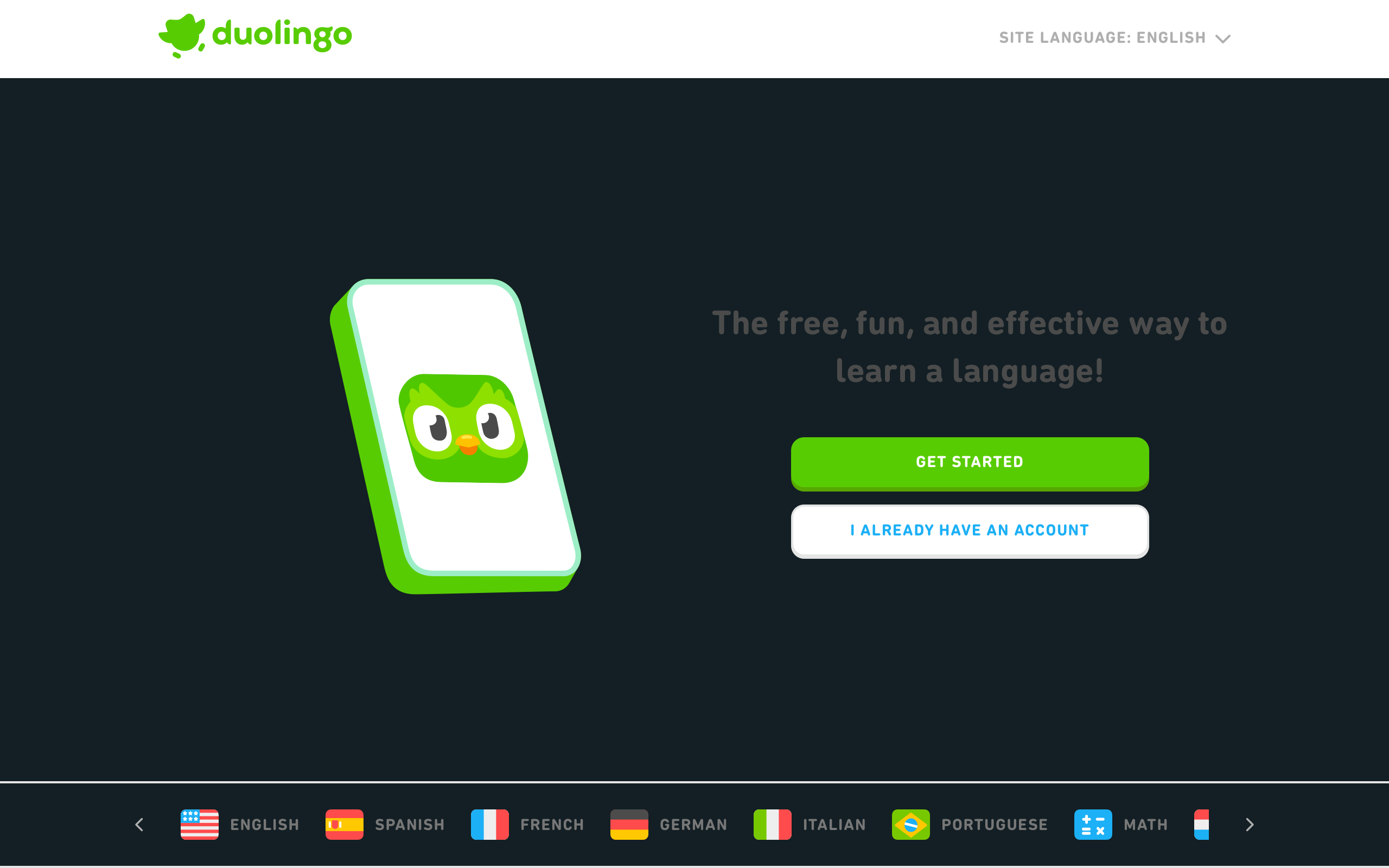
Duolingo: Gamification as Design Language
How Duolingo uses gamification psychology, streak mechanics, character animation, and progressive difficulty to make language learning addictive.
Duolingo: Gamification as Design Language
“The biggest problem in education is not that we don’t know how to teach. It’s that people stop showing up.” — Luis von Ahn, Duolingo CEO
Duolingo is not a language app that happens to use gamification. It is a gamification engine that happens to teach languages. That distinction matters. Every design decision — from the owl mascot’s guilt-trip notifications to the XP system to the streak counter — exists to solve one problem: retention. The hardest part of learning a language is not conjugation tables or vocabulary memorization. It is opening the app tomorrow, and the day after, and the day after that.
With over 100 million monthly active users and a streak culture so powerful that people plan vacations around maintaining their daily practice, Duolingo has built arguably the most sophisticated habit formation machine in consumer software. The design is bright, loud, playful, and relentlessly optimized. Nothing is accidental.
Why Duolingo Matters
Duolingo turned education into a daily habit for hundreds of millions of people through design, not content superiority.
Key achievements: - Created the most effective retention loop in consumer education software - Built a mascot (Duo the owl) that became a global meme and cultural phenomenon - Proved that gamification can drive real learning outcomes, not just engagement metrics - Developed a design language that makes failure feel safe and progress feel tangible - Scaled a single UX pattern across 40+ languages with wildly different structures
Key Takeaways
- Retention beats acquisition - Duolingo’s entire design philosophy optimizes for “will they come back tomorrow?” over “will they sign up today?”; the streak mechanic alone drives a measurable portion of DAU
- Make failure feel safe - Wrong answers trigger gentle animations and encouraging feedback, not red error screens; users need to feel safe making mistakes to learn, and the visual design reinforces that safety
- Character gives permission to be playful - Duo the owl is not decoration; it is a relationship vector that enables guilt-trip push notifications, celebratory animations, and emotional stakes that an abstract interface cannot create
- Progress must be visible and continuous - XP bars, crown levels, league tables, streak counters, and achievement badges create a layered progress system where something is always advancing, even on bad days
- Micro-learning respects real schedules - Lessons take 3-5 minutes because the design acknowledges that the biggest barrier is starting, not finishing; short sessions lower the activation energy to near zero
Core Design Principles
1. The Habit Formation Loop
Duolingo’s core loop is a textbook implementation of the Hook Model (Nir Eyal), but executed with unusual precision in every visual and interaction detail.
THE DUOLINGO LOOP:

  ┌─────────────┐
  │   TRIGGER    │ ← Push notification (Duo looks sad)
  │   External   │   or internal (guilt, streak anxiety)
  └──────┬──────┘
         ▼
  ┌─────────────┐
  │   ACTION     │ ← Open app, tap "Start lesson"
  │   (minimal)  │   Friction: near zero (3-5 min commitment)
  └──────┬──────┘
         ▼
  ┌─────────────┐
  │   REWARD     │ ← XP earned, streak maintained, league progress,
  │  (variable)  │   chest opened, hearts preserved
  └──────┬──────┘
         ▼
  ┌─────────────┐
  │  INVESTMENT  │ ← Streak grows (loss aversion increases),
  │              │   league position at stake, friends see progress
  └──────┬──────┘
         │
         └──────→ (Back to TRIGGER, next day)
Why this works in the UI: - The trigger is personalized and emotional (Duo’s facial expressions in notifications) - The action has almost no friction (one tap to start, lesson fits in 3 minutes) - The reward is variable (different XP amounts, surprise chests, combo bonuses) - The investment compounds (a 365-day streak creates enormous loss aversion)
2. Color as Energy System
Duolingo’s palette is aggressively bright and saturated. This is not arbitrary. Each color carries specific meaning in the gamification system.
:root {
  /* Core brand */
  --duo-green: #58cc02;        /* Success, correct, primary CTA */
  --duo-green-dark: #58a700;   /* Hover/active states */

  /* Gamification signals */
  --duo-blue: #1cb0f6;         /* Information, progress, neutral */
  --duo-red: #ff4b4b;          /* Hearts, mistakes, urgency */
  --duo-orange: #ff9600;       /* Streaks, fire, warmth */
  --duo-purple: #ce82ff;       /* League, premium, special */
  --duo-yellow: #ffc800;       /* XP, rewards, celebration */
  --duo-pink: #ff86d0;         /* Events, special challenges */

  /* Surfaces */
  --background: #ffffff;
  --surface-gray: #e5e5e5;
  --text-primary: #4b4b4b;
  --text-secondary: #afafaf;

  /* The signature green gradient for CTAs */
  --cta-gradient: linear-gradient(
    to bottom,
    #78e000 0%,
    #58cc02 100%
  );
}

/* Duolingo's distinctive button style */
.btn-primary {
  background: var(--duo-green);
  color: #ffffff;
  font-weight: 700;
  font-size: 17px;
  text-transform: uppercase;
  letter-spacing: 0.8px;
  border: none;
  border-bottom: 4px solid var(--duo-green-dark);
  border-radius: 16px;
  padding: 14px 24px;
  cursor: pointer;
  transition: filter 100ms ease;
}

.btn-primary:active {
  border-bottom-width: 0;
  margin-top: 4px;  /* Simulate physical press */
  filter: brightness(0.95);
}
The 3D button press: Duolingo’s buttons have a thick bottom border that creates a raised, tactile appearance. When pressed, the border disappears and the button shifts down, simulating a physical button click. This micro-interaction reinforces the playful, game-like feel of the entire interface.
3. Progressive Difficulty Curves
Duolingo’s lesson structure is designed to feel achievable at every step while gradually increasing complexity. The visual design mirrors this progression.
SKILL TREE (simplified):
┌─────────────────────────────────────┐
│                                     │
│          ★★★★★                      │  ← Legendary (gold)
│          ┃                          │
│       ┌──╋──┐                       │
│      ★★★ ★★★                        │  ← Crown Level 3-5
│       └──╋──┘                       │
│          ┃                          │
│       ┌──╋──┐                       │
│      ★★  ★★                         │  ← Crown Level 1-2
│       └──╋──┘                       │
│          ┃                          │
│         ★                           │  ← New skill (gray)
│                                     │
│  ● = completed  ○ = available       │
│  ◌ = locked                         │
└─────────────────────────────────────┘
Within a single lesson:
LESSON FLOW (15 challenges):

Challenge 1-3:   Multiple choice (easiest)
                 "Select the correct translation"
                 → Recognition only, no production

Challenge 4-7:   Word bank (medium)
                 "Tap the words to form a sentence"
                 → Constrained production, words provided

Challenge 8-11:  Typing (harder)
                 "Type what you hear"
                 → Full production, no scaffolding

Challenge 12-14: Mixed format (hardest)
                 Speaking, listening, translating
                 → Multi-skill integration

Challenge 15:    Often easier
                 → End on success, positive feeling
Design insight: The lesson always ends on an easier challenge. This is deliberate. Ending on failure creates negative association. Ending on success creates positive reinforcement and the confidence to return tomorrow.
Design Patterns Worth Stealing
The Streak Mechanic
The streak is Duolingo’s most powerful retention tool. It is also a masterclass in loss aversion design.
STREAK DISPLAY:
┌─────────────────────────────────────┐
│                                     │
│           🔥 247                     │
│         day streak                  │
│                                     │
│  Mon  Tue  Wed  Thu  Fri  Sat  Sun  │
│   ●    ●    ●    ●    ●    ○    ○   │
│                                     │
│  ○ = not yet completed              │
│  ● = completed (green check)        │
│                                     │
│  "Complete a lesson to extend       │
│   your streak!"                     │
│                                     │
└─────────────────────────────────────┘
Why it is psychologically effective:
/* Streak fire animation — urgency increases as day progresses */
.streak-icon {
  animation: flame-idle 2s ease-in-out infinite;
}

/* At risk (haven't practiced today, evening) */
.streak-icon--at-risk {
  animation: flame-urgent 0.8s ease-in-out infinite;
  filter: saturate(1.3);
}

@keyframes flame-idle {
  0%, 100% { transform: scale(1) rotate(0deg); }
  50% { transform: scale(1.05) rotate(2deg); }
}

@keyframes flame-urgent {
  0%, 100% { transform: scale(1) rotate(-3deg); }
  25% { transform: scale(1.1) rotate(3deg); }
  50% { transform: scale(1.05) rotate(-2deg); }
  75% { transform: scale(1.08) rotate(2deg); }
}
The streak freeze: Duolingo sells streak freezes (protect your streak if you miss a day). This is brilliant design because it monetizes the very anxiety the streak creates, while also providing a safety valve that prevents users from rage-quitting after losing a long streak.
Duo the Mascot as Emotional Interface
Duo is not a logo. Duo is the emotional layer of the entire application. The owl has dozens of expressions that map to specific user states.
DUO'S EMOTIONAL STATES:

😊 Happy         → Correct answer, streak maintained
😢 Sad           → Push notification ("I miss you")
😤 Frustrated    → Multiple wrong answers in a row
🥳 Celebrating   → Lesson complete, new achievement
😴 Sleeping      → Haven't opened app today
🤩 Excited       → New feature, streak milestone
😭 Crying        → Streak about to break
💀 Dead          → Streak broken (the nuclear option)
🎓 Proud         → Course completion, legendary level
Why character design matters for retention: - Anthropomorphism creates emotional stakes (you are not disappointing an app, you are disappointing Duo) - The mascot gives “permission” for aggressive push notifications (a sad owl is charming; a sad corporate logo is annoying) - Character expressions provide instant feedback that is faster to process than text - Meme-ability drives organic marketing (Duo’s threatening energy became a TikTok phenomenon)
Safe Failure Design
Most educational software punishes mistakes. Duolingo makes mistakes feel like a natural, safe part of learning.
CORRECT ANSWER:
┌─────────────────────────────────────┐
│                                     │
│  ✓ Great!                           │  ← Green banner
│                                     │  ← Positive sound effect
│  [ CONTINUE ]                       │  ← Immediate forward motion
│                                     │
└─────────────────────────────────────┘

WRONG ANSWER:
┌─────────────────────────────────────┐
│                                     │
│  ✗ Correct solution:                │  ← Red banner (not scary red)
│    "Je suis un homme"              │  ← Show the right answer
│                                     │  ← Gentle "wrong" sound
│  [ GOT IT ]                         │  ← Acknowledging, not punishing
│                                     │
└─────────────────────────────────────┘
/* Wrong answer — firm but not scary */
.feedback-incorrect {
  background: var(--duo-red);
  color: #ffffff;
  padding: 16px 24px;
  border-radius: 16px 16px 0 0;
  animation: slide-up 200ms ease-out;
}

/* The progress bar still moves forward */
.progress-bar {
  height: 16px;
  border-radius: 8px;
  background: var(--surface-gray);
  overflow: hidden;
}

.progress-bar-fill {
  height: 100%;
  background: var(--duo-green);
  border-radius: 8px;
  transition: width 300ms ease-out;
  /* Even wrong answers advance progress slightly */
}

@keyframes slide-up {
  from { transform: translateY(100%); }
  to { transform: translateY(0); }
}
Critical detail: The progress bar still advances after wrong answers (just less). This prevents the demoralizing feeling of being “stuck.” Something always moves forward.
The Verdict
Duolingo is the most rigorously designed habit formation product in consumer software. Every color, animation, notification, and reward is backed by behavioral psychology and validated through relentless A/B testing. The design is not beautiful in the way a portfolio piece is beautiful. It is beautiful in the way a well-tuned engine is beautiful: every part serves a function, and the whole machine runs with remarkable efficiency.
The lesson for designers is that gamification is not a layer you add on top of a product. It is a design philosophy that must be woven into every surface, every interaction, every notification, and every pixel. Duolingo does not gamify education. It educates through games.
Best for learning: How to design habit formation loops, how character and personality drive retention, and how to make failure feel safe so users keep practicing instead of quitting.
Frequently Asked Questions
How does Duolingo’s streak mechanic drive daily retention?
The streak counter leverages loss aversion — the psychological principle that losing something feels worse than gaining something of equal value. A 200-day streak represents months of investment that would be painful to lose. Duolingo amplifies this with escalating visual urgency (the flame icon animates faster as the day progresses), sad mascot notifications, and streak freeze purchases that monetize the anxiety.
Why does Duolingo use such bright, saturated colors?
The saturated palette serves the gamification system. Each color carries specific meaning: green for success, red for hearts/mistakes, orange for streaks, yellow for XP, purple for leagues. The brightness creates energy and excitement appropriate for a game-like experience. Muted, sophisticated colors would undermine the playful, accessible tone that drives Duolingo’s mass-market appeal.
How does Duo the mascot improve user engagement?
Duo transforms abstract app notifications into emotional relationships. A push notification saying “Your streak is about to end” is easy to ignore. A push notification showing a crying owl is harder to dismiss. The character creates anthropomorphic stakes — users feel they are letting Duo down, not just skipping a lesson. This emotional mechanism became so culturally resonant that Duo’s “threatening” personality became a global meme.
What makes Duolingo’s lesson structure effective for learning?
Lessons follow a carefully designed difficulty curve: recognition tasks first (multiple choice), then constrained production (word banks), then free production (typing). This scaffolding prevents overwhelming learners while building genuine skill. Critically, lessons end on easier challenges to ensure users finish on a success, creating positive association with the learning experience.
How does Duolingo handle wrong answers without discouraging users?
Wrong answers trigger gentle feedback (show the correct answer, use a firm but not alarming red, play a soft sound) and the progress bar still advances slightly. The “GOT IT” button language acknowledges the mistake without punishing it. The heart system limits mistakes per session but can be refilled, creating stakes without permanent failure. This design makes errors feel like a natural, safe part of learning.
Resources
- Website: duolingo.com
- Design Blog: blog.duolingo.com — Product and design case studies
- Research: Duolingo publishes peer-reviewed efficacy studies
- Brand Guidelines: Duolingo’s public brand assets and character guidelines
- TikTok: @duolingo — Study the mascot-driven social strategy