Drafts: Utilitarian Clarity for Text-First Capture
How Drafts uses blank-slate launches, system fonts, and a single brand blue to create the fastest path from thought to text.
Drafts: Utilitarian Clarity for Text-First Capture
“Where Text Starts” — Drafts
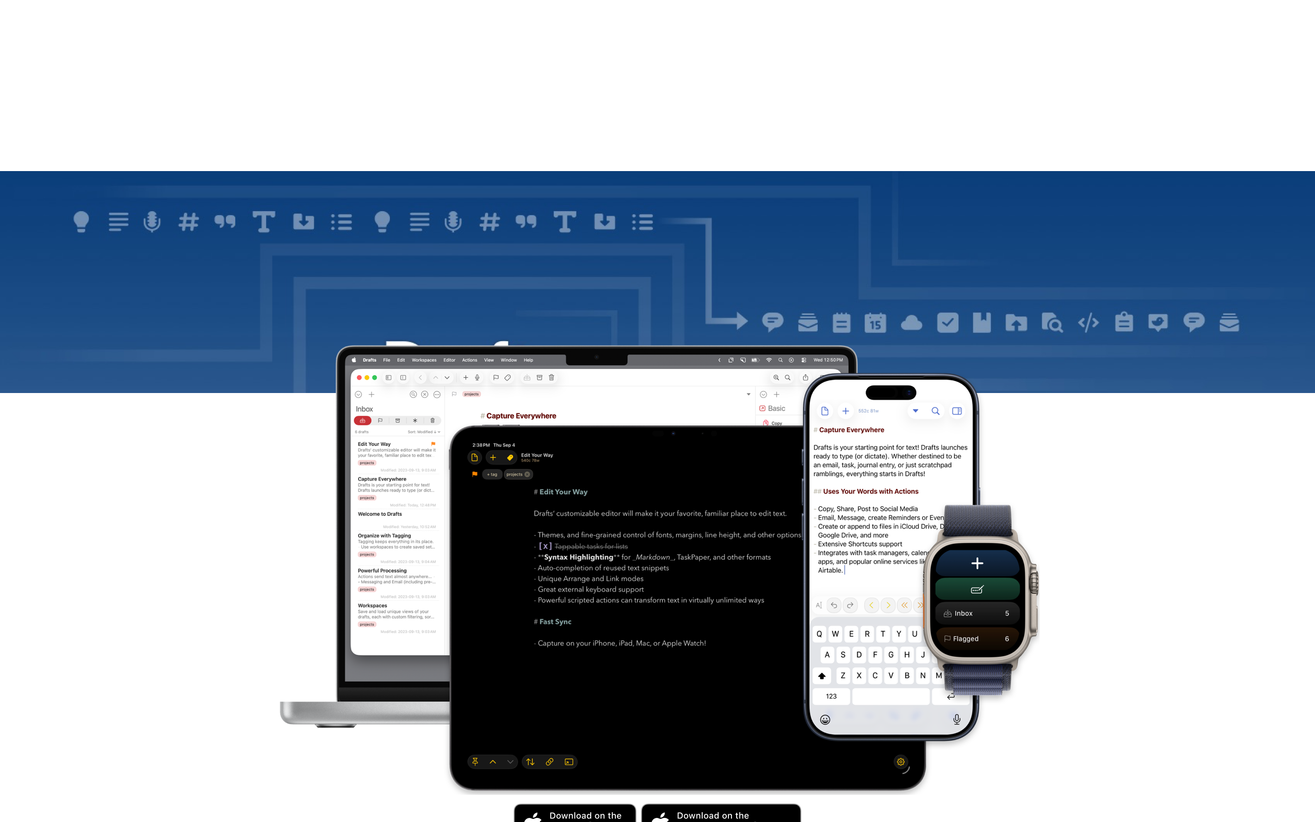
Most text capture tools force you to decide where something belongs before you have even written it — which note app, which document, which message thread. Drafts, built and maintained by solo developer Greg Pierce, inverts this entirely: open the app, start typing, decide later. That inversion is the product’s design thesis, and every visual and interaction decision follows from it.
Key Takeaways
- Blank-slate launch removes all friction - Every app open presents a new empty draft with no navigation, no file picker, and no decisions required before the first keystroke
- System fonts are a deliberate brand choice - By using the platform’s native typeface exclusively, Drafts ensures the text you write is the typography; the app chrome stays invisible
- A single brand color signals actionability - Brand blue (#335EEA) appears sparingly and exclusively on interactive elements, creating a reliable visual contract: if it is blue, you can tap it
- Complexity hides behind simplicity - Basic users see a text editor; power users discover a programmable text router with JavaScript support, keyboard shortcuts, and hundreds of community actions
- Light-weight headlines convey understated confidence - A 400-weight H1 at 48px is unusual for marketing pages, but the effect is refined and editorial rather than loud
Why Drafts Matters
Drafts answers a deceptively simple question: where does text go before it has a destination? The app functions as a text inbox — every piece of text captured is timestamped and searchable but uncategorized by default. The Action system, Drafts’ defining feature, lets you route text anywhere after writing it: to Messages, to Obsidian, to a calendar event, to a GitHub issue. Capture first, route second.
Key achievements: - Created the “text inbox” paradigm that separates capture from organization - Proved that a single developer can maintain a best-in-class app across iPhone, iPad, Mac, and Apple Watch - Demonstrated that platform-native design (system fonts, system colors, standard controls) can be a competitive advantage rather than a limitation - Built a thriving action ecosystem where the community extends the app’s capabilities without the developer writing additional code
Core Design Principles
1. The Blank Slate
Every app open presents a new empty draft. No navigation screen, no recent files list, no “what do you want to do?” dialog. Just a cursor and the keyboard. This is the core UX innovation — reducing friction to absolute zero for text capture.
The design implication is significant: the app’s most common state is empty. Where most apps invest their best design work in populated states (dashboards, feeds, galleries), Drafts invests in the blank page. The empty state is not a failure condition; it is the product’s primary interface.
2. Utilitarian Color Discipline
Drafts’ color palette is deliberately sparse. The vast majority of the interface is dark text (#161C2D) on a white background. Brand blue (#335EEA) appears only on elements that invite interaction — buttons, links, and action icons. This creates a reliable visual contract: color means “tap me.”
The text color itself carries subtle intention. Rather than pure black, Drafts uses rgb(22,28,45) — a near-black with a blue undertone that reads as softer and more refined than #000000. The secondary text colors (#869AB8 and #506690) share this blue undertone, creating a cohesive tonal family:
┌──────────────────────────────────────────────────┐
│  #FFFFFF  Pure white canvas                      │
│                                                  │
│  Where Text Starts                               │  ← #161C2D, 48px, weight 400
│                                                  │
│  Capture first, organize later.                  │  ← #161C2D, 17px body
│  Send anywhere with Actions.                     │  ← #869AB8, secondary
│                                                  │
│  ┌──────────────┐                                │
│  │  Get Drafts  │                                │  ← #335EEA, brand blue CTA
│  └──────────────┘                                │
│                                                  │
└──────────────────────────────────────────────────┘
3. The Action System as Power Layer
Drafts’ visual simplicity conceals remarkable depth. The Action system adds a grid of iconographic buttons, each representing a different text routing destination. These action icons are the app’s visual signature: small, precise, and color-coded by category using Apple’s system colors.
| Category | Color | Purpose |
|---|---|---|
| Default | System Blue | Sharing and system actions |
| Green | System Green | Completion and success |
| Orange | System Orange | Important or cautionary |
| Red | System Red | Destructive actions |
| Purple | System Purple | Custom user-created actions |
| Teal | System Teal | Export and integration |
By adopting Apple’s semantic color system rather than inventing a proprietary palette, the action colors feel native to each platform while providing clear categorical grouping.
4. Platform-Native by Conviction
Drafts does not chase visual novelty. No custom fonts, no dark theme as brand identity, no animated marketing heroes. System fonts, system colors, standard controls. The app feels like it belongs on each platform rather than wearing a cross-platform costume.
This commitment extends to the typography. The 17px body text matches Apple’s default body size in iOS. System font rendering (SF Pro on Apple platforms) provides optical clarity that custom web fonts often cannot match at small sizes. The result is an app where the text you type is indistinguishable in quality from the text the OS renders — because they use the same typeface.
5. Keyboard-First Interaction
Drafts was designed for people who do not want to lift their hands from the keyboard. Actions are triggerable via keyboard shortcuts. The custom keyboard row on iOS extends the default keyboard with programmable keys. On Mac, the full keyboard shortcut system means power users can capture, process, and route text without ever touching the mouse.
This keyboard-first philosophy does not exclude mouse or touch users — every action has a tappable equivalent. But the keyboard path is always the fastest path, and that priority shapes every interaction decision.
Transferable Patterns
Drafts’ design language is a masterclass in utilitarian clarity. The color system, typography, and spacing translate directly to any text-focused or productivity application.
The CSS implementation reveals how few custom properties are needed to achieve the Drafts aesthetic:
:root {
  /* Utilitarian palette */
  --color-background: #FFFFFF;
  --color-bg-secondary: #003471;
  --color-text: #161C2D;
  --color-secondary: #869AB8;
  --color-muted: #506690;
  --color-brand: #335EEA;
  --color-surface: #F5F5F7;
  --color-border: #D2D2D7;

  /* Minimal shadows */
  --shadow-card: 0 1px 3px rgba(0, 0, 0, 0.08);
  --shadow-focus: 0 0 0 3px rgba(51, 94, 234, 0.25);

  /* System font stack */
  --font-sans: -apple-system, BlinkMacSystemFont, "Segoe UI", Roboto,
    "Helvetica Neue", Arial, sans-serif;
}

/* Light-weight editorial headline */
h1 {
  font-size: 48px;
  font-weight: 400;
  letter-spacing: -0.96px;
  line-height: 1.2;
  color: var(--color-text);
}

/* Apple-native body size */
body {
  font-family: var(--font-sans);
  font-size: 17px;
  line-height: 27.2px;
  color: var(--color-text);
}
Notice the H1 at weight 400 — a deliberate departure from the 600-800 weights that dominate marketing pages. The -0.96px letter-spacing (exactly -2% of the font size) tightens the headline for an editorial quality. These small choices compound into an overall aesthetic of understated confidence.
For SwiftUI, the same philosophy produces a text editor that prioritizes content area above all else:
extension Color {
    static let draftsText = Color(red: 22/255, green: 28/255, blue: 45/255)
    static let draftsBrand = Color(red: 51/255, green: 94/255, blue: 234/255)
    static let draftsSecondary = Color(red: 134/255, green: 154/255, blue: 184/255)
    static let draftsSurface = Color(red: 245/255, green: 245/255, blue: 247/255)
}

struct DraftsEditorView: View {
    @State private var text = ""

    var body: some View {
        TextEditor(text: $text)
            .font(.body)
            .foregroundStyle(Color.draftsText)
            .scrollContentBackground(.hidden)
            .padding()
    }
}
The text editor view has no toolbar by default, no formatting ribbon, no sidebar. Just a cursor and your thoughts. The chrome is collapsible or auto-hidden. This is not minimalism for aesthetic reasons — it is a direct expression of the product principle that the text you are writing is always the most important thing on screen.
Design Lessons
Drafts teaches that platform conventions are not constraints but advantages. By trusting system fonts, system colors, and standard controls, Greg Pierce frees himself from maintaining a custom design system and his users from learning a new visual language. The app feels immediately familiar on every Apple platform.
The blank-slate pattern is transferable to any capture-oriented tool. If your product’s primary purpose is getting something out of the user’s head quickly, remove every obstacle between launch and input. No splash screens, no recent-files dialogs, no category selectors. Present the input surface immediately.
Avoid color overuse. When brand blue appears only on interactive elements, users develop an unconscious association: blue means actionable. This visual contract breaks the moment you use the brand color decoratively. Drafts maintains this discipline rigorously — if it is blue, you can tap it; if it is not blue, it is content.
Avoid feature-forward marketing. The Drafts site leads with a concept (“Where Text Starts”) rather than a feature list. The philosophy sells the app; features are secondary. Screenshots of the actual app do the selling, not animated renders or 3D mockups.
Frequently Asked Questions
What makes Drafts’ design distinctive?
Drafts’ design is defined by what it removes rather than what it adds. The blank-slate launch, system-only typography, and single-color accent create an interface that feels invisible until you need it to be powerful. The Action system adds depth without adding visual complexity — power features are one tap away but zero taps in the way.
How does Drafts balance simplicity with power-user features?
Through progressive disclosure implemented at the architectural level. A new user sees a text editor. An intermediate user discovers the Action drawer with pre-built routing options. An advanced user creates custom actions with JavaScript, builds keyboard shortcut workflows, and extends the app through the community Action Directory. The visual complexity scales with the user’s investment.
Why does Drafts use system fonts instead of a custom typeface?
The text you write in Drafts is the product’s visual identity — not the app chrome around it. A custom typeface would compete with the user’s content and introduce rendering inconsistencies across platforms. By using SF Pro on Apple devices and the system stack elsewhere, Drafts ensures the editing experience feels native and the focus remains on the user’s words.
What is the “text inbox” paradigm?
Traditional note apps require you to choose a destination (folder, notebook, tag) before writing. Drafts inverts this by treating every new piece of text as an inbox item — timestamped, searchable, but uncategorized. After writing, you use Actions to route the text to its final destination. This separation of capture from organization eliminates the friction that kills spontaneous ideas.
How does Drafts’ single-color approach affect usability?
By reserving brand blue (#335EEA) exclusively for interactive elements, Drafts creates an unconscious visual contract: if something is blue, it is tappable. This consistency reduces cognitive load and eliminates the guesswork users experience in interfaces where color is used decoratively. The restraint also makes the few colored elements more noticeable, improving discoverability.
References
- Drafts — Official homepage and product overview
- Drafts Action Directory — Community-built actions for routing text to hundreds of destinations
- Drafts Documentation — Complete user guide and feature reference
- Drafts Scripting Reference — JavaScript API documentation for custom actions
- Agile Tortoise — Greg Pierce’s development studio
- MacStories Review — Federico Viticci’s comprehensive review of Drafts 5