Copilot Money: Deep Space Finance with Cinematic Data
How Copilot Money treats financial data as design material, using deep navy canvases and vibrant Swift Charts to make budgets beautiful.
Copilot Money: Deep Space Finance with Cinematic Data
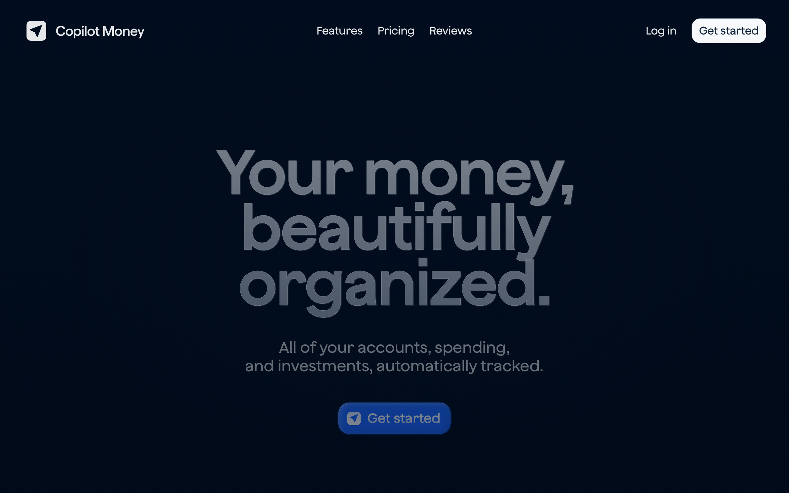
“Your money, beautifully organized.” — Copilot Money
Most finance apps feel like spreadsheets with paint. Copilot Money, an Apple Design Award finalist built entirely in Swift, proves that data-dense financial information can be presented with the same care as a premium consumer product. Where competitors reduce personal finance to rows and columns, Copilot treats financial data as a design material — something to be shaped, colored, and animated into clarity.
Key Takeaways
- Dark canvas makes data the hero - An ultra-dark navy background (#000814) lets vibrant chart colors pop, turning financial numbers into the visual focal point
- Semantic color creates instant comprehension - Green for income, red for spending, blue for net worth, yellow for pending — universal financial semiotics applied with unwavering consistency
- Charts are the interface, not decoration - Built with Swift Charts for native rendering and gesture integration, visualizations serve as the primary interaction layer rather than supplementary graphics
- 90% white text reduces fatigue - Slightly transparent text instead of pure white eliminates contrast harshness during extended financial review sessions
- Monumental typography signals confidence - A 112px display headline with -2.24px letter-spacing treats personal finance as architecture, not bureaucracy
Why Copilot Money Matters
Copilot Money represents a philosophical shift in financial software. The team rejected the assumption that finance apps must look clinical and instead built an experience where budgets feel cinematic. Machine learning handles tedious transaction categorization so the interface can focus entirely on insight rather than data entry.
Key achievements: - Proved that data-dense financial UIs can be beautiful without sacrificing clarity - Demonstrated native-first development (SwiftUI + Swift Charts) as a design advantage, not just a technical choice - Earned Apple Design Award recognition for treating personal finance as a consumer-grade experience - Established a visual language where the dark canvas and bright data create a clear hierarchy without any competing chrome
Core Design Principles
1. Deep Space Finance
Copilot’s marketing site uses an ultra-dark navy (#000814) that is nearly black but warmer than pure black. Text glows at 90% white opacity, producing a holographic, premium feel. The 112px headline with -2.24px letter-spacing is monumental — finance rendered as architecture.
The app itself balances this darkness with vibrant data visualization colors. Green (#00CC4B) signals income, red-orange (#FF4433) marks spending, yellow (#FECE4C) indicates warnings, and the signature blue (#1C6CFF) highlights interactive elements. The result is a clear visual language: dark canvas, bright data, nothing in between.
┌──────────────────────────────────────────────────────┐
│  #000814  Near-black navy canvas                     │
│                                                      │
│    ████  Income    #00CC4B (green)                    │
│    ██████████████  Spending  #FF4433 (red)            │
│    ████████  Net   #1C6CFF (blue)                     │
│    ██  Pending     #FECE4C (yellow)                   │
│                                                      │
│  Bright data on dark canvas = instant focal point    │
└──────────────────────────────────────────────────────┘
2. Charts as Primary Interface
In most finance apps, charts are afterthoughts — decorative summaries buried below transaction lists. Copilot inverts this hierarchy. Charts built with Swift Charts serve as the primary interface, offering native rendering performance, gesture integration, and smooth animations that feel like part of the operating system rather than a web view bolted onto a native shell.
This native-first approach means charts respond to pinch, drag, and tap gestures with the same fluidity as any other iOS control. Financial data becomes something you interact with physically, not something you read passively.
3. Progressive Disclosure of Complexity
The dashboard shows a summary first. No spreadsheet grids on launch, no walls of transaction numbers. Instead, contextual cards and progress bars communicate financial state at a glance. Transaction details reveal themselves through progressive disclosure — tap a chart segment to see the breakdown, swipe to navigate time periods, drill into categories on demand.
This approach ensures that casual check-ins take seconds while deep financial analysis remains fully accessible one interaction deeper.
4. Navy Over Black
Copilot never uses pure black (#000000). Every dark surface is tinted with deep navy, creating warmth that pure black cannot achieve. This seemingly minor decision has cascading effects: text feels softer against the background, extended reading sessions cause less eye strain, and the overall aesthetic reads as premium rather than stark.
The surface hierarchy builds on this foundation:
| Layer | Color | Purpose |
|---|---|---|
| Canvas | #000814 |
Primary background |
| Card | #001533 |
Slightly elevated surfaces |
| Elevated | #00204D |
Modals and active panels |
| Dark Section | #010D1E |
Recessed areas |
Transferable Patterns
Copilot’s design language translates directly to any data-rich application. The core insight — dark canvas with semantic bright data — works for dashboards, analytics tools, and monitoring interfaces far beyond finance.
The color system maps financial concepts to universal semiotics. Implementing this in CSS creates a reusable foundation for any dark-theme data visualization:
:root {
  /* Deep space canvas */
  --color-background: #000814;
  --color-surface: #001533;
  --color-surface-elevated: #00204D;
  --color-text: rgba(255, 255, 255, 0.9);
  --color-text-secondary: #7F8BA4;
  --color-text-muted: #597CAA;

  /* Semantic data colors */
  --color-accent: #1C6CFF;
  --color-success: #00CC4B;
  --color-warning: #FECE4C;
  --color-error: #FF4433;
  --color-orange: #FF9900;

  /* Light mode alternative */
  --color-light-bg: #F9FAFC;
  --color-light-surface: #F6F7F9;
}
For native iOS applications, the same palette translates to SwiftUI with semantic naming that communicates intent:
extension Color {
    static let copilotBackground = Color(hex: "000814")
    static let copilotSurface = Color(hex: "001533")
    static let copilotAccent = Color(hex: "1C6CFF")
    static let copilotIncome = Color(hex: "00CC4B")
    static let copilotSpending = Color(hex: "FF4433")
    static let copilotNet = Color(hex: "1C6CFF")
    static let copilotPending = Color(hex: "FECE4C")
}

// Monumental display typography
.font(.system(size: 112, weight: .semibold))
.tracking(-2.24)
.foregroundStyle(.white.opacity(0.9))
The typography system deserves attention. Copilot uses a 0.9 line-height on its display text — even tighter than most editorial designs. At 112px, the headline collapses onto itself for maximum visual impact. The -2.24px letter-spacing creates a luxury quality that signals “this is not your bank’s app.” Medium weight (500) at the H2 level produces elegance rather than boldness at 48px.
Design Lessons
Copilot Money teaches that data-dense interfaces benefit from constraint, not addition. The dark canvas is not merely an aesthetic choice — it is a functional decision that makes data colors more perceptible and reduces cognitive load during extended sessions.
The lesson for any data-heavy application: choose a canvas that recedes and let the data carry the visual weight. Avoid the temptation to decorate around data or to use color in the chrome itself. When the interface is quiet, the information speaks clearly.
Avoid spreadsheet aesthetics. Data should always be visualized through charts, progress bars, or contextual cards. Avoid cross-platform UI compromises — Copilot’s native-only approach (no React Native, no Flutter) means every animation and chart is platform-native, and users can feel the difference.
Frequently Asked Questions
What makes Copilot Money’s design distinctive?
Copilot treats financial data as design material rather than raw numbers to be displayed. The deep navy canvas (#000814) combined with semantically consistent chart colors creates a cinematic quality that makes reviewing your finances feel like interacting with a premium product rather than a spreadsheet.
How does Copilot Money handle data visualization?
Charts are built with Swift Charts, Apple’s native charting framework, which provides 60fps rendering, gesture integration, and smooth animations. Rather than treating charts as summary decorations, Copilot makes them the primary interface — users interact directly with visualizations to explore their financial data.
Why does Copilot use dark navy instead of pure black?
Pure black (#000000) creates harsh contrast that causes eye strain during extended sessions. Copilot’s near-black navy (#000814) adds subtle warmth that makes text more comfortable to read and gives the overall aesthetic a premium quality. The navy tint also provides enough differentiation for surface hierarchy (cards, modals) without resorting to visible borders.
What can designers learn from Copilot Money?
The central lesson is that data density and beauty are not in conflict. By establishing a dark, quiet canvas and reserving color exclusively for data, Copilot proves that even the most information-dense interfaces can feel premium. This pattern — semantic color on a receding background — applies to any dashboard, analytics tool, or monitoring interface.
References
- Copilot Money — Official homepage and product overview
- Apple Developer Article — Apple’s feature on Copilot Money’s development approach
- Copilot Money on the App Store — App listing with screenshots and reviews
- App Store Story — Apple editorial feature on Copilot Money