Camo Studio: Dark-Mode Professionalism for Video Production
How Camo uses dark interfaces, cool-toned text, and production-tool UI patterns to position a webcam app as studio software.
Camo Studio: Dark-Mode Professionalism for Video Production
“Your phone is a better webcam than your webcam.” — Reincubate, Camo’s founding thesis
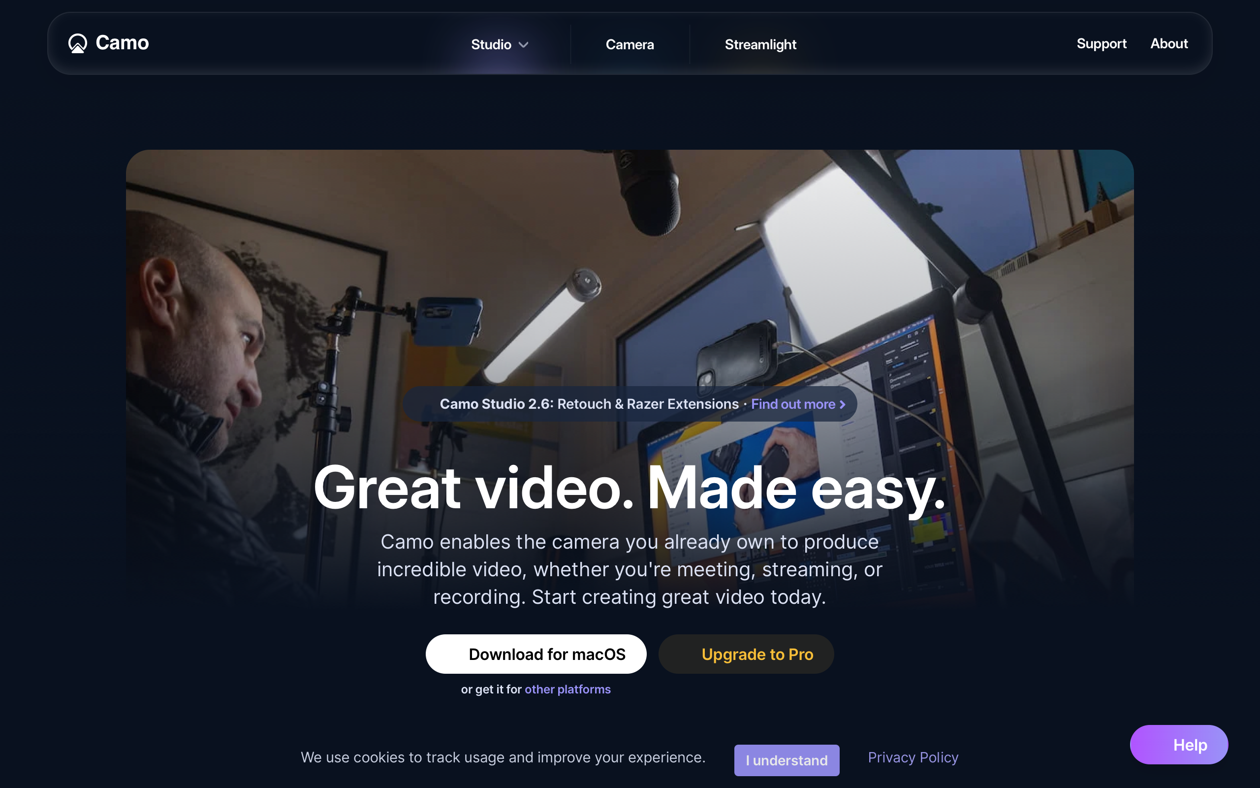
The pandemic put everyone on video calls, and everyone’s webcam looked terrible. Camo recognized that the problem was not the camera hardware — modern iPhones shoot cinema-quality video — but the software pipeline connecting cameras to video call apps. By positioning itself as a virtual camera with professional-grade controls, Camo turned a utility into a studio tool and proved that dark interfaces are not just an aesthetic preference but a strategic design decision.
Key Takeaways
- Dark mode signals professional tooling - Video and photo editing tools (Final Cut, DaVinci Resolve, Lightroom) use dark interfaces to keep focus on visual content; Camo adopts this convention to position a webcam app alongside professional software
- Cool-toned text reduces eye strain - Primary text at rgb(220,226,244) instead of pure white has a blue undertone that matches production-tool conventions and is significantly easier on the eyes during extended use
- Before/after demonstrations outperform feature lists - Product screenshots showing side-by-side camera quality comparisons make the value immediately visible; dark backgrounds make these images pop
- Single-purpose messaging builds clarity - Every section reinforces “better video, any camera, any app” with no feature sprawl or tangential use cases; the constraint is the selling point
- Semi-bold headlines suit dark backgrounds - Weight 600 rather than 700 creates confident but not aggressive headings; on dark backgrounds, full bold can appear too heavy
Why Camo Matters
Camo operates as infrastructure rather than application. It enhances the camera feed and hands it off to Zoom, Meet, Teams, or any app that accepts camera input. The “Studio” rebrand reflects an evolution from utility to creative tool — the name evokes a recording studio, a professional space where quality matters. This positioning justifies the depth of controls (LUT support, manual white balance, noise reduction) while maintaining the single-purpose constraint.
Key achievements: - Proved that a virtual camera app can command professional-tool pricing through design positioning alone - Demonstrated that dark-mode-only marketing is a viable strategy when it matches the product’s domain conventions - Built production-tool depth (color correction, background blur, framing, lens selection, lighting compensation) without building another video call platform - Maintained macOS-native feel despite a fully custom dark theme
Core Design Principles
1. Dark-Mode-Only Design
The entire marketing site and app UI use dark backgrounds. This is not a theme preference — it is a positioning decision. Video and photo editing professionals expect dark interfaces because dark surrounds keep visual content accurate and reduce eye fatigue during extended sessions. By adopting this convention, Camo signals “professional tool” before the user reads a word of copy.
The dark palette uses three elevation layers to create depth without borders:
CAMO'S DARK ELEVATION SYSTEM:
┌─────────────────────────────────────────────────┐
│  Background: rgb(15, 15, 20)    — Main canvas   │
│  ┌───────────────────────────────────────────┐  │
│  │  Surface: rgb(28, 28, 35)    — Cards      │  │
│  │  ┌─────────────────────────────────────┐  │  │
│  │  │  Elevated: rgb(42, 42, 52)  — Modal │  │  │
│  │  └─────────────────────────────────────┘  │  │
│  └───────────────────────────────────────────┘  │
└─────────────────────────────────────────────────┘
Shadows need higher opacity on dark backgrounds to register — cards use rgba(0,0,0,0.4) and dropdowns use rgba(0,0,0,0.5), significantly more aggressive than light-mode conventions.
2. Cool-Toned Typography
Camo pairs InterDisplay for headlines with standard Inter for body text. Headlines sit at 60px/600 weight with a tight 1.0 line-height and minimal letter-spacing (-0.176px) — large and confident, poster-style, without aggression. The semi-bold weight (600 rather than 700) is a deliberate choice: on dark backgrounds, full bold text appears too heavy and can feel overwhelming.
The most distinctive typographic decision is the text color. Primary text uses rgb(220,226,244) — not pure white. The blue undertone matches the professional video/photo editing convention and measurably reduces eye strain for dark-mode use. Headlines may use pure white for impact, but body text consistently uses this cooler, softer tone.
Control labels borrow from audio/video production conventions: 12px, weight 500, with 0.3px positive letter-spacing — reminiscent of the uppercase labels found on mixing boards and color grading panels.
3. Control-Panel UI Language
The app’s interface borrows directly from audio and video production tools. Sliders for exposure and color correction, dropdown selectors for camera sources and resolutions, toggle switches for features. Users familiar with DaVinci Resolve or OBS feel immediately at home.
This is reinforced by the before/after demonstration pattern on the marketing site. Product screenshots show side-by-side camera quality comparisons — the dark background makes these images pop, and the visual proof is more compelling than any copy. The hero section does not list features; it shows the result.
4. Virtual Camera Abstraction
Camo appears as a camera source in other applications. This invisible integration means users interact with Camo’s settings once, then forget it is running. The design supports this set-and-forget model: controls are organized for one-time configuration rather than frequent adjustment. Despite the custom dark theme, Camo respects macOS conventions — traffic light window controls, system-style sidebars, native-feeling toggle switches.
Transferable Patterns
Camo’s dark professional palette is immediately applicable to any tool targeting creative professionals. The key insight is the three-layer elevation system and the cool-toned text color:
:root {
  /* Dark professional foundation */
  --color-background: rgb(15, 15, 20);
  --color-surface: rgb(28, 28, 35);
  --color-elevated: rgb(42, 42, 52);
  --color-text: rgb(220, 226, 244);
  --color-text-secondary: rgb(150, 155, 175);
  --color-accent: rgb(56, 132, 244);
  --color-border: rgba(255, 255, 255, 0.08);

  /* Shadows — higher opacity for dark mode */
  --shadow-card: 0 4px 16px rgba(0, 0, 0, 0.4);
  --shadow-dropdown: 0 8px 32px rgba(0, 0, 0, 0.5);

  /* Typography */
  --font-display: "InterDisplay", Inter, ui-sans-serif, system-ui, sans-serif;
  --font-body: Inter, Helvetica, sans-serif;

  /* Border radius — subtle, professional */
  --radius-sm: 4px;
  --radius-md: 8px;
  --radius-lg: 12px;
}

/* Production-tool control label */
.control-label {
  font-family: var(--font-body);
  font-size: 12px;
  font-weight: 500;
  letter-spacing: 0.3px;
  color: var(--color-text-secondary);
}
The video production color vocabulary — recording red (rgb(255,55,55)), quality green (rgb(48,209,88)), warning amber (rgb(255,179,64)) — uses saturated, immediately recognizable status colors. These work because the dark, neutral background gives them room to communicate without competition.
For SwiftUI, the dark card pattern and slider control translate naturally:
// Dark professional card
struct StudioCard<Content: View>: View {
    let content: () -> Content

    var body: some View {
        content()
            .padding()
            .background(Color(red: 28/255, green: 28/255, blue: 35/255))
            .clipShape(RoundedRectangle(cornerRadius: 8))
            .shadow(color: .black.opacity(0.4), radius: 16, y: 4)
    }
}

// Control slider — production tool feel
VStack(alignment: .leading, spacing: 4) {
    Text("EXPOSURE")
        .font(.system(size: 12, weight: .medium))
        .tracking(0.3)
        .foregroundStyle(Color(red: 150/255, green: 155/255, blue: 175/255))
    Slider(value: $exposure, in: -2...2)
        .tint(Color(red: 56/255, green: 132/255, blue: 244/255))
}
Design Lessons
Dark mode is a positioning tool, not just a preference. When your product operates in a domain where professionals expect dark interfaces — video editing, audio production, code editors — adopting dark-mode-only design signals belonging. A light theme would undermine Camo’s professional positioning even if users requested it.
Never use pure white text on dark backgrounds. The difference between #FFFFFF and rgb(220,226,244) is subtle in a color picker but significant over extended reading sessions. The blue undertone reduces perceived harshness and aligns with established professional-tool conventions.
Avoid playful or rounded aesthetics in professional tools. No pill-shaped buttons, no bouncy animations, no emoji. Camo’s design language is serious and precise, matching the professional user it targets. The accent blue is functional, not decorative — there is no bright brand color competing for attention with the camera preview content.
Consumer app patterns undermine professional positioning. No onboarding carousels, no gamification, no social features. Camo treats its users as professionals who want controls, not tutorials.
Frequently Asked Questions
What makes Camo’s dark interface different from a typical dark mode?
Camo’s dark interface is not an alternative theme — it is the only mode, matching the convention that professional video and photo editing tools use dark surrounds to keep visual content accurate. The three-layer elevation system (background at rgb(15,15,20), surface at rgb(28,28,35), elevated at rgb(42,42,52)) creates depth through luminance differences rather than borders, and the cool-toned text color (rgb(220,226,244)) reduces eye strain during extended sessions.
How does Camo position a webcam utility as professional software?
Through design language borrowed from video production tools: dark interfaces, slider controls, production-standard status colors (recording red, quality green, warning amber), and control labels with tracking reminiscent of mixing-board typography. The “Studio” brand name and before/after demonstration pattern reinforce the professional positioning.
What can designers learn from Camo’s approach?
That domain conventions are powerful positioning tools. By adopting the visual language of Final Cut and DaVinci Resolve — dark backgrounds, semi-bold headlines, cool-toned text, control-panel UI — Camo signals professional credibility before the user evaluates a single feature. The lesson extends beyond video tools: matching the design conventions of your target domain builds immediate trust.
How does Camo handle the tension between custom design and native macOS feel?
Despite the fully custom dark theme, Camo preserves macOS conventions — traffic light window controls, system-style sidebars, native-feeling toggle switches. The custom design lives within native container patterns, so the app feels like a macOS citizen with a specialized skin rather than a foreign application.
References
- Camo Studio — Official product page with before/after demonstrations
- Reincubate — Parent company and technology background
- Camo on the App Store — Mac and iOS app listing
- Camo on Product Hunt — Launch and community reception
- Camo Setup Guide — Onboarding and configuration documentation