Anybox: Invisible Design Through Platform-Native Transparency
How Anybox achieves invisible design by deferring entirely to Apple platform conventions, proving restraint is a strategy.
Anybox: Invisible Design Through Platform-Native Transparency
“The best interface is the one you already know.” — Apple Human Interface Guidelines
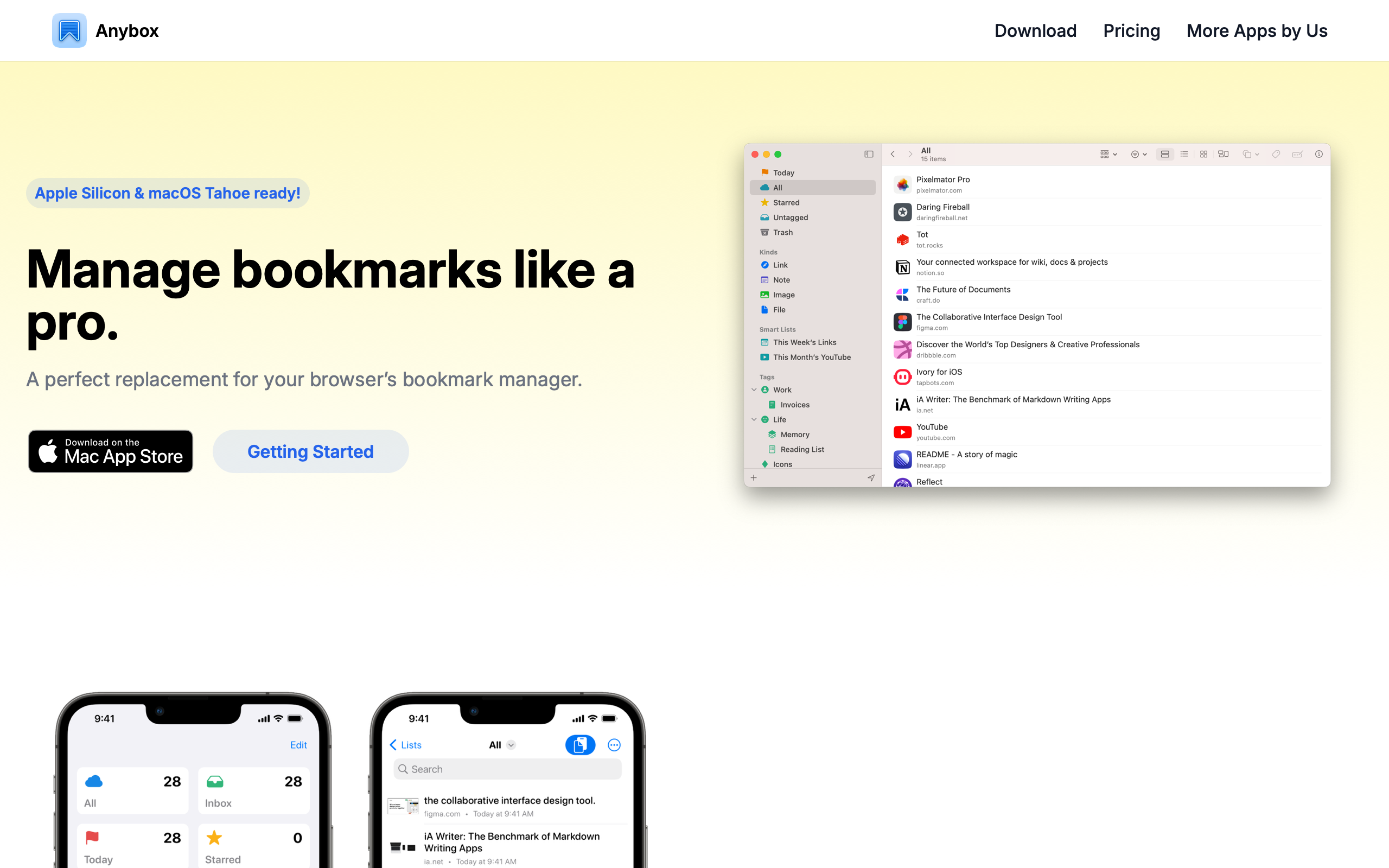
Bookmarks are broken. Browser bookmark managers are folder-based relics from the 1990s, read-it-later apps optimize for articles rather than links to tools and repos, and note-taking apps treat URLs as second-class citizens. Anybox solves this by treating links as first-class objects — with tags, smart folders, full-text search, and iCloud sync — while deferring so completely to Apple’s platform conventions that the app feels like it shipped with the operating system.
Key Takeaways
- Invisible design is a deliberate strategy - Anybox defers entirely to macOS and iOS conventions, making the app feel like a natural system extension rather than a third-party product
- Compact typography signals utility - H1 at 30px is modest by modern standards; H2 at 18px is barely larger than 16px body text — this flat scale creates a document-like reading experience appropriate for a tool that presents, not persuades
- Tags beat folders for flexible organization - Non-hierarchical, color-coded tag chips combined with smart folders (saved dynamic queries) give users power without rigid structure
- Constraint enables depth - Apple-only distribution (no web app, no Android) lets every feature use native frameworks deeply: Share Sheet, Spotlight, Shortcuts, widgets
- Screenshots sell utility apps - When the product is well-designed, app screenshots are the primary marketing tool; the website’s job is to frame them clearly, not compete with them
Why Anybox Matters
Anybox is a small indie app built by a solo developer, and it shows in the best possible way: no unnecessary features, no team collaboration, no social sharing. It is a personal bookmark manager that runs natively on Mac and iPhone, syncs via iCloud, and gets out of your way. Every screen has a clear purpose. Every feature earns its place.
Key achievements: - Proved that platform-native design can be a competitive advantage, not a limitation - Demonstrated that iCloud sync eliminates the need for account creation and server infrastructure - Built smart folders using familiar Apple paradigms (Finder smart folders, iTunes smart playlists), making a power feature immediately understandable - Showed that a one-person team can ship polished, deeply native software by embracing system frameworks instead of fighting them
Core Design Principles
1. Platform-Native Transparency
Anybox’s visual identity is invisible by design. The marketing site and the app both defer to system conventions. Inter serves as the web font — matching Apple’s own developer documentation aesthetic — with black text on white backgrounds and a layout so clean it could be a documentation site rather than a product page.
The app follows macOS and iOS design guidelines with disciplined precision: source list sidebars on Mac, tab bars on iPhone, system-standard toolbar icons. Users do not need to learn Anybox’s interface because they already know it from every other native app. The personality emerges not from visual flair but from structural clarity — smart folders, tag hierarchies, and link previews organized with the precision of a well-maintained filing system.
ANYBOX'S NATIVE UI STRUCTURE:
┌──────────────┬─────────────────────────────────────┐
│ Smart Folders │ Bookmark List                       │
│              │                                     │
│ ● All Links  │ 🌐 Stripe API Docs                  │
│ ● Unread     │    stripe.com/docs                  │
│ ● Starred    │    #dev #reference                  │
│              │                                     │
│ Tags         │ 🌐 Figma Community                   │
│ ○ dev        │    figma.com/community              │
│ ○ design     │    #design #inspiration             │
│ ○ reference  │                                     │
│              │ 🌐 Swift Evolution                   │
│ Folders      │    github.com/swiftlang/...         │
│ ▸ Work       │    #dev #swift                      │
│ ▸ Personal   │                                     │
└──────────────┴─────────────────────────────────────┘
2. Compact Typography Scale
The type scale is deliberately understated. H1 at 30px is modest by modern SaaS standards, where 48-72px hero headlines are common. H2 at 18px with semi-bold weight is barely larger than 16px body text, differentiated primarily by weight rather than size. There are no display-size headlines anywhere — the largest element is 30px.
This creates a document-like reading experience rather than a marketing splash. The text color (rgb(17,24,39), or Tailwind’s gray-900) is a very dark blue-gray, slightly warmer and softer than pure black. Body metrics are standard and unexceptional — 16px/24px with 1.5 line-height — because Anybox’s typography is meant to be read, not noticed.
3. Tag-Based Organization
Rather than folders (rigid hierarchy) or pure search (no organization), Anybox uses tags as its primary organizational mechanism. Tags are visual — color-coded chips rendered in a light blue background (#EFF6FF) with blue text (#2563EB) — and non-hierarchical, allowing any bookmark to belong to multiple categories without duplication.
Smart folders complement tags by functioning as saved dynamic queries, borrowing directly from Finder smart folders and iTunes smart playlists. A “Reading List” smart folder might filter for unread items tagged with #article; a “Dev Resources” folder might match anything tagged #dev or #reference. The power feature is presented through familiar Apple paradigms, making it immediately understandable.
4. Screenshot-Forward Marketing
Anybox’s marketing site is deliberately understated. No hero animations, no gradient backgrounds, no lifestyle photography. App screenshots are the primary visual content, presented cleanly against white backgrounds. The site acts as a frame for showing the product, not competing with it.
This works because the product itself is well-designed. When your app looks native and polished, the most persuasive thing you can do is show it. Download buttons are present but not styled to dominate the page — the approach is informational rather than persuasive.
Transferable Patterns
Anybox’s design system is built almost entirely from Tailwind’s gray and blue scales, making it straightforward to replicate. The palette reads as “professionally invisible”:
:root {
  /* Anybox's invisible, native palette */
  --color-background: #FFFFFF;
  --color-text: #111827;           /* gray-900 */
  --color-text-dark: #1F2937;      /* gray-800 */
  --color-text-medium: #374151;    /* gray-700 */
  --color-text-secondary: #6B7280; /* gray-500 */
  --color-text-muted: #9CA3AF;     /* gray-400 */
  --color-accent: #2563EB;         /* blue-600 */
  --color-accent-light: rgba(37, 99, 235, 0.1);
  --color-surface: #F9FAFB;
  --color-border: #E5E7EB;
  --color-tag-bg: #EFF6FF;

  /* Shadows — barely there */
  --shadow-card: 0 1px 3px rgba(0, 0, 0, 0.06);

  /* Typography */
  --font-sans: "Inter var", -apple-system, ui-sans-serif, system-ui, sans-serif;
}

/* Compact heading scale — document, not billboard */
h1 {
  font-size: 30px;
  font-weight: 700;
  line-height: 36px;
  letter-spacing: -0.3px;
  color: var(--color-text);
}

h2 {
  font-size: 18px;
  font-weight: 600;
  line-height: 24px;
  color: var(--color-text);
}

/* Tag chip */
.tag {
  background-color: var(--color-tag-bg);
  color: var(--color-accent);
  font-size: 12px;
  font-weight: 500;
  padding: 2px 8px;
  border-radius: 4px;
}
For native iOS implementations, the palette maps directly to SwiftUI color extensions. The bookmark list row pattern — favicon, title, URL, and tags in a compact horizontal layout — is worth studying for any app that displays link-based content:
struct BookmarkRow: View {
    let title: String
    let url: String
    let favicon: Image?

    var body: some View {
        HStack(spacing: 12) {
            (favicon ?? Image(systemName: "globe"))
                .resizable()
                .frame(width: 20, height: 20)
                .background(Color(red: 249/255, green: 250/255, blue: 251/255))
                .clipShape(RoundedRectangle(cornerRadius: 4))
            VStack(alignment: .leading, spacing: 2) {
                Text(title)
                    .font(.body)
                    .foregroundStyle(Color(red: 17/255, green: 24/255, blue: 39/255))
                Text(url)
                    .font(.caption)
                    .foregroundStyle(Color(red: 107/255, green: 114/255, blue: 128/255))
            }
        }
        .padding(.vertical, 6)
    }
}
Design Lessons
Platform conventions are a superpower for small teams. By embracing Apple’s HIG instead of building custom UI patterns, a solo developer can ship software that feels as polished as a large team’s output. Users already know the interaction model; the developer’s effort goes into the data layer and organizational features rather than reinventing buttons and navigation.
Restraint in marketing matches restraint in product. Anybox avoids aggressive CTAs, viewport-filling headlines, and lifestyle imagery on its marketing site — and this consistency builds trust. The product is understated; the marketing is understated; the user knows what they are getting.
Simple pricing complements simple design. No tiers, no feature gating, no team plans. A one-time purchase or simple subscription. The absence of pricing complexity mirrors the absence of visual complexity.
Avoid cross-platform compromise. By choosing Apple-only distribution, Anybox can use iCloud sync (zero configuration), Share Sheet (native capture), Spotlight (system search), and Shortcuts (automation) without building custom infrastructure for any of these capabilities. The constraint of a smaller addressable market is the feature.
Frequently Asked Questions
What makes Anybox’s design distinctive?
Anybox’s design is distinctive precisely because it does not try to be distinctive. By deferring entirely to Apple platform conventions — source list sidebars, system toolbar icons, tab bars — the app achieves an “invisible design” that feels like a natural extension of macOS and iOS. The personality comes from structural clarity and organizational features, not visual flair.
How does Anybox handle bookmark organization?
Anybox uses a three-layer system: tags (non-hierarchical, color-coded), smart folders (saved dynamic queries that update automatically), and traditional folders (for users who prefer hierarchy). Tags are the primary mechanism, displayed as visual chips that allow any bookmark to belong to multiple categories without duplication.
What can designers learn from Anybox?
That restraint is a design strategy, not a limitation. Anybox proves that a solo developer can ship polished, deeply native software by embracing system frameworks instead of building custom UI. The compact typography scale (largest heading at 30px), barely-there shadows (0.06 opacity), and screenshot-forward marketing demonstrate that quiet confidence can be more persuasive than visual spectacle.
Why does Anybox only support Apple platforms?
The constraint enables depth. By targeting only macOS and iOS, Anybox integrates with Share Sheet for capture, Spotlight for search, Shortcuts for automation, iCloud for sync, and widgets for quick access — all without building custom infrastructure. The result is an app that feels like it shipped with the operating system.
References
- Anybox — Official homepage with product screenshots and feature overview
- Anybox on the App Store — Mac and iOS app listing
- Anybox Help — Documentation and user guides
- Anybox Release Notes — Version history and feature changelog