Amie: Joyful Productivity Through Warm Minimalism
How Amie uses a 15-scale color system, warm neutrals, and orchestrated animations to make calendars feel like life canvases.
Amie: Joyful Productivity Through Warm Minimalism
“What would Google Maps look like if it was designed not to take you from New York to Boston, but to take you from ‘I can’t play saxophone’ to ‘I can’?” — Dennis Muller, Amie CEO
Productivity tools have a reputation for feeling transactional and sterile. Amie rejects that premise entirely. By treating the calendar as a canvas for your entire life rather than a grid of work meetings, Amie proved that delight and productivity are not mutually exclusive — earning Product Hunt’s Golden Kitty for design in the process.
Key Takeaways
- Color is organization, not decoration - Amie’s 15-scale event color system is the primary navigation mechanism; users understand their calendar through color before reading text
- Warm neutrals change the emotional register - A background of #FAFAFA instead of pure white, shadows at 4-12% opacity instead of the typical 10-20%, makes the entire experience feel gentler
- Flat type hierarchy signals equality - H2 and H3 at the same font size, differentiated only by weight, creates an “everything matters equally” feel that matches the calendar’s egalitarian philosophy
- Collapse-to-simplify preserves minimalism - Every panel (email, tasks, notes) can be hidden to zero width, letting users start minimal and add complexity only when they need it
- Isolate CTA colors from content colors - Action buttons use a muted blue that never appears in the calendar palette, preventing confusion between “clickable action” and “calendar category”
Why Amie Matters
Amie reimagined what a calendar could be by drawing inspiration from James Clear’s Atomic Habits — treating the calendar as a tool for building habits and tracking progress across all life domains, not just scheduling meetings. Features like heart rate integration and Spotify listening history transform the calendar into a life timeline.
Key achievements: - Won Product Hunt’s Golden Kitty for design excellence - Built a 15-color, 135-token design system that handles any color-coding need while maintaining harmony - Proved that a “collapse what you don’t need” architecture can support AI note-taking, meeting management, and email without sacrificing minimalism - Made warm, vibrant design viable in a market dominated by cold corporate tools
Core Design Principles
1. The 15-Scale Color System
Amie’s defining design feature is a comprehensive color system for event categorization. Fifteen color scales — Rose, Orange, Yellow, Amber, Lime, Green, Teal, Cyan, Blue, Indigo, Violet, Purple, Fuchsia, Pink, and Red — each with nine steps from 100 (very light, for backgrounds) to 900 (dark, for dark mode text). That yields 135 total color tokens.
This system is not decorative. It is the primary organizational layer. Users scanning a week view absorb the shape of their time through color before reading a single event title. A week heavy on purple (creative/personal) looks different from one dominated by blue (professional) at a glance. The key insight: color-coding at this scale requires careful harmonization. Random accent colors would clash; Amie’s scales are designed to sit next to each other in any combination.
AMIE'S EVENT COLOR SCALES (500-value primaries):
┌─────────┬──────────────────┬────────────────────┐
│ Rose    │ rgb(255,43,95)   │ Warm, energetic    │
│ Orange  │ rgb(254,102,0)   │ Vibrant, action    │
│ Yellow  │ rgb(244,175,0)   │ Bright, attention  │
│ Lime    │ rgb(132,204,22)  │ Fresh, growth      │
│ Green   │ rgb(1,202,69)    │ Success, health    │
│ Teal    │ rgb(20,184,166)  │ Calm, balanced     │
│ Blue    │ rgb(17,168,255)  │ Default, pro       │
│ Indigo  │ rgb(99,102,241)  │ Deep, focused      │
│ Violet  │ rgb(139,92,246)  │ Creative, personal │
│ Purple  │ rgb(160,80,255)  │ Bold, expressive   │
│ Fuchsia │ rgb(217,70,239)  │ Playful            │
│ Pink    │ rgb(255,50,154)  │ Social, personal   │
│ Red     │ rgb(253,43,56)   │ Urgent, important  │
└─────────┴──────────────────┴────────────────────┘
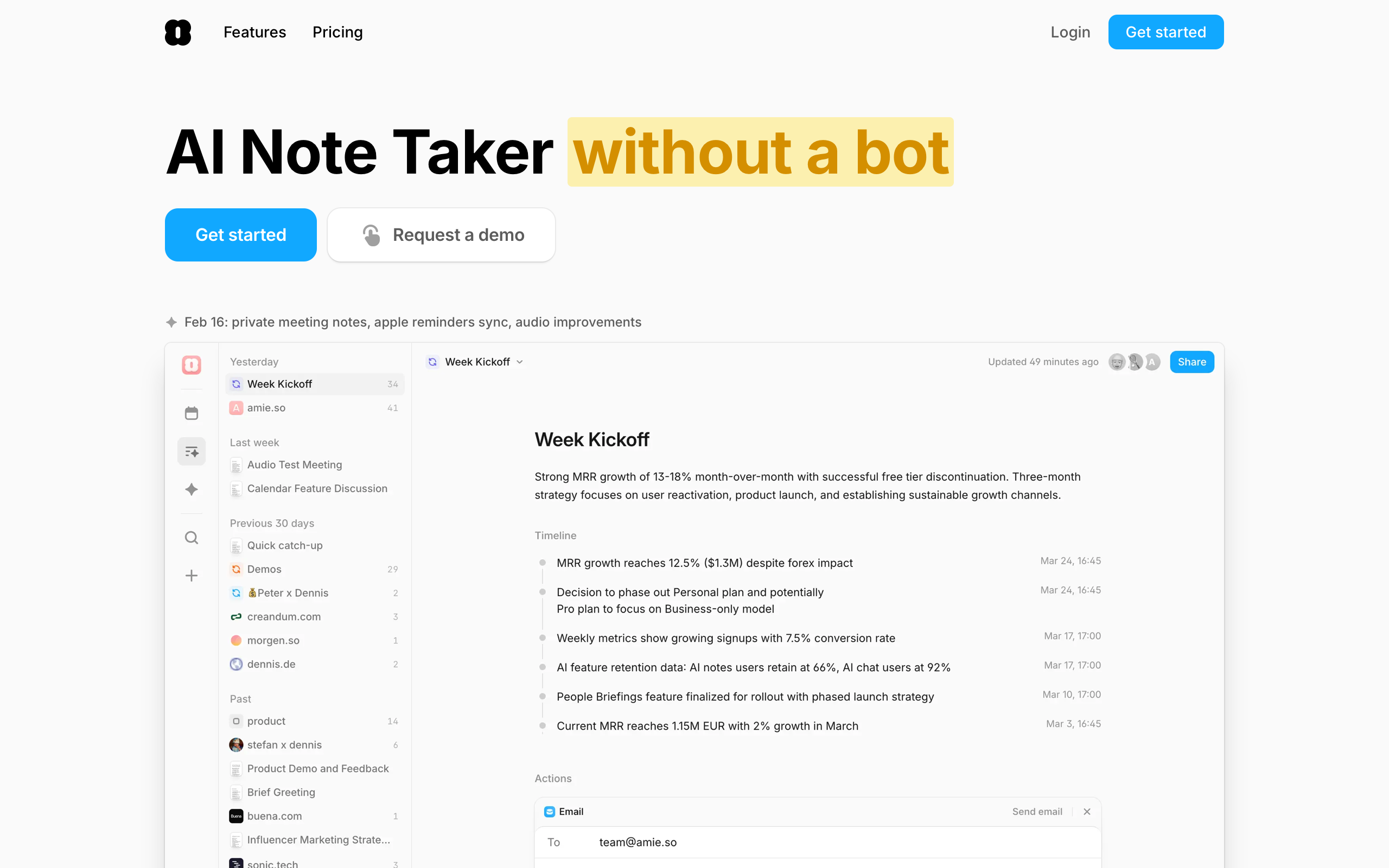
2. Warm Minimalism
Most productivity tools feel cold: gray surfaces, blue accents, neutral everything. Amie introduces warmth at every level. The background sits at #FAFAFA rather than pure white. Shadows operate at 4% and 12% opacity — almost invisible — with depth conveyed through background color differences rather than drop shadows. The signature brand pink (#F6A6A6) provides warmth without aggression.
The effect is opening a well-organized bullet journal rather than a corporate scheduling tool. Even the spacing contributes: a 60px grid row height in the calendar view gives events breathing room, while a compact 74px navigation rail maximizes calendar real estate. Everything runs on an implied 4px base grid (24, 36, 60, 64, 74, 200 — all multiples of 4).
3. Orchestrated Animation
Amie’s animations follow a precise choreography built on Framer Motion. Entry animations use 0.3-second durations with 0.05-second staggers — fast enough to feel responsive, slow enough to feel deliberate. Elements scale from 0.75 to 1.0 while fading in, creating a cascading “growing into place” effect. Exit animations reverse the pattern: shrink to 0.75 and fade out.
Scroll-triggered animations fire at the 50% viewport mark, ensuring content animates into view at the natural reading position rather than triggering too early or too late. The consistency of these timings across the entire interface creates a sense of unified choreography.
4. Flat Typography Hierarchy
Amie uses Inter as its workhorse typeface with an unusually flat heading scale. H2 and H3 are both 20px, differentiated only by weight (700 versus 600). This deliberate choice creates an egalitarian feel — nothing screams for attention because the calendar grid itself provides the hierarchy.
Body text runs at 16px with a generous 1.75 line-height, well above the typical 1.5-1.6, giving text breathing room in what is inherently a data-dense application. Display headlines use -0.5px letter-spacing to tighten large text for a premium feel, while the variable font (Inter var) enables fine-grained weight control throughout.
Transferable Patterns
Amie’s warm minimalism translates well to any productivity application that wants to feel approachable without sacrificing information density. The core palette is deceptively simple:
:root {
  /* Warm minimal foundation */
  --color-background: rgb(250, 250, 250);
  --color-surface: rgb(242, 242, 242);
  --color-primary: rgb(23, 23, 23);
  --color-secondary: rgb(92, 92, 92);
  --color-tertiary: rgb(160, 160, 160);
  --color-accent: rgb(253, 43, 56);
  --color-brand-pink: #F6A6A6;
  --color-cta: rgb(88, 144, 231);

  /* Shadows — barely there */
  --shadow-inner: rgba(0, 0, 0, 0.04);
  --shadow-outer: rgba(0, 0, 0, 0.12);

  /* Typography */
  --font-sans: "Inter var", ui-sans-serif, system-ui, -apple-system, sans-serif;

  /* 4px base grid */
  --space-xs: 4px;
  --space-sm: 8px;
  --space-md: 16px;
  --space-lg: 24px;
  --space-xl: 36px;
  --space-2xl: 60px;

  /* Animation */
  --duration-fast: 0.3s;
  --stagger: 0.05s;
}
The CTA button color (rgb(88,144,231)) is a critical detail worth replicating. It is a muted, professional blue deliberately chosen to differ from the calendar’s vibrant blue (rgb(17,168,255)). This separation prevents calendar event colors from competing with actionable interface elements — a pattern any app with a rich color-coding system should adopt.
For SwiftUI implementations, the animation timing translates directly:
// Staggered list appearance matching Amie's choreography
ForEach(Array(items.enumerated()), id: \.offset) { index, item in
    ItemView(item: item)
        .transition(.asymmetric(
            insertion: .scale(scale: 0.75).combined(with: .opacity),
            removal: .scale(scale: 0.75).combined(with: .opacity)
        ))
        .animation(.easeOut(duration: 0.3).delay(Double(index) * 0.05))
}
Design Lessons
Embrace full-spectrum color intentionally. Where most productivity tools default to one or two accent colors, Amie treats the full spectrum as a feature. The key is harmonic design across all scales — random accent colors clash, but a systematically designed 15-scale palette works in any combination.
Let data density breathe. Amie’s calendar is information-dense but never cluttered. The 60px row height, generous line-height, and barely-there shadows create breathing room without wasting space. Density and comfort are not opposites.
Design light-mode-first if warmth is the goal. Amie’s brand identity is the light, airy feel. Dark mode exists but the warm minimalism only fully registers against near-white backgrounds. Build the primary identity in light mode; adapt for dark rather than designing dark-first.
Avoid heavy drop shadows. Elevation through 4% and 12% opacity shadows is almost invisible — and that is the point. Cards feel like they float through color differences, not shadow theatrics.
Frequently Asked Questions
What makes Amie’s design distinctive among calendar apps?
Amie’s 15-scale color system with 135 tokens turns the calendar into a visual language. Users identify the shape of their week through color alone before reading event titles. Combined with warm neutrals (#FAFAFA backgrounds, barely-there shadows) and orchestrated Framer Motion animations, the result feels like a life canvas rather than a corporate scheduler.
How does Amie balance feature density with minimalism?
Through a “collapse what you don’t need” architecture. Every panel — email, tasks, notes, integrations — can be hidden to zero width. Users start with a minimal calendar and add complexity as needed. The compact 74px navigation rail maximizes calendar real estate, and the flat type hierarchy (H2 and H3 at the same size) prevents any single element from dominating the visual space.
What can designers learn from Amie’s approach?
Three things stand out. First, warm neutrals transform perceived personality — the difference between #FAFAFA and #FFFFFF backgrounds is small in hex but enormous in feel. Second, isolating CTA colors from content colors prevents interface confusion in color-rich applications. Third, animation choreography (consistent 0.3s durations, 0.05s staggers) creates a unified, polished feel that individual transition timings cannot achieve.
How does Amie handle non-traditional calendar data?
Heart rate, Spotify listening history, and sleep data integrate as data points on the calendar timeline. These appear as subtle overlays or companion rows, transforming the calendar from a meeting scheduler into a life timeline. The design treats all data points equally — a workout is as valid a calendar entry as a conference call.
References
- Amie — Official homepage and product information
- Product Hunt: Amie — Golden Kitty award-winning product page
- Figma Community: Amie Clone — Community-built design file for study
- Frontend.fyi: Recreating Amie Animations — Framer Motion animation breakdown
- Inverse: Dennis Muller Interview — CEO interview on design philosophy
- Fast Company: Amie Feature — Coverage of the color-coding approach