Liquid Glass en SwiftUI: tres patrones tras lanzar Return en iOS 26
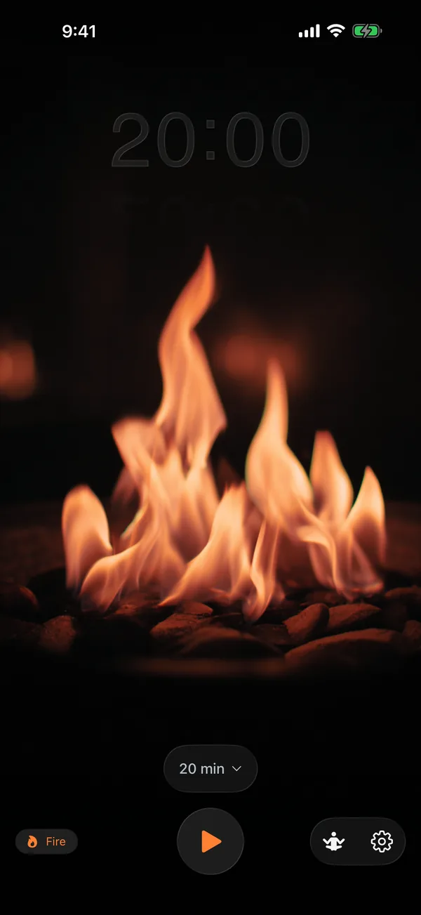
El Liquid Glass de Apple es una API de SwiftUI de una sola línea: .glassEffect().1 Return, mi temporizador de meditación, lo usa nueve veces en iOS, macOS y tvOS.2 Uno de esos usos aplica el modificador a un Shape personalizado que convierte los propios números del temporizador en liquid glass, glifo por glifo.
La pregunta interesante es qué pasa cuando vas más allá de la línea única. Las Human Interface Guidelines de Apple establecen una regla estricta de capas: Liquid Glass pertenece a la capa funcional (controles, navegación, UI transitoria) y nunca a la capa de contenido.3 La mayoría de los nueve usos en Return son aplicaciones clásicas de capa funcional: selectores, botones, tiras de control, distintivos de estado en pausa. Los usos interesantes son los tres que doblan las reglas sin romperlas.
Este ensayo recorre tres patrones que llevé a producción, las reglas que respetan, los escollos que me atraparon y la superficie de la API que decidí deliberadamente no usar.
TL;DR
- iOS 26 incorpora Liquid Glass como
.glassEffect(_:in:). La variante por defecto es.regulary la forma por defecto esCapsule.1 - Return usa tres patrones que van más allá de la línea única: vidrio sobre un
Shapepersonalizado (texto del temporizador mediante rutas de glifos de Core Text), el patrón de espejo (reflejo debajo mediante una copia volteada y enmascarada) y superposiciones HUD de capa funcional. - Regla de las HIG de Apple: Liquid Glass para la capa funcional, materiales estándar para la capa de contenido.3
- No usé
GlassEffectContainerdeliberadamente. La API de morphing no tiene caso de uso en Return (ningún elemento de vidrio se anima transformándose en otro), y no he medido la diferencia de rendimiento de renderizado; esto es una compensación sin medir, no una recomendación.1 - Escollos: el vidrio sobre un fondo plano se ve plano; la representación de dígitos sin saltos requiere celdas de ancho fijo; el
HStackde tvOS ignora el valor de entorno de dirección de diseño; reduce-motion debe respetarse en la animación de morph.
La API de una sola línea y la regla de capas
Apple incorpora Liquid Glass con una superficie pequeña, presentada como un pilar de diseño principal en la WWDC 2025:113
Text("Hello, World!")
    .font(.title)
    .padding()
    .glassEffect()                              // default: .regular variant, Capsule shape

Text("Hello, World!")
    .glassEffect(in: .rect(cornerRadius: 16))   // custom shape

Text("Hello, World!")
    .glassEffect(.regular.tint(.orange).interactive())  // tint + touch reactivity
Tres perillas: variante (.regular o .clear), forma (cualquier Shape) y una cadena GlassEffectStyle (tint, interactive). Esa es toda la API para una sola vista. El renderizado de varias vistas lo gestiona un GlassEffectContainer aparte, al que llegaré.
Las HIG son más estrictas que la API. Las Human Interface Guidelines de Apple definen dos capas en cada interfaz de iOS 26+:3
- La capa de contenido: el documento, lista, foto o medio que la persona está consumiendo. Aquí se usan materiales estándar (los
.regularMaterial,.thinMaterial, etc., existentes). - La capa funcional: controles, navegación, barras de pestañas, barras laterales, superposiciones transitorias. Aquí se usa Liquid Glass.
La instrucción específica de Apple: “No uses Liquid Glass en la capa de contenido. Liquid Glass funciona mejor cuando proporciona una distinción clara entre los elementos interactivos y el contenido, e incluirlo en la capa de contenido puede generar complejidad innecesaria y una jerarquía visual confusa.”3
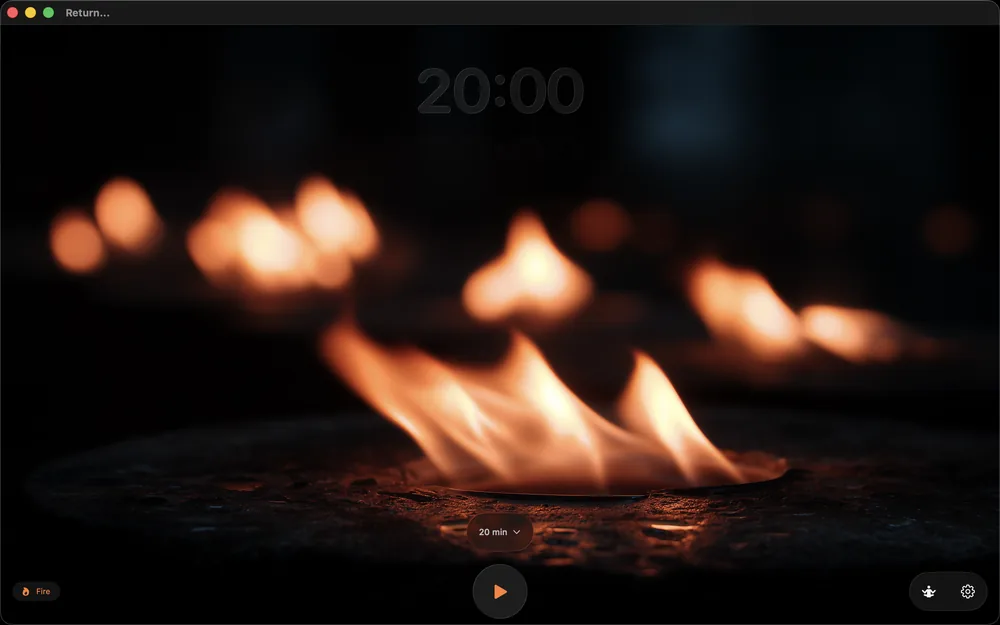
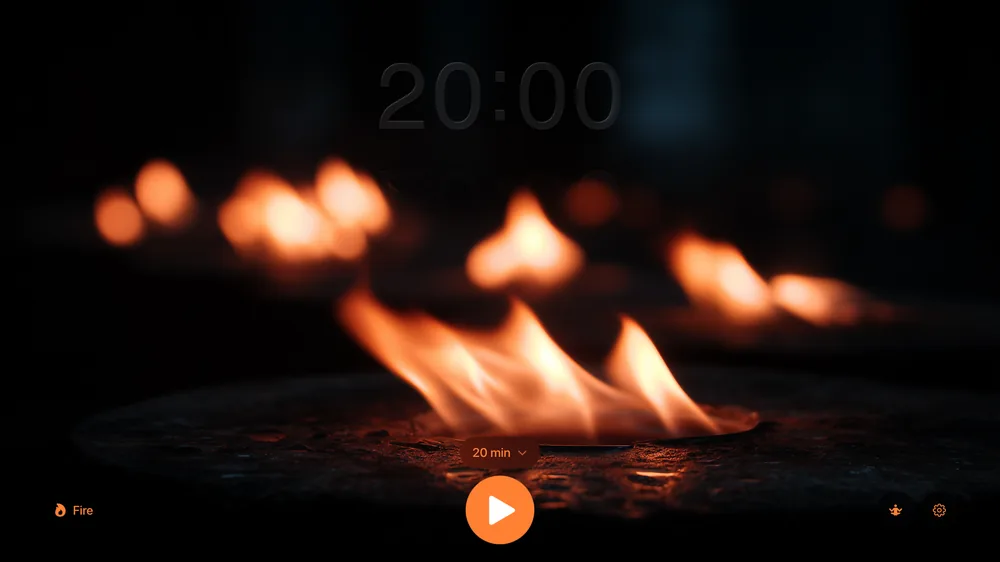
La regla suena restrictiva hasta que la mapeas a una app real. Return es un temporizador de meditación. Su capa de contenido son las imágenes de respiración y el video en bucle que se ejecuta detrás de todo. Su capa funcional es el selector de duración, la pila de botones de inicio/pausa/parada, la fila secundaria de botones de configuración y (en tvOS) el distintivo de estado en pausa. Ocho de los nueve usos de vidrio en Return son aplicaciones clásicas de capa funcional: tres variantes del selector de duración para las rutas de código de iOS y macOS, el conmutador de inicio/pausa, el botón de parada, la fila de botones de configuración, el indicador de pausa de tvOS y una superposición de control transitorio adicional.4
El noveno es el caso límite deliberado (Liquid Glass sobre los propios números del temporizador), que recorre la siguiente sección.
Patrón 1: vidrio sobre un Shape personalizado
Los números del temporizador en Return no son texto dibujado sobre un fondo de vidrio. El vidrio es el texto. .glassEffect(.clear, in:) acepta cualquier Shape,9 y un Shape es un protocolo que produce un Path.10 Así que el truco es: convertir la cadena del temporizador en una ruta de glifos usando Core Text,11 luego pasar esa ruta como Shape a .glassEffect.56
import SwiftUI
@preconcurrency import CoreText

struct GlassTextShape: Shape {
    let text: String
    let font: CTFont

    func path(in rect: CGRect) -> Path {
        guard !text.isEmpty else { return Path() }
        let combinedPath = CGMutablePath()

        let attrString = NSAttributedString(string: text, attributes: [.font: font])
        let line = CTLineCreateWithAttributedString(attrString)
        guard let runs = CTLineGetGlyphRuns(line) as? [CTRun], !runs.isEmpty else {
            return Path()
        }

        for run in runs {
            let glyphCount = CTRunGetGlyphCount(run)
            guard glyphCount > 0 else { continue }
            var glyphs = [CGGlyph](repeating: 0, count: glyphCount)
            var positions = [CGPoint](repeating: .zero, count: glyphCount)
            let range = CFRange(location: 0, length: glyphCount)
            CTRunGetGlyphs(run, range, &glyphs)
            CTRunGetPositions(run, range, &positions)

            for i in 0..<glyphCount {
                guard let glyphPath = CTFontCreatePathForGlyph(font, glyphs[i], nil) else { continue }
                let transform = CGAffineTransform(translationX: positions[i].x, y: positions[i].y)
                combinedPath.addPath(glyphPath, transform: transform)
            }
        }

        // Core Text y-axis is flipped vs SwiftUI; flip then re-bound and center.
        var swiftPath = Path(combinedPath).applying(CGAffineTransform(scaleX: 1, y: -1))
        let flippedBounds = swiftPath.boundingRect
        let offsetX = rect.midX - flippedBounds.midX
        let offsetY = rect.midY - flippedBounds.midY
        return swiftPath.applying(CGAffineTransform(translationX: offsetX, y: offsetY))
    }
}
Código real de producción de Return/Return/GlassTextShape.swift.5 La función path(in:) usa Core Text para componer la cadena, recorre cada CTRun, extrae el CGPath de cada glifo y los une en un único CGMutablePath. Los dos pasos no obvios vienen después de la unión: el sistema de coordenadas de Core Text coloca el origen en la esquina inferior izquierda, mientras que el Path de SwiftUI lo coloca en la esquina superior izquierda, por lo que la ruta debe voltearse mediante CGAffineTransform(scaleX: 1, y: -1). Luego el boundingRect de la ruta volteada tiene valores y negativos, así que una traducción la recentra dentro del rectángulo que SwiftUI le entrega al Shape. Si te saltas cualquiera de las dos transformaciones, los glifos se renderizan al revés o fuera de pantalla.
Entonces la aplicación es una sola línea:
Rectangle()
    .fill(.clear)
    .glassEffect(.clear, in: textShape)
    .frame(width: cellWidth, height: cellHeight)
El Rectangle transparente es un marcador de posición para la zona táctil; lo visual real es la forma que produce textShape. Con un Shape de ruta de glifos, el material Liquid Glass solo rellena los contornos de los glifos. El resultado: cada dígito del temporizador es una forma de liquid glass independiente, refractando cualquier animación que se ejecute detrás.6
El matiz de las HIG. La regla declarada por Apple es Liquid Glass para la capa funcional, materiales estándar para la capa de contenido, con una excepción explícita: los controles interactivos transitorios en la capa de contenido (deslizadores, conmutadores) pueden usar Liquid Glass cuando se activan.3 Los números del temporizador en Return son visualización de estado, no un control: se actualizan una vez por segundo desde Timer.publish(every: 1, ...) y no tienen gesto táctil (el botón de inicio/pausa que está debajo es lo que alterna el estado). Así que ponerles Liquid Glass es un caso límite deliberado, más cercano al “control interactivo transitorio” por intención que por interactividad literal, ya que los números son el punto focal visual que el usuario observa toda la sesión. Estoy doblando la regla, no rompiéndola. Un revisor que lea las HIG de forma estricta podría argumentar que esto debería ser material estándar; yo argumento que el temporizador es una superficie de control de tiempo transcurrido en la misma familia que un indicador de progreso. La documentación de Apple no zanja el caso directamente.
Por qué un Shape personalizado en vez de Text + fondo. Un Text renderizado sobre un fondo de vidrio se lee como texto sobre vidrio. Un Text renderizado como vidrio en sí mismo se lee como una categoría visual diferente. El usuario percibe los números como primer plano funcional, específicamente como un elemento transitorio que existe para mirar a través de él, no hacia él.
Patrón 2: el patrón de espejo
Return muestra un reflejo del temporizador debajo, atenuándose. Código real de producción:6
VStack(spacing: 0) {
    GlassTimerText(text: displayTime, fontSize: fontSize)
        .accessibilityLabel("Time remaining: \(accessibleDescription)")

    if showReflection {
        GlassTimerText(text: displayTime, fontSize: fontSize)
            .scaleEffect(x: 1, y: -1)
            .mask(
                LinearGradient(
                    stops: [
                        .init(color: .white.opacity(0.2), location: 0),
                        .init(color: .clear, location: 0.6)
                    ],
                    startPoint: .top,
                    endPoint: .bottom
                )
            )
            .offset(y: -8)
            .accessibilityHidden(true)
    }
}
Tres transformaciones componen el espejo, todas primitivas estándar de SwiftUI:14
scaleEffect(x: 1, y: -1)voltea la segunda copia de cabeza..mask(LinearGradient(...))desvanece el reflejo desde 20% de opacidad arriba hasta totalmente transparente al 60% hacia abajo..offset(y: -8)sube el reflejo 8 puntos para que linde con el original en lugar de dejar una costura visible.
El modificador .accessibilityHidden(true) sobre el reflejo es decisivo. VoiceOver no debe anunciar el tiempo reflejado dos veces; el accessibilityLabel y accessibilityAddTraits(.updatesFrequently) del original ya están adjuntos a la instancia principal de GlassTimerText arriba, y el reflejo es puramente decorativo.
Por qué esto funciona específicamente con Liquid Glass. El reflejo hereda el material de vidrio de GlassTimerText. Cualquier fondo sobre el que se asiente el original (un degradado de círculo respiratorio, un video, una escena tintada) se refracta a través de ambas copias. El espejo no necesita ningún código específico de vidrio; el material de vidrio gestiona la refracción gratis. Todo el efecto son tres modificadores y un degradado.
El costo de accesibilidad. Los usuarios con reduce-motion siguen viendo el espejo, pero la animación del material de vidrio entre actualizaciones de tiempo se suprime en otro lugar mediante @Environment(\.accessibilityReduceMotion).7 El reflejo en sí es estático; solo se anima el morph entre transiciones de dígitos.
Patrón 3: superposiciones HUD de vidrio para controles transitorios
Los ocho usos restantes de vidrio en Return son aplicaciones clásicas de capa funcional.4 Cada uno sigue el mismo patrón:
durationPicker
    .frame(height: 50)
    .frame(maxWidth: 320)
    .glassEffect()
    .padding(.horizontal, 20)
    .transition(.opacity.combined(with: .scale(scale: 0.95)))
.transition(.opacity.combined(with: .scale(scale: 0.95))) es la parte decisiva. Liquid Glass sobre controles transitorios solo se siente bien cuando los controles transitan. Un HUD de vidrio estático que se queda permanentemente en pantalla se lee como cromo. Un HUD de vidrio que aparece con fundido y escala cuando el usuario toca y vuelve a salir cuando aparta la mirada se lee como una superficie de control momentánea.
La documentación de Apple sobre glassEffect lo señala implícitamente: el modificador “captura el contenido para enviarlo al contenedor a renderizar” y “reacciona a las interacciones táctiles y de puntero en tiempo real.”1 Los ganchos de animación no están en la API, pero el pipeline de renderizado asume que los elementos de vidrio se mueven. Los elementos de vidrio estáticos pierden esa cualidad.
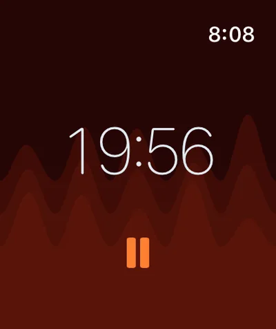
Return usa el patrón para el selector de duración (se desliza hacia arriba cuando el usuario toca), el botón de inicio/pausa (siempre visible pero escala al presionar), el botón de parada (solo visible a mitad de sesión), la fila de botones de configuración (una tira de control horizontal debajo del selector de duración) y el distintivo de estado en pausa de tvOS (solo visible cuando una sesión está en pausa en Apple TV). Los cinco contextos respetan la regla de capa funcional de las HIG.3
La cuestión de GlassEffectContainer
Apple recomienda GlassEffectContainer siempre que una app use .glassEffect() sobre varias vistas, por dos razones: mejor rendimiento de renderizado (los efectos de vidrio se procesan por lotes) y la capacidad de hacer morph entre formas durante las transiciones.1
No lo usé. El razonamiento es específico de la aplicación, no una refutación de la guía de Apple. Return tiene nueve vistas de vidrio, ninguna de las cuales necesita transformarse entre sí.46 El selector de duración nunca se anima convirtiéndose en el botón de inicio. El texto del temporizador nunca se anima convirtiéndose en la fila de botones de configuración. Cada elemento de vidrio es independiente. La API de morphing no tendría caso de uso al que dispararse, y las reglas de espaciado del contenedor restringirían diseños que hoy no necesitan coordinación.
El argumento de rendimiento de renderizado no puedo refutarlo del todo sin medición. La documentación de Apple advierte que “demasiados” efectos de vidrio fuera de un contenedor pueden degradar el rendimiento.1 Las nueve vistas de Return nunca comparten pantalla a la vez (el selector de duración solo aparece en el estado del menú, el botón de parada solo cuando está en pausa a mitad de sesión). En cualquier fotograma cuento tres o cuatro elementos de vidrio visibles, lo que ha sido fluido en cada dispositivo que he probado en iOS, iPadOS, macOS, watchOS y tvOS, pero no he ejecutado un trazado de instruments comparando contenedor frente a solo modificador. Así que la formulación honesta: Return omite GlassEffectContainer basándose en una experiencia de usuario observada como buena, no en una equivalencia de rendimiento medida.
La regla que extraje de esto: GlassEffectContainer es para apps donde varios elementos de vidrio son visibles y se animan simultáneamente. El ejemplo de Apple es el renderizado de conjuntos de símbolos con glassEffectUnion(id:namespace:): cuatro símbolos meteorológicos que se fusionan y dividen fluidamente como una unidad.1 Ese es un caso de uso clásico. Si una futura función de Return necesita que los elementos de vidrio se transformen o compartan las reglas de espaciado de un contenedor, el contenedor es la herramienta correcta para añadir entonces. Para la app de hoy, todavía no he topado con el caso.
Los escollos que me atraparon
Tres errores reales de producción:
Salto de los dígitos de vidrio. SF Pro Rounded tiene dígitos de ancho variable en renderizado proporcional. A medida que el temporizador hacía la cuenta atrás, la cadena mostrada cambiaba de longitud, y el HStack circundante se reorganizaba cada segundo, sacudiendo el temporizador entero. La solución: celdas de ancho fijo para cada carácter. Cada dígito recibe un cellWidth de fontSize * 0.6, cada dos puntos recibe fontSize * 0.3, y el HStack se convierte en una rejilla estable.6
HStack(spacing: 0) {
    ForEach(Array(text.enumerated()), id: \.offset) { _, char in
        let isColon = char == ":"
        let cellWidth = isColon ? colonCellWidth : digitCellWidth
        GlassDigitCell(character: String(char), font: ctFont,
                       cellWidth: cellWidth, cellHeight: cellHeight)
    }
}
Las celdas no son estándar de Apple; son un parche para el renderizado de ancho proporcional en tamaños de fuente fijos pequeños. SF Pro Rounded de Apple con .monospacedDigit() resolvería el mismo problema en Text, pero el modificador no está disponible en un renderizador de vidrio basado en Shape personalizado. El layout de celda fija es el sustituto.
Anulación de la dirección de diseño en tvOS. El mismo GlassTimerText corría en iOS, iPadOS, macOS y tvOS. Específicamente en tvOS, el HStack se reflejaba en un entorno de idioma de derecha a izquierda aunque la versión de iOS respetaba la anulación del entorno. La solución: fijar la dirección de diseño tanto mediante el valor de entorno como mediante el modificador explícito flipsForRightToLeftLayoutDirection(false), aplicado directamente al HStack de celdas de dígitos (el VStack padre aplica por separado la anulación de entorno para que la copia del reflejo la herede):6
HStack(spacing: 0) { ... }
    .flipsForRightToLeftLayoutDirection(false)
    .environment(\.layoutDirection, .leftToRight)
La razón: el HStack de tvOS parece ignorar la anulación a nivel de entorno en algunas versiones, y flipsForRightToLeftLayoutDirection(false) es el contrato explícito de no-espejado que se respeta de forma más fiable.12 Cinturón y tirantes.
Reduce-motion en el morph de dígitos. Liquid Glass anima por defecto las transiciones de morph entre las cadenas mostradas. Los usuarios con accessibilityReduceMotion activado veían el morph como parpadeo. La solución:6
.animation(reduceMotion ? nil : .easeInOut(duration: 0.15), value: displayTime)
El modificador de animación lee @Environment(\.accessibilityReduceMotion) y desactiva la transición por completo cuando reduce-motion está activado. La guía de accesibilidad de Apple es explícita: cualquier animación decorativa debe respetar la preferencia de movimiento del usuario.7
Cuándo no usar Liquid Glass
La negativa es parte del diseño.
No pongas Liquid Glass en la capa de contenido. Las HIG de Apple son explícitas, e ignorar la regla produce una jerarquía confusa: el usuario no puede saber qué es interactivo y qué es contenido.3 Si un efecto de vidrio está decorando una fila de lista o una tarjeta de foto, el diseño está luchando contra la plataforma.
No uses vidrio sobre un fondo plano. Liquid Glass refracta lo que está detrás. Si “lo que está detrás” es un único color sólido, la refracción no tiene nada que doblar, y el resultado se lee como un rectángulo plano tintado. O pones vidrio sobre contenido variado (un degradado, una imagen, un video) o no usas vidrio en absoluto. La pantalla del temporizador de Return ejecuta imágenes de portada basadas en tema y video en bucle como fondo a través de VideoBackgroundView,4 específicamente para que los elementos de vidrio sobre él siempre tengan textura que refractar.
Sé cauto con el vidrio sobre contenido de alta frecuencia. El renderizado del material de vidrio está limitado por GPU, y la animación de morph por defecto entre cambios de forma de vidrio es en sí misma una animación. Un temporizador que se actualiza una vez por segundo está bien en mis pruebas; una forma de onda o visualizador de audio a 60 Hz no está probado y probablemente pelea con la animación de morph. No he medido el límite superior; trata esto como una heurística, no como un umbral medido. La documentación de Apple no publica uno.
No lances vidrio sin probar reduce-motion. Cada animación de vidrio debe estar condicionada a accessibilityReduceMotion.7 El morph por defecto entre formas de vidrio es un efecto cinético, no solo un fundido.
Lo que Liquid Glass significa para apps que se lanzan en iOS 26+
La tesis es pequeña. Liquid Glass es una API de una sola línea solo cuando la app ya respeta la regla de capas de las HIG. Una app de SwiftUI que pone los controles en la capa funcional y el contenido en la capa de contenido puede adoptar Liquid Glass con modificadores .glassEffect() y sentirse nativa por defecto.
Las apps que mezclan las dos capas (controles dentro de filas de lista, barras de navegación tratadas como contenido, cromo decorativo en tarjetas de foto) adoptarán Liquid Glass y se sentirán mal. El material es correcto; la arquitectura debajo no lo es.
El patrón de Shape personalizado (Patrón 1) extiende la regla limpiamente. Cualquier cosa que sea funcionalmente un control puede usar Liquid Glass, aunque no se vea como un “control” en el sentido convencional. Un temporizador es un control, un medidor de nivel es un control, un indicador de progreso es un control. Liquid Glass sobre cada uno de esos está dentro de las especificaciones.
Combina este post con mis publicaciones anteriores sobre cómo lanzar la capa de datos de la misma app a través de App Intents y a través de un servidor MCP. La capa visual es la tercera superficie del mismo stack: entidades tipadas para la IA del sistema, formato de archivo para agentes multi-LLM y Liquid Glass para el humano frente al dispositivo.8
Preguntas frecuentes
¿Puedo usar .glassEffect() en plataformas distintas a iOS 26?
El modificador .glassEffect() es para iOS 26+, iPadOS 26+, macOS 26+, watchOS 26+, tvOS 26+, visionOS 26+. Las plataformas anteriores a la 26 tienen .background(.regularMaterial) y similares, que producen efectos de vidrio esmerilado pero no la nueva refracción de Liquid Glass.1
¿GlassEffectContainer cambia lo visual?
Los elementos de vidrio envueltos en un contenedor pueden mezclar sus formas cuando sus reglas de espaciado provocan superposición. Sin un contenedor, cada .glassEffect() es independiente. Para apps donde los elementos de vidrio deben fusionarse fluidamente durante la animación, GlassEffectContainer es la herramienta correcta. Para apps donde cada elemento de vidrio se mantiene distinto, un contenedor es sobrecarga.1
¿Por qué no usar Text directamente con .foregroundStyle(.thinMaterial)?
thinMaterial es un material estándar, no Liquid Glass. Lo visual es una superposición de vidrio esmerilado, no el efecto refractivo de vidrio que dobla la luz de Liquid Glass.3 Para texto que debe verse como el nuevo material específicamente, .glassEffect(.clear, in: customShape) es la ruta soportada.
¿Cómo capturo una captura de pantalla de Liquid Glass para marketing?
Los efectos de vidrio se renderizan por GPU en tiempo de ejecución, así que las capturas de pantalla se toman desde el simulador o el dispositivo con el efecto ya aplicado. Las imágenes oficiales de referencia de Liquid Glass de Apple provienen de sus páginas de documentación HIG y de las sesiones de la WWDC 2025.3
¿GlassTextShape funciona con texto arbitrario o solo con dígitos?
Cualquier cadena que Core Text pueda componer funciona. Return lo usa para dígitos y dos puntos, pero el mismo Shape funciona para letras, símbolos, emoji (con la fuente adecuada) o cadenas mixtas. El rendimiento está limitado por el conteo de glifos; un párrafo largo renderizado como vidrio sería costoso, pero un temporizador de seis caracteres es trivial.
Tres patrones, una regla y una API que decidí saltarme deliberadamente. Liquid Glass es la tercera superficie de una app de iOS 26+, asentándose sobre entidades tipadas y formatos de archivo compartidos. La API de una sola línea es real. La regla de las HIG bajo ella es lo que hace que la línea única funcione.
Referencias
-
Apple Developer, “Applying Liquid Glass to custom views”. Documentación del modificador
glassEffect(_:in:),GlassEffectContainer,glassEffectUnion(id:namespace:),glassEffectID(_:in:)yGlassEffectTransition. Variante por defecto.regular, forma por defectoCapsule. ↩↩↩↩↩↩↩↩↩↩ -
Return del autor, una app de temporizador de meditación publicada en la App Store el 21 de abril de 2026, disponible para iPhone, iPad, Mac, Apple Watch y Apple TV. Usa SwiftUI, SwiftData y HealthKit en iOS 26+ / macOS 26+. ↩
-
Apple Developer, “Materials” Human Interface Guidelines. Define la regla de capa funcional vs capa de contenido para Liquid Glass: “No uses Liquid Glass en la capa de contenido.” Lista las variantes regular y clear y sus usos previstos. ↩↩↩↩↩↩↩↩↩
-
Código de producción en
Return/Return/ContentView.swift(siete sitios de llamada.glassEffect()),Return/Return/GlassTimerText.swift(un sitio de llamada enGlassDigitCell) yReturn/ReturnTV/TVContentView.swift(un sitio de llamada en el indicador “Paused” de tvOS). Total nueve. MásReturn/Return/VideoBackgroundView.swift, que renderiza las imágenes de portada basadas en tema y el video en bucle a través de los cuales se refractan los elementos de vidrio. ↩↩↩↩ -
Código de producción en
Return/Return/GlassTextShape.swift. El envoltorio conforme aShapealrededor de Core Text. Creado el 26 de noviembre de 2025, incluido en la v1.0 lanzada en la App Store. ↩↩ -
Código de producción en
Return/Return/GlassTimerText.swift. VistasGlassDigitCell,GlassTimerTextyGlassTimerDisplay. Implementa el layout de celda de ancho fijo, el reflejo en espejo y la condición de reduce-motion. ↩↩↩↩↩↩↩ -
Apple Developer, valor de entorno “accessibilityReduceMotion”. Las apps deben respetar la preferencia de movimiento del usuario; las animaciones de morph por defecto en Liquid Glass deben estar condicionadas al valor. ↩↩↩
-
Análisis del autor en App Intents Are Apple’s New API to Your App y Two Agent Ecosystems, One Shopping List. El modelo de tres superficies: App Intents para Apple Intelligence, MCP para agentes multi-LLM, Liquid Glass para el humano frente al dispositivo. ↩
-
Apple Developer, “glassEffect(_:in:isEnabled:)” en
View. El parámetroin:acepta cualquier tipo conforme aShape. La forma por defecto esCapsule. ↩ -
Apple Developer, protocolo “Shape”. Un
Shapees cualquier tipo que produce unPathpara un rectángulo dado. Los shapes personalizados pueden envolver datosCGPatharbitrarios. ↩ -
Apple Developer, “Core Text Programming Guide” y
CTLineCreateWithAttributedString. Core Text es el motor de texto de bajo nivel usado para componer cadenas atribuidas en glyph runs y extraer rutas por glifo. ↩ -
Apple Developer, “flipsForRightToLeftLayoutDirection(_:)”. Anula explícitamente el espejado RTL en una
Viewindependientemente del valor de entorno\.layoutDirectioncircundante. ↩ -
Apple, “WWDC 2025 Highlights” via Apple Newsroom. Liquid Glass anunciado como el material de diseño unificador en iOS 26, iPadOS 26, macOS 26, watchOS 26, tvOS 26 y visionOS 26. Sesiones: “Meet Liquid Glass” (WWDC 2025), “Build a SwiftUI app with Liquid Glass”. ↩
-
Apple Developer, “LinearGradient”, “scaleEffect(x:y:anchor:)”, “mask(_:)”. Primitivas estándar de SwiftUI, todas disponibles desde iOS 13. ↩