From 76 to 100: Achieving a Perfect Lighthouse Score
A perfect Lighthouse score requires fixing problems most developers never find. This post belongs to the design engineering hub that collects the intersection of craft and implementation. This post documents the exact steps that took a FastAPI site from a 76 mobile performance score with 0.493 CLS to 100/100/100/100 across all four categories, including the CSS variable bug that caused invisible layout shifts on mobile devices.
TL;DR: A personal portfolio site went from a 76 mobile Lighthouse performance score with 0.493 CLS to a perfect 100/100/100/100 across all categories. The journey uncovered subtle CSS loading issues, regex bugs, and a particularly sneaky CSS variable override that caused layout shifts on mobile.
The Starting Point
The site was a FastAPI + Jinja2 portfolio with HTMX and Alpine.js for interactivity. Initial Lighthouse mobile audit:
| Metric | Score |
|---|---|
| Performance | 76 |
| Accessibility | 91 |
| Best Practices | 100 |
| SEO | 100 |
| CLS | 0.493 |
That CLS number is brutal. Google considers anything above 0.1 “poor.” At 0.493, the page was visibly jumping around during load.
Phase 1: Accessibility Quick Wins
Before tackling performance, I cleaned up accessibility issues to establish a baseline:
Form Labels
Changed decorative spans to proper <label> elements:
<!-- Before: span with aria-describedby -->
<span class="contact-form__label">Email</span>
<input id="email" aria-describedby="...">

<!-- After: proper label association -->
<label for="email" class="contact-form__label">Email</label>
<input id="email">
Contrast Ratios
Footer headings and form labels were using --color-text-tertiary (40% opacity white). Bumped to --color-text-secondary (65% opacity) to meet WCAG AA 4.5:1 contrast requirements. Getting contrast right is part of a broader color system — perceptual uniformity matters for accessibility, not just aesthetics.
Redundant Alt Text
Social media icons had alt text like “LinkedIn icon” when they were inside links that already had aria-labels. Changed to alt="" with aria-hidden="true" to prevent screen reader repetition.
Identical Link Text
Multiple “View Case Study” links were indistinguishable to screen readers. Added aria-label attributes with project names:
<a href="/work/introl" aria-label="View Introl Branding case study">
  View Case Study
</a>
Result: Accessibility jumped from 91 to 100.
Phase 2: The Render-Blocking CSS Problem
Lighthouse showed a 2,460ms “Element render delay” in the LCP breakdown. The culprit: a synchronous CSS file blocking first paint.
<!-- The problem: render-blocking stylesheet -->
<link rel="stylesheet" href="/static/css/styles.min.css">
The browser had to download and parse the entire 25KB stylesheet before painting anything.
The Solution: Critical CSS + Async Loading
Step 1: Extract critical (above-the-fold) CSS into a separate file that gets inlined in <head>.
Step 2: Load the full stylesheet asynchronously using the media="print" trick:
<!-- Critical CSS inlined for instant first paint -->
<style>{% include "components/_critical.css" %}</style>

<!-- Full CSS loaded async (doesn't block render) -->
<link rel="stylesheet" href="/static/css/styles.min.css"
      media="print" onload="this.media='all'">
<noscript>
  <link rel="stylesheet" href="/static/css/styles.min.css">
</noscript>
The media="print" attribute tells the browser “this stylesheet isn’t needed for screen rendering” so it doesn’t block. Once loaded, the onload handler switches it to media="all".
The Critical CSS Extraction Script
I wrote a Python script to automatically extract critical CSS for above-the-fold components:
CRITICAL_PREFIXES = [
    ".container",
    ".header",
    ".nav",
    ".hero",
    ".personal-photos",
]

def extract_critical_css(css_content: str) -> str:
    # Strip comments to prevent regex pollution
    css_no_comments = re.sub(r'/\*[\s\S]*?\*/', '', css_content)

    # Extract :root variables
    # Extract base reset rules
    # Extract component rules by prefix
    # Extract media queries containing critical selectors
    ...
Result: LCP element render delay dropped from 2,460ms to ~300ms.
Phase 3: The CLS Nightmare Begins
After implementing async CSS, CLS actually got worse—jumping to 0.119. Lighthouse showed <main> as the shifting element.
Bug #1: CSS Comments Polluting Regex
The extraction script used a regex to match selectors:
rule_pattern = r"([.#\w][^{]+)\{([^}]+)\}"
Problem: CSS comments weren’t being stripped before extraction. A comment like:
/* Hero Section - Editorial */
.hero { ... }
Would cause the regex to match from “Hero Section” to the opening brace, creating malformed selectors that failed the prefix check. Critical .hero styles were being silently dropped.
Fix: Strip comments before any regex operations:
css_no_comments = re.sub(r'/\*[\s\S]*?\*/', '', css_content)
Bug #2: Media Query Rules Extracted as Standalone
The regex was matching rules inside media queries and extracting them as standalone rules:
/* Full CSS structure */
.hero__title { font-size: 5rem; }           /* Desktop */

@media (max-width: 768px) {
  .hero__title { font-size: 1.875rem; }     /* Mobile */
}
The script extracted both rules at the top level:
/* Broken critical CSS */
.hero__title { font-size: 5rem; }
.hero__title { font-size: 1.875rem; }  /* Overrides desktop! */
On mobile, the title was rendering at the mobile size from critical CSS, then… staying there because the full CSS had the same rules. But on desktop, the mobile override was incorrectly applying.
Fix: Track media query positions and skip rules inside them:
# Find all media query ranges
media_ranges = []
for match in re.finditer(media_pattern, css_no_comments):
    media_ranges.append((match.start(), match.end()))

def is_inside_media_query(pos: int) -> bool:
    return any(start <= pos < end for start, end in media_ranges)

# Skip rules inside media queries during extraction
for match in re.finditer(rule_pattern, css_no_comments):
    if is_inside_media_query(match.start()):
        continue  # Will be included with full media query block
    # ... extract rule
Phase 4: The 100vh Hypothesis
CLS was still at 0.116. Theory: if nothing below the fold is visible on initial paint, it can’t contribute to CLS.
Changed the hero from 85vh to 100vh:
.hero {
  /* 100vh ensures nothing below fold is visible on initial paint */
  min-height: 100vh;
}
Result: No change. CLS still 0.116. The shift was happening within the viewport.
Phase 5: The Smoking Gun
Lighthouse filmstrip showed the hero text visibly shifting position between frames. Not fading—moving horizontally.
Deep dive into what styles affect horizontal positioning:
- .hero__content uses padding: 0 var(--gutter)
- --gutter is defined as 48px in :root
Then I found it:
/* In full CSS, but NOT in critical CSS */
@media (max-width: 768px) {
  :root {
    --gutter: var(--spacing-md);  /* 24px */
  }
}
The sequence on mobile:
- Critical CSS loads:
--gutter: 48px - Hero renders with 48px side padding
- Full CSS loads async
- Media query sets
--gutter: 24px - Hero padding shrinks from 48px to 24px
- Text reflows and shifts = CLS 0.116
The Fix
Extract :root media queries as part of critical CSS:
# Extract :root media queries (variable overrides are critical)
root_media_pattern = r"@media[^{]+\{\s*:root\s*\{[^}]+\}\s*\}"
for match in re.finditer(root_media_pattern, css_no_comments):
    critical_rules.append(match.group())
Now critical CSS includes:
:root { --gutter: 48px; /* ... */ }

@media (max-width: 768px) {
  :root { --gutter: var(--spacing-md); }
}
Mobile renders with the correct 24px gutter from the start. When full CSS loads, --gutter is already 24px—no change, no shift.
Phase 6: CSP and Alpine.js
One more issue: Alpine.js was throwing console errors about Content Security Policy violations. Alpine uses dynamic expression evaluation internally.
# In security headers middleware
CSP_DIRECTIVES = {
    "script-src": "'self' 'unsafe-inline' 'unsafe-eval'",
    # ...
}
The 'unsafe-eval' directive is required for Alpine.js’s expression parsing. The alternative is using Alpine’s CSP-compatible build, which has some limitations.
Final Results
| Metric | Before | After |
|---|---|---|
| Performance | 76 | 100 |
| Accessibility | 91 | 100 |
| Best Practices | 100 | 100 |
| SEO | 100 | 100 |
| CLS | 0.493 | 0.033 |
| LCP | 2.6s | 0.8s |
The Proof
Desktop audit showing perfect scores across all four categories:
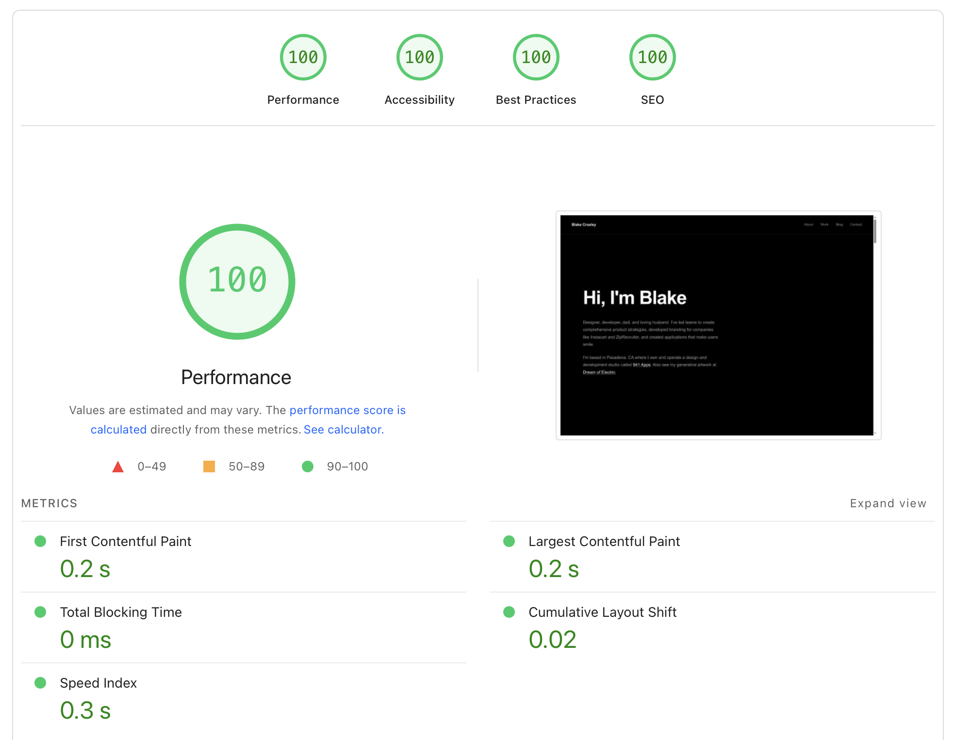
Mobile audit—the one that matters most—also hitting perfect marks:

Key Takeaways
1. CSS Variables Can Cause CLS
Media query overrides of CSS custom properties are invisible in DevTools’ computed styles panel — you only see the final value. If your critical CSS doesn’t include variable overrides, layout will shift when the full stylesheet loads. This is especially dangerous in typography systems where font-size and line-height variables cascade through every text element.
The color science that underpins the site’s perceptual color system also played a role: the CSS variable overrides that caused CLS included color variables alongside spacing variables, and the fix applied to both.
2. Critical CSS Extraction is Tricky
Simple regex approaches fail on:
- CSS comments (can pollute selector matching)
- Rules inside media queries (must stay inside their blocks)
- :root media queries (variable changes affect everything)
3. The media="print" Trick Works
Loading non-critical CSS with media="print" onload="this.media='all'" is a legitimate way to defer stylesheet loading without JavaScript complexity.
4. CLS Debugging Requires the Filmstrip
Lighthouse’s filmstrip view shows exactly when shifts occur. Without it, you’re guessing. The element highlighted as “shifting” might just be a symptom—look for what’s causing it to shift.
5. 100vh Hero Sections Have Benefits Beyond Aesthetics
If your hero fills the viewport, below-fold content can’t contribute to CLS because it’s not measured until the user scrolls. This dovetails with editorial design principles — full-viewport heroes create both visual impact and a performance advantage.
The Stack
- Backend: FastAPI + Jinja2
- Frontend: HTMX + Alpine.js (self-hosted, no CDN)
- CSS: Plain CSS with custom properties, no preprocessors
- Optimization: Custom Python script for critical CSS extraction
- Hosting: Railway with GZip compression and immutable caching
The entire stack runs without build tools — no webpack, no Vite, no bundler. The No-Build Manifesto documents the full metrics and tradeoffs of this approach. That simplicity made the design system easier to audit — fewer layers between the CSS you write and what the browser receives. This post belongs to the design engineering hub that collects the intersection of craft and implementation across the site.
Frequently Asked Questions
What is a good Lighthouse score?
A score of 90 or above is considered good by Google. Scoring 100 across all four categories (Performance, Accessibility, Best Practices, SEO) is rare on mobile because real-world conditions — variable network speeds, CPU throttling, third-party scripts — make it difficult to control every metric. Most production sites score between 50 and 80 on mobile performance.
What causes Cumulative Layout Shift (CLS)?
CLS measures how much visible content shifts after initial render. Common causes include images without explicit dimensions, dynamically injected content, web fonts that swap with fallbacks (FOIT/FOUT), and — as this post documents — CSS custom properties that change value when a deferred stylesheet loads. Google considers a CLS score above 0.1 “poor” and below 0.1 “good.”
How does critical CSS improve Lighthouse performance?
Critical CSS extracts the styles needed for above-the-fold content and inlines them in the HTML <head>. This eliminates the render-blocking round trip where the browser downloads and parses a full stylesheet before painting anything. The remaining CSS loads asynchronously using the media="print" technique, so the browser treats it as non-blocking. In this case, it reduced LCP element render delay from 2,460ms to roughly 300ms.
Can you get a perfect Lighthouse score without a build tool?
Yes. This site uses plain CSS with no preprocessor, no bundler, and no framework — just FastAPI serving Jinja2 templates. A Python script handles critical CSS extraction at deploy time. The absence of build tooling actually simplifies performance auditing because there are fewer abstraction layers between source CSS and what the browser receives.
Why does mobile Lighthouse score matter more than desktop?
Google uses mobile-first indexing, meaning the mobile version of your site determines search rankings. Mobile Lighthouse audits apply CPU throttling (4x slowdown) and network throttling (simulated slow 4G) that expose performance problems invisible on desktop. A site scoring 100 on desktop frequently scores 20-30 points lower on mobile under those constraints.
Tools Used
- Lighthouse (Chrome DevTools)
- Lighthouse filmstrip view for CLS debugging
grepandregex101.comfor CSS analysis- Python for the critical CSS extraction script
- iTerm 2
- Claude Code CLI with Opus 4.5 and a lot of ultrathink